Benvenuto nelle Font Più Popolari — dove popolarità e qualità si incontrano. Qui trovi i font più scaricati e usati dell'anno. Se cerchi scelte sicure per logo, web o social, inizia da qui.
Ogni font top si distingue per equilibrio, leggibilità e versatilità. Troverai sans serif moderne, script eleganti, serif vintage e display minimalisti.
-
( Download for Personal Use. For Commercial: http://www.k-type.com )
A modern, italicized font with medium contrast and normal spacing.
 Scaricare 180 Downloads@WebFont
 -
( Fonts by ANTI Hamar - Personal-use only. For commercial use please contact owner. )
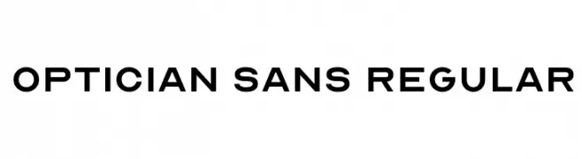
A clean, modern sans-serif font with geometric structure and uniform strokes.
![Optician Sans Regular font caratteri gratis]() Scaricare 180 Downloads@WebFont
Scaricare 180 Downloads@WebFont -
( Fonts by Daniel Zadorozny - www.iconian.com - Personal-use only. For commercial use please contact owner. )
A bold, geometric font with a modern, industrial style and expanded width.
![Peace & Houston Expanded font caratteri gratis]() Scaricare 180 Downloads@WebFont
Scaricare 180 Downloads@WebFont -
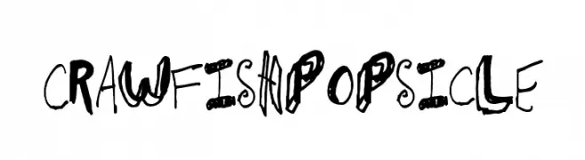
![CrawfishPopsicle font caratteri gratis]() Scaricare 180 Downloads@WebFont
Scaricare 180 Downloads@WebFont -
( Fonts by Style-7 - www.styleseven.com - Personal-use only. For commercial use please contact owner. )
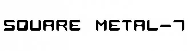
A bold, geometric font with a modern, industrial style.
![Square Metal-7 font caratteri gratis]() Scaricare 180 Downloads@WebFont
Scaricare 180 Downloads@WebFont -
-
( Fonts by zoe fonts - www.comiczeichnerin.de - free for non-commercial and commercial purposes. )
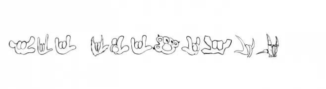
A playful, hand-drawn font inspired by sign language gestures.
![ZOE ILYhands 1.0 font caratteri gratis]() Scaricare 180 Downloads@WebFont
Scaricare 180 Downloads@WebFont -
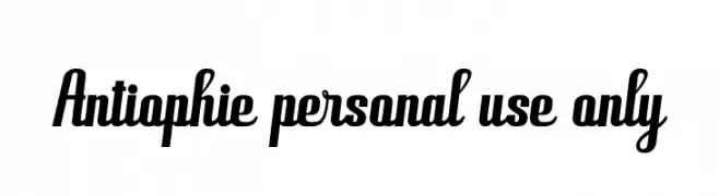
( Andhi Yulianto - creativemarket.com/great19 )
A bold, slanted font with dynamic and energetic letterforms.
![Antiophie personal use only font caratteri gratis]() Scaricare 180 Downloads@WebFont
Scaricare 180 Downloads@WebFont -
( Fonts by a David Fens. Personal-use only. For commercial use please contact owner. )
A bold, pixelated font with a retro video game aesthetic.
![Metroid Fusion Regular font caratteri gratis]() Scaricare 180 Downloads@WebFont
Scaricare 180 Downloads@WebFont -
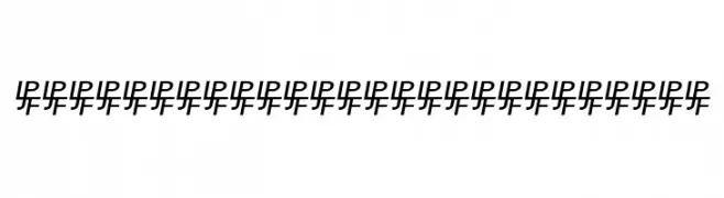
( Paul Lloyd Fonts )
A modern, italicized pattern with bold, stylized characters.
![NewStyleSmallCaps Embossed font caratteri gratis]() Scaricare 180 Downloads@WebFont
Scaricare 180 Downloads@WebFont -
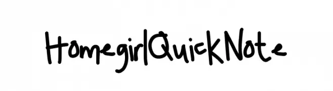
![HomegirlQuickNote font caratteri gratis]() Scaricare 180 Downloads@WebFont
Scaricare 180 Downloads@WebFont


Quali sono i font più popolari adesso?
Poppins, Roboto, Montserrat, Open Sans e Lato sono molto usati per le forme pulite e l'ampia applicabilità — dall'identità di marca alle landing page e ai poster.
Quali font si usano spesso nei loghi?
Le sans serif geometriche (es. Poppins, famiglie in stile Gotham) sono scelte comuni per un branding pulito e scalabile. Per un tocco personale restano valide script e stili manoscritti. Abbina un display deciso per i titoli a un corpo testo neutro per riconoscibilità ed equilibrio.
Ogni quanto si aggiorna la lista?
Con regolarità, in base ai download e all'attività reale. Torna spesso per scoprire in anticipo le nuove preferite.
💡 Consiglio: aggiungi ai preferiti — le tendenze cambiano in fretta e i font top di oggi possono ispirare il rebranding di domani.