Benvenuto nelle Font Più Popolari — dove popolarità e qualità si incontrano. Qui trovi i font più scaricati e usati dell'anno. Se cerchi scelte sicure per logo, web o social, inizia da qui.
Ogni font top si distingue per equilibrio, leggibilità e versatilità. Troverai sans serif moderne, script eleganti, serif vintage e display minimalisti.
-
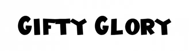
( Fonts by Hatf Type )
A bold, playful font with a hand-drawn, cartoonish style.
 Scaricare 180 Downloads@WebFont
 -
![PolyFace Regular font caratteri gratis]() Scaricare 180 Downloads@WebFont
Scaricare 180 Downloads@WebFont -
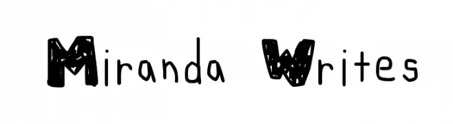
( Fonts by www.lifewithouttaffy.com )
A playful, bold, hand-drawn font with textured uppercase and casual lowercase letters.
![Miranda Writes font caratteri gratis]() Scaricare 180 Downloads@WebFont
Scaricare 180 Downloads@WebFont -
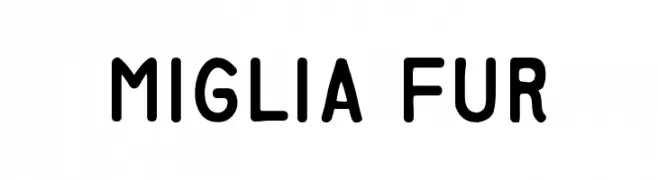
( Fonts by ihsan habib. Personal-use only. For commercial use please contact owner. )
A clean, rounded sans-serif font with a modern and friendly appearance.
![Miglia Fur font caratteri gratis]() Scaricare 180 Downloads@WebFont
Scaricare 180 Downloads@WebFont -
![Gee_WP_Handwriting_2016_3D Book font caratteri gratis]() Scaricare 180 Downloads@WebFont
Scaricare 180 Downloads@WebFont -
-
( Fonts by Peter Olexa - www.dealjumbo.com - Personal-use only. For commercial use please contact owner. )
A bold, nautical-themed slab serif font with strong geometric shapes.
![Sailor Bold font caratteri gratis]() Scaricare 180 Downloads@WebFont
Scaricare 180 Downloads@WebFont -
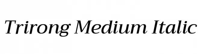
( Copyright (c) 2015, Cadson Demak (info@cadsondemak.com) )
A medium-weight, italic serif font with elegant, slanted characters.
![Trirong Medium Italic font caratteri gratis]() Scaricare 180 Downloads@WebFont
Scaricare 180 Downloads@WebFont -
( Fonts by ViactionType - Lukman Hidayat - Personal-use only. For commercial use please contact owner. )
A bold, handwritten font with a playful and energetic style.
![Velcro font caratteri gratis]() Scaricare 180 Downloads@WebFont
Scaricare 180 Downloads@WebFont -
( Fonts by Dirt2.com )
A bold, angular gothic-style font with sharp, elongated characters.
![Gothickella Free font caratteri gratis]() Scaricare 180 Downloads@WebFont
Scaricare 180 Downloads@WebFont -
( Fonts by Jacob Fisher - www.pizzadude.dk )
A futuristic, geometric font with dots and lines creating a digital aesthetic.
![Iron Lounge Dots font caratteri gratis]() Scaricare 180 Downloads@WebFont
Scaricare 180 Downloads@WebFont


Quali sono i font più popolari adesso?
Poppins, Roboto, Montserrat, Open Sans e Lato sono molto usati per le forme pulite e l'ampia applicabilità — dall'identità di marca alle landing page e ai poster.
Quali font si usano spesso nei loghi?
Le sans serif geometriche (es. Poppins, famiglie in stile Gotham) sono scelte comuni per un branding pulito e scalabile. Per un tocco personale restano valide script e stili manoscritti. Abbina un display deciso per i titoli a un corpo testo neutro per riconoscibilità ed equilibrio.
Ogni quanto si aggiorna la lista?
Con regolarità, in base ai download e all'attività reale. Torna spesso per scoprire in anticipo le nuove preferite.
💡 Consiglio: aggiungi ai preferiti — le tendenze cambiano in fretta e i font top di oggi possono ispirare il rebranding di domani.