Benvenuto nelle Font Più Popolari — dove popolarità e qualità si incontrano. Qui trovi i font più scaricati e usati dell'anno. Se cerchi scelte sicure per logo, web o social, inizia da qui.
Ogni font top si distingue per equilibrio, leggibilità e versatilità. Troverai sans serif moderne, script eleganti, serif vintage e display minimalisti.
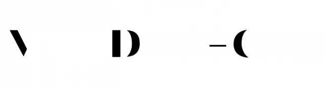
-
 Scaricare 769 Downloads@WebFont
 -
( Fonts by Saridezra )
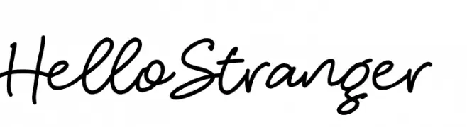
A lively, expressive handwritten font with fluid, connected letters.
![HelloStranger font caratteri gratis]() Scaricare 769 Downloads@WebFont
Scaricare 769 Downloads@WebFont -
( Fonts by www.gliphmaker.com. Personal-use only. For commercial use please contact owner. )
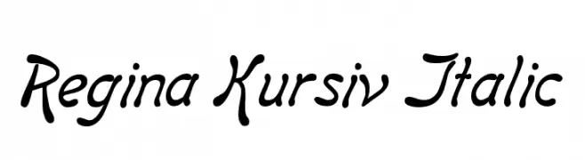
A flowing, cursive font with elegant curves and a sophisticated slant.
![Regina Kursiv Italic font caratteri gratis]() Scaricare 769 Downloads@WebFont
Scaricare 769 Downloads@WebFont -
( Fonts by Sharkshock Productions----www.sharkshock.com. Personal-use only. For commercial use please contact owner. )
A bold, impactful font with thick, uniform strokes for strong visual presence.
![News of the World Wide font caratteri gratis]() Scaricare 769 Downloads@WebFont
Scaricare 769 Downloads@WebFont -
( Fonts by a Neale Davidson - www.pixelsagas.com. Personal-use only. For commercial use please contact owner. )
A sleek, italic font with a futuristic and dynamic design.
![Classic Robot Italic font caratteri gratis]() Scaricare 769 Downloads@WebFont
Scaricare 769 Downloads@WebFont -
-
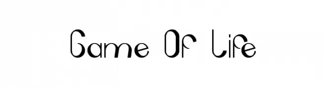
![Game Of Life font caratteri gratis]() Scaricare 769 Downloads@WebFont
Scaricare 769 Downloads@WebFont -
![DiagaNO font caratteri gratis]() Scaricare 769 Downloads@WebFont
Scaricare 769 Downloads@WebFont -
( Copyright (c) 2011 by Brenda Gallo (gbrenda1987@gmail.com) )
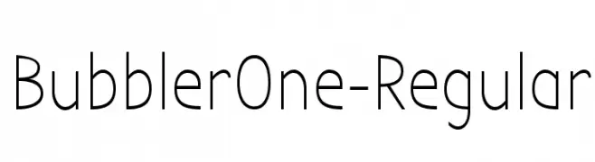
A modern, geometric sans-serif font with consistent stroke width and balanced spacing.
![BubblerOne-Regular font caratteri gratis]() Scaricare 769 Downloads@WebFont
Scaricare 769 Downloads@WebFont -
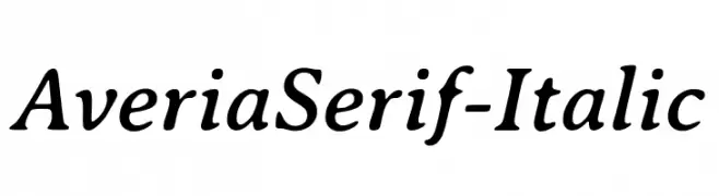
![AveriaSerif-Italic font caratteri gratis]() Scaricare 769 Downloads@WebFont
Scaricare 769 Downloads@WebFont -
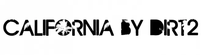
( Fonts by Andrew Hart - dirt2.com )
A bold, distressed font with a grunge texture, ideal for impactful designs.
![California by Dirt2 font caratteri gratis]() Scaricare 769 Downloads@WebFont
Scaricare 769 Downloads@WebFont -
( Copyright (c) 2010, Danh Hong (khmertype.blogspot.com) )
A modern, geometric sans-serif font with uniform stroke width.
![Battambang font caratteri gratis]() Scaricare 769 Downloads@WebFont
Scaricare 769 Downloads@WebFont -
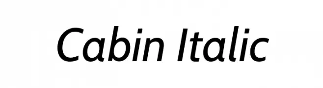
( Copyright 2016 The Cabin Project Authors (impallari@gmail.com) )
A modern, italic sans-serif font with excellent readability and dynamic style.
![Cabin Italic font caratteri gratis]() Scaricare 769 Downloads@WebFont
Scaricare 769 Downloads@WebFont -
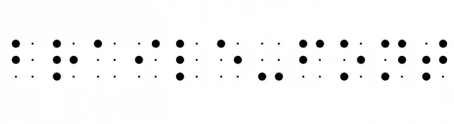
![Braile-font font caratteri gratis]() Scaricare 769 Downloads@WebFont
Scaricare 769 Downloads@WebFont -
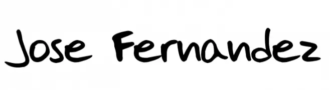
![Jose Fernandez font caratteri gratis]() Scaricare 769 Downloads@WebFont
Scaricare 769 Downloads@WebFont -
( Fonts by Omega Font Labs )
A bold, decorative font with a blackletter influence, featuring ornate curves and sharp angles.
![St Charles font caratteri gratis]() Scaricare 769 Downloads@WebFont
Scaricare 769 Downloads@WebFont -
![TX Jello font caratteri gratis]() Scaricare 769 Downloads@WebFont
Scaricare 769 Downloads@WebFont -
( Fonts by Paul Lloyd )
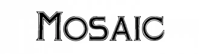
A bold, decorative font with a three-dimensional effect and geometric influence.
![Mosaic font caratteri gratis]() Scaricare 769 Downloads@WebFont
Scaricare 769 Downloads@WebFont -
( Fonts by Graham Meade - GemFonts )
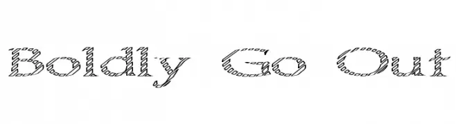
A decorative serif font with a crosshatched pattern for a textured, artistic look.
![Boldly Go Out font caratteri gratis]() Scaricare 769 Downloads@WebFont
Scaricare 769 Downloads@WebFont -
( Fonts by GreyWolf Webworks - www.greywolfwebworks.com - Personal-use only. For commercial use please contact owner. )
A bold, vintage-style serif font with high contrast and dramatic serifs.
![Pointedly Mad font caratteri gratis]() Scaricare 768 Downloads@WebFont
Scaricare 768 Downloads@WebFont -
( Fonts by Chequered Ink - chequered.ink - Personal-use only. For commercial use please contact owner. )
A bold, geometric font with a modern and cohesive design.
![Doubleplus font caratteri gratis]() Scaricare 768 Downloads@WebFont
Scaricare 768 Downloads@WebFont -
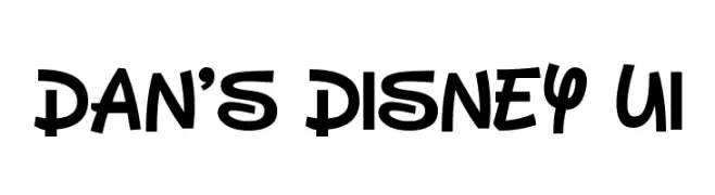
( Fonts by Dan P. Lyons - Personal-use only. For commercial use please contact owner. )
A playful, bold font with rounded characters and a whimsical style.
![Dan's Disney UI font caratteri gratis]() Scaricare 768 Downloads@WebFont
Scaricare 768 Downloads@WebFont -
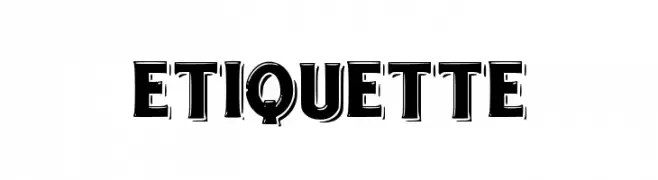
( Fonts by dee signator )
A bold, shadowed font with a three-dimensional effect, ideal for impactful designs.
![etiquette font caratteri gratis]() Scaricare 768 Downloads@WebFont
Scaricare 768 Downloads@WebFont -
![IFoundMyValentine font caratteri gratis]() Scaricare 768 Downloads@WebFont
Scaricare 768 Downloads@WebFont -
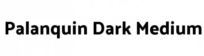
( Copyright 2014 Pria Ravichandran (pria.ravichandran@gmail.com) )
A modern sans-serif font with medium weight and balanced design.
![Palanquin Dark Medium font caratteri gratis]() Scaricare 768 Downloads@WebFont
Scaricare 768 Downloads@WebFont -
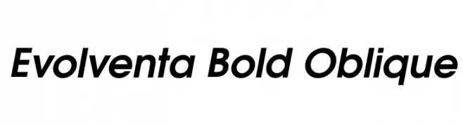
![Evolventa Bold Oblique font caratteri gratis]() Scaricare 768 Downloads@WebFont
Scaricare 768 Downloads@WebFont -
( Fonts by Daniel Zadorozny - www.iconian.com )
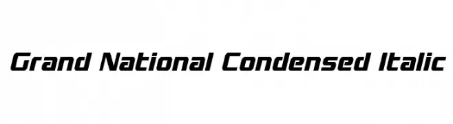
A modern, condensed italic font with a sleek and dynamic style.
![Grand National Condensed Italic font caratteri gratis]() Scaricare 768 Downloads@WebFont
Scaricare 768 Downloads@WebFont -
( Fonts by Daniel Zadorozny - www.iconian.com - Free for personal use )
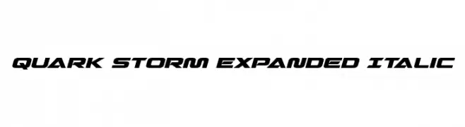
A bold, expanded, and italicized futuristic font with sharp angles.
![Quark Storm Expanded Italic font caratteri gratis]() Scaricare 768 Downloads@WebFont
Scaricare 768 Downloads@WebFont -
( Fonts by junkohanhero )
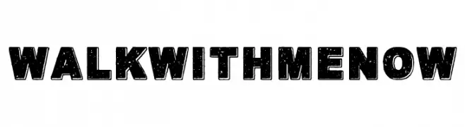
A bold, distressed font with a vintage, rugged look.
![Walk with me now font caratteri gratis]() Scaricare 768 Downloads@WebFont
Scaricare 768 Downloads@WebFont -
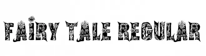
( Fonts by Steve Cloutier - www.cloutierfontes.ca )
A whimsical, decorative font with intricate floral patterns.
![Fairy Tale Regular font caratteri gratis]() Scaricare 768 Downloads@WebFont
Scaricare 768 Downloads@WebFont -
( Fonts by www.artill.de - Lukas Bischoff )
A bold, cutout-style font with high contrast and geometric shapes.
![VillaDidot-Cutout font caratteri gratis]() Scaricare 768 Downloads@WebFont
Scaricare 768 Downloads@WebFont -
( Copyright (c) 2011, TypeTogether (www.type-together.com) )
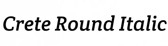
A modern serif font with rounded edges and an elegant italic style.
![Crete Round Italic font caratteri gratis]() Scaricare 768 Downloads@WebFont
Scaricare 768 Downloads@WebFont -
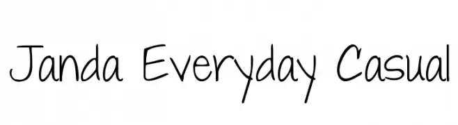
( Fonts by www.kimberlygeswein.com - Kimberly Geswein )
A casual, handwritten font with a friendly and approachable style.
![Janda Everyday Casual font caratteri gratis]() Scaricare 768 Downloads@WebFont
Scaricare 768 Downloads@WebFont -
![Catty font caratteri gratis]() Scaricare 768 Downloads@WebFont
Scaricare 768 Downloads@WebFont -
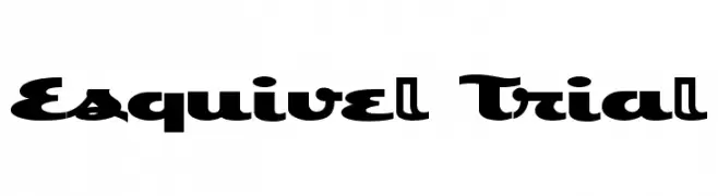
![Esquivel Trial font caratteri gratis]() Scaricare 768 Downloads@WebFont
Scaricare 768 Downloads@WebFont -
( Fonts by www.abecedarienne.com )
A bold, distressed font with a vintage, textured appearance.
![FultonMarkersRegular font caratteri gratis]() Scaricare 768 Downloads@WebFont
Scaricare 768 Downloads@WebFont


Quali sono i font più popolari adesso?
Poppins, Roboto, Montserrat, Open Sans e Lato sono molto usati per le forme pulite e l'ampia applicabilità — dall'identità di marca alle landing page e ai poster.
Quali font si usano spesso nei loghi?
Le sans serif geometriche (es. Poppins, famiglie in stile Gotham) sono scelte comuni per un branding pulito e scalabile. Per un tocco personale restano valide script e stili manoscritti. Abbina un display deciso per i titoli a un corpo testo neutro per riconoscibilità ed equilibrio.
Ogni quanto si aggiorna la lista?
Con regolarità, in base ai download e all'attività reale. Torna spesso per scoprire in anticipo le nuove preferite.
💡 Consiglio: aggiungi ai preferiti — le tendenze cambiano in fretta e i font top di oggi possono ispirare il rebranding di domani.