Benvenuto nelle Font Più Popolari — dove popolarità e qualità si incontrano. Qui trovi i font più scaricati e usati dell'anno. Se cerchi scelte sicure per logo, web o social, inizia da qui.
Ogni font top si distingue per equilibrio, leggibilità e versatilità. Troverai sans serif moderne, script eleganti, serif vintage e display minimalisti.
-
( Fonts by JoannaVu - https://ioannaladopoulou.design - Personal-use only. For commercial use please contact owner. )
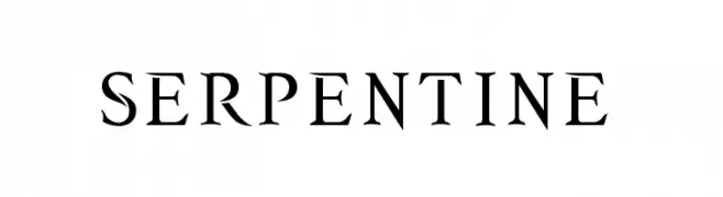
A bold serif font with sharp, angular serifs and a modern twist.
 Scaricare 773 Downloads@WebFont
 -
( Billy Argel - billyargel.com/ )
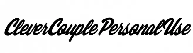
A bold, cursive font with interconnected letters and a modern script style.
![Clever Couple Personal Use font caratteri gratis]() Scaricare 773 Downloads@WebFont
Scaricare 773 Downloads@WebFont -
( Fonts by CannotIntoSpaceFonts - KineticPlasma Fonts - Personal-use only. For commercial use please contact owner. )
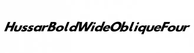
A bold, wide, and oblique font with a modern and dynamic style.
![Hussar Bold Wide Oblique Four font caratteri gratis]() Scaricare 773 Downloads@WebFont
Scaricare 773 Downloads@WebFont -
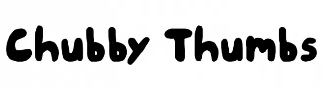
![Chubby Thumbs font caratteri gratis]() Scaricare 773 Downloads@WebFont
Scaricare 773 Downloads@WebFont -
( Fonts by Typodermic Fonts )
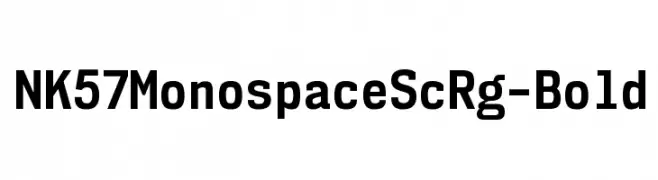
A bold, monospaced font with a clean and structured design, ideal for technical and professional use.
![NK57MonospaceScRg-Bold font caratteri gratis]() Scaricare 773 Downloads@WebFont
Scaricare 773 Downloads@WebFont -
-
( Fonts by Adien Gunarta - fontasticindonesia.blogspot.com )
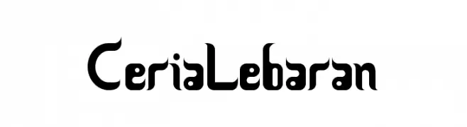
A bold, modern font with sharp edges and dynamic curves.
![CeriaLebaran font caratteri gratis]() Scaricare 773 Downloads@WebFont
Scaricare 773 Downloads@WebFont -
( Fonts by a Adrian Candela - http://www.behance.net/takuminokami . Personal-use only. For commercial use please contact owner. )
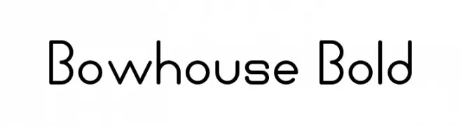
A modern, geometric font with rounded edges and consistent stroke widths.
![Bowhouse Bold font caratteri gratis]() Scaricare 773 Downloads@WebFont
Scaricare 773 Downloads@WebFont -
( Copyright (c) 2010-2011, Rubén Prol (ipanemagrafica@gmail.com|www.ipanemagrafica.com) )
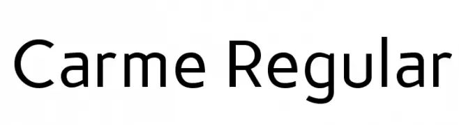
A clean, modern sans-serif font with balanced proportions and consistent stroke width.
![Carme Regular font caratteri gratis]() Scaricare 773 Downloads@WebFont
Scaricare 773 Downloads@WebFont -
![DobiType font caratteri gratis]() Scaricare 773 Downloads@WebFont
Scaricare 773 Downloads@WebFont -
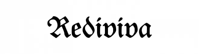
( Fonts by Dieter Steffmann )
A classic blackletter font with ornate, decorative letterforms and strong visual impact.
![Rediviva font caratteri gratis]() Scaricare 773 Downloads@WebFont
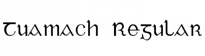
Scaricare 773 Downloads@WebFont -
![Tuamach Regular font caratteri gratis]() Scaricare 773 Downloads@WebFont
Scaricare 773 Downloads@WebFont -
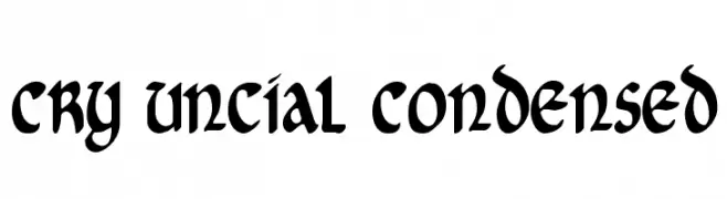
( Fonts by Daniel Zadorozny - www.iconian.com )
A bold, condensed uncial-style font with a historical yet modern appeal.
![Cry Uncial Condensed font caratteri gratis]() Scaricare 773 Downloads@WebFont
Scaricare 773 Downloads@WebFont -
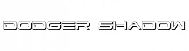
( Fonts by Iconian Fonts - Daniel Zadorozny )
A bold, futuristic font with a three-dimensional shadow effect.
![Dodger Shadow font caratteri gratis]() Scaricare 773 Downloads@WebFont
Scaricare 773 Downloads@WebFont -
( Fonts by Apostrophic Lab )
A bold, gothic-style font with intricate, medieval-inspired details.
![Endor font caratteri gratis]() Scaricare 773 Downloads@WebFont
Scaricare 773 Downloads@WebFont -
( Fonts by niyos - Nur Huda - Personal-use only. For commercial use please contact owner. )
A graceful script font with elegant flourishes and a handwritten feel.
![adelina font caratteri gratis]() Scaricare 772 Downloads@WebFont
Scaricare 772 Downloads@WebFont -
( Fonts by TypeType )
A bold, geometric font with strong, uniform letterforms.
![PeaceSans font caratteri gratis]() Scaricare 772 Downloads@WebFont
Scaricare 772 Downloads@WebFont -
( Fonts by Situjuh Nazara - 7ntypes.com - Personal-use only. For commercial use please contact owner. )
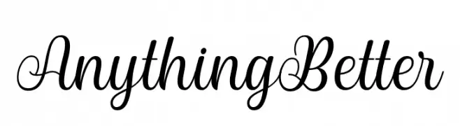
A graceful, cursive font with elegant loops and smooth strokes.
![Anything Better font caratteri gratis]() Scaricare 772 Downloads@WebFont
Scaricare 772 Downloads@WebFont -
( Fonts by Alit Suarnegara - Alit Design - www.alitdesign.net - Personal-use only. For commercial use please contact owner. )
An elegant, cursive font with flowing, sophisticated strokes.
![Beautiful Lovina Regular font caratteri gratis]() Scaricare 772 Downloads@WebFont
Scaricare 772 Downloads@WebFont -
( Fonts by Out of Step Font Company - Dan Steinbok - outofstepfontco.com - Personal-use only. For commercial use please contact owner. )
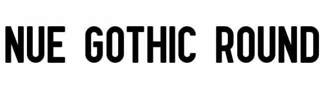
A bold, modern sans-serif font with rounded edges and uniform stroke width.
![Nue Gothic Round font caratteri gratis]() Scaricare 772 Downloads@WebFont
Scaricare 772 Downloads@WebFont -
( Fonts by Zanatlija - Personal-use only. For commercial use please contact owner. )
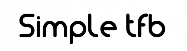
A modern, rounded font with clean lines and even spacing.
![Simple tfb font caratteri gratis]() Scaricare 772 Downloads@WebFont
Scaricare 772 Downloads@WebFont -
( weknow - Wino S Kadir - www.creativefabrica.com/designer/weknow/ )
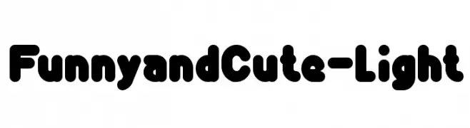
A playful, rounded font with a bold and friendly appearance.
![Funny and Cute-Light font caratteri gratis]() Scaricare 772 Downloads@WebFont
Scaricare 772 Downloads@WebFont -
( fey design - Fey Design - www.creativemarket.com/feydesign )
A sophisticated script font with high contrast and elegant, flowing strokes.
![AmbergrisScriptFreePersonal font caratteri gratis]() Scaricare 772 Downloads@WebFont
Scaricare 772 Downloads@WebFont -
( Letterhend Studio - Hendry Juanda - creativemarket.com/letterhend )
A bold, modern sans-serif font with clean lines and uniform strokes.
![CalasansDEMO font caratteri gratis]() Scaricare 772 Downloads@WebFont
Scaricare 772 Downloads@WebFont -
( Fonts by Rosie Tea - rosietea.com.au/fonts/ - Personal-use only. For commercial use please contact owner. )
A bold, playful font with rounded edges and a slightly condensed form.
![Jelly font caratteri gratis]() Scaricare 772 Downloads@WebFont
Scaricare 772 Downloads@WebFont -
( Fonts by Arwan Sutanto www.locomotype.com - Personal-use only. For commercial use please contact owner. )
A playful, bold font with a hand-drawn, whimsical style.
![Belepotan font caratteri gratis]() Scaricare 772 Downloads@WebFont
Scaricare 772 Downloads@WebFont -
( Fonts by www.chequered.ink - Chequered Ink - Personal-use only. For commercial use please contact owner. )
A modern, bold sans-serif font with geometric influences and excellent readability.
![Leipziger Messe font caratteri gratis]() Scaricare 772 Downloads@WebFont
Scaricare 772 Downloads@WebFont -
![Every Movie Every Night font caratteri gratis]() Scaricare 772 Downloads@WebFont
Scaricare 772 Downloads@WebFont -
( Fonts by Wino S Kadir - weknow - www.revolge.com/shop/weknow/ - Personal-use only. For commercial use please contact owner. )
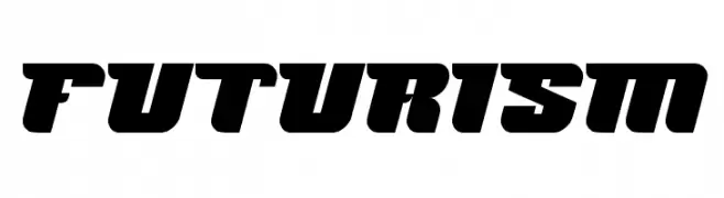
A bold, futuristic font with geometric shapes and a dynamic slant.
![FUTURISM font caratteri gratis]() Scaricare 772 Downloads@WebFont
Scaricare 772 Downloads@WebFont -
( Fonts by LJ Design Studios )
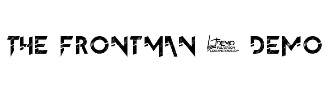
A bold, distressed font with an edgy, futuristic design.
![The FrontMan 2 demo font caratteri gratis]() Scaricare 772 Downloads@WebFont
Scaricare 772 Downloads@WebFont -
( Fonts by Alvaro Thomaz - alvarothomaz.com )
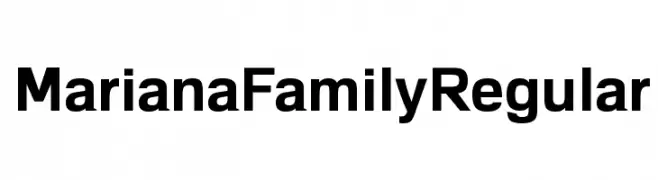
A bold, modern sans-serif font with a clean and professional appearance.
![MarianaFamilyRegular font caratteri gratis]() Scaricare 772 Downloads@WebFont
Scaricare 772 Downloads@WebFont -
( Fonts by a Adrian Candela - http://www.behance.net/takuminokami . Personal-use only. For commercial use please contact owner. )
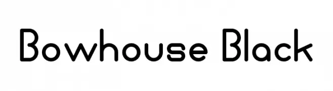
A bold, rounded font with a modern and playful style.
![Bowhouse Black font caratteri gratis]() Scaricare 772 Downloads@WebFont
Scaricare 772 Downloads@WebFont -
![DavidEurofanEurovision-Bold font caratteri gratis]() Scaricare 772 Downloads@WebFont
Scaricare 772 Downloads@WebFont -
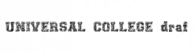
![UNIVERSAL-COLLEGE-draft font caratteri gratis]() Scaricare 772 Downloads@WebFont
Scaricare 772 Downloads@WebFont -
![DiddleTheMouse font caratteri gratis]() Scaricare 772 Downloads@WebFont
Scaricare 772 Downloads@WebFont -
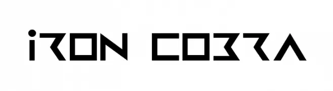
( Fonts by Daniel Zadorozny - www.iconian.com )
A bold, geometric font with a futuristic and angular design.
![Iron Cobra font caratteri gratis]() Scaricare 772 Downloads@WebFont
Scaricare 772 Downloads@WebFont


Quali sono i font più popolari adesso?
Poppins, Roboto, Montserrat, Open Sans e Lato sono molto usati per le forme pulite e l'ampia applicabilità — dall'identità di marca alle landing page e ai poster.
Quali font si usano spesso nei loghi?
Le sans serif geometriche (es. Poppins, famiglie in stile Gotham) sono scelte comuni per un branding pulito e scalabile. Per un tocco personale restano valide script e stili manoscritti. Abbina un display deciso per i titoli a un corpo testo neutro per riconoscibilità ed equilibrio.
Ogni quanto si aggiorna la lista?
Con regolarità, in base ai download e all'attività reale. Torna spesso per scoprire in anticipo le nuove preferite.
💡 Consiglio: aggiungi ai preferiti — le tendenze cambiano in fretta e i font top di oggi possono ispirare il rebranding di domani.