Benvenuto nelle Font Più Popolari — dove popolarità e qualità si incontrano. Qui trovi i font più scaricati e usati dell'anno. Se cerchi scelte sicure per logo, web o social, inizia da qui.
Ogni font top si distingue per equilibrio, leggibilità e versatilità. Troverai sans serif moderne, script eleganti, serif vintage e display minimalisti.
-
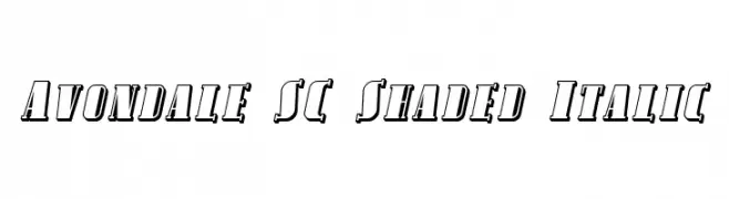
( Fonts by Apostrophic Lab )
A bold, shaded italic font with sharp serifs and dynamic style.
 Scaricare 165 Downloads@WebFont
 -
( Fonts by Dan P. Lyons - Personal-use only. For commercial use please contact owner. )
A bold, geometric sans-serif font with clean lines and strong presence.
![Egmont Text Bold font caratteri gratis]() Scaricare 165 Downloads@WebFont
Scaricare 165 Downloads@WebFont -
( Fonts by Amos Jerbi - ajerbi.com - Personal-use only. For commercial use please contact owner. )
A modern sans-serif font with clean lines and balanced proportions.
![Carmelit Regular Regular font caratteri gratis]() Scaricare 165 Downloads@WebFont
Scaricare 165 Downloads@WebFont -
![curvation font caratteri gratis]() Scaricare 165 Downloads@WebFont
Scaricare 165 Downloads@WebFont -
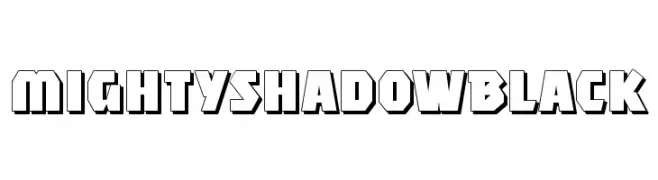
( Fonts by Manfred Klein - manfred-klein.ina-mar.com )
A bold, 3D font with strong shadow effects and geometric style.
![MightyShadowBlack font caratteri gratis]() Scaricare 165 Downloads@WebFont
Scaricare 165 Downloads@WebFont -
-
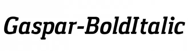
( Fonts by Carlos Alonso - Personal-use only. For commercial use please contact owner. )
A bold and italic font with strong, dynamic strokes and excellent readability.
![Gaspar-BoldItalic font caratteri gratis]() Scaricare 165 Downloads@WebFont
Scaricare 165 Downloads@WebFont -
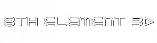
( Fonts by Daniel Zadorozny - www.iconian.com - Free for personal use )
A futuristic, geometric font with a 3D outline effect.
![8th Element 3D font caratteri gratis]() Scaricare 165 Downloads@WebFont
Scaricare 165 Downloads@WebFont -
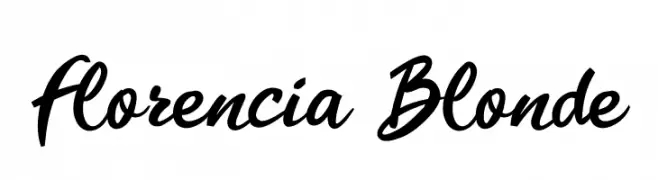
( Fonts by Fenny Wiryani - Personal-use only. For commercial use please contact owner. )
A dynamic and elegant script font with flowing, connected letterforms.
![Florencia Blonde font caratteri gratis]() Scaricare 165 Downloads@WebFont
Scaricare 165 Downloads@WebFont -
![Lampshade SuperExtended font caratteri gratis]() Scaricare 165 Downloads@WebFont
Scaricare 165 Downloads@WebFont -
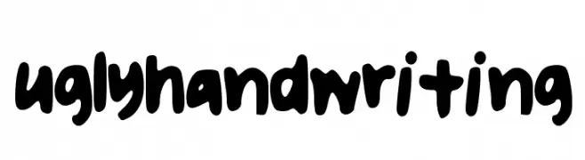
( Free for personal use - flavors.me/nasuha )
A bold, playful handwritten font with rounded, bubbly characters.
![uglyhandwriting font caratteri gratis]() Scaricare 165 Downloads@WebFont
Scaricare 165 Downloads@WebFont


Quali sono i font più popolari adesso?
Poppins, Roboto, Montserrat, Open Sans e Lato sono molto usati per le forme pulite e l'ampia applicabilità — dall'identità di marca alle landing page e ai poster.
Quali font si usano spesso nei loghi?
Le sans serif geometriche (es. Poppins, famiglie in stile Gotham) sono scelte comuni per un branding pulito e scalabile. Per un tocco personale restano valide script e stili manoscritti. Abbina un display deciso per i titoli a un corpo testo neutro per riconoscibilità ed equilibrio.
Ogni quanto si aggiorna la lista?
Con regolarità, in base ai download e all'attività reale. Torna spesso per scoprire in anticipo le nuove preferite.
💡 Consiglio: aggiungi ai preferiti — le tendenze cambiano in fretta e i font top di oggi possono ispirare il rebranding di domani.