Benvenuto nelle Font Più Popolari — dove popolarità e qualità si incontrano. Qui trovi i font più scaricati e usati dell'anno. Se cerchi scelte sicure per logo, web o social, inizia da qui.
Ogni font top si distingue per equilibrio, leggibilità e versatilità. Troverai sans serif moderne, script eleganti, serif vintage e display minimalisti.
-
( Fonts by bob istheowl http://luc.devroye.org/bobistheowl.html )
The image contains decorative graphics, not a standard font.
 Scaricare 165 Downloads@WebFont
 -
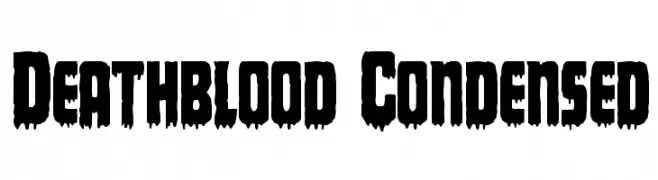
( Fonts by Daniel Zadorozny - www.iconian.com )
A bold, condensed font with a dripping, horror-themed style.
![Deathblood Condensed font caratteri gratis]() Scaricare 165 Downloads@WebFont
Scaricare 165 Downloads@WebFont -
( Fonts by a cenz qobbal - www.facebook.com/cenzqobbalfonts. Personal-use only. For commercial use please contact owner. )
A sketch-like, hand-drawn font with textured, artistic lines.
![usang font caratteri gratis]() Scaricare 165 Downloads@WebFont
Scaricare 165 Downloads@WebFont -
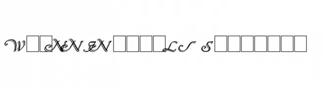
( Fonts by Paul Lloyd )
Elegant, decorative font with shadowed, three-dimensional effect.
![Wrenn Initials Shadowed font caratteri gratis]() Scaricare 165 Downloads@WebFont
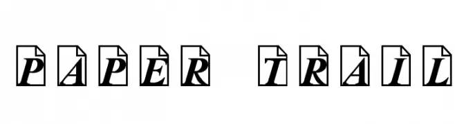
Scaricare 165 Downloads@WebFont -
![Paper Trail font caratteri gratis]() Scaricare 165 Downloads@WebFont
Scaricare 165 Downloads@WebFont -
-
( Fonts by Iconian Fonts )
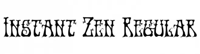
A decorative and artistic font with intricate details and high contrast.
![Instant Zen Regular font caratteri gratis]() Scaricare 165 Downloads@WebFont
Scaricare 165 Downloads@WebFont -
( Fonts by Linecreative - ARI JUANDA - Personal-use only. For commercial use please contact owner. )
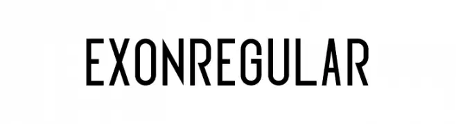
A modern, condensed sans-serif font with clean lines and uniform strokes.
![Exonregular font caratteri gratis]() Scaricare 165 Downloads@WebFont
Scaricare 165 Downloads@WebFont -
( Fonts by Manfred Klein. Free for private and charity use. Free for commercial with donation to organizations )
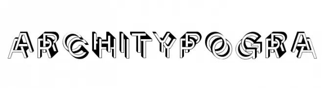
A bold, three-dimensional font with architectural and geometric influences.
![Architypogra font caratteri gratis]() Scaricare 165 Downloads@WebFont
Scaricare 165 Downloads@WebFont -
( Fonts by Astigmatic One Eye Typographic Institute - Brian J. Bonislawsky - astigmatic.com )
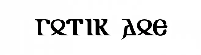
A classic Gothic font with sharp, angular lines and intricate detailing.
![Gotik AOE font caratteri gratis]() Scaricare 165 Downloads@WebFont
Scaricare 165 Downloads@WebFont -
![Tar Pits font caratteri gratis]() Scaricare 165 Downloads@WebFont
Scaricare 165 Downloads@WebFont

Quali sono i font più popolari adesso?
Poppins, Roboto, Montserrat, Open Sans e Lato sono molto usati per le forme pulite e l'ampia applicabilità — dall'identità di marca alle landing page e ai poster.
Quali font si usano spesso nei loghi?
Le sans serif geometriche (es. Poppins, famiglie in stile Gotham) sono scelte comuni per un branding pulito e scalabile. Per un tocco personale restano valide script e stili manoscritti. Abbina un display deciso per i titoli a un corpo testo neutro per riconoscibilità ed equilibrio.
Ogni quanto si aggiorna la lista?
Con regolarità, in base ai download e all'attività reale. Torna spesso per scoprire in anticipo le nuove preferite.
💡 Consiglio: aggiungi ai preferiti — le tendenze cambiano in fretta e i font top di oggi possono ispirare il rebranding di domani.