Benvenuto nelle Font Più Popolari — dove popolarità e qualità si incontrano. Qui trovi i font più scaricati e usati dell'anno. Se cerchi scelte sicure per logo, web o social, inizia da qui.
Ogni font top si distingue per equilibrio, leggibilità e versatilità. Troverai sans serif moderne, script eleganti, serif vintage e display minimalisti.
-
( Fonts by Adrien Coquet - Personal-use only. For commercial use please contact owner. )
A tall, narrow, and playful handwritten font with consistent stroke width.
 Scaricare 696 Downloads@WebFont
 -
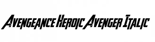
( Fontry - M.G. Adkins - www.thefontry.com/ )
A bold, italicized font with a dynamic and heroic style.
![Avengeance Heroic Avenger Italic font caratteri gratis]() Scaricare 696 Downloads@WebFont
Scaricare 696 Downloads@WebFont -
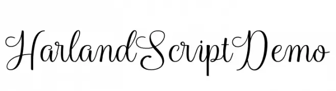
( Cooldesignlab - Kurniadi Saputra - creativemarket.com/cooldesignlab?u=cooldesignlab )
A sophisticated script font with elegant loops and swashes.
![HarlandScriptDemo font caratteri gratis]() Scaricare 696 Downloads@WebFont
Scaricare 696 Downloads@WebFont -
Caratteri di HammerBro101. For commercial use please contact the owner.
( This is the font used in Gamecube Mario Games. )
A bold, angular font with a retro video game aesthetic.
![Super [Mario] Script 3 font caratteri gratis]() Scaricare 696 Downloads@WebFont
Scaricare 696 Downloads@WebFont -
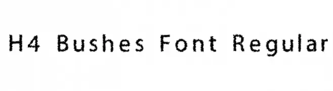
![H4 Bushes Font Regular font caratteri gratis]() Scaricare 696 Downloads@WebFont
Scaricare 696 Downloads@WebFont -
-
( Fonts by Aaron Hooker )
A geometric, blocky font with a futuristic and digital aesthetic.
![Legacy font caratteri gratis]() Scaricare 696 Downloads@WebFont
Scaricare 696 Downloads@WebFont -
( Fonts by a Situjuh Nazara - c7n1.wordpress.com. Personal-use only. For commercial use please contact owner. )
A sleek, modern, and italicized font with thin, condensed letterforms.
![Gobold Thin Italic Italic font caratteri gratis]() Scaricare 696 Downloads@WebFont
Scaricare 696 Downloads@WebFont -
![PfefferMediaeval font caratteri gratis]() Scaricare 696 Downloads@WebFont
Scaricare 696 Downloads@WebFont -
( Fonts by www.fontscafe.com )
A bold, decorative font with a vintage circus and wild west flair.
![HenryRodeoCircus_demo font caratteri gratis]() Scaricare 696 Downloads@WebFont
Scaricare 696 Downloads@WebFont -
![CHIP tunes 3D pixel font caratteri gratis]() Scaricare 696 Downloads@WebFont
Scaricare 696 Downloads@WebFont -
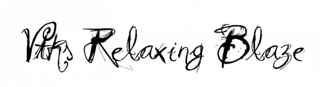
( Fonts by Douglas Vitkauskas - www.vtksdesign.com. Personal-use only. For commercial use please contact owner. )
An expressive, artistic font with fluid, hand-drawn strokes.
![Vtks Relaxing Blaze font caratteri gratis]() Scaricare 696 Downloads@WebFont
Scaricare 696 Downloads@WebFont -
( Fonts by www.aenigmafonts.com )
A bold, grid-patterned font with a pixelated, digital style.
![A.M.P. font caratteri gratis]() Scaricare 696 Downloads@WebFont
Scaricare 696 Downloads@WebFont -
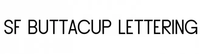
( Fonts by ShyFonts )
A modern, clean sans-serif font with uniform strokes and slightly condensed width.
![SF Buttacup Lettering font caratteri gratis]() Scaricare 696 Downloads@WebFont
Scaricare 696 Downloads@WebFont -
( Fonts by Daniel Zadorozny - www.iconian.com )
A bold, modern font with thick strokes and a slightly condensed style.
![Bronic font caratteri gratis]() Scaricare 696 Downloads@WebFont
Scaricare 696 Downloads@WebFont -
![Jungle Fever font caratteri gratis]() Scaricare 696 Downloads@WebFont
Scaricare 696 Downloads@WebFont -
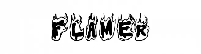
( Fonts by Spork Thug Typography - Josh Wilhelm - www.lifewithouttaffy.com/taffy/blog )
A bold, flame-themed decorative font perfect for dynamic and energetic designs.
![Flamer font caratteri gratis]() Scaricare 696 Downloads@WebFont
Scaricare 696 Downloads@WebFont -
![Crop Circle Dingbats font caratteri gratis]() Scaricare 696 Downloads@WebFont
Scaricare 696 Downloads@WebFont -
( Fonts by Jacob Fisher - www.pizzadude.dk )
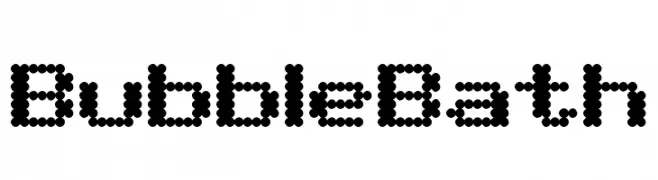
A playful font with characters made of small, evenly spaced circles, creating a bubbly appearance.
![BubbleBath font caratteri gratis]() Scaricare 696 Downloads@WebFont
Scaricare 696 Downloads@WebFont -
( Fonts by uatype.faithweb.com - UnAuthorized Type )
A dynamic and whimsical font with bold, exaggerated strokes and a playful, gothic influence.
![Beta Dance font caratteri gratis]() Scaricare 696 Downloads@WebFont
Scaricare 696 Downloads@WebFont -
( Fonts by RaisProject )
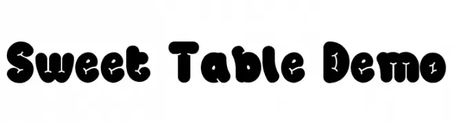
A bold, playful font with rounded characters and whimsical decorative elements.
![Sweet Table Demo font caratteri gratis]() Scaricare 695 Downloads@WebFont
Scaricare 695 Downloads@WebFont -
( Fonts by Omnibus Type )
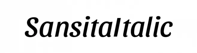
A modern, elegant italic font with smooth curves and consistent stroke width.
![Sansita Italic font caratteri gratis]() Scaricare 695 Downloads@WebFont
Scaricare 695 Downloads@WebFont -
( Fonts by Pinisiart )
A bold, playful font with rounded edges and a bubbly appearance.
![Brocil font caratteri gratis]() Scaricare 695 Downloads@WebFont
Scaricare 695 Downloads@WebFont -
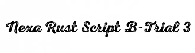
( Fonts by Fontfabric - Svetoslav Simov - Personal-use only. For commercial use please contact owner. )
A bold, textured script font with a vintage, handcrafted style.
![Nexa Rust Script B-Trial 3 font caratteri gratis]() Scaricare 695 Downloads@WebFont
Scaricare 695 Downloads@WebFont -
( Fonts by Fachranheit )
A bold, dramatic font with a strong, comic book-inspired aesthetic.
![BREAKING SPAWN SOLID DEMO font caratteri gratis]() Scaricare 695 Downloads@WebFont
Scaricare 695 Downloads@WebFont -
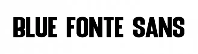
( Fonts by Syaf Rizal - www.creativefabrica.com/ref/53/ - Personal-use only. For commercial use please contact owner. )
A bold, modern typeface with thick strokes and a strong presence.
![Blue Fonte Sans font caratteri gratis]() Scaricare 695 Downloads@WebFont
Scaricare 695 Downloads@WebFont -
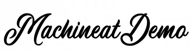
( Wacaksara Co - www.wacaksara.co )
An elegant and flowing script font with classic cursive letterforms.
![MachineatDemo font caratteri gratis]() Scaricare 695 Downloads@WebFont
Scaricare 695 Downloads@WebFont -
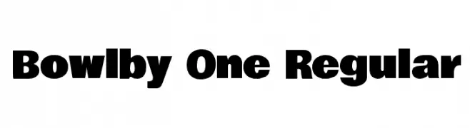
( Copyright (c) 2011 by vernon adams (vern@newtypography.co.uk) )
A bold, impactful typeface with thick strokes and strong presence.
![Bowlby One Regular font caratteri gratis]() Scaricare 695 Downloads@WebFont
Scaricare 695 Downloads@WebFont -
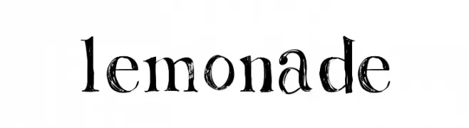
( Fonts by Rachel Adams - www.rlaurendesign.com - Personal-use only. For commercial use please contact owner. )
A distressed, textured font with a hand-drawn, artistic style.
![Lemonade font caratteri gratis]() Scaricare 695 Downloads@WebFont
Scaricare 695 Downloads@WebFont -
![Aleida Demo font caratteri gratis]() Scaricare 695 Downloads@WebFont
Scaricare 695 Downloads@WebFont -
( Fonts by Mikrojihad Inc - www.behance.net/mikrojihad - Personal-use only. For commercial use please contact owner. )
A bold, flowing script font with interconnected characters and a modern touch.
![BukhariScript Alternates font caratteri gratis]() Scaricare 695 Downloads@WebFont
Scaricare 695 Downloads@WebFont -
( Fonts by Jonathan S. Harris - www.tattoowoo.com. Personal-use only. For commercial use please contact owner. )
A dynamic, cursive script font with high contrast and elegant flow.
![Early Bird font caratteri gratis]() Scaricare 695 Downloads@WebFont
Scaricare 695 Downloads@WebFont -
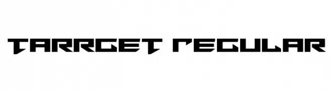
( Fonts by Daniel Zadorozny - www.iconian.com - Free for personal use )
A bold, angular, and futuristic font with sharp geometric shapes.
![Tarrget Regular font caratteri gratis]() Scaricare 695 Downloads@WebFont
Scaricare 695 Downloads@WebFont -
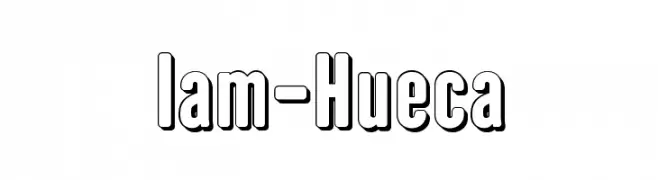
( Fonts by Fernando Haro - defharo.com )
A bold, outlined font with a modern, three-dimensional appearance.
![Iam-Hueca font caratteri gratis]() Scaricare 695 Downloads@WebFont
Scaricare 695 Downloads@WebFont -
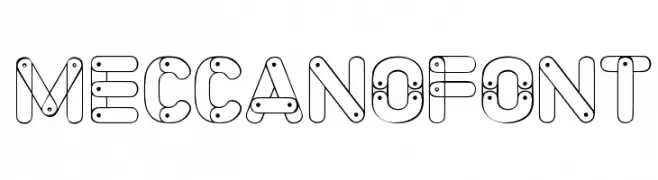
( www.woodcutter.es )
A playful, mechanical-themed font with interconnected lines and nodes.
![Meccano Font font caratteri gratis]() Scaricare 695 Downloads@WebFont
Scaricare 695 Downloads@WebFont -
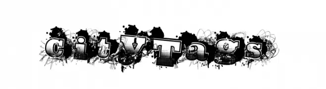
( Fonts by a Max Infeld - XEROGRAPHER FONTS - xerographer.blogspot.com . Personal-use only. For commercial use please contact owner. )
A bold, graffiti-inspired font with an urban, artistic style.
![CityTags font caratteri gratis]() Scaricare 695 Downloads@WebFont
Scaricare 695 Downloads@WebFont
![Super [Mario] Script 3 font caratteri gratis](https://d144mzi0q5mijx.cloudfront.net/img/S/U/Super-Mario-Script-31.webp)


Quali sono i font più popolari adesso?
Poppins, Roboto, Montserrat, Open Sans e Lato sono molto usati per le forme pulite e l'ampia applicabilità — dall'identità di marca alle landing page e ai poster.
Quali font si usano spesso nei loghi?
Le sans serif geometriche (es. Poppins, famiglie in stile Gotham) sono scelte comuni per un branding pulito e scalabile. Per un tocco personale restano valide script e stili manoscritti. Abbina un display deciso per i titoli a un corpo testo neutro per riconoscibilità ed equilibrio.
Ogni quanto si aggiorna la lista?
Con regolarità, in base ai download e all'attività reale. Torna spesso per scoprire in anticipo le nuove preferite.
💡 Consiglio: aggiungi ai preferiti — le tendenze cambiano in fretta e i font top di oggi possono ispirare il rebranding di domani.