Benvenuto nelle Font Più Popolari — dove popolarità e qualità si incontrano. Qui trovi i font più scaricati e usati dell'anno. Se cerchi scelte sicure per logo, web o social, inizia da qui.
Ogni font top si distingue per equilibrio, leggibilità e versatilità. Troverai sans serif moderne, script eleganti, serif vintage e display minimalisti.
-
( Fonts by Fonts of Chaos - www.fontsofchaos.com - check the website before use the fonts! )
A bold, geometric font with a strong, modern presence.
 Scaricare 149 Downloads@WebFont
 -
( Fonts by www.kimberlygeswein.com - Kimberly Geswein )
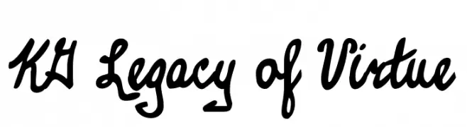
A bold, handwritten font with a playful and energetic style.
![KG Legacy of Virtue font caratteri gratis]() Scaricare 149 Downloads@WebFont
Scaricare 149 Downloads@WebFont -
( GroovyJournal - www.groovyjournal.com )
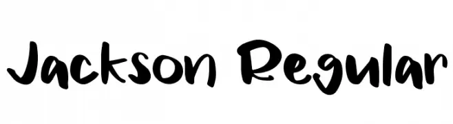
A bold, playful handwritten font with smooth curves and dynamic slant.
![Jackson Regular font caratteri gratis]() Scaricare 149 Downloads@WebFont
Scaricare 149 Downloads@WebFont -
![MeganBats font caratteri gratis]() Scaricare 149 Downloads@WebFont
Scaricare 149 Downloads@WebFont -
( Dominique Demetz )
A playful, handwritten script font with bold uppercase and fluid lowercase letters.
![Grainne font caratteri gratis]() Scaricare 149 Downloads@WebFont
Scaricare 149 Downloads@WebFont -
-
( Fonts by Megan Harney - Personal-use only. For commercial use please contact owner. )
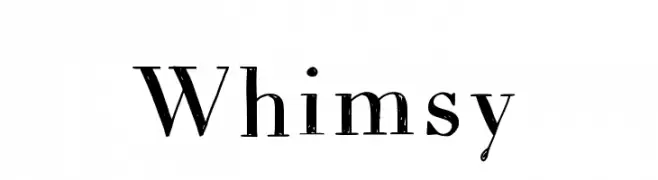
A distressed serif font with a vintage, textured style.
![Whimsy font caratteri gratis]() Scaricare 149 Downloads@WebFont
Scaricare 149 Downloads@WebFont -
( Fonts by dcoxy | Greg Medina )
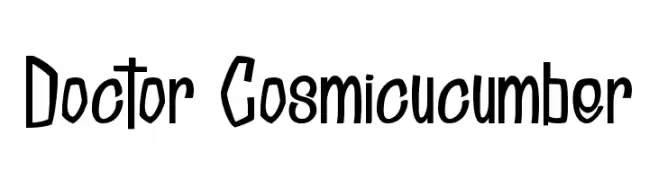
A playful, quirky font with tall, narrow letterforms and a hand-drawn feel.
![Doctor Cosmicucumber font caratteri gratis]() Scaricare 149 Downloads@WebFont
Scaricare 149 Downloads@WebFont -
( Personal-use only. For commercial use please contact owner. )
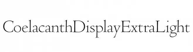
An elegant and refined font with thin, elongated strokes and a sophisticated appearance.
![Coelacanth Display ExtraLight font caratteri gratis]() Scaricare 149 Downloads@WebFont
Scaricare 149 Downloads@WebFont -
( Fonts by Manfred Klein. Free for private and charity use. Free for commercial with donation to organizations )
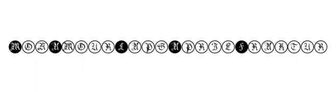
An ornate blackletter font with characters encased in circular borders.
![MonAmourCapsAprilFraktur font caratteri gratis]() Scaricare 149 Downloads@WebFont
Scaricare 149 Downloads@WebFont -
( Fonts by Designaja Studio )
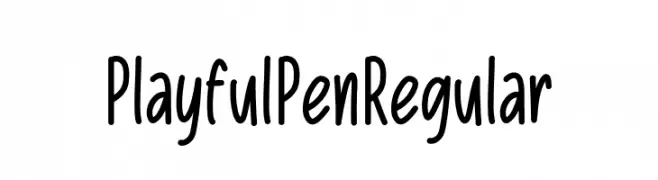
Casual handwritten font with a playful style.
![Playful Pen Regular font caratteri gratis]() Scaricare 149 Downloads@WebFont
Scaricare 149 Downloads@WebFont

Quali sono i font più popolari adesso?
Poppins, Roboto, Montserrat, Open Sans e Lato sono molto usati per le forme pulite e l'ampia applicabilità — dall'identità di marca alle landing page e ai poster.
Quali font si usano spesso nei loghi?
Le sans serif geometriche (es. Poppins, famiglie in stile Gotham) sono scelte comuni per un branding pulito e scalabile. Per un tocco personale restano valide script e stili manoscritti. Abbina un display deciso per i titoli a un corpo testo neutro per riconoscibilità ed equilibrio.
Ogni quanto si aggiorna la lista?
Con regolarità, in base ai download e all'attività reale. Torna spesso per scoprire in anticipo le nuove preferite.
💡 Consiglio: aggiungi ai preferiti — le tendenze cambiano in fretta e i font top di oggi possono ispirare il rebranding di domani.