Benvenuto nelle Font Più Popolari — dove popolarità e qualità si incontrano. Qui trovi i font più scaricati e usati dell'anno. Se cerchi scelte sicure per logo, web o social, inizia da qui.
Ogni font top si distingue per equilibrio, leggibilità e versatilità. Troverai sans serif moderne, script eleganti, serif vintage e display minimalisti.
-
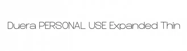
( Måns Grebäck - www.mansgreback.com )
A modern, expanded, and thin font with clean lines and minimal contrast.
 Scaricare 149 Downloads@WebFont
 -
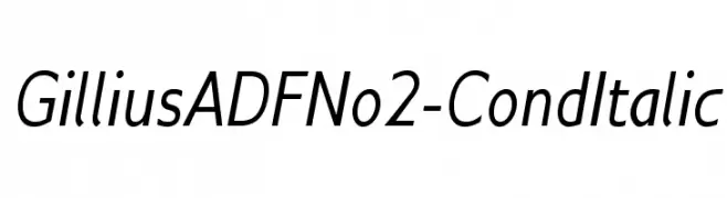
( Fonts by Arkandis Digital Foundry )
A modern, condensed italic font with clean lines and excellent readability.
![GilliusADFNo2-CondItalic font caratteri gratis]() Scaricare 149 Downloads@WebFont
Scaricare 149 Downloads@WebFont -
( Fonts by Gagegostyle - Syera Syailendra - Personal-use only. For commercial use please contact owner. )
A lively script font with fluid, cursive strokes and bold numerals.
![Yummy font caratteri gratis]() Scaricare 149 Downloads@WebFont
Scaricare 149 Downloads@WebFont -
( Fonts by junkohanhero )
A hand-drawn, playful font with tall, narrow characters and varying stroke widths.
![Mindmonkey font caratteri gratis]() Scaricare 149 Downloads@WebFont
Scaricare 149 Downloads@WebFont -
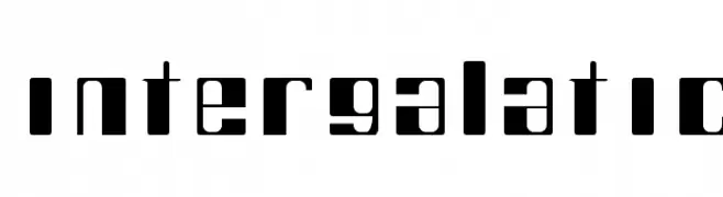
![intergalatic font caratteri gratis]() Scaricare 149 Downloads@WebFont
Scaricare 149 Downloads@WebFont -
-
![Painter pointer Bold font caratteri gratis]() Scaricare 149 Downloads@WebFont
Scaricare 149 Downloads@WebFont -
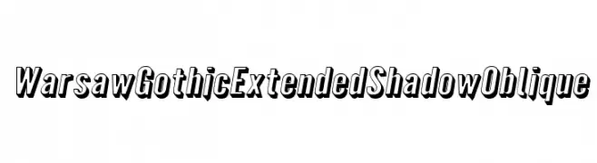
( Fonts by CannotIntoSpaceFonts - KineticPlasma Fonts - Personal-use only. For commercial use please contact owner. )
A bold, shadowed, and oblique font with a gothic influence, perfect for dynamic designs.
![Warsaw Gothic Extended Shadow Oblique font caratteri gratis]() Scaricare 149 Downloads@WebFont
Scaricare 149 Downloads@WebFont -
( Fonts by a Max Infeld - XEROGRAPHER FONTS - xerographer.blogspot.com . Personal-use only. For commercial use please contact owner. )
An expressive, hand-drawn font with dynamic and fluid strokes.
![ParisLabel font caratteri gratis]() Scaricare 149 Downloads@WebFont
Scaricare 149 Downloads@WebFont -
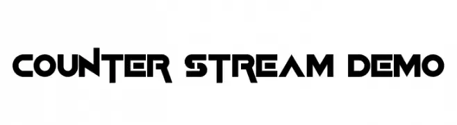
( Fonts by Edric Studio - Personal-use only. For commercial use please contact owner. )
A bold, geometric font with a futuristic and modern aesthetic.
![Counter Stream Demo font caratteri gratis]() Scaricare 149 Downloads@WebFont
Scaricare 149 Downloads@WebFont -
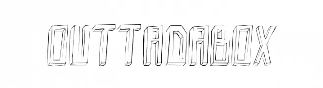
( Fonts by Alex Tomlinson - Skyhaven Fonts - shfonts.com )
A bold, three-dimensional, hand-drawn font with a sketch-like appearance.
![Outtadabox font caratteri gratis]() Scaricare 149 Downloads@WebFont
Scaricare 149 Downloads@WebFont


Quali sono i font più popolari adesso?
Poppins, Roboto, Montserrat, Open Sans e Lato sono molto usati per le forme pulite e l'ampia applicabilità — dall'identità di marca alle landing page e ai poster.
Quali font si usano spesso nei loghi?
Le sans serif geometriche (es. Poppins, famiglie in stile Gotham) sono scelte comuni per un branding pulito e scalabile. Per un tocco personale restano valide script e stili manoscritti. Abbina un display deciso per i titoli a un corpo testo neutro per riconoscibilità ed equilibrio.
Ogni quanto si aggiorna la lista?
Con regolarità, in base ai download e all'attività reale. Torna spesso per scoprire in anticipo le nuove preferite.
💡 Consiglio: aggiungi ai preferiti — le tendenze cambiano in fretta e i font top di oggi possono ispirare il rebranding di domani.