Benvenuto nelle Font Più Popolari — dove popolarità e qualità si incontrano. Qui trovi i font più scaricati e usati dell'anno. Se cerchi scelte sicure per logo, web o social, inizia da qui.
Ogni font top si distingue per equilibrio, leggibilità e versatilità. Troverai sans serif moderne, script eleganti, serif vintage e display minimalisti.
-
( Fonts by CannotIntoSpaceFonts - KineticPlasma Fonts - Personal-use only. For commercial use please contact owner. )
A bold, modern sans-serif font with clean, geometric lines.
 Scaricare 146 Downloads@WebFont
 -
( Xerographer Fonts - Max Infeld - xerographer.blogspot.com )
A bold, geometric font with a double-line structure and modern appeal.
![Algorithma font caratteri gratis]() Scaricare 146 Downloads@WebFont
Scaricare 146 Downloads@WebFont -
( www.junkohanhero.com )
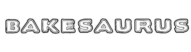
A bold, playful font with a unique outline style and cartoonish appearance.
![Bakesaurus font caratteri gratis]() Scaricare 146 Downloads
Scaricare 146 Downloads -
( Fonts by Umar Daniala )
A playful, retro font with bold, rounded shapes and whimsical curves.
![Retro Cookies font caratteri gratis]() Scaricare 146 Downloads@WebFont
Scaricare 146 Downloads@WebFont -
( Fonts by Haksen Studio - Sarwo Edhi Prayitno - Personal-use only. For commercial use please contact owner. )
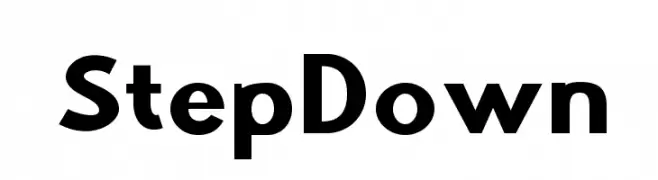
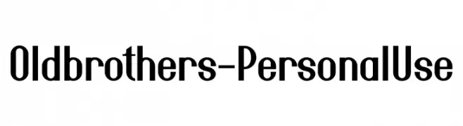
A bold, modern font with a sleek, slightly condensed style.
![Oldbrothers - Personal Use font caratteri gratis]() Scaricare 146 Downloads@WebFont
Scaricare 146 Downloads@WebFont -
-
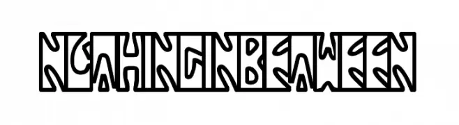
![NothingInbetween font caratteri gratis]() Scaricare 146 Downloads@WebFont
Scaricare 146 Downloads@WebFont -
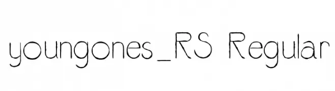
![youngones_RS Regular font caratteri gratis]() Scaricare 146 Downloads@WebFont
Scaricare 146 Downloads@WebFont -
( Fonts by www.houseoflime.com )
A decorative font with ornate flourishes and embellishments.
![Designer Mix II font caratteri gratis]() Scaricare 146 Downloads@WebFont
Scaricare 146 Downloads@WebFont -
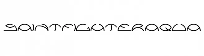
( Fonts by weknow - Wino S Kadir )
A futuristic and abstract font with geometric shapes and consistent line weight.
![saintfighteraqua font caratteri gratis]() Scaricare 146 Downloads@WebFont
Scaricare 146 Downloads@WebFont -
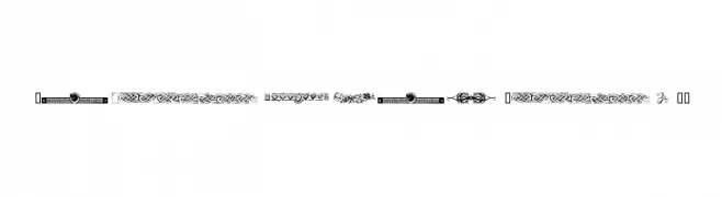
( Fonts by Tanaestel )
A playful collection of hand-drawn doodle frames with unique designs.
![Tanaestel Doodle Frames Regular font caratteri gratis]() Scaricare 146 Downloads@WebFont
Scaricare 146 Downloads@WebFont


Quali sono i font più popolari adesso?
Poppins, Roboto, Montserrat, Open Sans e Lato sono molto usati per le forme pulite e l'ampia applicabilità — dall'identità di marca alle landing page e ai poster.
Quali font si usano spesso nei loghi?
Le sans serif geometriche (es. Poppins, famiglie in stile Gotham) sono scelte comuni per un branding pulito e scalabile. Per un tocco personale restano valide script e stili manoscritti. Abbina un display deciso per i titoli a un corpo testo neutro per riconoscibilità ed equilibrio.
Ogni quanto si aggiorna la lista?
Con regolarità, in base ai download e all'attività reale. Torna spesso per scoprire in anticipo le nuove preferite.
💡 Consiglio: aggiungi ai preferiti — le tendenze cambiano in fretta e i font top di oggi possono ispirare il rebranding di domani.