Benvenuto nelle Font Più Popolari — dove popolarità e qualità si incontrano. Qui trovi i font più scaricati e usati dell'anno. Se cerchi scelte sicure per logo, web o social, inizia da qui.
Ogni font top si distingue per equilibrio, leggibilità e versatilità. Troverai sans serif moderne, script eleganti, serif vintage e display minimalisti.
-
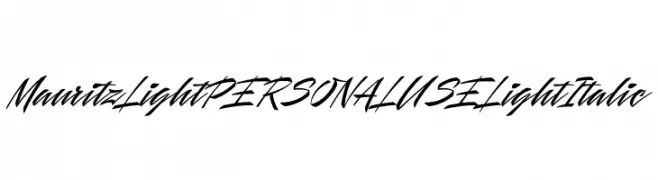
( Fonts by Mans Greback - Personal-use only. For commercial use please contact owner. )
A dynamic, flowing script font with elegant, cursive letterforms.
 Scaricare 145 Downloads@WebFont
 -
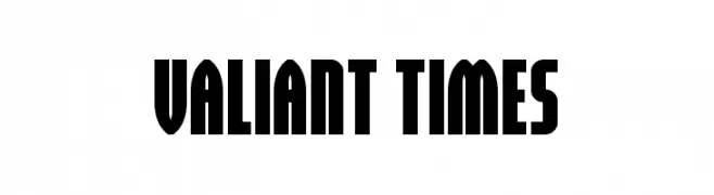
( Fonts by Daniel Zadorozny - www.iconian.com - Personal-use only. For commercial use please contact owner. )
A bold, block-like font with strong vertical lines and minimal curves.
![Valiant Times font caratteri gratis]() Scaricare 145 Downloads@WebFont
Scaricare 145 Downloads@WebFont -
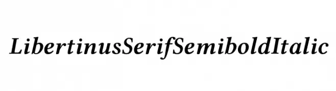
( Fonts by Philipp H. Poll - Personal-use only. For commercial use please contact owner. )
A classic serif font with semi-bold weight and italic style, offering elegance and readability.
![Libertinus Serif Semibold Italic font caratteri gratis]() Scaricare 145 Downloads@WebFont
Scaricare 145 Downloads@WebFont -
![Angelshand font caratteri gratis]() Scaricare 145 Downloads@WebFont
Scaricare 145 Downloads@WebFont -
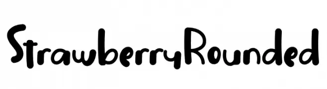
( Fonts by Nuryanto Dwi )
A playful, rounded font with a hand-drawn, friendly appearance.
![Strawberry Rounded font caratteri gratis]() Scaricare 145 Downloads@WebFont
Scaricare 145 Downloads@WebFont -
-
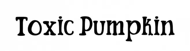
( Fonts by Masa Aska Sanurumi )
A playful, whimsical font with a spooky, hand-drawn style.
![Toxic Pumpkin font caratteri gratis]() Scaricare 145 Downloads@WebFont
Scaricare 145 Downloads@WebFont -
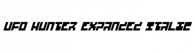
( Fonts by Daniel Zadorozny - www.iconian.com - Free for personal use )
A bold, expanded, and italicized futuristic font with geometric, angular characters.
![UFO Hunter Expanded Italic font caratteri gratis]() Scaricare 145 Downloads@WebFont
Scaricare 145 Downloads@WebFont -
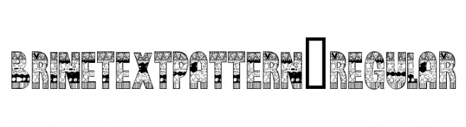
( thealexzone.com/ )
A decorative font with intricate patterns and bold uppercase letters.
![BrinetextPattern-Regular font caratteri gratis]() Scaricare 145 Downloads@WebFont
Scaricare 145 Downloads@WebFont -
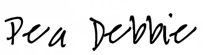
( Free for a personal use. For a commercial use please visit www.kevinandamanda.com )
A casual, handwritten font with a playful and informal style.
![Pea Debbie font caratteri gratis]() Scaricare 145 Downloads@WebFont
Scaricare 145 Downloads@WebFont -
![HellraiserSC font caratteri gratis]() Scaricare 145 Downloads@WebFont
Scaricare 145 Downloads@WebFont

Quali sono i font più popolari adesso?
Poppins, Roboto, Montserrat, Open Sans e Lato sono molto usati per le forme pulite e l'ampia applicabilità — dall'identità di marca alle landing page e ai poster.
Quali font si usano spesso nei loghi?
Le sans serif geometriche (es. Poppins, famiglie in stile Gotham) sono scelte comuni per un branding pulito e scalabile. Per un tocco personale restano valide script e stili manoscritti. Abbina un display deciso per i titoli a un corpo testo neutro per riconoscibilità ed equilibrio.
Ogni quanto si aggiorna la lista?
Con regolarità, in base ai download e all'attività reale. Torna spesso per scoprire in anticipo le nuove preferite.
💡 Consiglio: aggiungi ai preferiti — le tendenze cambiano in fretta e i font top di oggi possono ispirare il rebranding di domani.