Benvenuto nelle Font Più Popolari — dove popolarità e qualità si incontrano. Qui trovi i font più scaricati e usati dell'anno. Se cerchi scelte sicure per logo, web o social, inizia da qui.
Ogni font top si distingue per equilibrio, leggibilità e versatilità. Troverai sans serif moderne, script eleganti, serif vintage e display minimalisti.
-
 Scaricare 644 Downloads@WebFont
 -
( Fonts by Press Gang Studios - Andeh Pinkard - www.pressgang-studios.com )
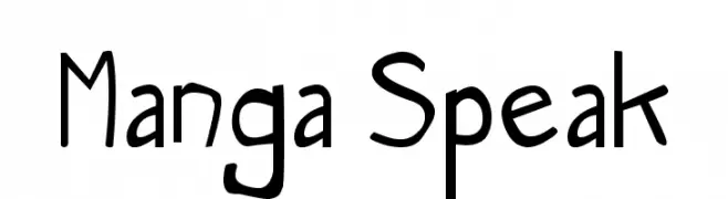
A playful, comic-style font with a handwritten feel.
![Manga Speak font caratteri gratis]() Scaricare 644 Downloads@WebFont
Scaricare 644 Downloads@WebFont -
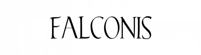
![Falconis font caratteri gratis]() Scaricare 644 Downloads@WebFont
Scaricare 644 Downloads@WebFont -
( Fonts by Graham Meade - GemFonts )
A classic serif font with elegant lines and high contrast, perfect for sophisticated designs.
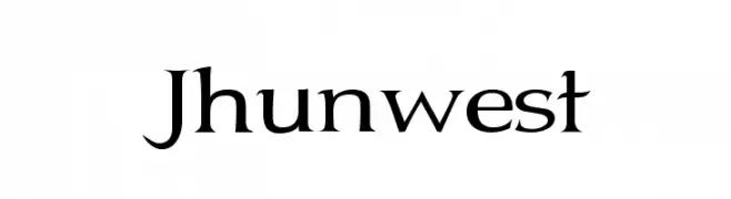
![Jhunwest font caratteri gratis]() Scaricare 644 Downloads@WebFont
Scaricare 644 Downloads@WebFont -
( Fonts by David Rakowski )
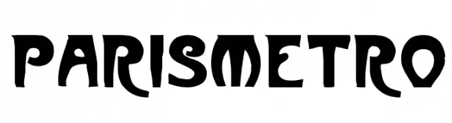
A bold, Art Nouveau-inspired font with decorative, flowing lines.
![ParisMetro font caratteri gratis]() Scaricare 644 Downloads
Scaricare 644 Downloads -
-
( Fonts by Rochadi Sudarma [Rochart Studio] - Personal-use only. For commercial use please contact owner. )
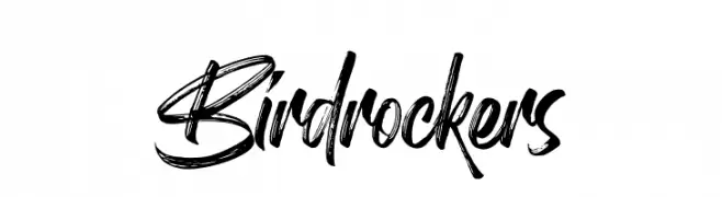
A bold, brush-style font with dynamic, handwritten flair.
![Birdrockers font caratteri gratis]() Scaricare 644 Downloads@WebFont
Scaricare 644 Downloads@WebFont -
( Fonts by www.blambot.com )
A bold, distressed font with a vintage, hand-printed style.
![CryptCreep BB font caratteri gratis]() Scaricare 644 Downloads@WebFont
Scaricare 644 Downloads@WebFont -
( Fonts by Iconian Fonts )
A bold, italic font with angular lines and a dynamic, sporty style.
![Falcon Punch Italic font caratteri gratis]() Scaricare 644 Downloads@WebFont
Scaricare 644 Downloads@WebFont -
( Fonts by www.blambot.com )
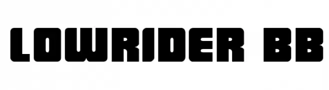
A bold, blocky font with a retro, geometric style.
![LowRider BB font caratteri gratis]() Scaricare 644 Downloads@WebFont
Scaricare 644 Downloads@WebFont -
( Fonts by Levi Halmos )
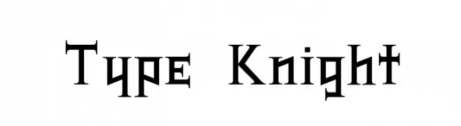
A bold, gothic-inspired font with sharp, angular serifs and a medieval aesthetic.
![Type Knight font caratteri gratis]() Scaricare 644 Downloads@WebFont
Scaricare 644 Downloads@WebFont -
( Fonts by Manfred Klein - manfred-klein.ina-mar.com )
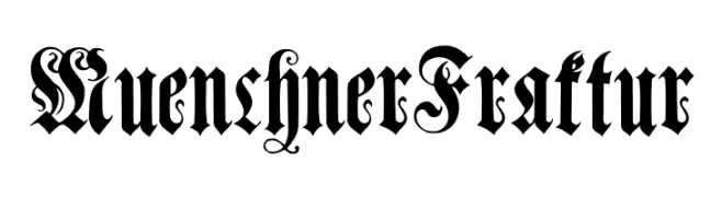
A decorative Blackletter font with intricate flourishes and Gothic style.
![MuenchnerFraktur font caratteri gratis]() Scaricare 644 Downloads@WebFont
Scaricare 644 Downloads@WebFont -
( Fonts by Fenotype - Emil Bertell - Personal-use only. For commercial use please contact owner. )
A modern, light sans-serif font with excellent readability and low contrast.
![Klik Light font caratteri gratis]() Scaricare 644 Downloads@WebFont
Scaricare 644 Downloads@WebFont -
( Fonts by blueroom - Personal-use only. For commercial use please contact owner. )
A bold, oblique font with strong, angular lines and a dynamic slant.
![Fyodor Bold Oblique font caratteri gratis]() Scaricare 644 Downloads@WebFont
Scaricare 644 Downloads@WebFont -
( - www.vnbc.fr )
A fragmented, distressed font with a bold and chaotic design.
![aerial demented font caratteri gratis]() Scaricare 644 Downloads@WebFont
Scaricare 644 Downloads@WebFont -
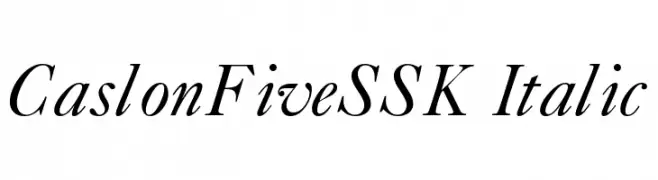
![CaslonFiveSSK Italic font caratteri gratis]() Scaricare 644 Downloads@WebFont
Scaricare 644 Downloads@WebFont -
( Blambot - www.blambot.com )
A bold, playful font with rounded, italicized letterforms.
![Anime Ace Bold font caratteri gratis]() Scaricare 644 Downloads@WebFont
Scaricare 644 Downloads@WebFont -
( K-Type Freebies (Free for Personal Use Only) FROM http://www.k-type.com )
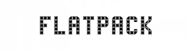
A bold, pixelated font with a geometric, digital style.
![FlatPack font caratteri gratis]() Scaricare 644 Downloads@WebFont
Scaricare 644 Downloads@WebFont -
( Fonts by Steve Cloutier - www.cloutierfontes.ca )
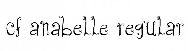
A whimsical, decorative font with curly embellishments and a vintage feel.
![CF Anabelle Regular font caratteri gratis]() Scaricare 644 Downloads@WebFont
Scaricare 644 Downloads@WebFont -
( Fonts by Moonotonous )
A modern, rounded sans-serif font with smooth curves and a friendly appearance.
![Peasone font caratteri gratis]() Scaricare 644 Downloads@WebFont
Scaricare 644 Downloads@WebFont -
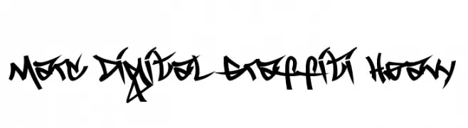
( Donationware - www.marcdigital.com )
A bold, graffiti-inspired font with dynamic, artistic strokes.
![Marc Digital Graffiti Heavy font caratteri gratis]() Scaricare 644 Downloads@WebFont
Scaricare 644 Downloads@WebFont -
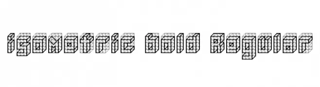
![isometric bold Regular font caratteri gratis]() Scaricare 644 Downloads@WebFont
Scaricare 644 Downloads@WebFont -
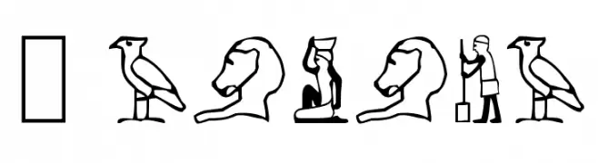
![Pharaoh font caratteri gratis]() Scaricare 644 Downloads@WebFont
Scaricare 644 Downloads@WebFont -
![Sweet Smile font caratteri gratis]() Scaricare 644 Downloads@WebFont
Scaricare 644 Downloads@WebFont -
( Copyright (c) 2010, Kimberly Geswein (kimberlygeswein.com) )
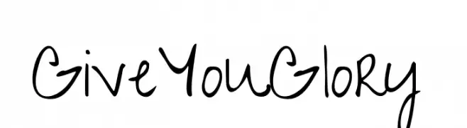
A playful, casual handwritten font with fluid strokes and rounded edges.
![GiveYouGlory font caratteri gratis]() Scaricare 644 Downloads@WebFont
Scaricare 644 Downloads@WebFont -
( Free for a personal use. For a commercial use please visit www.kevinandamanda.com )
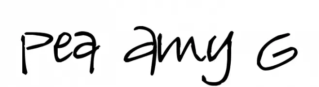
A playful, casual handwritten font with an organic, lively style.
![Pea Amy G font caratteri gratis]() Scaricare 644 Downloads@WebFont
Scaricare 644 Downloads@WebFont -
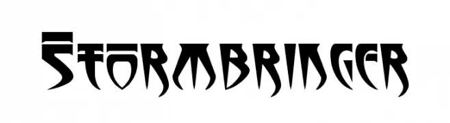
![Stormbringer font caratteri gratis]() Scaricare 644 Downloads@WebFont
Scaricare 644 Downloads@WebFont -
( Fonts by www.typodermicfonts.com - Ray Larabie )
A bold serif font with sharp serifs and a commanding presence.
![Goodfish-Bold font caratteri gratis]() Scaricare 644 Downloads@WebFont
Scaricare 644 Downloads@WebFont -
( Fonts by Douglas Vitkauskas - www.vtksdesign.com. Personal-use only. For commercial use please contact owner. )
A decorative font with elaborate swirls and gothic-inspired embellishments.
![Vtks Focus font caratteri gratis]() Scaricare 644 Downloads@WebFont
Scaricare 644 Downloads@WebFont -
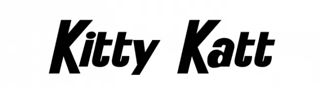
![Kitty Katt font caratteri gratis]() Scaricare 644 Downloads@WebFont
Scaricare 644 Downloads@WebFont -
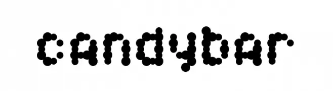
![Candybar font caratteri gratis]() Scaricare 644 Downloads@WebFont
Scaricare 644 Downloads@WebFont -
( Fonts by Daniel Zadorozny - www.iconian.com - Free for personal use )
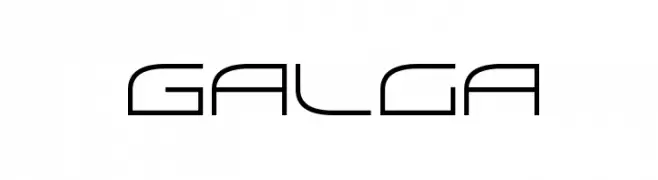
A sleek, futuristic font with geometric elements and clean lines.
![Galga font caratteri gratis]() Scaricare 644 Downloads@WebFont
Scaricare 644 Downloads@WebFont -
( Fonts by Manfred Klein. Free for private and charity use. Free for commercial with donation to organizations )
A decorative font with tourism-themed illustrations replacing letters.
![Tourism font caratteri gratis]() Scaricare 644 Downloads@WebFont
Scaricare 644 Downloads@WebFont -
( Fonts by Daniel Zadorozny - www.iconian.com - Free for personal use )
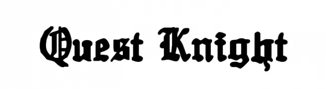
A bold, gothic-style font with intricate, medieval-inspired letterforms.
![Quest Knight font caratteri gratis]() Scaricare 643 Downloads@WebFont
Scaricare 643 Downloads@WebFont -
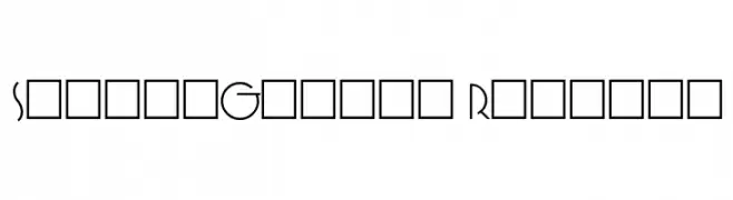
![SpringGarden Regular font caratteri gratis]() Scaricare 643 Downloads@WebFont
Scaricare 643 Downloads@WebFont -
( Fonts by Situjuh Nazara - 7ntypes.com - Personal-use only. For commercial use please contact owner. )
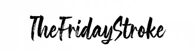
A bold, expressive brush-style font with dynamic strokes and a hand-painted look.
![The Friday Stroke font caratteri gratis]() Scaricare 643 Downloads@WebFont
Scaricare 643 Downloads@WebFont


Quali sono i font più popolari adesso?
Poppins, Roboto, Montserrat, Open Sans e Lato sono molto usati per le forme pulite e l'ampia applicabilità — dall'identità di marca alle landing page e ai poster.
Quali font si usano spesso nei loghi?
Le sans serif geometriche (es. Poppins, famiglie in stile Gotham) sono scelte comuni per un branding pulito e scalabile. Per un tocco personale restano valide script e stili manoscritti. Abbina un display deciso per i titoli a un corpo testo neutro per riconoscibilità ed equilibrio.
Ogni quanto si aggiorna la lista?
Con regolarità, in base ai download e all'attività reale. Torna spesso per scoprire in anticipo le nuove preferite.
💡 Consiglio: aggiungi ai preferiti — le tendenze cambiano in fretta e i font top di oggi possono ispirare il rebranding di domani.