Benvenuto nelle Font Più Popolari — dove popolarità e qualità si incontrano. Qui trovi i font più scaricati e usati dell'anno. Se cerchi scelte sicure per logo, web o social, inizia da qui.
Ogni font top si distingue per equilibrio, leggibilità e versatilità. Troverai sans serif moderne, script eleganti, serif vintage e display minimalisti.
-
 Scaricare 133 Downloads@WebFont
 -
( Fonts by Jecko Development - www.jeckodevelopment.com )
A bold, brush-style font with a casual, artistic flair.
![JDBrush font caratteri gratis]() Scaricare 133 Downloads@WebFont
Scaricare 133 Downloads@WebFont -
![ClassProjectNBP font caratteri gratis]() Scaricare 133 Downloads@WebFont
Scaricare 133 Downloads@WebFont -
( Fonts by StringLabs - stringlabscreative.com - Personal-use only. For commercial use please contact owner. )
A bold, handwritten font with a playful and energetic style.
![Avenus Type font caratteri gratis]() Scaricare 133 Downloads@WebFont
Scaricare 133 Downloads@WebFont -
( Fonts by a Max Infeld - XEROGRAPHER FONTS - xerographer.blogspot.com . Personal-use only. For commercial use please contact owner. )
A bold, distressed font with a grunge texture and rugged appearance.
![StrungPiano font caratteri gratis]() Scaricare 133 Downloads@WebFont
Scaricare 133 Downloads@WebFont -
-
( Fonts by Riyadh Rahman - Personal-use only. For commercial use please contact owner. )
A dynamic and elegant script font with flowing, cursive letterforms.
![athika font caratteri gratis]() Scaricare 133 Downloads@WebFont
Scaricare 133 Downloads@WebFont -
( Fonts by Rantau Type - rantaustudio.com - Personal-use only. For commercial use please contact owner. )
A playful, whimsical handwritten font with flowing cursive letters.
![Rietha font caratteri gratis]() Scaricare 133 Downloads@WebFont
Scaricare 133 Downloads@WebFont -
( Fonts by Billy Argel - Personal-use only. For commercial use please contact owner. )
A textured, cursive script font with a rustic and vintage appeal.
![Stanley Roots Personal Use Regular font caratteri gratis]() Scaricare 133 Downloads@WebFont
Scaricare 133 Downloads@WebFont -
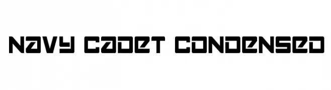
![Navy Cadet Condensed font caratteri gratis]() Scaricare 133 Downloads@WebFont
Scaricare 133 Downloads@WebFont -
( Fonts by Tomasz Skowronski - Personal-use only. For commercial use please contact owner. )
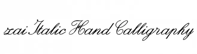
A graceful, cursive script font with elegant, flowing lines.
![zai Italic Hand Calligraphy font caratteri gratis]() Scaricare 133 Downloads@WebFont
Scaricare 133 Downloads@WebFont


Quali sono i font più popolari adesso?
Poppins, Roboto, Montserrat, Open Sans e Lato sono molto usati per le forme pulite e l'ampia applicabilità — dall'identità di marca alle landing page e ai poster.
Quali font si usano spesso nei loghi?
Le sans serif geometriche (es. Poppins, famiglie in stile Gotham) sono scelte comuni per un branding pulito e scalabile. Per un tocco personale restano valide script e stili manoscritti. Abbina un display deciso per i titoli a un corpo testo neutro per riconoscibilità ed equilibrio.
Ogni quanto si aggiorna la lista?
Con regolarità, in base ai download e all'attività reale. Torna spesso per scoprire in anticipo le nuove preferite.
💡 Consiglio: aggiungi ai preferiti — le tendenze cambiano in fretta e i font top di oggi possono ispirare il rebranding di domani.