Benvenuto nelle Font Più Popolari — dove popolarità e qualità si incontrano. Qui trovi i font più scaricati e usati dell'anno. Se cerchi scelte sicure per logo, web o social, inizia da qui.
Ogni font top si distingue per equilibrio, leggibilità e versatilità. Troverai sans serif moderne, script eleganti, serif vintage e display minimalisti.
-
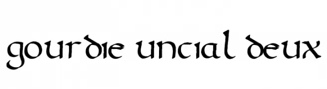
( Mouser Fonts - www.mouserfonts.com/ )
A medieval-inspired font with rounded, flowing letterforms and a calligraphic style.
 Scaricare 133 Downloads@WebFont
 -
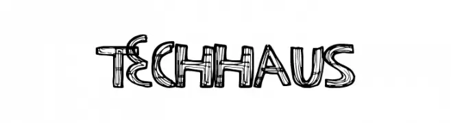
( Fonts by a Max Infeld - XEROGRAPHER FONTS - xerographer.blogspot.com . Personal-use only. For commercial use please contact owner. )
A sketch-like, hand-drawn font with bold outlines and a playful style.
![TechHaus font caratteri gratis]() Scaricare 133 Downloads@WebFont
Scaricare 133 Downloads@WebFont -
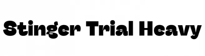
( Fonts by Zetafonts - Personal-use only. For commercial use please contact owner. )
A bold, geometric typeface with thick, uniform strokes and rounded edges.
![Stinger Trial Heavy font caratteri gratis]() Scaricare 133 Downloads@WebFont
Scaricare 133 Downloads@WebFont -
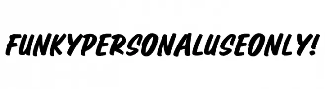
( Fonts by Kong Font )
A bold, dynamic script font with brush-like strokes and high contrast.
![Funky PERSONAL USE ONLY! font caratteri gratis]() Scaricare 133 Downloads@WebFont
Scaricare 133 Downloads@WebFont -
( Fonts by Apostrophic Lab )
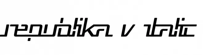
A modern, italic font with geometric, angular design and consistent character height.
![Republika V Italic font caratteri gratis]() Scaricare 133 Downloads@WebFont
Scaricare 133 Downloads@WebFont -
-
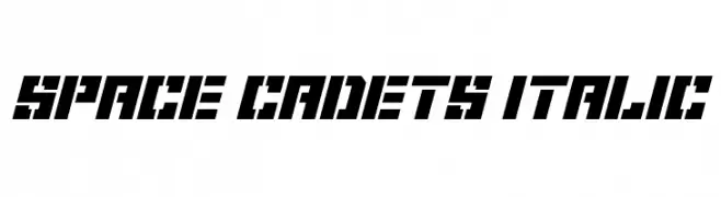
![Space Cadets Italic font caratteri gratis]() Scaricare 133 Downloads@WebFont
Scaricare 133 Downloads@WebFont -
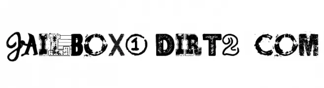
( Free for Personal Use. To use commercially please visit the http://dirt2.com )
A distressed, grungy font with bold, textured characters perfect for edgy designs.
![Jailbox1 Dirt2.com font caratteri gratis]() Scaricare 133 Downloads@WebFont
Scaricare 133 Downloads@WebFont -
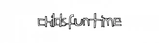
( Fonts by a Max Infeld - XEROGRAPHER FONTS - xerographer.blogspot.com . Personal-use only. For commercial use please contact owner. )
A playful, hand-drawn font with bold outlines and quirky shapes.
![ChildsFuntime font caratteri gratis]() Scaricare 133 Downloads@WebFont
Scaricare 133 Downloads@WebFont -
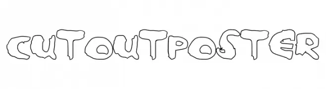
( Fonts by a Max Infeld - XEROGRAPHER FONTS - xerographer.blogspot.com . Personal-use only. For commercial use please contact owner. )
A playful, cut-out style font with bold, jagged edges.
![CutoutPoster font caratteri gratis]() Scaricare 133 Downloads@WebFont
Scaricare 133 Downloads@WebFont -
( www.mschroeppel.de/ )
A bold, distressed font with a grunge, hand-drawn aesthetic.
![LLFutur font caratteri gratis]() Scaricare 133 Downloads@WebFont
Scaricare 133 Downloads@WebFont

Quali sono i font più popolari adesso?
Poppins, Roboto, Montserrat, Open Sans e Lato sono molto usati per le forme pulite e l'ampia applicabilità — dall'identità di marca alle landing page e ai poster.
Quali font si usano spesso nei loghi?
Le sans serif geometriche (es. Poppins, famiglie in stile Gotham) sono scelte comuni per un branding pulito e scalabile. Per un tocco personale restano valide script e stili manoscritti. Abbina un display deciso per i titoli a un corpo testo neutro per riconoscibilità ed equilibrio.
Ogni quanto si aggiorna la lista?
Con regolarità, in base ai download e all'attività reale. Torna spesso per scoprire in anticipo le nuove preferite.
💡 Consiglio: aggiungi ai preferiti — le tendenze cambiano in fretta e i font top di oggi possono ispirare il rebranding di domani.