Benvenuto nelle Font Più Popolari — dove popolarità e qualità si incontrano. Qui trovi i font più scaricati e usati dell'anno. Se cerchi scelte sicure per logo, web o social, inizia da qui.
Ogni font top si distingue per equilibrio, leggibilità e versatilità. Troverai sans serif moderne, script eleganti, serif vintage e display minimalisti.
-
 Scaricare 596 Downloads@WebFont
 -
( Fonts by Bree Gorton )
Bold, dynamic font with a slight slant and strong presence.
![DdaftT-lowercase font caratteri gratis]() Scaricare 596 Downloads@WebFont
Scaricare 596 Downloads@WebFont -
![Neovix Basic font caratteri gratis]() Scaricare 596 Downloads@WebFont
Scaricare 596 Downloads@WebFont -
( Fonts by www.vicfieger.com )
A bold, textured font with a hand-drawn, artistic style.
![Xenophone font caratteri gratis]() Scaricare 596 Downloads@WebFont
Scaricare 596 Downloads@WebFont -
( Fonts by Letterayu )
A playful, bold handwritten font with rounded, smooth letterforms.
![Bigolive font caratteri gratis]() Scaricare 596 Downloads@WebFont
Scaricare 596 Downloads@WebFont -
-
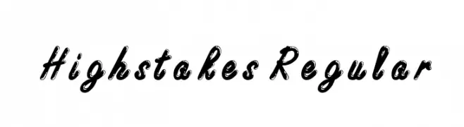
![Highstakes Regular font caratteri gratis]() Scaricare 596 Downloads@WebFont
Scaricare 596 Downloads@WebFont -
( Fonts by Ferdie Balderas - Personal-use only. For commercial use please contact owner. )
A playful, hand-drawn font with tall, narrow letters and a casual style.
![Engine font caratteri gratis]() Scaricare 596 Downloads@WebFont
Scaricare 596 Downloads@WebFont -
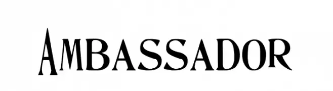
![Ambassador font caratteri gratis]() Scaricare 596 Downloads@WebFont
Scaricare 596 Downloads@WebFont -
( Fonts by Huerta Tipográfica - Personal-use only. For commercial use please contact owner. )
A modern serif font with elegant curves and balanced stroke contrast.
![Andada font caratteri gratis]() Scaricare 596 Downloads@WebFont
Scaricare 596 Downloads@WebFont -
( Fonts by Iconian Fonts )
A bold, condensed, and playful hand-drawn font with rounded characters.
![98 Bottles of Beer Bold Condensed font caratteri gratis]() Scaricare 596 Downloads@WebFont
Scaricare 596 Downloads@WebFont -
( Fonts by TypeFaithFonts - Personal-use only. For commercial use please contact owner. )
A modern, bold italic sans-serif font with a dynamic and clean appearance.
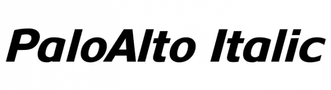
![PaloAlto Italic font caratteri gratis]() Scaricare 596 Downloads@WebFont
Scaricare 596 Downloads@WebFont -
( Fonts by www.lars-manenschijn.nl )
A modern, rounded geometric font with a hollow interior and consistent line thickness.
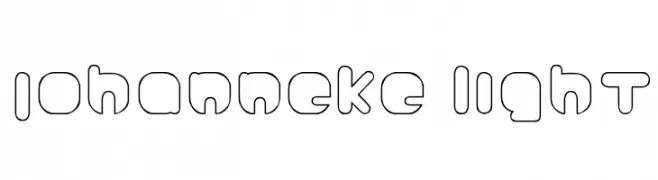
![Johanneke Light font caratteri gratis]() Scaricare 596 Downloads@WebFont
Scaricare 596 Downloads@WebFont -
( Fonts by Omnibus Type )
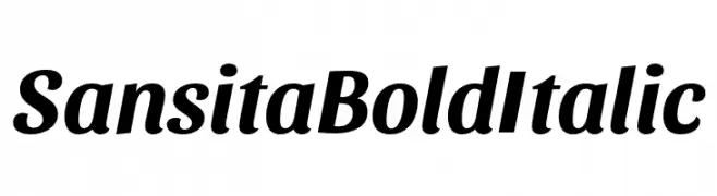
A bold, italicized font with a dynamic and elegant style.
![Sansita Bold Italic font caratteri gratis]() Scaricare 596 Downloads@WebFont
Scaricare 596 Downloads@WebFont -
![H74 Revolution font caratteri gratis]() Scaricare 596 Downloads@WebFont
Scaricare 596 Downloads@WebFont -
( Fonts by Daniel Zadorozny - www.iconian.com - Free for personal use )
A grid-based, pixelated font with a digital and futuristic style.
![Y-Grid font caratteri gratis]() Scaricare 596 Downloads@WebFont
Scaricare 596 Downloads@WebFont -
( Fonts by Jacob Fisher - www.pizzadude.dk )
A playful decorative font with diverse star-themed glyphs.
![PizzaDude Stars font caratteri gratis]() Scaricare 595 Downloads@WebFont
Scaricare 595 Downloads@WebFont -
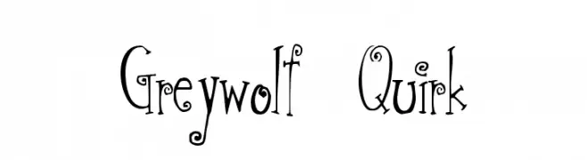
![Greywolf Quirk font caratteri gratis]() Scaricare 595 Downloads@WebFont
Scaricare 595 Downloads@WebFont -
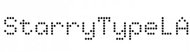
![StarryTypeLA font caratteri gratis]() Scaricare 595 Downloads@WebFont
Scaricare 595 Downloads@WebFont -
( Fonts by Jeff Bensch. Personal-use only. For commercial use please contact owner. )
A playful, rounded font with smooth curves and uniform stroke width.
![namo font caratteri gratis]() Scaricare 595 Downloads@WebFont
Scaricare 595 Downloads@WebFont -
( Noto is a trademark of Google Inc. Noto fonts are open source. All Noto fonts are published under the SIL Open Font License, Version 1.1 )
A geometric, monospaced font with uniform, boxed glyphs.
![Noto Kufi Arabic font caratteri gratis]() Scaricare 595 Downloads@WebFont
Scaricare 595 Downloads@WebFont -
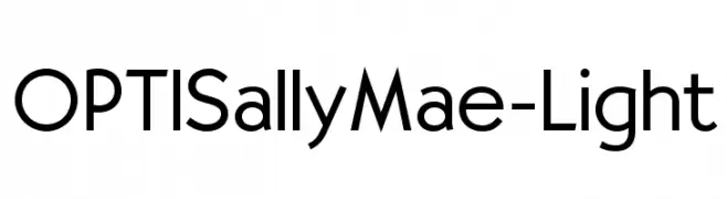
( Fonts by Castcraft Software - OPTI Fonts Archive - opti.netii.net - Personal-use only. For commercial use please contact owner. )
A modern sans-serif font with geometric shapes and uniform strokes.
![OPTISallyMae-Light font caratteri gratis]() Scaricare 595 Downloads@WebFont
Scaricare 595 Downloads@WebFont -
( Fonts by Dennis Ludlow - Sharkshock Productions )
A playful, hand-drawn font with bold, rounded characters and a whimsical style.
![Fruitopia font caratteri gratis]() Scaricare 595 Downloads@WebFont
Scaricare 595 Downloads@WebFont -
( Fonts by David Rakowski )
A bold, three-dimensional font with rounded edges and a modern, sophisticated style.
![RoundedRelief font caratteri gratis]() Scaricare 595 Downloads@WebFont
Scaricare 595 Downloads@WebFont -
![OmahaDings font caratteri gratis]() Scaricare 595 Downloads@WebFont
Scaricare 595 Downloads@WebFont -
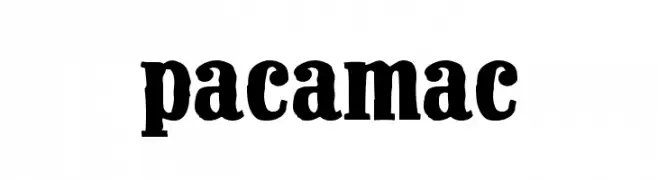
![Pacamac font caratteri gratis]() Scaricare 595 Downloads@WebFont
Scaricare 595 Downloads@WebFont -
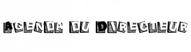
![Agenda du Directeur font caratteri gratis]() Scaricare 595 Downloads@WebFont
Scaricare 595 Downloads@WebFont -
( Nils Kähler - creativevikings.com )
A modern, geometric sans-serif font with clean lines and uniform thickness.
![Unified font caratteri gratis]() Scaricare 595 Downloads@WebFont
Scaricare 595 Downloads@WebFont -
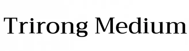
( Copyright (c) 2015, Cadson Demak (info@cadsondemak.com) )
A modern serif font with elegant, balanced letterforms and pronounced serifs.
![Trirong Medium font caratteri gratis]() Scaricare 595 Downloads@WebFont
Scaricare 595 Downloads@WebFont -
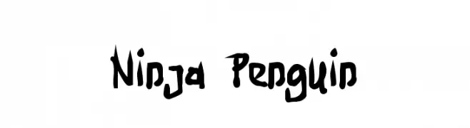
( Fonts by Utopiafonts )
A bold, brush-style font with a dynamic, hand-drawn appearance.
![Ninja Penguin font caratteri gratis]() Scaricare 595 Downloads@WebFont
Scaricare 595 Downloads@WebFont -
( Eva Barabasne Olasz - www.etsy.com/ie/shop/digitaltypefaces )
A clean, minimalist font with geometric influences and decorative monogram frames.
![Square Monogram Frames Demo font caratteri gratis]() Scaricare 595 Downloads@WebFont
Scaricare 595 Downloads@WebFont -
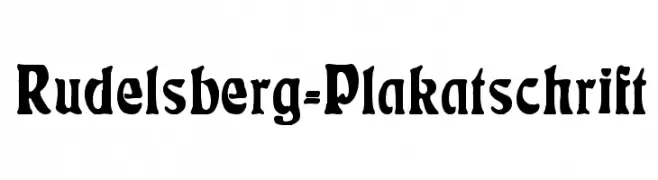
( Fonts by Dieter Steffmann )
A bold, decorative font with a strong, impactful design.
![Rudelsberg-Plakatschrift font caratteri gratis]() Scaricare 595 Downloads@WebFont
Scaricare 595 Downloads@WebFont -
( Fonts by Farul Arjianto - creativemarket.com/typefar - Personal-use only. For commercial use please contact owner. )
A bold, expressive script font with a dynamic, handwritten style.
![Belynda font caratteri gratis]() Scaricare 595 Downloads@WebFont
Scaricare 595 Downloads@WebFont -
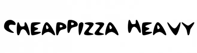
![CheapPizza Heavy font caratteri gratis]() Scaricare 595 Downloads@WebFont
Scaricare 595 Downloads@WebFont -
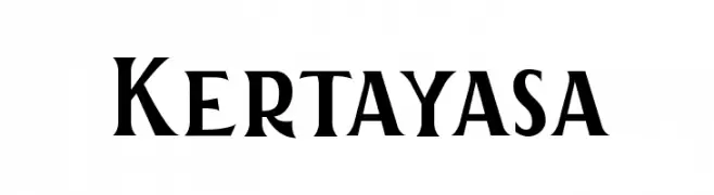
( Fonts by Aku Fadhl )
A bold serif font with angular serifs and a modern twist.
![Kertayasa font caratteri gratis]() Scaricare 595 Downloads@WebFont
Scaricare 595 Downloads@WebFont -
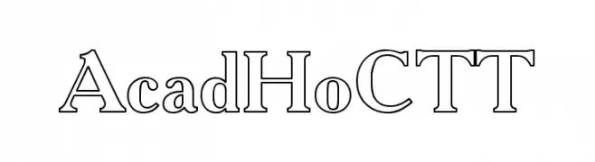
![AcadHoCTT font caratteri gratis]() Scaricare 595 Downloads@WebFont
Scaricare 595 Downloads@WebFont


Quali sono i font più popolari adesso?
Poppins, Roboto, Montserrat, Open Sans e Lato sono molto usati per le forme pulite e l'ampia applicabilità — dall'identità di marca alle landing page e ai poster.
Quali font si usano spesso nei loghi?
Le sans serif geometriche (es. Poppins, famiglie in stile Gotham) sono scelte comuni per un branding pulito e scalabile. Per un tocco personale restano valide script e stili manoscritti. Abbina un display deciso per i titoli a un corpo testo neutro per riconoscibilità ed equilibrio.
Ogni quanto si aggiorna la lista?
Con regolarità, in base ai download e all'attività reale. Torna spesso per scoprire in anticipo le nuove preferite.
💡 Consiglio: aggiungi ai preferiti — le tendenze cambiano in fretta e i font top di oggi possono ispirare il rebranding di domani.