Benvenuto nelle Font Più Popolari — dove popolarità e qualità si incontrano. Qui trovi i font più scaricati e usati dell'anno. Se cerchi scelte sicure per logo, web o social, inizia da qui.
Ogni font top si distingue per equilibrio, leggibilità e versatilità. Troverai sans serif moderne, script eleganti, serif vintage e display minimalisti.
-
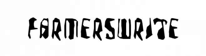
( Fonts by Manfred Klein. Free for private and charity use. Free for commercial with donation to organizations )
A bold, rugged font with jagged, carved-like characters.
 Scaricare 121 Downloads@WebFont
 -
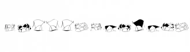
( Fonts by Manfred Klein. Free for private and charity use. Free for commercial with donation to organizations )
Abstract, hand-drawn cattle illustrations form each character.
![TaurusCowboys font caratteri gratis]() Scaricare 121 Downloads@WebFont
Scaricare 121 Downloads@WebFont -
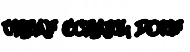
( Fonts by or from www.graffitifonts.net )
A bold, graffiti-inspired font with thick, rounded strokes and a dynamic, urban style.
![Urban Scrawl Down font caratteri gratis]() Scaricare 121 Downloads
Scaricare 121 Downloads -
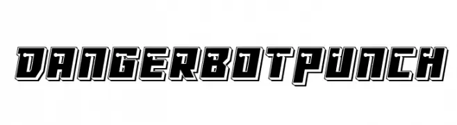
( Fonts by Iconian Fonts )
A bold, three-dimensional font with a futuristic, tech-inspired design.
![Dangerbot Punch font caratteri gratis]() Scaricare 121 Downloads@WebFont
Scaricare 121 Downloads@WebFont -
( Fonts by Dieter Steffmann )
An ornate and intricate Blackletter font with a medieval and historical appearance.
![LiturgischZierbuchstaben font caratteri gratis]() Scaricare 121 Downloads@WebFont
Scaricare 121 Downloads@WebFont -
-
( Fonts by Daniel Zadorozny - www.iconian.com - Free for personal use )
A bold, italicized font with a futuristic, angular design.
![Repulsor Italic font caratteri gratis]() Scaricare 121 Downloads@WebFont
Scaricare 121 Downloads@WebFont -
![Pavadee UltraLight font caratteri gratis]() Scaricare 121 Downloads@WebFont
Scaricare 121 Downloads@WebFont -
( Fonts by Apostrophic Lab )
A bold, decorative font with a maze-like, three-dimensional outline and italic slant.
![Republikaps - Maze Italic font caratteri gratis]() Scaricare 121 Downloads@WebFont
Scaricare 121 Downloads@WebFont -
( Fonts by Manuel Viergutz - Typo Graphic Design - www.typographicdesign.de )
A pixelated, medium-weight italic font with a retro digital style.
![webpixelbitmap-MediumItalic font caratteri gratis]() Scaricare 121 Downloads@WebFont
Scaricare 121 Downloads@WebFont -
![LaMorte4 font caratteri gratis]() Scaricare 121 Downloads@WebFont
Scaricare 121 Downloads@WebFont

Quali sono i font più popolari adesso?
Poppins, Roboto, Montserrat, Open Sans e Lato sono molto usati per le forme pulite e l'ampia applicabilità — dall'identità di marca alle landing page e ai poster.
Quali font si usano spesso nei loghi?
Le sans serif geometriche (es. Poppins, famiglie in stile Gotham) sono scelte comuni per un branding pulito e scalabile. Per un tocco personale restano valide script e stili manoscritti. Abbina un display deciso per i titoli a un corpo testo neutro per riconoscibilità ed equilibrio.
Ogni quanto si aggiorna la lista?
Con regolarità, in base ai download e all'attività reale. Torna spesso per scoprire in anticipo le nuove preferite.
💡 Consiglio: aggiungi ai preferiti — le tendenze cambiano in fretta e i font top di oggi possono ispirare il rebranding di domani.