Benvenuto nelle Font Più Popolari — dove popolarità e qualità si incontrano. Qui trovi i font più scaricati e usati dell'anno. Se cerchi scelte sicure per logo, web o social, inizia da qui.
Ogni font top si distingue per equilibrio, leggibilità e versatilità. Troverai sans serif moderne, script eleganti, serif vintage e display minimalisti.
-
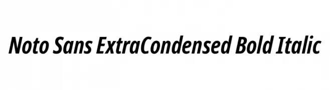
( Fonts by Google )
A bold, italic, extra-condensed sans-serif font with a modern and dynamic style.
 Scaricare 121 Downloads@WebFont
 -
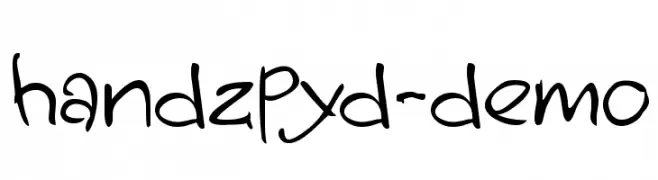
( Fonts by Blu Aoi )
A playful, handwritten font with irregular strokes and a casual style.
![handzpyd-demo font caratteri gratis]() Scaricare 121 Downloads@WebFont
Scaricare 121 Downloads@WebFont -
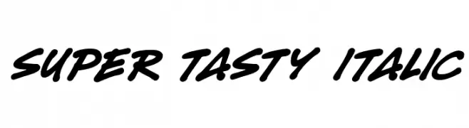
( Fonts by Darrell Flood )
A bold, italic script font with dynamic, flowing strokes.
![Super Tasty Italic font caratteri gratis]() Scaricare 121 Downloads@WebFont
Scaricare 121 Downloads@WebFont -
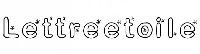
![Lettreetoile font caratteri gratis]() Scaricare 121 Downloads@WebFont
Scaricare 121 Downloads@WebFont -
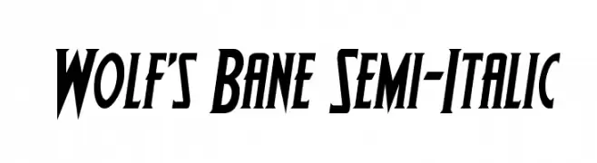
( Fonts by Daniel Zadorozny - www.iconian.com - Free for personal use )
A bold, semi-italic font with angular edges and a dynamic style.
![Wolf's Bane Semi-Italic font caratteri gratis]() Scaricare 121 Downloads@WebFont
Scaricare 121 Downloads@WebFont -
-
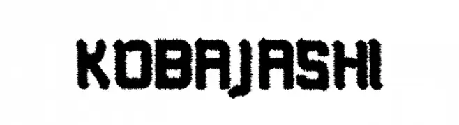
( Fonts by Bartek Nowak - www.nowak.tv/fontoholic/ )
A bold, jagged font with a dynamic, textured appearance.
![Kobajashi font caratteri gratis]() Scaricare 121 Downloads@WebFont
Scaricare 121 Downloads@WebFont -
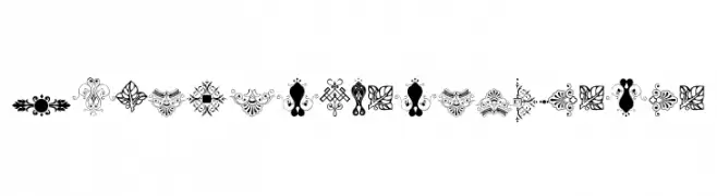
( Free for personal use - new.myfonts.com/foundry/Intellecta_Design/?refby=paulow )
Intricate and ornate decorative ornaments with floral and geometric patterns.
![SoftOrnamentsTwelve font caratteri gratis]() Scaricare 121 Downloads@WebFont
Scaricare 121 Downloads@WebFont -
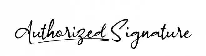
( Fonts by wep - Wahyu Eka Prasetya - Personal-use only. For commercial use please contact owner. )
A cursive, handwritten font with elegant, flowing strokes and medium contrast.
![Authorized_Signature font caratteri gratis]() Scaricare 121 Downloads@WebFont
Scaricare 121 Downloads@WebFont -
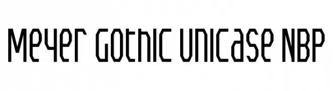
![Meyer Gothic Unicase NBP font caratteri gratis]() Scaricare 121 Downloads@WebFont
Scaricare 121 Downloads@WebFont -
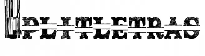
( Fonts by Woodcutter )
A bold, distressed font with a unique horizontal split effect, perfect for vintage and industrial designs.
![Split Letras font caratteri gratis]() Scaricare 121 Downloads@WebFont
Scaricare 121 Downloads@WebFont
Quali sono i font più popolari adesso?
Poppins, Roboto, Montserrat, Open Sans e Lato sono molto usati per le forme pulite e l'ampia applicabilità — dall'identità di marca alle landing page e ai poster.
Quali font si usano spesso nei loghi?
Le sans serif geometriche (es. Poppins, famiglie in stile Gotham) sono scelte comuni per un branding pulito e scalabile. Per un tocco personale restano valide script e stili manoscritti. Abbina un display deciso per i titoli a un corpo testo neutro per riconoscibilità ed equilibrio.
Ogni quanto si aggiorna la lista?
Con regolarità, in base ai download e all'attività reale. Torna spesso per scoprire in anticipo le nuove preferite.
💡 Consiglio: aggiungi ai preferiti — le tendenze cambiano in fretta e i font top di oggi possono ispirare il rebranding di domani.