Benvenuto nelle Font Più Popolari — dove popolarità e qualità si incontrano. Qui trovi i font più scaricati e usati dell'anno. Se cerchi scelte sicure per logo, web o social, inizia da qui.
Ogni font top si distingue per equilibrio, leggibilità e versatilità. Troverai sans serif moderne, script eleganti, serif vintage e display minimalisti.
-
( CROLrene )
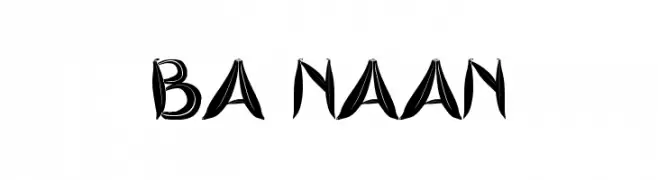
A bold, dynamic font with sweeping strokes and a modern calligraphic style.
 Scaricare 120 Downloads@WebFont
 -
( Fonts by Woodcutter )
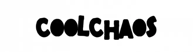
A bold, playful font with irregular, chunky letterforms and a hand-drawn appearance.
![Cool Chaos font caratteri gratis]() Scaricare 120 Downloads@WebFont
Scaricare 120 Downloads@WebFont -
( Fonts by Savira Faeyza Art )
A bold, playful font with rounded, chunky letters and a whimsical style.
![Sleep Baby font caratteri gratis]() Scaricare 120 Downloads@WebFont
Scaricare 120 Downloads@WebFont -
( Fonts by Chris Vile )
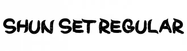
A bold, brush-style font with a distressed texture and dynamic appearance.
![Shun Set Regular font caratteri gratis]() Scaricare 120 Downloads@WebFont
Scaricare 120 Downloads@WebFont -
( Fonts by imagex - Personal-use only. For commercial use please contact owner. )
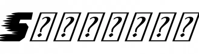
A bold, italicized font with a dynamic, speedy appearance.
![Speedway font caratteri gratis]() Scaricare 120 Downloads@WebFont
Scaricare 120 Downloads@WebFont -
-
( Fonts by Manfred Klein. Free for private and charity use. Free for commercial with donation to organizations )
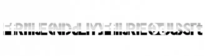
A bold, modern font with a stencil-like, futuristic design.
![FriendlyFireDust font caratteri gratis]() Scaricare 120 Downloads@WebFont
Scaricare 120 Downloads@WebFont -
( Fonts by TarmSaft Font Factory - http://www.aska.nu/tarmsaft/ )
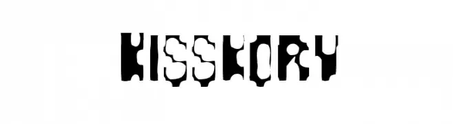
A bold, stencil-style font with a strong, industrial aesthetic.
![Kisskorv font caratteri gratis]() Scaricare 120 Downloads@WebFont
Scaricare 120 Downloads@WebFont -
( Fonts by Woodcutter Manero - http://www.woodcutter.es - Personal-use only. For commercial use please contact owner. )
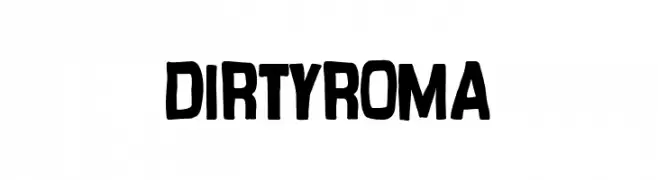
A bold, hand-drawn font with a playful and informal style.
![Dirty Roma font caratteri gratis]() Scaricare 120 Downloads@WebFont
Scaricare 120 Downloads@WebFont -
( Fonts by Rune Bjørnerås )
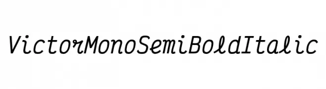
A modern monospaced font with semi-bold weight and italic style, ideal for coding.
![Victor Mono SemiBold Italic font caratteri gratis]() Scaricare 120 Downloads@WebFont
Scaricare 120 Downloads@WebFont -
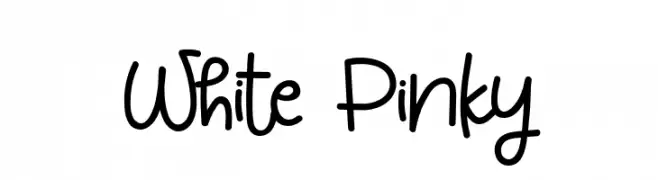
( Fonts by Syaf Rizal - Khurasan - Personal-use only. For commercial use please contact owner. )
A playful, handwritten font with rounded, whimsical characters and decorative elements.
![White Pinky font caratteri gratis]() Scaricare 120 Downloads@WebFont
Scaricare 120 Downloads@WebFont

Quali sono i font più popolari adesso?
Poppins, Roboto, Montserrat, Open Sans e Lato sono molto usati per le forme pulite e l'ampia applicabilità — dall'identità di marca alle landing page e ai poster.
Quali font si usano spesso nei loghi?
Le sans serif geometriche (es. Poppins, famiglie in stile Gotham) sono scelte comuni per un branding pulito e scalabile. Per un tocco personale restano valide script e stili manoscritti. Abbina un display deciso per i titoli a un corpo testo neutro per riconoscibilità ed equilibrio.
Ogni quanto si aggiorna la lista?
Con regolarità, in base ai download e all'attività reale. Torna spesso per scoprire in anticipo le nuove preferite.
💡 Consiglio: aggiungi ai preferiti — le tendenze cambiano in fretta e i font top di oggi possono ispirare il rebranding di domani.