Benvenuto nelle Font Più Popolari — dove popolarità e qualità si incontrano. Qui trovi i font più scaricati e usati dell'anno. Se cerchi scelte sicure per logo, web o social, inizia da qui.
Ogni font top si distingue per equilibrio, leggibilità e versatilità. Troverai sans serif moderne, script eleganti, serif vintage e display minimalisti.
-
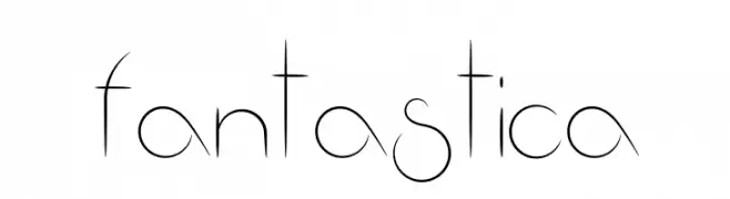
( Fonts by Manuel Ramos - www.infinitismo.com - Personal-use only. For commercial use please contact owner. )
A modern, high-contrast font with thin, elongated letterforms and a unique geometric style.
 Scaricare 123 Downloads@WebFont
 -
( Fonts by Ramandhani Nugraha )
A bold, hand-drawn font with a playful and artistic style.
![valencia sans font caratteri gratis]() Scaricare 123 Downloads@WebFont
Scaricare 123 Downloads@WebFont -
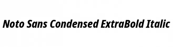
( Fonts by Google )
A bold, italic, and condensed typeface with a modern and assertive style.
![Noto Sans Condensed ExtraBold Italic font caratteri gratis]() Scaricare 123 Downloads@WebFont
Scaricare 123 Downloads@WebFont -
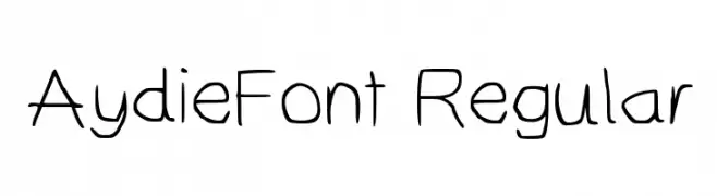
Caratteri di AydenC. For commercial use please contact the owner.
![AydieFont Regular font caratteri gratis]() Scaricare 123 Downloads@WebFont
Scaricare 123 Downloads@WebFont -
( Fonts by Motokiwo - Anton Cahyono - Personal-use only. For commercial use please contact owner. )
A classic, elegant script font with flowing, interconnected letters.
![Cherio font caratteri gratis]() Scaricare 123 Downloads@WebFont
Scaricare 123 Downloads@WebFont -
-
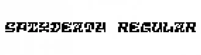
( Fonts by Winter Design Studio - winty5.wixsite.com/noahtheawesome/ - Personal-use only. For commercial use please contact owner. )
A bold, pixelated font with a retro digital aesthetic.
![5Pixdeath Regular font caratteri gratis]() Scaricare 123 Downloads@WebFont
Scaricare 123 Downloads@WebFont -
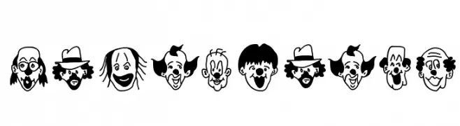
( Fonts by Manfred Klein. Free for private and charity use. Free for commercial with donation to organizations )
A decorative font made of expressive clown faces for each character.
![Hanswurste font caratteri gratis]() Scaricare 123 Downloads@WebFont
Scaricare 123 Downloads@WebFont -
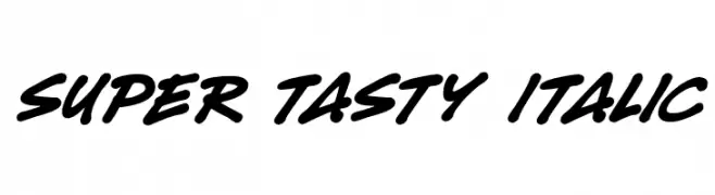
( Fonts by Darrell Flood )
A bold, italic script font with dynamic, flowing strokes.
![Super Tasty Italic font caratteri gratis]() Scaricare 123 Downloads@WebFont
Scaricare 123 Downloads@WebFont -
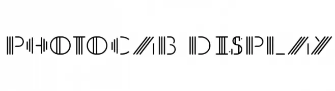
( Ink Sg - www.behance.net/inksega )
A modern, geometric font with parallel lines creating a dynamic and futuristic look.
![PhotoCab Display font caratteri gratis]() Scaricare 123 Downloads@WebFont
Scaricare 123 Downloads@WebFont -
( Fonts by wep - Wahyu Eka Prasetya - Personal-use only. For commercial use please contact owner. )
A cursive, handwritten font with elegant, flowing strokes and medium contrast.
![Authorized_Signature font caratteri gratis]() Scaricare 123 Downloads@WebFont
Scaricare 123 Downloads@WebFont


Quali sono i font più popolari adesso?
Poppins, Roboto, Montserrat, Open Sans e Lato sono molto usati per le forme pulite e l'ampia applicabilità — dall'identità di marca alle landing page e ai poster.
Quali font si usano spesso nei loghi?
Le sans serif geometriche (es. Poppins, famiglie in stile Gotham) sono scelte comuni per un branding pulito e scalabile. Per un tocco personale restano valide script e stili manoscritti. Abbina un display deciso per i titoli a un corpo testo neutro per riconoscibilità ed equilibrio.
Ogni quanto si aggiorna la lista?
Con regolarità, in base ai download e all'attività reale. Torna spesso per scoprire in anticipo le nuove preferite.
💡 Consiglio: aggiungi ai preferiti — le tendenze cambiano in fretta e i font top di oggi possono ispirare il rebranding di domani.