Benvenuto nelle Font Più Popolari — dove popolarità e qualità si incontrano. Qui trovi i font più scaricati e usati dell'anno. Se cerchi scelte sicure per logo, web o social, inizia da qui.
Ogni font top si distingue per equilibrio, leggibilità e versatilità. Troverai sans serif moderne, script eleganti, serif vintage e display minimalisti.
-
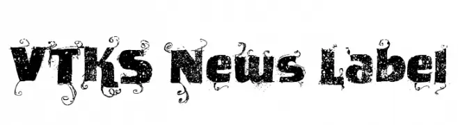
( Fonts by Douglas Vitkauskas - www.vtksdesign.com. Personal-use only. For commercial use please contact owner. )
A bold, decorative font with a vintage, grunge texture and intricate embellishments.
 Scaricare 564 Downloads@WebFont
 -
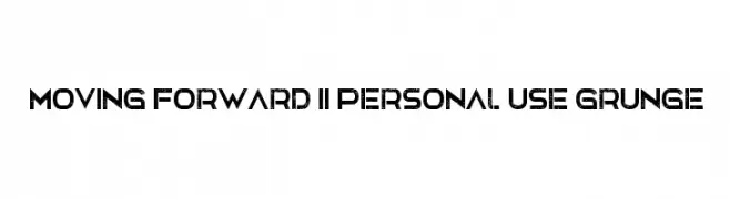
![Moving Forward II Personal Use Grunge font caratteri gratis]() Scaricare 564 Downloads@WebFont
Scaricare 564 Downloads@WebFont -
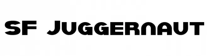
![SF Juggernaut font caratteri gratis]() Scaricare 564 Downloads@WebFont
Scaricare 564 Downloads@WebFont -
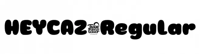
( Fonts by twinletter )
A bold, playful font with rounded edges and a bubbly appearance.
![HEYCAZ-Regular font caratteri gratis]() Scaricare 564 Downloads@WebFont
Scaricare 564 Downloads@WebFont -
( Fonts by Edric Studio www.creativefabrica.com/designer/edricstudio/ - Personal-use only. For commercial use please contact owner. )
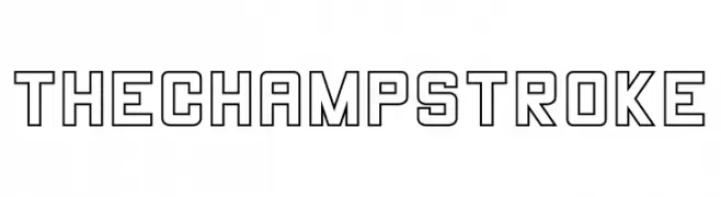
A bold, geometric outline font with a modern and impactful style.
![THE CHAMP Stroke font caratteri gratis]() Scaricare 564 Downloads@WebFont
Scaricare 564 Downloads@WebFont -
-
( Fonts by Daniel Zadorozny - www.iconian.com )
A sleek, italicized font with angular, futuristic letterforms.
![Eurofighter Italic font caratteri gratis]() Scaricare 564 Downloads@WebFont
Scaricare 564 Downloads@WebFont -
( Fonts by Dieter Steffmann )
An ornate and decorative font with intricate patterns and a blackletter influence.
![Ehmcke-Fraktur Initialen font caratteri gratis]() Scaricare 564 Downloads@WebFont
Scaricare 564 Downloads@WebFont -
( Fonts by Style-7 - www.styleseven.com - Personal-use only. For commercial use please contact owner. )
A pixelated, monospaced font with a retro digital style.
![Small Pixel-7 font caratteri gratis]() Scaricare 564 Downloads@WebFont
Scaricare 564 Downloads@WebFont -
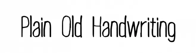
![Plain Old Handwriting font caratteri gratis]() Scaricare 564 Downloads@WebFont
Scaricare 564 Downloads@WebFont -
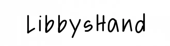
![LibbysHand font caratteri gratis]() Scaricare 564 Downloads@WebFont
Scaricare 564 Downloads@WebFont -
( Fonts by www.selawetype.com - Personal-use only. FOR DONATION https://www.paypal.me/selawe . For commercial use please contact owner. )
A bold, brush-style script font with dynamic, connected letters.
![RODAMAS font caratteri gratis]() Scaricare 564 Downloads@WebFont
Scaricare 564 Downloads@WebFont -
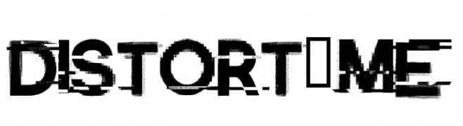
![Distort-Me font caratteri gratis]() Scaricare 564 Downloads@WebFont
Scaricare 564 Downloads@WebFont -
( Fonts by Typodermic Fonts - Raymond Larabie - Personal-use only. For commercial use please contact owner. )
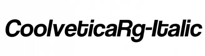
A modern, italic sans-serif font with smooth curves and consistent stroke width.
![CoolveticaRg-Italic font caratteri gratis]() Scaricare 564 Downloads@WebFont
Scaricare 564 Downloads@WebFont -
( Fonts by Goldman Sans - https://design.gs.com/d/design-system/foundation/typography/ - Personal-use only. For commercial use please contact owner. )
A clean, modern sans-serif typeface with excellent legibility and balance.
![Goldman Sans Light font caratteri gratis]() Scaricare 564 Downloads@WebFont
Scaricare 564 Downloads@WebFont -
( Fonts by Eknoji Studio - www.eknojistudio.com - Personal-use only. For commercial use please contact owner. )
A playful, bold, hand-drawn font with outlined characters.
![Quoote font caratteri gratis]() Scaricare 564 Downloads@WebFont
Scaricare 564 Downloads@WebFont -
( Fonts by zamjump - Ahmad Zamzami - Personal-use only. For commercial use please contact owner. )
A flowing, elegant script font with dynamic curves and varying line thickness.
![Something Wrong font caratteri gratis]() Scaricare 564 Downloads@WebFont
Scaricare 564 Downloads@WebFont -
( Fonts by GGBotNet - Personal-use only. For commercial use please contact owner. )
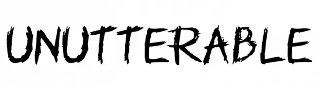
A rugged, hand-drawn font with a distressed, edgy appearance.
![Unutterable font caratteri gratis]() Scaricare 564 Downloads@WebFont
Scaricare 564 Downloads@WebFont -
![Cyberia font caratteri gratis]() Scaricare 564 Downloads@WebFont
Scaricare 564 Downloads@WebFont -
( Fonts by Buddha Graphix - buddha.graphix.dk/fonts.html )
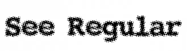
A halftone dot pattern font with a retro, textured aesthetic.
![See Regular font caratteri gratis]() Scaricare 564 Downloads@WebFont
Scaricare 564 Downloads@WebFont -
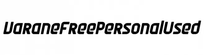
( Fonts by Mocha Frappuccino - Personal-use only. For commercial use please contact owner. )
A bold, modern font with a slight slant and consistent stroke width.
![Varane Free Personal Used font caratteri gratis]() Scaricare 564 Downloads@WebFont
Scaricare 564 Downloads@WebFont -
( Fonts by Daniel Zadorozny - www.iconian.com - Free for personal use )
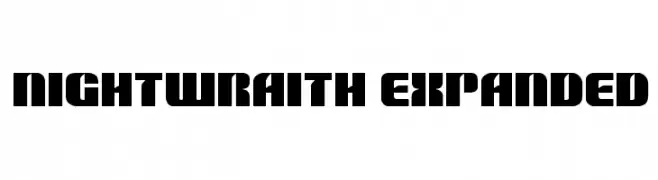
A bold, expanded font with a geometric and impactful style.
![Nightwraith Expanded font caratteri gratis]() Scaricare 564 Downloads@WebFont
Scaricare 564 Downloads@WebFont -
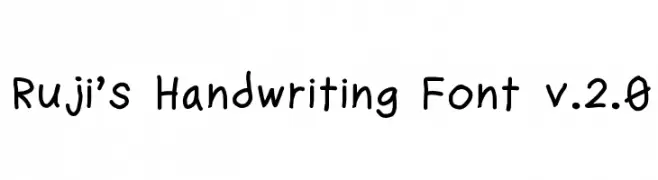
![Ruji's Handwriting Font v.2.0 font caratteri gratis]() Scaricare 564 Downloads@WebFont
Scaricare 564 Downloads@WebFont -
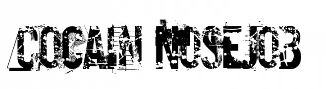
![Cocain Nosejob font caratteri gratis]() Scaricare 564 Downloads@WebFont
Scaricare 564 Downloads@WebFont -
![aa QWERTZ-Tasten font caratteri gratis]() Scaricare 564 Downloads@WebFont
Scaricare 564 Downloads@WebFont -
( HENRIavecunK )
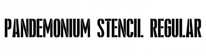
A bold, stencil-style font with a rugged, industrial look.
![Pandemonium Stencil Regular font caratteri gratis]() Scaricare 564 Downloads@WebFont
Scaricare 564 Downloads@WebFont -
( Fonts by weknow )
A bold, geometric font with a modern and solid appearance.
![Dark font caratteri gratis]() Scaricare 564 Downloads@WebFont
Scaricare 564 Downloads@WebFont -
( Fonts by www.studiotypo.com - Personal-use only. For commercial use please contact owner. )
A bold, modern font with thick strokes and a strong presence.
![Aprikas Black Demo font caratteri gratis]() Scaricare 564 Downloads@WebFont
Scaricare 564 Downloads@WebFont -
( Fonts by RaisProject )
A dynamic and fluid script font with elegant, flowing letterforms.
![Little Change Demo font caratteri gratis]() Scaricare 564 Downloads@WebFont
Scaricare 564 Downloads@WebFont -
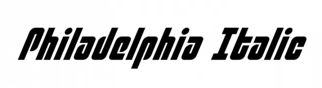
( Fonts by Daniel Zadorozny - www.iconian.com )
A bold, italic font with dynamic slanted letterforms and strong, modern aesthetics.
![Philadelphia Italic font caratteri gratis]() Scaricare 564 Downloads@WebFont
Scaricare 564 Downloads@WebFont -
![Elegante Normal font caratteri gratis]() Scaricare 564 Downloads@WebFont
Scaricare 564 Downloads@WebFont -
![May We font caratteri gratis]() Scaricare 564 Downloads@WebFont
Scaricare 564 Downloads@WebFont -
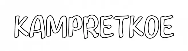
( Fonts by Inermedia Studio )
A playful, hand-drawn font with a bold, cartoonish outline style.
![KAMPRET KOE font caratteri gratis]() Scaricare 564 Downloads@WebFont
Scaricare 564 Downloads@WebFont -
( Fonts by Tokokoo Studio )
A bold, playful font with a cartoonish and whimsical style.
![Kartooni font caratteri gratis]() Scaricare 564 Downloads@WebFont
Scaricare 564 Downloads@WebFont -
( Fonts by Mabhal Studio )
A playful, bold, and rounded font with a hand-drawn, whimsical style.
![Holiday Cheer font caratteri gratis]() Scaricare 564 Downloads@WebFont
Scaricare 564 Downloads@WebFont -
( Copyright (c) 2015 Dan Reynolds. )
A modern sans-serif font with clean lines and excellent readability.
![Biryani Regular font caratteri gratis]() Scaricare 564 Downloads@WebFont
Scaricare 564 Downloads@WebFont


Quali sono i font più popolari adesso?
Poppins, Roboto, Montserrat, Open Sans e Lato sono molto usati per le forme pulite e l'ampia applicabilità — dall'identità di marca alle landing page e ai poster.
Quali font si usano spesso nei loghi?
Le sans serif geometriche (es. Poppins, famiglie in stile Gotham) sono scelte comuni per un branding pulito e scalabile. Per un tocco personale restano valide script e stili manoscritti. Abbina un display deciso per i titoli a un corpo testo neutro per riconoscibilità ed equilibrio.
Ogni quanto si aggiorna la lista?
Con regolarità, in base ai download e all'attività reale. Torna spesso per scoprire in anticipo le nuove preferite.
💡 Consiglio: aggiungi ai preferiti — le tendenze cambiano in fretta e i font top di oggi possono ispirare il rebranding di domani.