Benvenuto nelle Font Più Popolari — dove popolarità e qualità si incontrano. Qui trovi i font più scaricati e usati dell'anno. Se cerchi scelte sicure per logo, web o social, inizia da qui.
Ogni font top si distingue per equilibrio, leggibilità e versatilità. Troverai sans serif moderne, script eleganti, serif vintage e display minimalisti.
-
Caratteri di Qbotype. For commercial use please contact the owner.
( Fonts by www.phuxerdesigns.com.ar - Non-commercial use of any typeface free version, only buying the full version )
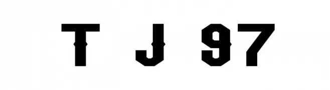
A bold, geometric font with a blocky, futuristic style.
 Scaricare 563 Downloads@WebFont
 -
![Team Jersey 97 font caratteri gratis]() Scaricare 563 Downloads@WebFont
Scaricare 563 Downloads@WebFont -
( Fonts by weknow )
A bold, geometric font with a modern and solid appearance.
![Dark font caratteri gratis]() Scaricare 563 Downloads@WebFont
Scaricare 563 Downloads@WebFont -
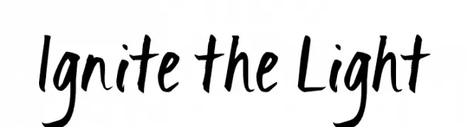
( Fonts by Kimberly Geswein - kimberlygeswein.com )
A bold, brush-style font with dynamic, hand-drawn strokes.
![Ignite the Light font caratteri gratis]() Scaricare 563 Downloads@WebFont
Scaricare 563 Downloads@WebFont -
( Fonts by Castcraft Software - OPTI Fonts Archive - opti.netii.net - Personal-use only. For commercial use please contact owner. )
A classic serif font with rounded edges and moderate contrast, offering elegance and readability.
![OPTIWorcester-RoundSL font caratteri gratis]() Scaricare 563 Downloads@WebFont
Scaricare 563 Downloads@WebFont -
-
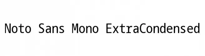
( Noto is a trademark of Google Inc. Noto fonts are open source. All Noto fonts are published under the SIL Open Font License, Version 1.1 )
A clean, monospaced, extra-condensed sans-serif font ideal for technical use.
![Noto Sans Mono ExtraCondensed font caratteri gratis]() Scaricare 563 Downloads@WebFont
Scaricare 563 Downloads@WebFont -
![Stony Island NF Bold font caratteri gratis]() Scaricare 563 Downloads@WebFont
Scaricare 563 Downloads@WebFont -
( Fonts by Albert Kalingga )
A bold, playful font with rounded, thick strokes and a modern, decorative style.
![Badon Mone font caratteri gratis]() Scaricare 563 Downloads@WebFont
Scaricare 563 Downloads@WebFont -
( Fonts by Iconian Fonts )
A bold, playful, and italicized handwritten font with rounded characters.
![Villain Team-Up Rotalic font caratteri gratis]() Scaricare 563 Downloads@WebFont
Scaricare 563 Downloads@WebFont -
![Inter-Bureau Expanded font caratteri gratis]() Scaricare 563 Downloads@WebFont
Scaricare 563 Downloads@WebFont -
( Fonts by Castcraft Software - opti.netii.net - check the website before use )
A bold, decorative font with high contrast and slightly condensed letterforms.
![OPTIChartresGothic-Bold font caratteri gratis]() Scaricare 563 Downloads@WebFont
Scaricare 563 Downloads@WebFont -
![Artskyd Hand font caratteri gratis]() Scaricare 563 Downloads@WebFont
Scaricare 563 Downloads@WebFont -
( Fonts by Darrell Flood )
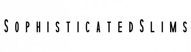
A sleek, modern font with tall, narrow characters and a minimalist style.
![Sophisticated Slims font caratteri gratis]() Scaricare 563 Downloads@WebFont
Scaricare 563 Downloads@WebFont -
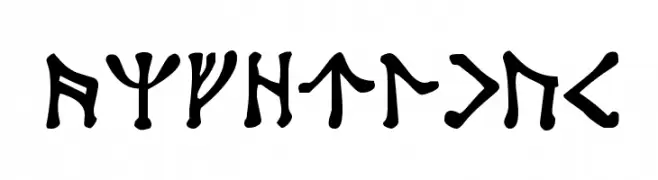
![Angerthas font caratteri gratis]() Scaricare 563 Downloads@WebFont
Scaricare 563 Downloads@WebFont -
( Fonts by a Max Infeld - XEROGRAPHER FONTS - xerographer.blogspot.com . Personal-use only. For commercial use please contact owner. )
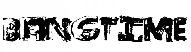
A bold, distressed font with a grunge, hand-painted style.
![BangTime font caratteri gratis]() Scaricare 563 Downloads@WebFont
Scaricare 563 Downloads@WebFont -
( Copyright (c) 2012-2015, The Mozilla Foundation and Telefonica S.A. )
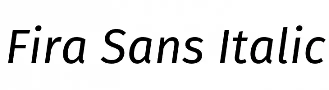
A modern, italic sans-serif font with clean lines and excellent readability.
![Fira Sans Italic font caratteri gratis]() Scaricare 563 Downloads@WebFont
Scaricare 563 Downloads@WebFont -
( Fonts by Latinotype )
A bold, dynamic font with a playful and energetic style.
![Ceviche One font caratteri gratis]() Scaricare 563 Downloads@WebFont
Scaricare 563 Downloads@WebFont -
( Fonts by Don Marciano - Personal-use only. For commercial use please contact owner. )
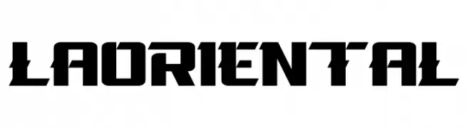
A bold, geometric font with sharp, angular characters.
![La Oriental font caratteri gratis]() Scaricare 563 Downloads@WebFont
Scaricare 563 Downloads@WebFont -
![decanter font caratteri gratis]() Scaricare 563 Downloads@WebFont
Scaricare 563 Downloads@WebFont -
( Fonts by Alit Suarnegara - Alit Design - www.alitdesign.net - Personal-use only. For commercial use please contact owner. )
A playful handwritten font with rounded edges and a casual style.
![Melloner Fun font caratteri gratis]() Scaricare 563 Downloads@WebFont
Scaricare 563 Downloads@WebFont -
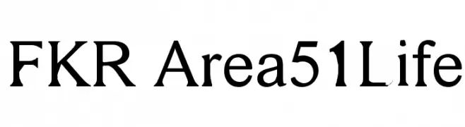
![FKR Area51Life font caratteri gratis]() Scaricare 563 Downloads@WebFont
Scaricare 563 Downloads@WebFont -
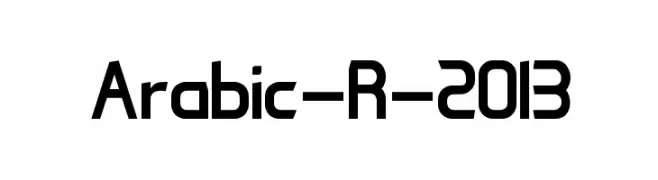
![Arabic-R-2013 font caratteri gratis]() Scaricare 563 Downloads@WebFont
Scaricare 563 Downloads@WebFont -
( Fonts by Audrius Skersys - www.extate.lt )
A modern, geometric font with consistent stroke widths and a minimalist design.
![Sanserifing font caratteri gratis]() Scaricare 562 Downloads@WebFont
Scaricare 562 Downloads@WebFont -
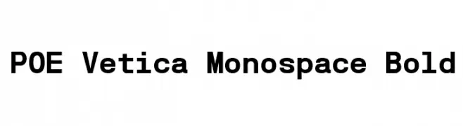
![POE Vetica Monospace Bold font caratteri gratis]() Scaricare 562 Downloads@WebFont
Scaricare 562 Downloads@WebFont -
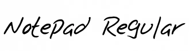
![Notepad Regular font caratteri gratis]() Scaricare 562 Downloads@WebFont
Scaricare 562 Downloads@WebFont -
( Fonts by Daniel Zadorozny - www.iconian.com )
A futuristic, geometric font with sharp, angular letterforms.
![911 Porscha Laser font caratteri gratis]() Scaricare 562 Downloads@WebFont
Scaricare 562 Downloads@WebFont -
![StreetGathering font caratteri gratis]() Scaricare 562 Downloads@WebFont
Scaricare 562 Downloads@WebFont -
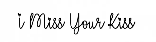
![I Miss Your Kiss font caratteri gratis]() Scaricare 562 Downloads@WebFont
Scaricare 562 Downloads@WebFont -
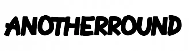
( Fonts by Woodcutter )
A bold, playful font with rounded, hand-drawn characters.
![Another Round font caratteri gratis]() Scaricare 562 Downloads@WebFont
Scaricare 562 Downloads@WebFont -
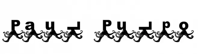
![Paul Pulpo font caratteri gratis]() Scaricare 562 Downloads@WebFont
Scaricare 562 Downloads@WebFont -
( Fonts by Daniel Gauthier )
A playful, hand-drawn font with overlapping lines and a whimsical style.
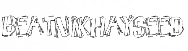
![BeatnikHayseed font caratteri gratis]() Scaricare 562 Downloads@WebFont
Scaricare 562 Downloads@WebFont -
( Fonts by orchstrdsgn - Personal-use only. For commercial use please contact owner. )
A modern sans-serif font with geometric shapes and uniform stroke width.
![Gloryn font caratteri gratis]() Scaricare 562 Downloads@WebFont
Scaricare 562 Downloads@WebFont -
![Kyiss M'ass font caratteri gratis]() Scaricare 562 Downloads@WebFont
Scaricare 562 Downloads@WebFont -
( Fonts by Kong Font )
A playful, bold, and hand-drawn style font with rounded strokes.
![Starco font caratteri gratis]() Scaricare 562 Downloads@WebFont
Scaricare 562 Downloads@WebFont -
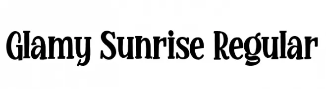
( Fonts by Bangkit Tri Setiadi )
A bold, playful, and decorative font with a whimsical touch.
![Glamy Sunrise Regular font caratteri gratis]() Scaricare 562 Downloads@WebFont
Scaricare 562 Downloads@WebFont


Quali sono i font più popolari adesso?
Poppins, Roboto, Montserrat, Open Sans e Lato sono molto usati per le forme pulite e l'ampia applicabilità — dall'identità di marca alle landing page e ai poster.
Quali font si usano spesso nei loghi?
Le sans serif geometriche (es. Poppins, famiglie in stile Gotham) sono scelte comuni per un branding pulito e scalabile. Per un tocco personale restano valide script e stili manoscritti. Abbina un display deciso per i titoli a un corpo testo neutro per riconoscibilità ed equilibrio.
Ogni quanto si aggiorna la lista?
Con regolarità, in base ai download e all'attività reale. Torna spesso per scoprire in anticipo le nuove preferite.
💡 Consiglio: aggiungi ai preferiti — le tendenze cambiano in fretta e i font top di oggi possono ispirare il rebranding di domani.