Benvenuto nelle Font Più Popolari — dove popolarità e qualità si incontrano. Qui trovi i font più scaricati e usati dell'anno. Se cerchi scelte sicure per logo, web o social, inizia da qui.
Ogni font top si distingue per equilibrio, leggibilità e versatilità. Troverai sans serif moderne, script eleganti, serif vintage e display minimalisti.
-
 Scaricare 116 Downloads@WebFont
 -
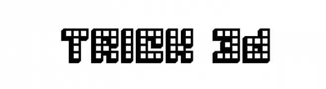
![Trick 3D font caratteri gratis]() Scaricare 116 Downloads@WebFont
Scaricare 116 Downloads@WebFont -
( Fonts by Manfred Klein. Free for private and charity use. Free for commercial with donation to organizations )
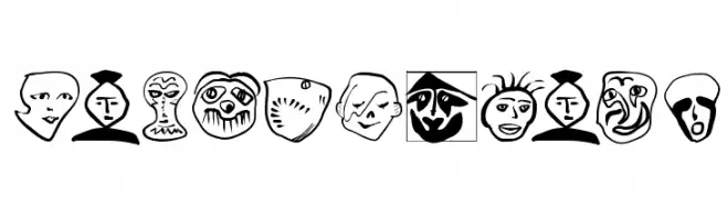
Expressive, hand-drawn font made of illustrated faces and abstract characters.
![Wacomedians font caratteri gratis]() Scaricare 116 Downloads@WebFont
Scaricare 116 Downloads@WebFont -
( Fonts by StringLabs Creative Studio )
Elegant cursive script font.
![Tindak Fundi font caratteri gratis]() Scaricare 116 Downloads@WebFont
Scaricare 116 Downloads@WebFont -
( Fonts by Chequered Ink )
A bold, strong font ideal for impactful headlines and designs.
![Stroud font caratteri gratis]() Scaricare 116 Downloads@WebFont
Scaricare 116 Downloads@WebFont -
-
( Fonts by Iconian Fonts )
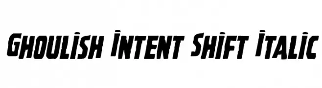
A bold, italicized font with a dynamic slant and sharp angles.
![Ghoulish Intent Shift Italic font caratteri gratis]() Scaricare 116 Downloads@WebFont
Scaricare 116 Downloads@WebFont -
( Fonts by fortunes co - Ramandhani Nugraha - Personal-use only. For commercial use please contact owner. )
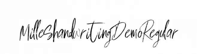
A dynamic, expressive handwritten font with a modern, artistic flair.
![Milles handwriting Demo Regular font caratteri gratis]() Scaricare 116 Downloads@WebFont
Scaricare 116 Downloads@WebFont -
( Fonts by Manfred Klein. Free for private and charity use. Free for commercial with donation to organizations )
A playful, abstract, and illustrative decorative font with quirky, hand-drawn characters.
![MyMaestroMrMiro font caratteri gratis]() Scaricare 116 Downloads@WebFont
Scaricare 116 Downloads@WebFont -
( licensed via a Creative Commons agreement http://www.skulladay.com )
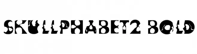
A bold, decorative font with skull motifs, ideal for edgy designs.
![Skullphabet2 Bold font caratteri gratis]() Scaricare 116 Downloads@WebFont
Scaricare 116 Downloads@WebFont -
( Fonts by Peter Wiegel - www.peter-wiegel.de - Personal-use only. For commercial use please contact owner. )
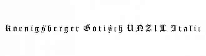
A traditional Blackletter font with intricate detailing and gothic elegance.
![Koenigsberger Gotisch UNZ1L Italic font caratteri gratis]() Scaricare 116 Downloads@WebFont
Scaricare 116 Downloads@WebFont


Quali sono i font più popolari adesso?
Poppins, Roboto, Montserrat, Open Sans e Lato sono molto usati per le forme pulite e l'ampia applicabilità — dall'identità di marca alle landing page e ai poster.
Quali font si usano spesso nei loghi?
Le sans serif geometriche (es. Poppins, famiglie in stile Gotham) sono scelte comuni per un branding pulito e scalabile. Per un tocco personale restano valide script e stili manoscritti. Abbina un display deciso per i titoli a un corpo testo neutro per riconoscibilità ed equilibrio.
Ogni quanto si aggiorna la lista?
Con regolarità, in base ai download e all'attività reale. Torna spesso per scoprire in anticipo le nuove preferite.
💡 Consiglio: aggiungi ai preferiti — le tendenze cambiano in fretta e i font top di oggi possono ispirare il rebranding di domani.