Benvenuto nelle Font Più Popolari — dove popolarità e qualità si incontrano. Qui trovi i font più scaricati e usati dell'anno. Se cerchi scelte sicure per logo, web o social, inizia da qui.
Ogni font top si distingue per equilibrio, leggibilità e versatilità. Troverai sans serif moderne, script eleganti, serif vintage e display minimalisti.
-
( Fonts by Scratchones )
Casual handwritten script font.
 Scaricare 116 Downloads@WebFont
 -
( Fonts by Manfred Klein. Free for private and charity use. Free for commercial with donation to organizations )
A grid-based, geometric font with a modern, technical aesthetic.
![SketchiquaC font caratteri gratis]() Scaricare 116 Downloads@WebFont
Scaricare 116 Downloads@WebFont -
( Fonts by Daniel Zadorozny - www.iconian.com - Free for personal use )
![US Navy 3D font caratteri gratis]() Scaricare 116 Downloads@WebFont
Scaricare 116 Downloads@WebFont -
( Fonts by a Max Infeld - XEROGRAPHER FONTS - xerographer.blogspot.com . Personal-use only. For commercial use please contact owner. )
A tall, slender serif font with elegant, elongated characters.
![skinnyserif font caratteri gratis]() Scaricare 116 Downloads@WebFont
Scaricare 116 Downloads@WebFont -
( Fonts by Daniel Zadorozny - www.iconian.com )
A bold, geometric font with a futuristic and condensed style.
![Extechchop Condensed font caratteri gratis]() Scaricare 116 Downloads@WebFont
Scaricare 116 Downloads@WebFont -
-
( Fonts by alphArtype )
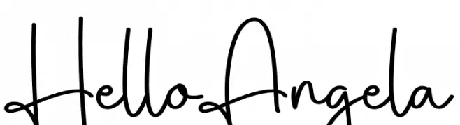
A modern, elegant handwritten font with fluid, connected strokes.
![Relettered font caratteri gratis]() Scaricare 116 Downloads@WebFont
Scaricare 116 Downloads@WebFont -
( Fonts by Iconian Fonts )
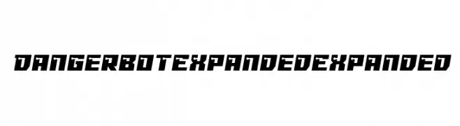
A bold, futuristic font with sharp angles and a mechanical aesthetic.
![Dangerbot Expanded Expanded font caratteri gratis]() Scaricare 116 Downloads@WebFont
Scaricare 116 Downloads@WebFont -
( Fonts by Geronimo Fonts - Personal-use only. For commercial use please contact owner. )
A bold, geometric font with angular shapes and a modern industrial aesthetic.
![Lines Regular font caratteri gratis]() Scaricare 116 Downloads@WebFont
Scaricare 116 Downloads@WebFont -
( Ryan Williamson )
A modern, geometric font with a clean, monospaced appearance.
![Quota Regular Ext. font caratteri gratis]() Scaricare 116 Downloads@WebFont
Scaricare 116 Downloads@WebFont -
![Basix-Medium font caratteri gratis]() Scaricare 116 Downloads@WebFont
Scaricare 116 Downloads@WebFont


Quali sono i font più popolari adesso?
Poppins, Roboto, Montserrat, Open Sans e Lato sono molto usati per le forme pulite e l'ampia applicabilità — dall'identità di marca alle landing page e ai poster.
Quali font si usano spesso nei loghi?
Le sans serif geometriche (es. Poppins, famiglie in stile Gotham) sono scelte comuni per un branding pulito e scalabile. Per un tocco personale restano valide script e stili manoscritti. Abbina un display deciso per i titoli a un corpo testo neutro per riconoscibilità ed equilibrio.
Ogni quanto si aggiorna la lista?
Con regolarità, in base ai download e all'attività reale. Torna spesso per scoprire in anticipo le nuove preferite.
💡 Consiglio: aggiungi ai preferiti — le tendenze cambiano in fretta e i font top di oggi possono ispirare il rebranding di domani.