Benvenuto nelle Font Più Popolari — dove popolarità e qualità si incontrano. Qui trovi i font più scaricati e usati dell'anno. Se cerchi scelte sicure per logo, web o social, inizia da qui.
Ogni font top si distingue per equilibrio, leggibilità e versatilità. Troverai sans serif moderne, script eleganti, serif vintage e display minimalisti.
-
( Fonts by MadeType - Personal-use only. For commercial use please contact owner. )
A bold, futuristic font with geometric and dynamic design elements.
 Scaricare 113 Downloads@WebFont
 -
( Fonts by Chank Co. - www.chank.com )
A bold, futuristic font with sharp angles and a sleek, dynamic design.
![LemonadeSpeedster font caratteri gratis]() Scaricare 113 Downloads@WebFont
Scaricare 113 Downloads@WebFont -
( Fonts by Toko Laris Djaja )
A playful serif font with a hand-drawn, whimsical style.
![Raccoon Serif Demo font caratteri gratis]() Scaricare 113 Downloads@WebFont
Scaricare 113 Downloads@WebFont -
( Fonts by Dhan Studio - Maulizari - Personal-use only. For commercial use please contact owner. )
A dynamic, hand-drawn script font with energetic strokes and a lively appearance.
![DexotickByDhanStudio font caratteri gratis]() Scaricare 113 Downloads@WebFont
Scaricare 113 Downloads@WebFont -
( Fonts by www.woodcutter.es - woodcutter Manero - Personal-use only. For commercial use please contact owner. )
A bold, brush-style font with dynamic, hand-drawn strokes.
![Gutierrez+ font caratteri gratis]() Scaricare 113 Downloads@WebFont
Scaricare 113 Downloads@WebFont -
-
( Fonts by earl ciel )
A bold, geometric font with a modern, futuristic style.
![stay in square Regular font caratteri gratis]() Scaricare 113 Downloads@WebFont
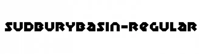
Scaricare 113 Downloads@WebFont -
![SudburyBasin-Regular font caratteri gratis]() Scaricare 113 Downloads@WebFont
Scaricare 113 Downloads@WebFont -
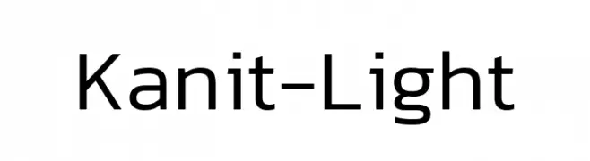
( Fonts by Cadson Demak )
A modern, geometric sans-serif font with balanced spacing and clear readability.
![Kanit-Light font caratteri gratis]() Scaricare 113 Downloads@WebFont
Scaricare 113 Downloads@WebFont -
( Fonts by Kimberly Geswein )
A bold, impactful font with clean lines and consistent stroke width.
![KG Someone You Loved Shadow font caratteri gratis]() Scaricare 113 Downloads@WebFont
Scaricare 113 Downloads@WebFont -
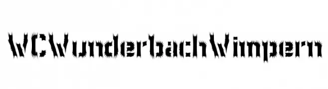
( Fonts by Christophe Feray - www.wcfonts.com )
A bold, jagged, and decorative font with a dynamic and edgy style.
![WCWunderbachWimpern font caratteri gratis]() Scaricare 113 Downloads@WebFont
Scaricare 113 Downloads@WebFont


Quali sono i font più popolari adesso?
Poppins, Roboto, Montserrat, Open Sans e Lato sono molto usati per le forme pulite e l'ampia applicabilità — dall'identità di marca alle landing page e ai poster.
Quali font si usano spesso nei loghi?
Le sans serif geometriche (es. Poppins, famiglie in stile Gotham) sono scelte comuni per un branding pulito e scalabile. Per un tocco personale restano valide script e stili manoscritti. Abbina un display deciso per i titoli a un corpo testo neutro per riconoscibilità ed equilibrio.
Ogni quanto si aggiorna la lista?
Con regolarità, in base ai download e all'attività reale. Torna spesso per scoprire in anticipo le nuove preferite.
💡 Consiglio: aggiungi ai preferiti — le tendenze cambiano in fretta e i font top di oggi possono ispirare il rebranding di domani.