Benvenuto nelle Font Più Popolari — dove popolarità e qualità si incontrano. Qui trovi i font più scaricati e usati dell'anno. Se cerchi scelte sicure per logo, web o social, inizia da qui.
Ogni font top si distingue per equilibrio, leggibilità e versatilità. Troverai sans serif moderne, script eleganti, serif vintage e display minimalisti.
-
( Iconian Fonts - Daniel Zadorozny - www.iconian.com )
A bold, geometric font with a futuristic and industrial style.
 Scaricare 113 Downloads@WebFont
 -
![RDJ-Hand Pixel font caratteri gratis]() Scaricare 113 Downloads@WebFont
Scaricare 113 Downloads@WebFont -
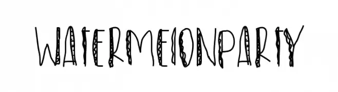
![WatermelonParty font caratteri gratis]() Scaricare 113 Downloads@WebFont
Scaricare 113 Downloads@WebFont -
( Fonts by www.graphicartsunit.com - Personal-use only. For commercial use please contact owner. )
Bold, rounded font with a playful and modern style.
![GauFontShirousagi font caratteri gratis]() Scaricare 113 Downloads@WebFont
Scaricare 113 Downloads@WebFont -
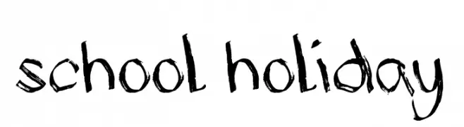
![School Holiday font caratteri gratis]() Scaricare 113 Downloads@WebFont
Scaricare 113 Downloads@WebFont -
-
( Fonts by Thomas Ledin - tomledin.com )
A playful, hand-drawn font with bold, irregular strokes and a casual style.
![Janky font caratteri gratis]() Scaricare 113 Downloads@WebFont
Scaricare 113 Downloads@WebFont -
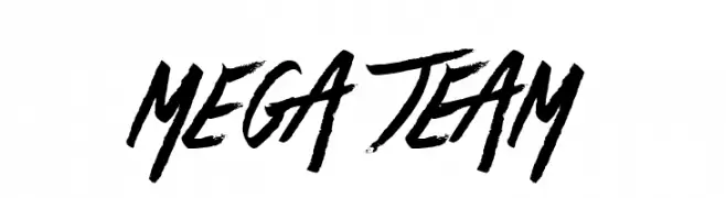
( Fonts by Jonathan S. Harris - www.tattoowoo.com. Personal-use only. For commercial use please contact owner. )
A bold, dynamic brush script with expressive, fluid strokes and a handmade feel.
![Mega Team font caratteri gratis]() Scaricare 113 Downloads@WebFont
Scaricare 113 Downloads@WebFont -
( Fonts by Billy Argel Fonts - www.billyargel.com - Personal-use only. For commercial use please contact owner. )
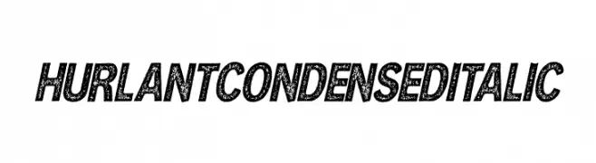
A bold, condensed italic font with a textured, vintage look.
![HURLANT CONDENSED ITALIC font caratteri gratis]() Scaricare 113 Downloads@WebFont
Scaricare 113 Downloads@WebFont -
( Fonts by Manfred Klein. Free for private and charity use. Free for commercial with donation to organizations )
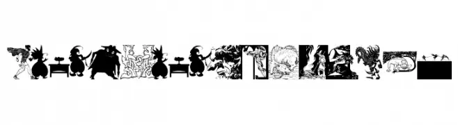
A decorative font featuring detailed fantasy-themed illustrations.
![FantasyPixTwo font caratteri gratis]() Scaricare 113 Downloads@WebFont
Scaricare 113 Downloads@WebFont -
( Fonts by David Espinosa [Type Sailor] - www.facebook.com/typesailor - Personal-use only. For commercial use please contact owner. )
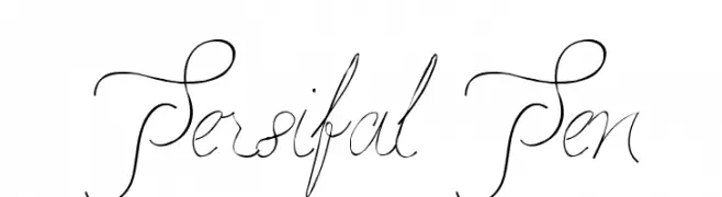
An elegant, flowing script font with ornate swashes and high contrast.
![Persifal Pen font caratteri gratis]() Scaricare 113 Downloads@WebFont
Scaricare 113 Downloads@WebFont


Quali sono i font più popolari adesso?
Poppins, Roboto, Montserrat, Open Sans e Lato sono molto usati per le forme pulite e l'ampia applicabilità — dall'identità di marca alle landing page e ai poster.
Quali font si usano spesso nei loghi?
Le sans serif geometriche (es. Poppins, famiglie in stile Gotham) sono scelte comuni per un branding pulito e scalabile. Per un tocco personale restano valide script e stili manoscritti. Abbina un display deciso per i titoli a un corpo testo neutro per riconoscibilità ed equilibrio.
Ogni quanto si aggiorna la lista?
Con regolarità, in base ai download e all'attività reale. Torna spesso per scoprire in anticipo le nuove preferite.
💡 Consiglio: aggiungi ai preferiti — le tendenze cambiano in fretta e i font top di oggi possono ispirare il rebranding di domani.