Benvenuto nelle Font Più Popolari — dove popolarità e qualità si incontrano. Qui trovi i font più scaricati e usati dell'anno. Se cerchi scelte sicure per logo, web o social, inizia da qui.
Ogni font top si distingue per equilibrio, leggibilità e versatilità. Troverai sans serif moderne, script eleganti, serif vintage e display minimalisti.
-
 Scaricare 111 Downloads@WebFont
 -
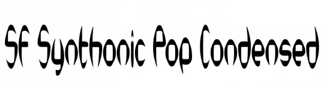
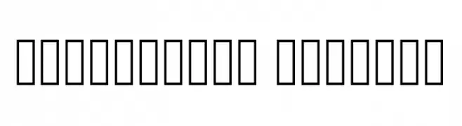
![SF Synthonic Pop Condensed font caratteri gratis]() Scaricare 111 Downloads@WebFont
Scaricare 111 Downloads@WebFont -
( Fonts by Don Marciano - Personal-use only. For commercial use please contact owner. )
A playful, bold, handwritten font with a comic-like style.
![Comico font caratteri gratis]() Scaricare 111 Downloads@WebFont
Scaricare 111 Downloads@WebFont -
( Fonts by Manfred Klein. Free for private and charity use. Free for commercial with donation to organizations )
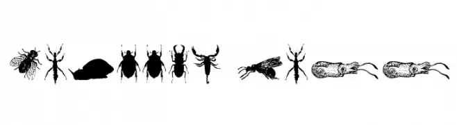
Abstract, human-like silhouettes form each character in a non-traditional, illustrative style.
![HumanDeformations font caratteri gratis]() Scaricare 111 Downloads@WebFont
Scaricare 111 Downloads@WebFont -
( Hanoded - David Kerkhoff - www.hanodedfonts.com )
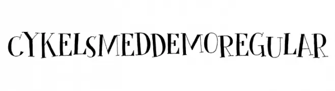
A playful, hand-drawn font with whimsical characters and unique symbols.
![Cykelsmed DEMO Regular font caratteri gratis]() Scaricare 111 Downloads@WebFont
Scaricare 111 Downloads@WebFont -
-
( Fonts by Amos Jerbi - ajerbi.com - Personal-use only. For commercial use please contact owner. )
A narrow, whimsical font with thin strokes and a playful style.
![PtilNarrow Regular font caratteri gratis]() Scaricare 111 Downloads@WebFont
Scaricare 111 Downloads@WebFont -
( Fonts by Daniel Zadorozny - www.iconian.com - Free for personal use )
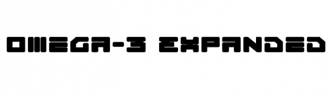
A bold, geometric font with a futuristic and expanded style.
![Omega-3 Expanded font caratteri gratis]() Scaricare 111 Downloads@WebFont
Scaricare 111 Downloads@WebFont -
( Fonts by Chequered Ink )
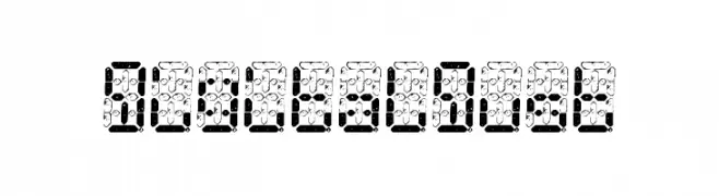
A digital-style font with segmented, pixelated characters ideal for tech-themed designs.
![Digital Dust font caratteri gratis]() Scaricare 111 Downloads@WebFont
Scaricare 111 Downloads@WebFont -
Caratteri di satrianovian20. For commercial use please contact the owner.
( elemental acts )
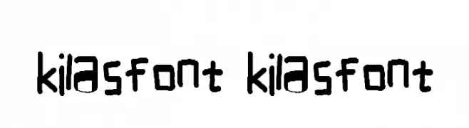
A playful, handwritten font with a casual and informal style.
![kilasfont kilasfont font caratteri gratis]() Scaricare 111 Downloads@WebFont
Scaricare 111 Downloads@WebFont -
( Chequered Ink - chequered.ink/ )
A bold, geometric font with a modern and futuristic style.
![The Citadels font caratteri gratis]() Scaricare 111 Downloads@WebFont
Scaricare 111 Downloads@WebFont

Quali sono i font più popolari adesso?
Poppins, Roboto, Montserrat, Open Sans e Lato sono molto usati per le forme pulite e l'ampia applicabilità — dall'identità di marca alle landing page e ai poster.
Quali font si usano spesso nei loghi?
Le sans serif geometriche (es. Poppins, famiglie in stile Gotham) sono scelte comuni per un branding pulito e scalabile. Per un tocco personale restano valide script e stili manoscritti. Abbina un display deciso per i titoli a un corpo testo neutro per riconoscibilità ed equilibrio.
Ogni quanto si aggiorna la lista?
Con regolarità, in base ai download e all'attività reale. Torna spesso per scoprire in anticipo le nuove preferite.
💡 Consiglio: aggiungi ai preferiti — le tendenze cambiano in fretta e i font top di oggi possono ispirare il rebranding di domani.