Benvenuto nelle Font Più Popolari — dove popolarità e qualità si incontrano. Qui trovi i font più scaricati e usati dell'anno. Se cerchi scelte sicure per logo, web o social, inizia da qui.
Ogni font top si distingue per equilibrio, leggibilità e versatilità. Troverai sans serif moderne, script eleganti, serif vintage e display minimalisti.
-
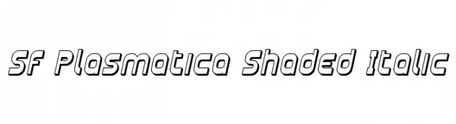 Scaricare 111 Downloads@WebFont
 -
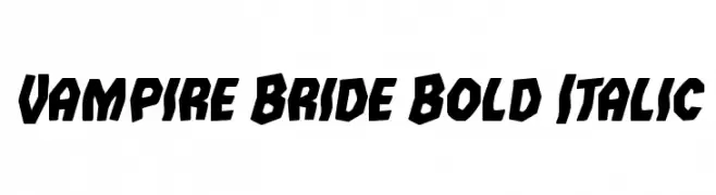
( Fonts by Iconian Fonts )
A bold, italicized font with sharp angles and an edgy appearance.
![Vampire Bride Bold Italic font caratteri gratis]() Scaricare 111 Downloads@WebFont
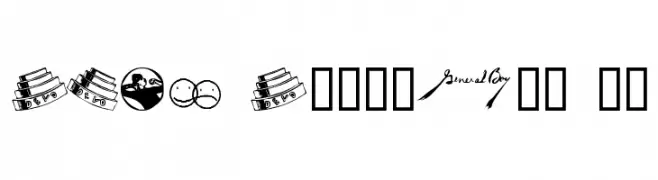
Scaricare 111 Downloads@WebFont -
![DEVO Dingbats 10 font caratteri gratis]() Scaricare 111 Downloads@WebFont
Scaricare 111 Downloads@WebFont -
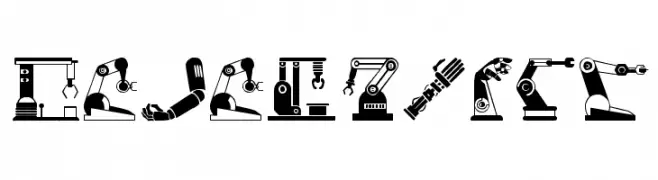
( Woodcutter - woodcutter Manero - www.woodcutter.es )
A display font made from stylized robotic arm illustrations.
![Robotic Arm font caratteri gratis]() Scaricare 111 Downloads@WebFont
Scaricare 111 Downloads@WebFont -
( Fonts by Haslinda Adnan - Personal-use only. For commercial use please contact owner. )
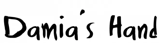
A playful, informal handwritten font with uneven strokes.
![Damia's Hand font caratteri gratis]() Scaricare 111 Downloads@WebFont
Scaricare 111 Downloads@WebFont -
-
( Fonts by Billy Argel )
A pixelated, retro-style font inspired by early digital displays.
![Blue Screen Regular font caratteri gratis]() Scaricare 111 Downloads@WebFont
Scaricare 111 Downloads@WebFont -
( Fonts by Lekearls )
A playful, handwritten-style font with a casual and friendly appearance.
![Kindergarten Regular font caratteri gratis]() Scaricare 111 Downloads@WebFont
Scaricare 111 Downloads@WebFont -
Caratteri di danny91194. For commercial use please contact the owner.
( Byieshination )
A decorative and abstract font with bold, sweeping curves and intricate details.
![ResallFont font caratteri gratis]() Scaricare 111 Downloads@WebFont
Scaricare 111 Downloads@WebFont -
( Fonts by Outline Studio )
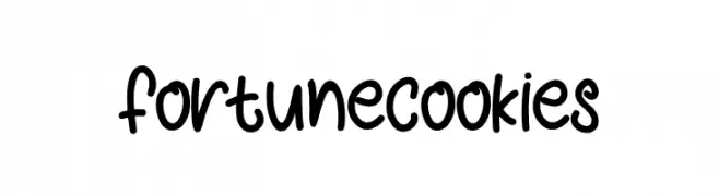
A playful, handwritten-style font with a smooth, flowing appearance.
![fortune cookies font caratteri gratis]() Scaricare 111 Downloads@WebFont
Scaricare 111 Downloads@WebFont -
( Fonts by Wino S Kadir - weknow - www.revolge.com/shop/weknow/ - Personal-use only. For commercial use please contact owner. )
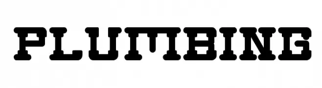
A bold, geometric font with an industrial, stencil-like appearance.
![Plumbing font caratteri gratis]() Scaricare 111 Downloads@WebFont
Scaricare 111 Downloads@WebFont


Quali sono i font più popolari adesso?
Poppins, Roboto, Montserrat, Open Sans e Lato sono molto usati per le forme pulite e l'ampia applicabilità — dall'identità di marca alle landing page e ai poster.
Quali font si usano spesso nei loghi?
Le sans serif geometriche (es. Poppins, famiglie in stile Gotham) sono scelte comuni per un branding pulito e scalabile. Per un tocco personale restano valide script e stili manoscritti. Abbina un display deciso per i titoli a un corpo testo neutro per riconoscibilità ed equilibrio.
Ogni quanto si aggiorna la lista?
Con regolarità, in base ai download e all'attività reale. Torna spesso per scoprire in anticipo le nuove preferite.
💡 Consiglio: aggiungi ai preferiti — le tendenze cambiano in fretta e i font top di oggi possono ispirare il rebranding di domani.