Benvenuto nelle Font Più Popolari — dove popolarità e qualità si incontrano. Qui trovi i font più scaricati e usati dell'anno. Se cerchi scelte sicure per logo, web o social, inizia da qui.
Ogni font top si distingue per equilibrio, leggibilità e versatilità. Troverai sans serif moderne, script eleganti, serif vintage e display minimalisti.
-
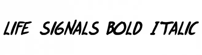
( Fonts by Press Gang Studios - Personal-use only. For commercial use please contact owner. )
A bold, italic handwritten font with dynamic and fluid strokes.
 Scaricare 110 Downloads@WebFont
 -
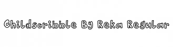
( Fonts by Reka )
A playful, hand-drawn font with a whimsical, childlike style.
![Childscribble By Reka Regular font caratteri gratis]() Scaricare 110 Downloads@WebFont
Scaricare 110 Downloads@WebFont -
![TeddyBears2 font caratteri gratis]() Scaricare 110 Downloads@WebFont
Scaricare 110 Downloads@WebFont -
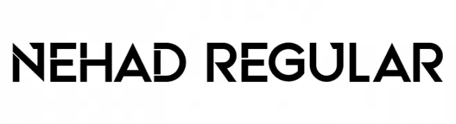
( Fonts by Vladimir Nikolic - www.creativefabrica.com/designer/vladimirnikolic/ - Personal-use only. For commercial use please contact owner. )
A bold, geometric sans-serif font with a modern and clean aesthetic.
![Nehad Regular font caratteri gratis]() Scaricare 110 Downloads@WebFont
Scaricare 110 Downloads@WebFont -
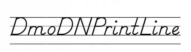
( Demo font. To purchase the full version, you can order it online at www.schoolhousefonts.com )
Elegant cursive font with a classic, handwritten style.
![DmoDNPrintLine font caratteri gratis]() Scaricare 110 Downloads@WebFont
Scaricare 110 Downloads@WebFont -
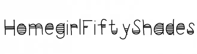
-
![HomegirlFiftyShades font caratteri gratis]() Scaricare 110 Downloads@WebFont
Scaricare 110 Downloads@WebFont -
( Fonts by Peter Wiegel - www.peter-wiegel.de )
A decorative and abstract font with intricate loops and curves, ideal for artistic projects.
![Numukki font caratteri gratis]() Scaricare 110 Downloads@WebFont
Scaricare 110 Downloads@WebFont -
( Fonts by Xerographer Fonts )
A bold, textured font with a distressed, hand-painted appearance.
![Zipties font caratteri gratis]() Scaricare 110 Downloads@WebFont
Scaricare 110 Downloads@WebFont -
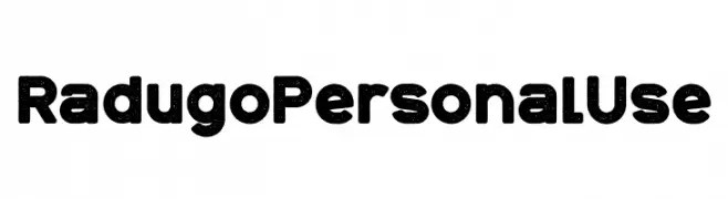
( Fonts by twinletter - Rozikan - Personal-use only. For commercial use please contact owner. )
A bold, rounded font with a distressed, vintage texture.
![Radugo Personal Use font caratteri gratis]() Scaricare 110 Downloads@WebFont
Scaricare 110 Downloads@WebFont -
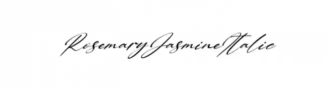
( Fonts by Kong Font - Personal-use only. For commercial use please contact owner. )
A graceful, italic script font with flowing, connected characters.
![Rosemary Jasmine Italic font caratteri gratis]() Scaricare 110 Downloads@WebFont
Scaricare 110 Downloads@WebFont


Quali sono i font più popolari adesso?
Poppins, Roboto, Montserrat, Open Sans e Lato sono molto usati per le forme pulite e l'ampia applicabilità — dall'identità di marca alle landing page e ai poster.
Quali font si usano spesso nei loghi?
Le sans serif geometriche (es. Poppins, famiglie in stile Gotham) sono scelte comuni per un branding pulito e scalabile. Per un tocco personale restano valide script e stili manoscritti. Abbina un display deciso per i titoli a un corpo testo neutro per riconoscibilità ed equilibrio.
Ogni quanto si aggiorna la lista?
Con regolarità, in base ai download e all'attività reale. Torna spesso per scoprire in anticipo le nuove preferite.
💡 Consiglio: aggiungi ai preferiti — le tendenze cambiano in fretta e i font top di oggi possono ispirare il rebranding di domani.