Benvenuto nelle Font Più Popolari — dove popolarità e qualità si incontrano. Qui trovi i font più scaricati e usati dell'anno. Se cerchi scelte sicure per logo, web o social, inizia da qui.
Ogni font top si distingue per equilibrio, leggibilità e versatilità. Troverai sans serif moderne, script eleganti, serif vintage e display minimalisti.
-
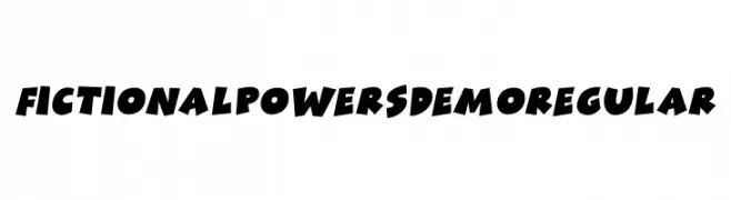
( Fonts by Pizzadude )
A bold and dynamic font with a playful, energetic style.
 Scaricare 110 Downloads@WebFont
 -
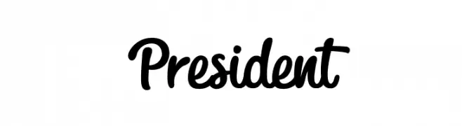
( Fonts by Octotype - Personal-use only. For commercial use please contact owner. )
A bold, flowing script font with a handwritten, artistic style.
![President font caratteri gratis]() Scaricare 110 Downloads@WebFont
Scaricare 110 Downloads@WebFont -
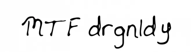
( Fonts by Miss Tiina at www.misstiina.com (please check the website before use) )
A playful, handwritten font with fluid and organic letterforms.
![MTF drgnldy font caratteri gratis]() Scaricare 110 Downloads@WebFont
Scaricare 110 Downloads@WebFont -
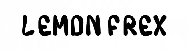
( Fonts by Ambara Studio )
A playful, bold font with rounded, hand-drawn characters.
![LEMON FREX font caratteri gratis]() Scaricare 110 Downloads@WebFont
Scaricare 110 Downloads@WebFont -
( Fonts by Manfred Klein. Free for private and charity use. Free for commercial with donation to organizations )
A bold, abstract font with dynamic, splatter-like characters.
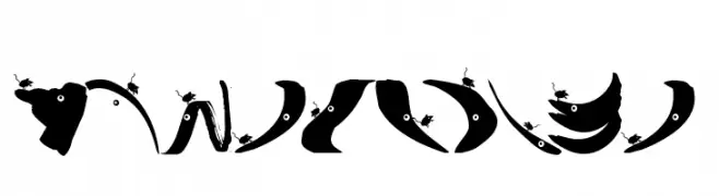
![MouseTraps font caratteri gratis]() Scaricare 110 Downloads@WebFont
Scaricare 110 Downloads@WebFont -
-
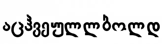
![Achveullbold font caratteri gratis]() Scaricare 110 Downloads@WebFont
Scaricare 110 Downloads@WebFont -
( Dan Marian Sabanovici )
An elegant, narrow font with elongated letterforms and a modern touch.
![EDITORS font caratteri gratis]() Scaricare 110 Downloads@WebFont
Scaricare 110 Downloads@WebFont -
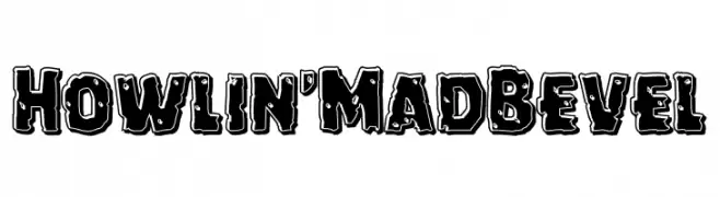
![Howlin' Mad Bevel font caratteri gratis]() Scaricare 110 Downloads@WebFont
Scaricare 110 Downloads@WebFont -
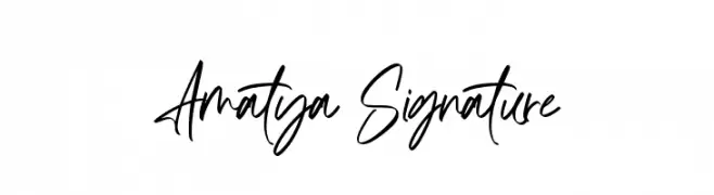
( Fonts by AminMario - Amin Mario - Personal-use only. For commercial use please contact owner. )
A modern, elegant handwritten font with fluid, dynamic strokes.
![Amatya Signature font caratteri gratis]() Scaricare 110 Downloads@WebFont
Scaricare 110 Downloads@WebFont -
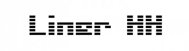
( BRIDGEco - bridgeco.jp/ )
A digital-inspired font with horizontal line construction, offering a futuristic and tech-savvy look.
![Liner HH font caratteri gratis]() Scaricare 110 Downloads@WebFont
Scaricare 110 Downloads@WebFont

Quali sono i font più popolari adesso?
Poppins, Roboto, Montserrat, Open Sans e Lato sono molto usati per le forme pulite e l'ampia applicabilità — dall'identità di marca alle landing page e ai poster.
Quali font si usano spesso nei loghi?
Le sans serif geometriche (es. Poppins, famiglie in stile Gotham) sono scelte comuni per un branding pulito e scalabile. Per un tocco personale restano valide script e stili manoscritti. Abbina un display deciso per i titoli a un corpo testo neutro per riconoscibilità ed equilibrio.
Ogni quanto si aggiorna la lista?
Con regolarità, in base ai download e all'attività reale. Torna spesso per scoprire in anticipo le nuove preferite.
💡 Consiglio: aggiungi ai preferiti — le tendenze cambiano in fretta e i font top di oggi possono ispirare il rebranding di domani.