Benvenuto nelle Font Più Popolari — dove popolarità e qualità si incontrano. Qui trovi i font più scaricati e usati dell'anno. Se cerchi scelte sicure per logo, web o social, inizia da qui.
Ogni font top si distingue per equilibrio, leggibilità e versatilità. Troverai sans serif moderne, script eleganti, serif vintage e display minimalisti.
-
 Scaricare 528 Downloads@WebFont
 -
( Fonts by Tiffany Major - Gate & Lock Co )
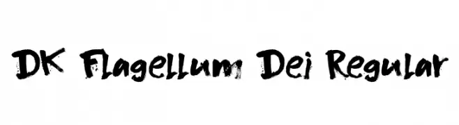
An ornate blackletter font with intricate details and a gothic style.
![metalover font caratteri gratis]() Scaricare 528 Downloads@WebFont
Scaricare 528 Downloads@WebFont -
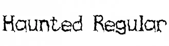
![Haunted Regular font caratteri gratis]() Scaricare 528 Downloads@WebFont
Scaricare 528 Downloads@WebFont -
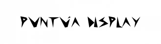
![puntúa display font caratteri gratis]() Scaricare 528 Downloads@WebFont
Scaricare 528 Downloads@WebFont -
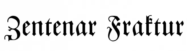
( Fonts by Dieter Steffmann )
A traditional Blackletter font with intricate and ornate strokes, ideal for historical themes.
![Zentenar Fraktur font caratteri gratis]() Scaricare 528 Downloads@WebFont
Scaricare 528 Downloads@WebFont -
-
( Fonts by Pi Luo Chiu - thisisallenchiu.tumblr.com )
A clean, geometric font with rounded edges and consistent line weight.
![Gordon Heights font caratteri gratis]() Scaricare 528 Downloads@WebFont
Scaricare 528 Downloads@WebFont -
![GraphicPixel font caratteri gratis]() Scaricare 528 Downloads@WebFont
Scaricare 528 Downloads@WebFont -
![Rune font caratteri gratis]() Scaricare 528 Downloads@WebFont
Scaricare 528 Downloads@WebFont -
( Fonts by allsuperfont.com - Personal-use only. For commercial use please contact owner. )
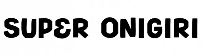
A bold, playful font with rounded edges and a hand-drawn feel.
![Super Onigiri font caratteri gratis]() Scaricare 528 Downloads@WebFont
Scaricare 528 Downloads@WebFont -
( Fonts by Khurasan )
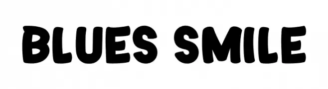
A bold, rounded font with a playful and friendly style.
![Blues Smile font caratteri gratis]() Scaricare 528 Downloads@WebFont
Scaricare 528 Downloads@WebFont -
( Fonts by Nick Curtis - www.nicksfonts.com )
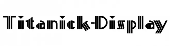
A bold, geometric font with strong vertical lines and sharp angles.
![Titanick-Display font caratteri gratis]() Scaricare 528 Downloads
Scaricare 528 Downloads -
( Fonts by Letterena Studios )
A playful, bold font with thick, rounded strokes and a friendly appearance.
![Happy Food font caratteri gratis]() Scaricare 528 Downloads@WebFont
Scaricare 528 Downloads@WebFont -
( Fonts by Daniel Zadorozny - www.iconian.com - Free for personal use )
A bold, futuristic font with geometric shapes and sharp angles.
![Future Forces Expanded font caratteri gratis]() Scaricare 528 Downloads@WebFont
Scaricare 528 Downloads@WebFont -
( Fonts by www.aka-acid.com )
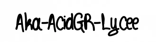
A bold, playful handwritten font with a lively and informal style.
![Aka-AcidGR-Lycee font caratteri gratis]() Scaricare 528 Downloads@WebFont
Scaricare 528 Downloads@WebFont -
( mlkwsn - Malik Wisnu )
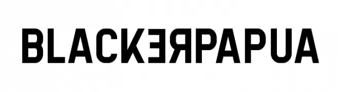
A bold, modern font with strong geometric shapes and high contrast.
![BlackerPapua font caratteri gratis]() Scaricare 528 Downloads@WebFont
Scaricare 528 Downloads@WebFont -
( Free for a personal use. For a commercial use please visit www.kevinandamanda.com )
A whimsical, hand-drawn font with playful, irregular strokes.
![Ian Jude font caratteri gratis]() Scaricare 528 Downloads@WebFont
Scaricare 528 Downloads@WebFont -
( Fonts by www.junkohanhero.com - Personal-use only. For commercial use please contact owner. )
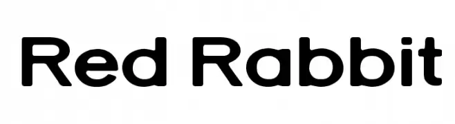
A modern, rounded sans-serif font with smooth edges and balanced spacing.
![Red Rabbit font caratteri gratis]() Scaricare 528 Downloads@WebFont
Scaricare 528 Downloads@WebFont -
( Fonts by Iconian Fonts )
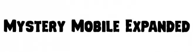
A bold, rounded, and playful font with an expanded width.
![Mystery Mobile Expanded font caratteri gratis]() Scaricare 528 Downloads@WebFont
Scaricare 528 Downloads@WebFont -
( Fonts by Iconian Fonts - Daniel Zadorozny )
A bold, expanded font with a futuristic and geometric design.
![Metroplex Expanded font caratteri gratis]() Scaricare 528 Downloads@WebFont
Scaricare 528 Downloads@WebFont -
( Fonts by Kotak Kuning Studio - kotakkuning.com - Personal-use only. For commercial use please contact owner. )
A dynamic brush script font with bold, fluid strokes and a lively appearance.
![Carelo Brush font caratteri gratis]() Scaricare 528 Downloads@WebFont
Scaricare 528 Downloads@WebFont -
( Fonts by Geronimo Fonts - Personal-use only. For commercial use please contact owner. )
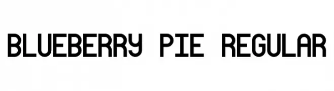
A bold, geometric font with a modern and balanced design.
![Blueberry Pie Regular font caratteri gratis]() Scaricare 527 Downloads@WebFont
Scaricare 527 Downloads@WebFont -
( Fonts by MuraKnockout Media + Design - muraknockout.com. Personal-use only. For commercial use please contact owner. )
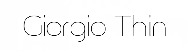
A sleek, modern font with thin lines and geometric precision.
![Giorgio Thin font caratteri gratis]() Scaricare 527 Downloads@WebFont
Scaricare 527 Downloads@WebFont -
( Fonts by Dieter Steffmann )
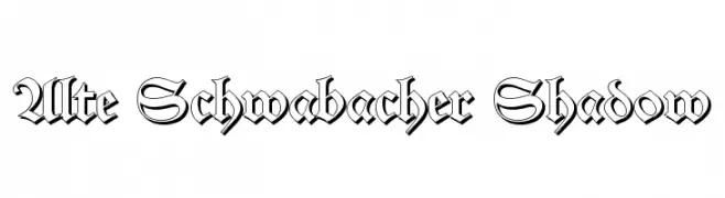
A bold Blackletter font with shadow effects, featuring intricate, angular designs.
![Alte Schwabacher Shadow font caratteri gratis]() Scaricare 527 Downloads@WebFont
Scaricare 527 Downloads@WebFont -
![Winsberg font caratteri gratis]() Scaricare 527 Downloads@WebFont
Scaricare 527 Downloads@WebFont -
( Fonts by Galdino Otten )
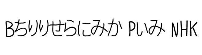
A casual, handwritten-style font with smooth, medium-thick strokes.
![Ballpoint Pen NHK font caratteri gratis]() Scaricare 527 Downloads@WebFont
Scaricare 527 Downloads@WebFont -
( Fonts by www.blambot.com )
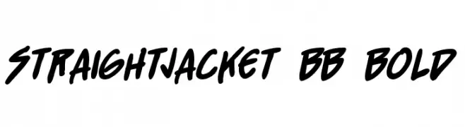
A bold, energetic handwritten font with a playful and dynamic style.
![StraightJacket BB Bold font caratteri gratis]() Scaricare 527 Downloads@WebFont
Scaricare 527 Downloads@WebFont -
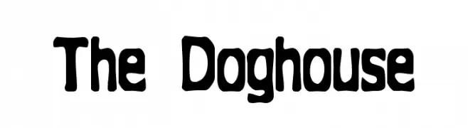
![The Doghouse font caratteri gratis]() Scaricare 527 Downloads@WebFont
Scaricare 527 Downloads@WebFont -
( Fonts by Apostrophic Lab )
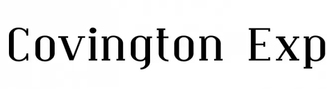
A modern serif font with elegant, elongated serifs and balanced letterforms.
![Covington Exp font caratteri gratis]() Scaricare 527 Downloads@WebFont
Scaricare 527 Downloads@WebFont -
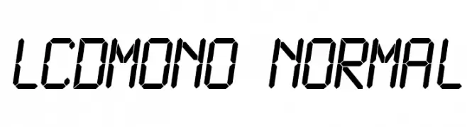
![LCDMono Normal font caratteri gratis]() Scaricare 527 Downloads@WebFont
Scaricare 527 Downloads@WebFont -
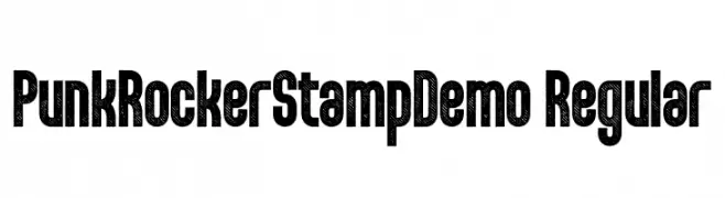
( Fonts by Fenotype - Emil Bertell - Personal-use only. For commercial use please contact owner. )
A bold, distressed font with a gritty, urban style.
![PunkRockerStampDemo-Regular font caratteri gratis]() Scaricare 527 Downloads@WebFont
Scaricare 527 Downloads@WebFont -
( Fonts by a Neale Davidson - www.pixelsagas.com. Personal-use only. For commercial use please contact owner. )
A bold, italic, and geometric font with a dynamic and energetic style.
![Coulson Italic font caratteri gratis]() Scaricare 527 Downloads@WebFont
Scaricare 527 Downloads@WebFont -
( Fonts by Andrew McCluskey - nalgames.com )
A bold, angular font with a futuristic and geometric design.
![Berate The Elementary Regular font caratteri gratis]() Scaricare 527 Downloads@WebFont
Scaricare 527 Downloads@WebFont -
( Fonts by Castcraft Software - opti.netii.net - check the website before use )
A classic serif font with elegant, sharp serifs and a modern touch.
![OPTIMarkusRoman font caratteri gratis]() Scaricare 527 Downloads@WebFont
Scaricare 527 Downloads@WebFont -
( Fonts by Lauren Thompson - www.nymfont.com )
A bold, modern sans-serif font with excellent readability and versatility.
![Jolly Bold font caratteri gratis]() Scaricare 527 Downloads@WebFont
Scaricare 527 Downloads@WebFont -
( Fonts by Clement Nicolle - www.stereo-type.fr - Personal-use only. For commercial use please contact owner. )
An elegant, cursive font with flowing, handwritten style.
![Rose Of Baltimore font caratteri gratis]() Scaricare 527 Downloads@WebFont
Scaricare 527 Downloads@WebFont


Quali sono i font più popolari adesso?
Poppins, Roboto, Montserrat, Open Sans e Lato sono molto usati per le forme pulite e l'ampia applicabilità — dall'identità di marca alle landing page e ai poster.
Quali font si usano spesso nei loghi?
Le sans serif geometriche (es. Poppins, famiglie in stile Gotham) sono scelte comuni per un branding pulito e scalabile. Per un tocco personale restano valide script e stili manoscritti. Abbina un display deciso per i titoli a un corpo testo neutro per riconoscibilità ed equilibrio.
Ogni quanto si aggiorna la lista?
Con regolarità, in base ai download e all'attività reale. Torna spesso per scoprire in anticipo le nuove preferite.
💡 Consiglio: aggiungi ai preferiti — le tendenze cambiano in fretta e i font top di oggi possono ispirare il rebranding di domani.