Benvenuto nelle Font Più Popolari — dove popolarità e qualità si incontrano. Qui trovi i font più scaricati e usati dell'anno. Se cerchi scelte sicure per logo, web o social, inizia da qui.
Ogni font top si distingue per equilibrio, leggibilità e versatilità. Troverai sans serif moderne, script eleganti, serif vintage e display minimalisti.
-
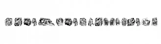
( Fonts by Manfred Klein. Free for private and charity use. Free for commercial with donation to organizations )
An artistic font with characters embedded in detailed black and white illustrations.
 Scaricare 104 Downloads@WebFont
 -
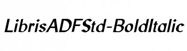
( Fonts by Arkandis Digital Foundry )
A bold, italicized font with a modern and sleek appearance.
![LibrisADFStd-BoldItalic font caratteri gratis]() Scaricare 104 Downloads@WebFont
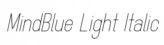
Scaricare 104 Downloads@WebFont -
![MindBlue Light Italic font caratteri gratis]() Scaricare 104 Downloads@WebFont
Scaricare 104 Downloads@WebFont -
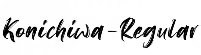
( Fonts by Motokiwo - Anton Cahyono - Personal-use only. For commercial use please contact owner. )
A dynamic brush script font with fluid, expressive strokes.
![Konichiwa-Regular font caratteri gratis]() Scaricare 104 Downloads@WebFont
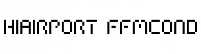
Scaricare 104 Downloads@WebFont -
![HIAIRPORT FFMCOND font caratteri gratis]() Scaricare 104 Downloads@WebFont
Scaricare 104 Downloads@WebFont -
-
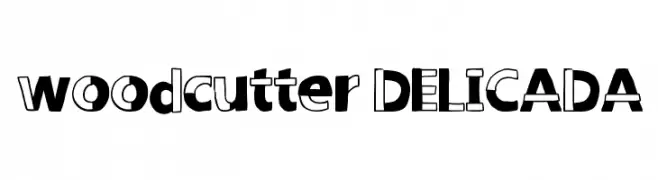
( Fonts by www.woodcutter.es - woodcutter Manero - Personal-use only. For commercial use please contact owner. )
A playful, bold font with a mix of solid and outlined characters.
![woodcutter DELICADA font caratteri gratis]() Scaricare 104 Downloads@WebFont
Scaricare 104 Downloads@WebFont -
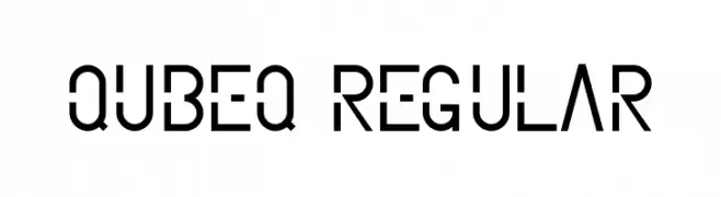
![qubeq Regular font caratteri gratis]() Scaricare 104 Downloads@WebFont
Scaricare 104 Downloads@WebFont -
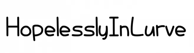
![Hopelessly In Lurve font caratteri gratis]() Scaricare 104 Downloads@WebFont
Scaricare 104 Downloads@WebFont -
( Fonts by Carlos Daniel Matteoli - Qbotype Fonts - http://carlosmatteoli.wix.com/qbotype. Personal-use only. For commercial use please contact owner. )
A bold, geometric font with a modern and futuristic design.
![Rixon font caratteri gratis]() Scaricare 104 Downloads@WebFont
Scaricare 104 Downloads@WebFont -
( Fonts by Krafti Lab - Onur Cem TAN - Personal-use only. For commercial use please contact owner. )
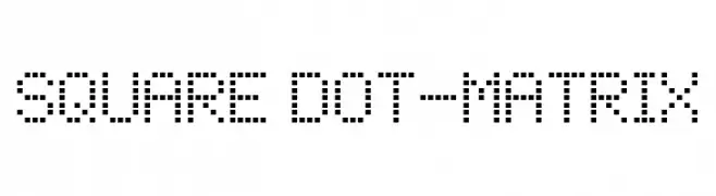
A pixelated, square dot matrix font with a digital and retro feel.
![Square Dot-Matrix font caratteri gratis]() Scaricare 104 Downloads@WebFont
Scaricare 104 Downloads@WebFont

Quali sono i font più popolari adesso?
Poppins, Roboto, Montserrat, Open Sans e Lato sono molto usati per le forme pulite e l'ampia applicabilità — dall'identità di marca alle landing page e ai poster.
Quali font si usano spesso nei loghi?
Le sans serif geometriche (es. Poppins, famiglie in stile Gotham) sono scelte comuni per un branding pulito e scalabile. Per un tocco personale restano valide script e stili manoscritti. Abbina un display deciso per i titoli a un corpo testo neutro per riconoscibilità ed equilibrio.
Ogni quanto si aggiorna la lista?
Con regolarità, in base ai download e all'attività reale. Torna spesso per scoprire in anticipo le nuove preferite.
💡 Consiglio: aggiungi ai preferiti — le tendenze cambiano in fretta e i font top di oggi possono ispirare il rebranding di domani.