Benvenuto nelle Font Più Popolari — dove popolarità e qualità si incontrano. Qui trovi i font più scaricati e usati dell'anno. Se cerchi scelte sicure per logo, web o social, inizia da qui.
Ogni font top si distingue per equilibrio, leggibilità e versatilità. Troverai sans serif moderne, script eleganti, serif vintage e display minimalisti.
-
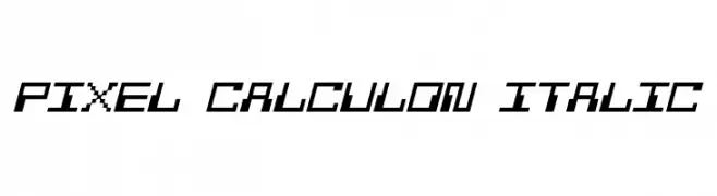
( Fonts by a Neale Davidson - www.pixelsagas.com. Personal-use only. For commercial use please contact owner. )
A pixelated, italic font with a retro digital aesthetic.
 Scaricare 106 Downloads@WebFont
 -
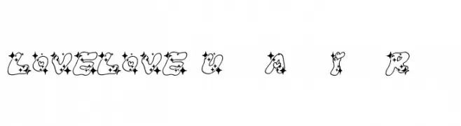
( Fonts by Baka - Kyakirun - bakafonts.kyakirun.com )
A playful, decorative font with star and heart embellishments.
![LOVELOVE_UfunAhanIyanRamee font caratteri gratis]() Scaricare 106 Downloads@WebFont
Scaricare 106 Downloads@WebFont -
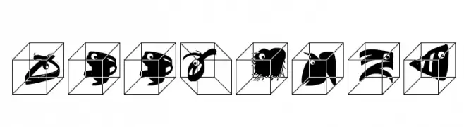
( Fonts by Manfred Klein. Free for private and charity use. Free for commercial with donation to organizations )
A playful and decorative set of animal illustrations within cubes.
![ZooCages font caratteri gratis]() Scaricare 106 Downloads@WebFont
Scaricare 106 Downloads@WebFont -
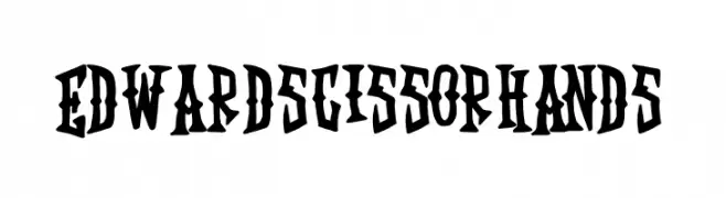
( Fonts by Feri Fauzi - Personal-use only. For commercial use please contact owner. )
A bold, edgy font with sharp, angular lines and a gothic style.
![Edward Scissorhands font caratteri gratis]() Scaricare 106 Downloads@WebFont
Scaricare 106 Downloads@WebFont -
( Fonts by Benoit Champy - www.vnbc.fr - Personal-use only. For commercial use please contact owner. )
A bold, retro-inspired font with thick, stylized characters.
![Flea Market Plain font caratteri gratis]() Scaricare 106 Downloads@WebFont
Scaricare 106 Downloads@WebFont -
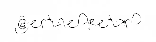
-
![CertifiedRetard font caratteri gratis]() Scaricare 106 Downloads@WebFont
Scaricare 106 Downloads@WebFont -
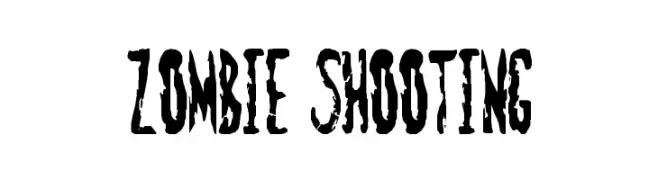
( Fonts by Goma Shin - www.geocities.jp/gomarice_font/ - Personal-use only. For commercial use please contact owner. )
A distressed, horror-themed font with jagged, uneven characters.
![Zombie Shooting font caratteri gratis]() Scaricare 106 Downloads@WebFont
Scaricare 106 Downloads@WebFont -
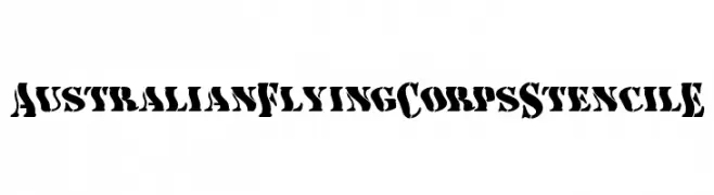
( Perry Mason )
A bold, stencil-style font with a rugged, utilitarian look.
![AustralianFlyingCorpsStencilE font caratteri gratis]() Scaricare 106 Downloads@WebFont
Scaricare 106 Downloads@WebFont -
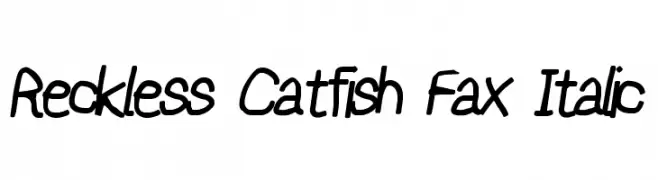
![Reckless Catfish Fax Italic font caratteri gratis]() Scaricare 106 Downloads@WebFont
Scaricare 106 Downloads@WebFont -
( Fonts by Vladimir Nikolic )
Ornamental font featuring diverse hairstyle silhouettes.
![Haircut Regular font caratteri gratis]() Scaricare 106 Downloads@WebFont
Scaricare 106 Downloads@WebFont

Quali sono i font più popolari adesso?
Poppins, Roboto, Montserrat, Open Sans e Lato sono molto usati per le forme pulite e l'ampia applicabilità — dall'identità di marca alle landing page e ai poster.
Quali font si usano spesso nei loghi?
Le sans serif geometriche (es. Poppins, famiglie in stile Gotham) sono scelte comuni per un branding pulito e scalabile. Per un tocco personale restano valide script e stili manoscritti. Abbina un display deciso per i titoli a un corpo testo neutro per riconoscibilità ed equilibrio.
Ogni quanto si aggiorna la lista?
Con regolarità, in base ai download e all'attività reale. Torna spesso per scoprire in anticipo le nuove preferite.
💡 Consiglio: aggiungi ai preferiti — le tendenze cambiano in fretta e i font top di oggi possono ispirare il rebranding di domani.