Benvenuto nelle Font Più Popolari — dove popolarità e qualità si incontrano. Qui trovi i font più scaricati e usati dell'anno. Se cerchi scelte sicure per logo, web o social, inizia da qui.
Ogni font top si distingue per equilibrio, leggibilità e versatilità. Troverai sans serif moderne, script eleganti, serif vintage e display minimalisti.
-
( Fargun Studio - Fajar Gunawan - creativemarket.com/FargunStudio )
A decorative script font with elegant loops and swashes.
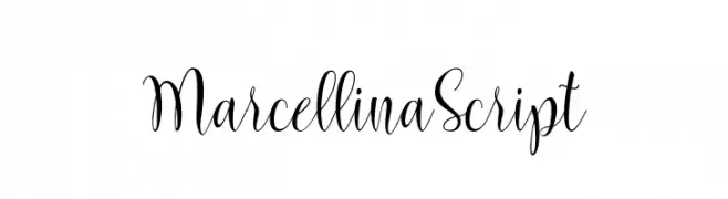 Scaricare 428 Downloads@WebFont
 -
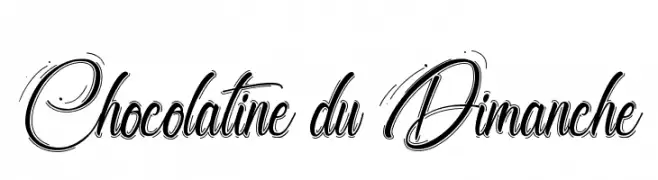
( Fonts by Octotype - www.foundmyfont.com - Personal-use only. For commercial use please contact owner. )
An elegant script font with flowing cursive style and intricate swashes.
![Chocolatine du Dimanche font caratteri gratis]() Scaricare 428 Downloads@WebFont
Scaricare 428 Downloads@WebFont -
( Fonts by Neale Davidson - www.pixelsagas.com )
A bold, angular font with a futuristic and dynamic style.
![Takara font caratteri gratis]() Scaricare 428 Downloads@WebFont
Scaricare 428 Downloads@WebFont -
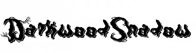
( Fonts by Otto Maurer Design )
A bold, decorative font with an eerie, twisted branch design.
![DarkwoodShadow font caratteri gratis]() Scaricare 428 Downloads@WebFont
Scaricare 428 Downloads@WebFont -
Caratteri di NicholasJudy456. For commercial use please contact the owner.
( Here's More of the House Fonts )
A playful, hand-drawn font with a rough, textured appearance.
![Sckoolhouse font caratteri gratis]() Scaricare 428 Downloads@WebFont
Scaricare 428 Downloads@WebFont -
-
( Fonts by Docallisme HAS - Ryal - docallisme.blogspot.com - Personal-use only. For commercial use please contact owner. )
Not a valid font; consists of repeated cartoon illustrations.
![Doraemon-slalala font caratteri gratis]() Scaricare 428 Downloads@WebFont
Scaricare 428 Downloads@WebFont -
![Believe it font caratteri gratis]() Scaricare 428 Downloads@WebFont
Scaricare 428 Downloads@WebFont -
( Fonts by Mocha Frappuccino - Personal-use only. For commercial use please contact owner. )
A bold, narrow font with a modern and geometric style.
![Nomz font caratteri gratis]() Scaricare 428 Downloads@WebFont
Scaricare 428 Downloads@WebFont -
( Ydhra Studio - creativemarket.com/ydhra )
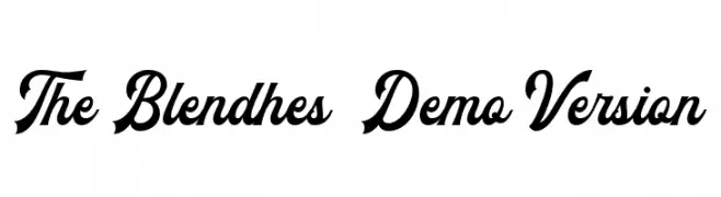
A bold, cursive font with flowing, connected characters and a dynamic, elegant style.
![The Blendhes - Demo Version font caratteri gratis]() Scaricare 428 Downloads@WebFont
Scaricare 428 Downloads@WebFont -
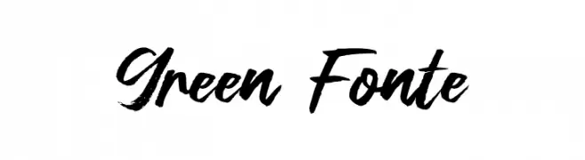
( Fonts by Syaf Rizal - www.creativefabrica.com/ref/53/ - Personal-use only. For commercial use please contact owner. )
A bold, expressive script font with a hand-painted, artistic style.
![Green Fonte font caratteri gratis]() Scaricare 428 Downloads@WebFont
Scaricare 428 Downloads@WebFont -
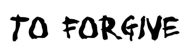
( Fonts by Jacob Fisher - www.pizzadude.dk )
A bold, brush-style font with dynamic and irregular strokes.
![To forgive font caratteri gratis]() Scaricare 428 Downloads@WebFont
Scaricare 428 Downloads@WebFont -
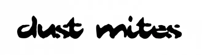
( Fonts by Scott Dieznyik - Kejak (formerly Cheops) )
A bold, artistic script font with fluid, interconnected strokes and high contrast.
![Dust Mites font caratteri gratis]() Scaricare 428 Downloads@WebFont
Scaricare 428 Downloads@WebFont -
( Free for a personal use. For a commercial use please visit www.kevinandamanda.com )
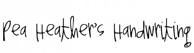
A playful, casual handwritten font with an informal and personal style.
![Pea Heather's Handwriting font caratteri gratis]() Scaricare 428 Downloads@WebFont
Scaricare 428 Downloads@WebFont -
![Redkost Comic font caratteri gratis]() Scaricare 428 Downloads@WebFont
Scaricare 428 Downloads@WebFont -
( Roger White - web.archive.org/web/20120416090521/www.rogersfonts.org.uk/ )
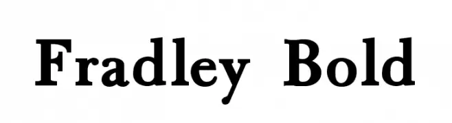
A bold, classic serif font with strong strokes and elegant serifs.
![Fradley Bold font caratteri gratis]() Scaricare 428 Downloads@WebFont
Scaricare 428 Downloads@WebFont -
( Fonts by Graham Meade - GemFonts )
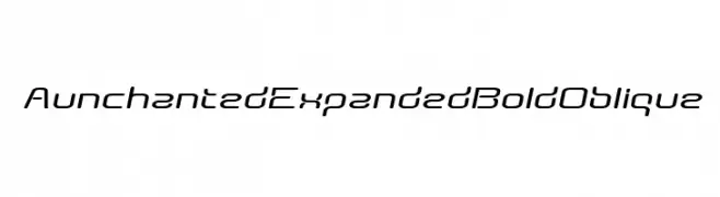
A futuristic, expanded, bold oblique font with rounded edges and smooth curves.
![AunchantedExpandedBoldOblique font caratteri gratis]() Scaricare 428 Downloads@WebFont
Scaricare 428 Downloads@WebFont -
( Fonts by Mooniak - Personal-use only. For commercial use please contact owner. )
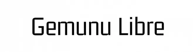
A modern, geometric sans-serif font with a clean and uniform appearance.
![Gemunu Libre font caratteri gratis]() Scaricare 428 Downloads@WebFont
Scaricare 428 Downloads@WebFont -
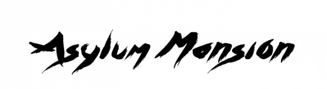
( Fonts by Jonathan S. Harris - www.tattoowoo.com. Personal-use only. For commercial use please contact owner. )
A bold, expressive brush-style font with dynamic strokes and artistic flair.
![Asylum Mansion font caratteri gratis]() Scaricare 428 Downloads@WebFont
Scaricare 428 Downloads@WebFont -
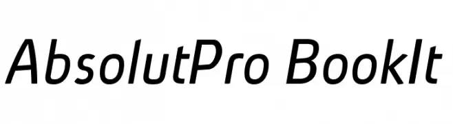
( Fonts by Ingo Zimmermann - www.ingofonts.com )
A modern, slightly italic font with a clean and professional style.
![AbsolutPro-BookIt font caratteri gratis]() Scaricare 428 Downloads@WebFont
Scaricare 428 Downloads@WebFont -
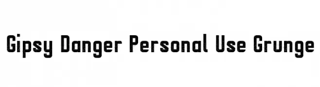
( LJ Design Studios - www.ljdesignstudios.com )
A bold, distressed font with a grunge texture for a rugged, vintage look.
![Gipsy Danger Personal Use Grunge font caratteri gratis]() Scaricare 428 Downloads@WebFont
Scaricare 428 Downloads@WebFont -
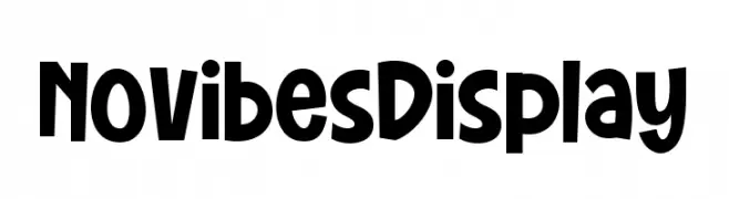
( Fonts by DumadiStyle )
A playful, bold font with a hand-drawn, whimsical style.
![Novibes Display font caratteri gratis]() Scaricare 428 Downloads@WebFont
Scaricare 428 Downloads@WebFont -
( Copyright 2017 The Barlow Project Authors (https://github.com/jpt/barlow) )
A modern, semi-bold, italic sans-serif font with a clean and dynamic style.
![Barlow SemiBold Italic font caratteri gratis]() Scaricare 428 Downloads@WebFont
Scaricare 428 Downloads@WebFont -
( Fonts by Fernando Carvente - serifdechocolate.wordpress.com )
A bold, decorative font with a striped gradient effect.
![BabaluGradient font caratteri gratis]() Scaricare 428 Downloads@WebFont
Scaricare 428 Downloads@WebFont -
( Daymarius - www.creativefabrica.com/designer/Daymarius )
A pixelated, retro-style font inspired by early digital displays.
![Retron2000 font caratteri gratis]() Scaricare 428 Downloads@WebFont
Scaricare 428 Downloads@WebFont -
( Fonts by Dieter Steffmann )
A classic serif font with elegant, decorative elements and modern touches.
![Koch-AntiquaZier font caratteri gratis]() Scaricare 428 Downloads@WebFont
Scaricare 428 Downloads@WebFont -
( Fonts by Linecreative - ARI JUANDA - Personal-use only. For commercial use please contact owner. )
A bold, futuristic font with sharp, angular edges and a geometric design.
![Bord Demo font caratteri gratis]() Scaricare 428 Downloads@WebFont
Scaricare 428 Downloads@WebFont -
( Fonts by Daniel Zadorozny - www.iconian.com )
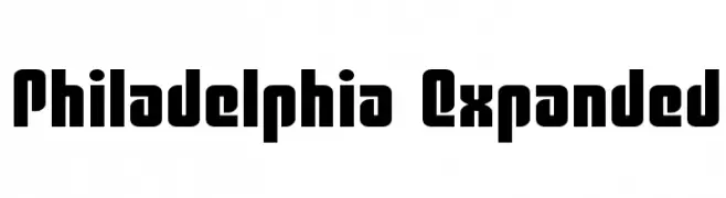
A bold, expanded font with geometric shapes and minimal contrast.
![Philadelphia Expanded font caratteri gratis]() Scaricare 428 Downloads@WebFont
Scaricare 428 Downloads@WebFont -
( MeanStreak )
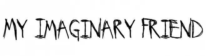
A bold, hand-drawn font with an artistic, graffiti-like style.
![My Imaginary Friend font caratteri gratis]() Scaricare 428 Downloads@WebFont
Scaricare 428 Downloads@WebFont -
( Fonts by www.omniglot.com )
An ornate, decorative font with elaborate swashes and flourishes.
![CR-Insom font caratteri gratis]() Scaricare 428 Downloads@WebFont
Scaricare 428 Downloads@WebFont -
![ST Moviehead Ultra-condensed Medium font caratteri gratis]() Scaricare 428 Downloads@WebFont
Scaricare 428 Downloads@WebFont -
( Fonts by Daniel Zadorozny - www.iconian.com )
A bold, 3D geometric font with a futuristic and dynamic style.
![Han Solo 3D font caratteri gratis]() Scaricare 428 Downloads@WebFont
Scaricare 428 Downloads@WebFont -
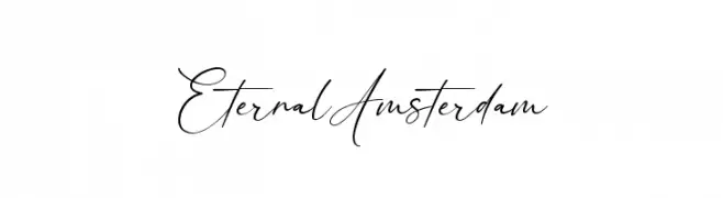
( Fonts by Kong Font - https://fontkong.com/ - Personal-use only. For commercial use please contact owner. )
An elegant, cursive font with a sophisticated, handwritten style.
![Eternal Amsterdam font caratteri gratis]() Scaricare 428 Downloads@WebFont
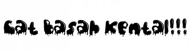
Scaricare 428 Downloads@WebFont -
![Cat Basah Kental!!! font caratteri gratis]() Scaricare 428 Downloads@WebFont
Scaricare 428 Downloads@WebFont -
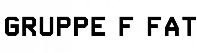
( Helldunkel - www.helldunkel.com )
A bold, geometric font with an industrial and modern design.
![Gruppe F Fat font caratteri gratis]() Scaricare 428 Downloads@WebFont
Scaricare 428 Downloads@WebFont -
( Fonts by Chris Vile - fontmonger.com - Personal-use only. For commercial use please contact owner. )
A bold, italic script font with dynamic strokes and high contrast.
![blackjacketboys-BoldItalic font caratteri gratis]() Scaricare 428 Downloads@WebFont
Scaricare 428 Downloads@WebFont


Quali sono i font più popolari adesso?
Poppins, Roboto, Montserrat, Open Sans e Lato sono molto usati per le forme pulite e l'ampia applicabilità — dall'identità di marca alle landing page e ai poster.
Quali font si usano spesso nei loghi?
Le sans serif geometriche (es. Poppins, famiglie in stile Gotham) sono scelte comuni per un branding pulito e scalabile. Per un tocco personale restano valide script e stili manoscritti. Abbina un display deciso per i titoli a un corpo testo neutro per riconoscibilità ed equilibrio.
Ogni quanto si aggiorna la lista?
Con regolarità, in base ai download e all'attività reale. Torna spesso per scoprire in anticipo le nuove preferite.
💡 Consiglio: aggiungi ai preferiti — le tendenze cambiano in fretta e i font top di oggi possono ispirare il rebranding di domani.