Benvenuto nelle Font Più Popolari — dove popolarità e qualità si incontrano. Qui trovi i font più scaricati e usati dell'anno. Se cerchi scelte sicure per logo, web o social, inizia da qui.
Ogni font top si distingue per equilibrio, leggibilità e versatilità. Troverai sans serif moderne, script eleganti, serif vintage e display minimalisti.
-
( Fonts by www.tepidmonkey.net )
A playful, rounded, and handwritten-style font with a friendly vibe.
 Scaricare 430 Downloads@WebFont
 -
( Fonts by mjanetmars.com - Personal-use only. For commercial use please contact owner. )
A bold, impactful typeface with thick, blocky characters.
![Zentropa font caratteri gratis]() Scaricare 430 Downloads@WebFont
Scaricare 430 Downloads@WebFont -
( Fonts by Manfred Klein. Free for private and charity use. Free for commercial with donation to organizations )
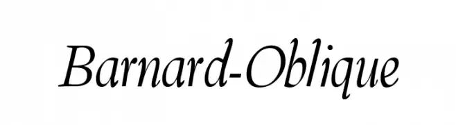
An elegant oblique font with smooth, fluid strokes and moderate contrast.
![Barnard-Oblique font caratteri gratis]() Scaricare 430 Downloads@WebFont
Scaricare 430 Downloads@WebFont -
![FrightWrite1 Medium font caratteri gratis]() Scaricare 430 Downloads@WebFont
Scaricare 430 Downloads@WebFont -
![Asylum Regular font caratteri gratis]() Scaricare 430 Downloads@WebFont
Scaricare 430 Downloads@WebFont -
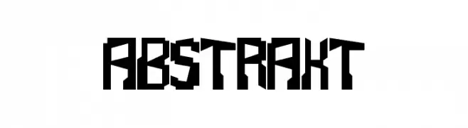
-
![Abstrakt font caratteri gratis]() Scaricare 430 Downloads@WebFont
Scaricare 430 Downloads@WebFont -
( Fonts by CannotIntoSpaceFonts - KineticPlasma Fonts - Personal-use only. For commercial use please contact owner. )
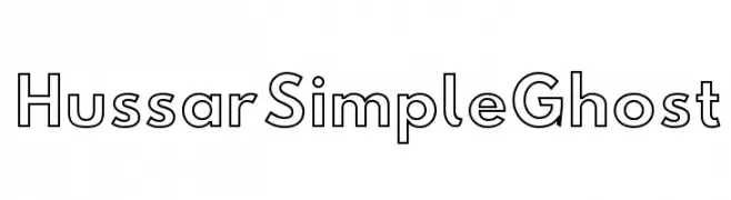
A modern, geometric outline font with consistent line thickness and high legibility.
![Hussar Simple Ghost font caratteri gratis]() Scaricare 430 Downloads@WebFont
Scaricare 430 Downloads@WebFont -
( Fonts by Noah Type - noahtype.com - Personal-use only. For commercial use please contact owner. )
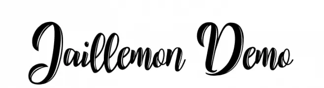
A bold, dynamic script font with elegant loops and modern flair.
![Jaillemon Demo font caratteri gratis]() Scaricare 430 Downloads@WebFont
Scaricare 430 Downloads@WebFont -
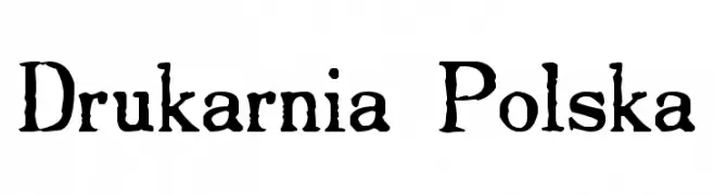
( - polskaonline.org )
A vintage, distressed font with bold strokes and a hand-crafted appearance.
![Drukarnia Polska font caratteri gratis]() Scaricare 430 Downloads@WebFont
Scaricare 430 Downloads@WebFont -
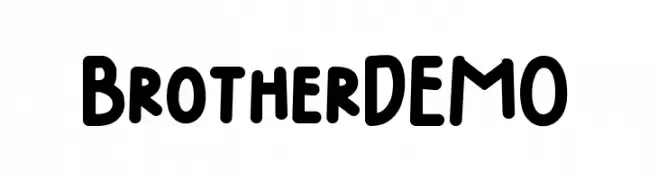
( Fonts by Trim Studio )
A playful, bold font with rounded edges and a hand-drawn look.
![Brother DEMO font caratteri gratis]() Scaricare 430 Downloads@WebFont
Scaricare 430 Downloads@WebFont -
( Wojtek Zolty )
A bold, futuristic font with geometric shapes and clean lines.
![SpaceCapitan-Regular font caratteri gratis]() Scaricare 430 Downloads@WebFont
Scaricare 430 Downloads@WebFont -
( Copyright (c) 2015, Christian Thalmann and the Cormorant Project Authors (github.com/CatharsisFonts/Cormorant) )
A classic, elegant serif font with graceful italics and medium weight.
![Cormorant Medium Italic font caratteri gratis]() Scaricare 430 Downloads@WebFont
Scaricare 430 Downloads@WebFont -
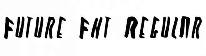
( Fonts by Kanye West - www.kanyewest.com - Personal-use only. For commercial use please contact owner. )
A bold, hand-drawn font with dynamic and irregular shapes.
![Future Fnt Regular font caratteri gratis]() Scaricare 430 Downloads@WebFont
Scaricare 430 Downloads@WebFont -
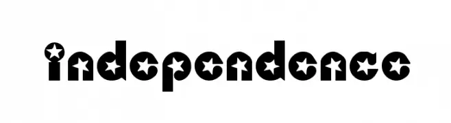
![Independence font caratteri gratis]() Scaricare 430 Downloads@WebFont
Scaricare 430 Downloads@WebFont -
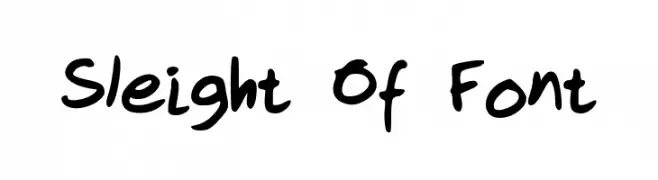
![Sleight Of Font font caratteri gratis]() Scaricare 430 Downloads@WebFont
Scaricare 430 Downloads@WebFont -
![Freshwater-Classic font caratteri gratis]() Scaricare 430 Downloads@WebFont
Scaricare 430 Downloads@WebFont -
( Fonts by Thomas Ledin - tomledin.com )
A sketch-like, hand-drawn font with an energetic and expressive style.
![Scrum-Bucket font caratteri gratis]() Scaricare 430 Downloads@WebFont
Scaricare 430 Downloads@WebFont -
( Fonts by Harold Lohner - www.haroldsfonts.com )
A bold, hand-painted style font with dynamic, expressive characters.
![Gamera font caratteri gratis]() Scaricare 430 Downloads@WebFont
Scaricare 430 Downloads@WebFont -
![Dancetech Bold Italic font caratteri gratis]() Scaricare 430 Downloads@WebFont
Scaricare 430 Downloads@WebFont -
( Fonts by Carrois Type Design / Ralph du Carrois )
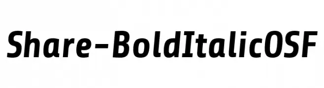
A bold, italicized font with a modern and professional look.
![Share-BoldItalicOSF font caratteri gratis]() Scaricare 430 Downloads@WebFont
Scaricare 430 Downloads@WebFont -
( Fonts by Creative Lab - Creative LAB - Personal-use only. For commercial use please contact owner. )
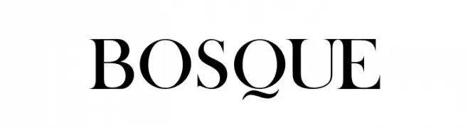
A classic serif font with elegant strokes and refined serifs.
![BOSQUE font caratteri gratis]() Scaricare 430 Downloads@WebFont
Scaricare 430 Downloads@WebFont -
( Fonts by a Max Infeld - XEROGRAPHER FONTS - xerographer.blogspot.com . Personal-use only. For commercial use please contact owner. )
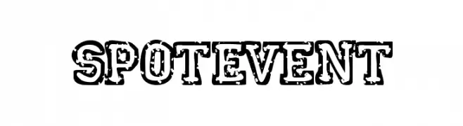
A bold, distressed font with a vintage, grunge aesthetic.
![SpotEvent font caratteri gratis]() Scaricare 430 Downloads@WebFont
Scaricare 430 Downloads@WebFont -
![Northingtown font caratteri gratis]() Scaricare 430 Downloads@WebFont
Scaricare 430 Downloads@WebFont -
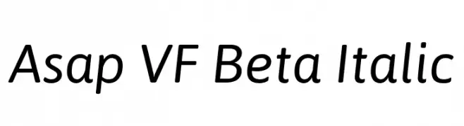
( Copyright 2016 The Asap Project Authors (omnibus.type@gmail.com) )
A modern, italic sans-serif font with a clean and dynamic style.
![Asap VF Beta Italic font caratteri gratis]() Scaricare 430 Downloads@WebFont
Scaricare 430 Downloads@WebFont -
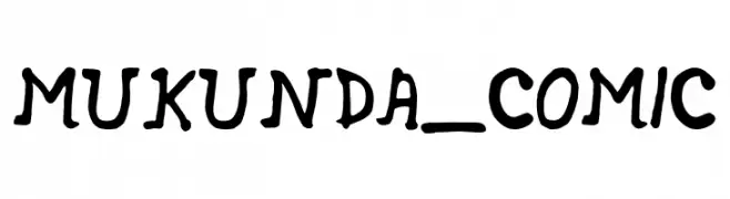
( Fonts by Mukunda Sarkar )
A playful, comic-style font with a hand-drawn, whimsical appearance.
![MUKUNDA_COMIC font caratteri gratis]() Scaricare 430 Downloads@WebFont
Scaricare 430 Downloads@WebFont -
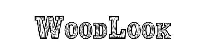
( Fonts by character - Personal-use only. For commercial use please contact owner. )
A bold, woodgrain-textured font with a rustic, decorative style.
![WoodLook font caratteri gratis]() Scaricare 430 Downloads@WebFont
Scaricare 430 Downloads@WebFont -
![The Loyalist font caratteri gratis]() Scaricare 430 Downloads@WebFont
Scaricare 430 Downloads@WebFont -
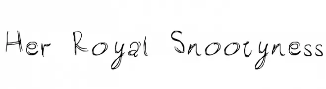
![Her Royal Snootyness font caratteri gratis]() Scaricare 430 Downloads@WebFont
Scaricare 430 Downloads@WebFont -
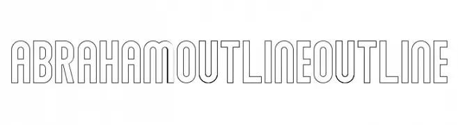
( Sabrtype - creativemarket.com/Sabrtype )
A modern, bold outline font with geometric letterforms and consistent width.
![Abraham Outline Outline font caratteri gratis]() Scaricare 430 Downloads@WebFont
Scaricare 430 Downloads@WebFont -
( Fonts by Misti`s Fonts - mistifonts.com - Personal-use only. For commercial use please contact owner. )
A playful, handwritten font with smooth curves and a casual style.
![AprilFlowers font caratteri gratis]() Scaricare 430 Downloads@WebFont
Scaricare 430 Downloads@WebFont -
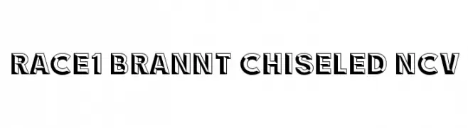
( Fontry - M.G. Adkins - www.thefontry.com/ )
A bold, chiseled font with a three-dimensional shadow effect.
![RACE1 Brannt Chiseled NCV font caratteri gratis]() Scaricare 430 Downloads@WebFont
Scaricare 430 Downloads@WebFont -
![Uecker font caratteri gratis]() Scaricare 430 Downloads
Scaricare 430 Downloads -
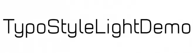
( Fonts by www.studiotypo.com - Personal-use only. For commercial use please contact owner. )
A modern, geometric sans-serif font with uniform stroke widths and rounded edges.
![Typo Style Light Demo font caratteri gratis]() Scaricare 430 Downloads@WebFont
Scaricare 430 Downloads@WebFont -
![ElHombre font caratteri gratis]() Scaricare 430 Downloads@WebFont
Scaricare 430 Downloads@WebFont -
![KadlecUT Bold font caratteri gratis]() Scaricare 430 Downloads@WebFont
Scaricare 430 Downloads@WebFont


Quali sono i font più popolari adesso?
Poppins, Roboto, Montserrat, Open Sans e Lato sono molto usati per le forme pulite e l'ampia applicabilità — dall'identità di marca alle landing page e ai poster.
Quali font si usano spesso nei loghi?
Le sans serif geometriche (es. Poppins, famiglie in stile Gotham) sono scelte comuni per un branding pulito e scalabile. Per un tocco personale restano valide script e stili manoscritti. Abbina un display deciso per i titoli a un corpo testo neutro per riconoscibilità ed equilibrio.
Ogni quanto si aggiorna la lista?
Con regolarità, in base ai download e all'attività reale. Torna spesso per scoprire in anticipo le nuove preferite.
💡 Consiglio: aggiungi ai preferiti — le tendenze cambiano in fretta e i font top di oggi possono ispirare il rebranding di domani.