Benvenuto nelle Font Più Popolari — dove popolarità e qualità si incontrano. Qui trovi i font più scaricati e usati dell'anno. Se cerchi scelte sicure per logo, web o social, inizia da qui.
Ogni font top si distingue per equilibrio, leggibilità e versatilità. Troverai sans serif moderne, script eleganti, serif vintage e display minimalisti.
-
 Scaricare 378 Downloads@WebFont
 -
( Fonts by TarmSaft Font Factory - http://www.aska.nu/tarmsaft/ )
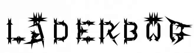
An edgy, thorn-inspired font with a bold and dramatic style.
![Läderbög font caratteri gratis]() Scaricare 378 Downloads@WebFont
Scaricare 378 Downloads@WebFont -
( Fonts by Mans Greback - www.mawns.com )
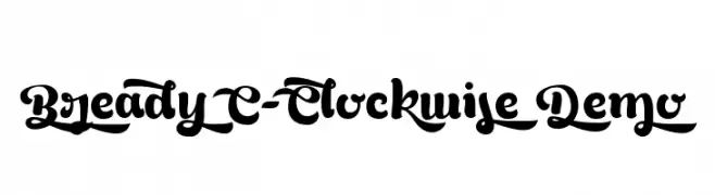
A bold, decorative font with sweeping strokes and intricate curves.
![Bready C-Clockwise Demo font caratteri gratis]() Scaricare 378 Downloads@WebFont
Scaricare 378 Downloads@WebFont -
( Free )
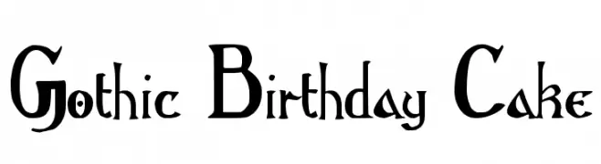
A Gothic-inspired decorative font with ornate, playful letterforms and high contrast.
![Gothic Birthday Cake font caratteri gratis]() Scaricare 378 Downloads@WebFont
Scaricare 378 Downloads@WebFont -
( Michael D. Adams - www.triskele.com/roadgeek-fonts/ )
A modern sans-serif font with bold, geometric shapes and excellent readability.
![Roadgeek 2005 Series 5W font caratteri gratis]() Scaricare 378 Downloads@WebFont
Scaricare 378 Downloads@WebFont -
-
( Fonts by Apostrophic Lab )
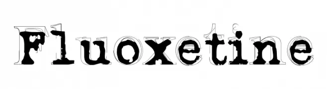
A bold, distressed serif font with a vintage, artistic style.
![Fluoxetine font caratteri gratis]() Scaricare 378 Downloads@WebFont
Scaricare 378 Downloads@WebFont -
( Fonts by EssentialsStudio - Personal-use only. For commercial use please contact owner. )
A playful, handwritten font with dynamic strokes and a whimsical style.
![Bencoleng font caratteri gratis]() Scaricare 378 Downloads@WebFont
Scaricare 378 Downloads@WebFont -
![Enervate font caratteri gratis]() Scaricare 378 Downloads@WebFont
Scaricare 378 Downloads@WebFont -
( Fonts by Hatf Type )
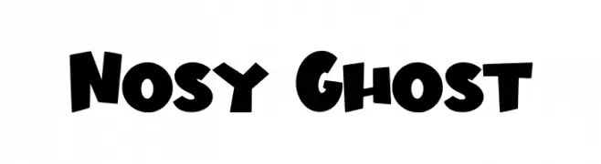
A bold, playful font with a whimsical and energetic style.
![Nosy Ghost font caratteri gratis]() Scaricare 378 Downloads@WebFont
Scaricare 378 Downloads@WebFont -
![NHL EAST font caratteri gratis]() Scaricare 378 Downloads@WebFont
Scaricare 378 Downloads@WebFont -
( Fonts by La Tipomatika )
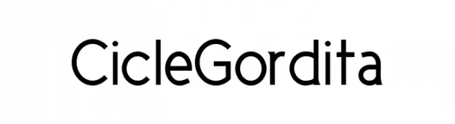
A modern, geometric sans-serif font with a clean and professional look.
![CicleGordita font caratteri gratis]() Scaricare 378 Downloads@WebFont
Scaricare 378 Downloads@WebFont -
( Fonts by Chuck Mountain - Chuck`s Fonts - Personal-use only. For commercial use please contact owner. )
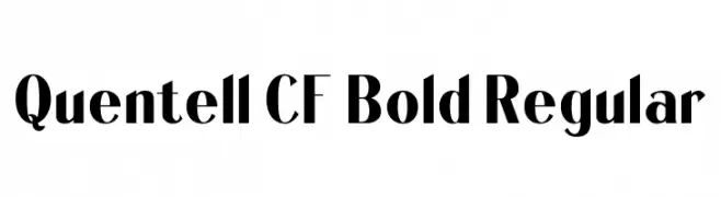
A bold, high-contrast font with a modern yet classic style.
![Quentell CF Bold Regular font caratteri gratis]() Scaricare 378 Downloads@WebFont
Scaricare 378 Downloads@WebFont -
( Fonts by Ideas and Apps )
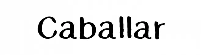
A playful, hand-drawn font with bold, rounded strokes and an informal style.
![Caballar font caratteri gratis]() Scaricare 378 Downloads@WebFont
Scaricare 378 Downloads@WebFont -
( Fonts by or from www.graffitifonts.net )
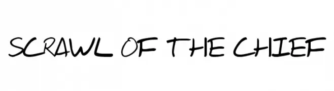
A bold, handwritten font with a dynamic and informal style.
![Scrawl Of The Chief font caratteri gratis]() Scaricare 378 Downloads@WebFont
Scaricare 378 Downloads@WebFont -
( Pixel Sagas - www.pixelsagas.com )
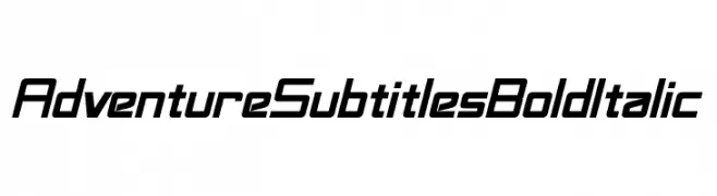
A bold, italicized font with a modern, adventurous style and geometric structure.
![Adventure Subtitles Bold Italic font caratteri gratis]() Scaricare 378 Downloads@WebFont
Scaricare 378 Downloads@WebFont -
( Fonts by Balpirick Studio - Personal-use only. For commercial use please contact owner. )
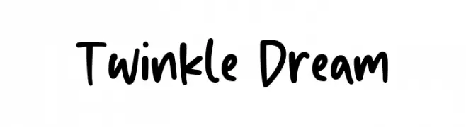
A playful handwritten font with a friendly and casual style.
![Twinkle Dream font caratteri gratis]() Scaricare 378 Downloads@WebFont
Scaricare 378 Downloads@WebFont -
( Azetype86 - Muh. Aswar - creativemarket.com/Azetmedia )
A dynamic, expressive handwritten font with fluid strokes.
![Six Away Font [Demo] font caratteri gratis]() Scaricare 378 Downloads@WebFont
Scaricare 378 Downloads@WebFont -
( Fonts by www.selawetype.com - Personal-use only. FOR DONATION https://www.paypal.me/selawe . For commercial use please contact owner. )
A bold, handwritten font with a brush-like texture and playful style.
![Tanzaniah font caratteri gratis]() Scaricare 378 Downloads@WebFont
Scaricare 378 Downloads@WebFont -
( Fonts by Omnibus Type )
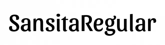
A modern, elegant font with a friendly and versatile design.
![Sansita Regular font caratteri gratis]() Scaricare 378 Downloads@WebFont
Scaricare 378 Downloads@WebFont -
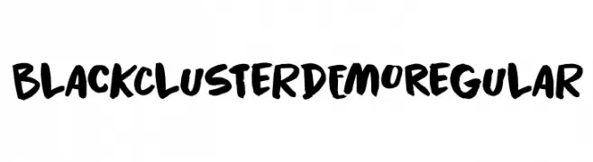
![Black Cluster DEMO Regular font caratteri gratis]() Scaricare 378 Downloads@WebFont
Scaricare 378 Downloads@WebFont -
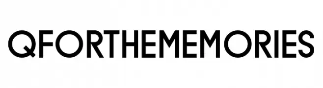
( Fonts by www.chequered.ink - Chequered Ink - Personal-use only. For commercial use please contact owner. )
A modern sans-serif font with geometric shapes and uniform stroke width.
![Q for the Memories font caratteri gratis]() Scaricare 378 Downloads@WebFont
Scaricare 378 Downloads@WebFont -
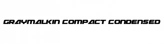
( Fonts by Daniel Zadorozny - www.iconian.com )
A bold, futuristic, and condensed font with sharp angles and a geometric style.
![Graymalkin Compact Condensed font caratteri gratis]() Scaricare 378 Downloads@WebFont
Scaricare 378 Downloads@WebFont -
( Free for a personal use. For a commercial use please visit www.kevinandamanda.com )
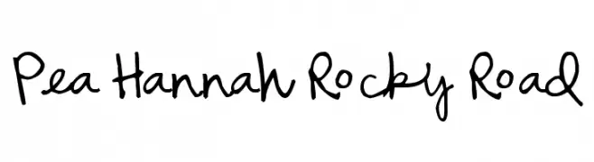
A playful, casual handwritten font with a loose, flowing style.
![Pea Hannah Rocky Road font caratteri gratis]() Scaricare 378 Downloads@WebFont
Scaricare 378 Downloads@WebFont -
( Fonts by FONTS BY LYAJKA - Personal-use only. For commercial use please contact owner. )
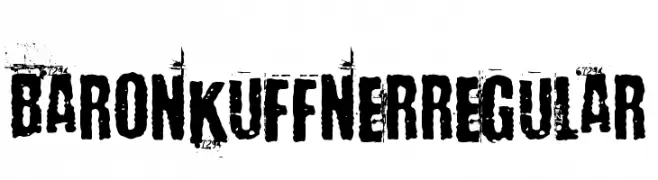
A bold, distressed font with a rugged, grunge-like texture.
![Baron Kuffner Regular font caratteri gratis]() Scaricare 378 Downloads@WebFont
Scaricare 378 Downloads@WebFont -
( Fonts by Darcy Baldwin {fontography} )
A bold, modern sans-serif font with clean lines and excellent readability.
![DJB Sticky Tape Labels Strips font caratteri gratis]() Scaricare 378 Downloads@WebFont
Scaricare 378 Downloads@WebFont -
![Superglue font caratteri gratis]() Scaricare 378 Downloads@WebFont
Scaricare 378 Downloads@WebFont -
![Checks Font font caratteri gratis]() Scaricare 378 Downloads@WebFont
Scaricare 378 Downloads@WebFont -
( Fonts by www.dcoxy.com )
A playful, whimsical font with rounded, elongated letterforms and creative details.
![Magic Kiss font caratteri gratis]() Scaricare 378 Downloads@WebFont
Scaricare 378 Downloads@WebFont -
( Copyright (c) 2009-2011 by Accademia di Belle Arti di Urbino and students of MA course of Visual design. Some rights reserved. )
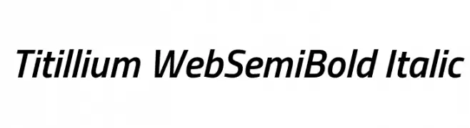
A modern, semi-bold italic font with clean strokes and dynamic slant.
![Titillium WebSemiBold Italic font caratteri gratis]() Scaricare 378 Downloads@WebFont
Scaricare 378 Downloads@WebFont -
( Fonts by KÄrlis KalviÅ¡kis . For commercial use please contact owner. )
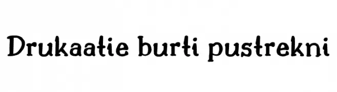
A playful, handwritten font with bold, rounded strokes and a whimsical style.
![Drukaatie burti pustrekni font caratteri gratis]() Scaricare 377 Downloads@WebFont
Scaricare 377 Downloads@WebFont -
( Fonts by Thais Trizoli - www.behance.net/thaistrizoli )
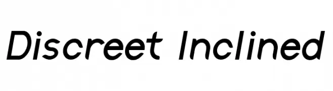
A modern, inclined font with clean lines and consistent stroke width.
![Discreet Inclined font caratteri gratis]() Scaricare 377 Downloads@WebFont
Scaricare 377 Downloads@WebFont -
( Fonts by Typodermic Fonts )
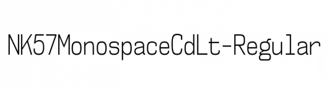
A modern, monospaced font with a clean, geometric design and uniform stroke widths.
![NK57MonospaceCdLt-Regular font caratteri gratis]() Scaricare 377 Downloads@WebFont
Scaricare 377 Downloads@WebFont -
( Fonts by a Max Infeld - XEROGRAPHER FONTS - xerographer.blogspot.com . Personal-use only. For commercial use please contact owner. )
A bold, distressed font with a textured, grunge appearance.
![StripeDisco font caratteri gratis]() Scaricare 377 Downloads@WebFont
Scaricare 377 Downloads@WebFont -
( melpc.blogspot.com )
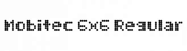
A dot matrix style font with a retro, digital display aesthetic.
![Mobitec 6x6 Regular font caratteri gratis]() Scaricare 377 Downloads@WebFont
Scaricare 377 Downloads@WebFont -
( Fonts by OCSstudio )
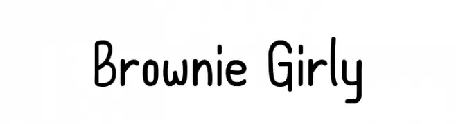
A playful, hand-drawn font with rounded, uniform characters and a whimsical style.
![Brownie Girly font caratteri gratis]() Scaricare 377 Downloads@WebFont
Scaricare 377 Downloads@WebFont


![Six Away Font [Demo] font caratteri gratis](https://d144mzi0q5mijx.cloudfront.net/img/S/I/Six-Away-Font-Demo.webp)


Quali sono i font più popolari adesso?
Poppins, Roboto, Montserrat, Open Sans e Lato sono molto usati per le forme pulite e l'ampia applicabilità — dall'identità di marca alle landing page e ai poster.
Quali font si usano spesso nei loghi?
Le sans serif geometriche (es. Poppins, famiglie in stile Gotham) sono scelte comuni per un branding pulito e scalabile. Per un tocco personale restano valide script e stili manoscritti. Abbina un display deciso per i titoli a un corpo testo neutro per riconoscibilità ed equilibrio.
Ogni quanto si aggiorna la lista?
Con regolarità, in base ai download e all'attività reale. Torna spesso per scoprire in anticipo le nuove preferite.
💡 Consiglio: aggiungi ai preferiti — le tendenze cambiano in fretta e i font top di oggi possono ispirare il rebranding di domani.