Benvenuto nelle Font Più Popolari — dove popolarità e qualità si incontrano. Qui trovi i font più scaricati e usati dell'anno. Se cerchi scelte sicure per logo, web o social, inizia da qui.
Ogni font top si distingue per equilibrio, leggibilità e versatilità. Troverai sans serif moderne, script eleganti, serif vintage e display minimalisti.
-
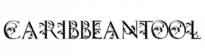
( Fonts by billyargel.blogspot.com - Billy Argel )
An ornate and decorative serif font with intricate flourishes.
 Scaricare 377 Downloads@WebFont
 -
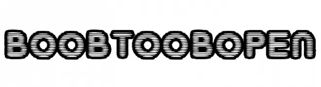
( Fonts by Daniel Gauthier )
A bold, layered font with a three-dimensional effect and rounded edges.
![BoobToobOpen font caratteri gratis]() Scaricare 377 Downloads@WebFont
Scaricare 377 Downloads@WebFont -
![midnight font caratteri gratis]() Scaricare 377 Downloads@WebFont
Scaricare 377 Downloads@WebFont -
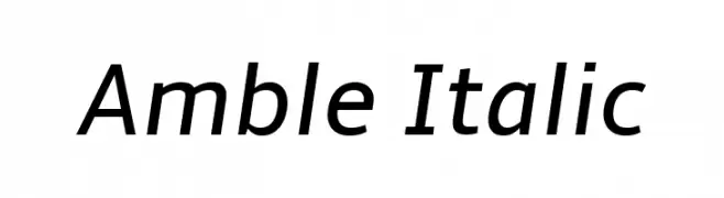
( Fonts by Punchcut )
A modern, italic sans-serif font with smooth curves and consistent stroke width.
![Amble Italic font caratteri gratis]() Scaricare 377 Downloads@WebFont
Scaricare 377 Downloads@WebFont -
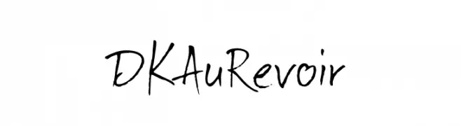
( Fonts by David Kerkhoff - www.hanodedphotography.com )
A lively, expressive handwritten font with dynamic strokes.
![DKAuRevoir font caratteri gratis]() Scaricare 377 Downloads@WebFont
Scaricare 377 Downloads@WebFont -
-
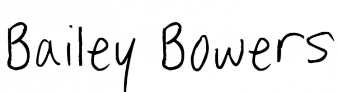
( Fonts by www.fontpanda.com. Personal-use only. For commercial use please contact owner. )
A casual, handwritten font with a playful and informal style.
![Bailey Bowers font caratteri gratis]() Scaricare 377 Downloads@WebFont
Scaricare 377 Downloads@WebFont -
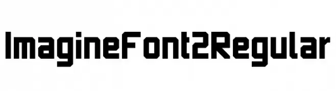
( Jooki - www.myfonts.com/fonts/jooki/imagine-font/ )
A bold, geometric font with a futuristic and angular design.
![Imagine Font 2 Regular font caratteri gratis]() Scaricare 377 Downloads@WebFont
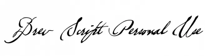
Scaricare 377 Downloads@WebFont -
![Brev Script Personal Use font caratteri gratis]() Scaricare 377 Downloads@WebFont
Scaricare 377 Downloads@WebFont -
![Yank font caratteri gratis]() Scaricare 377 Downloads@WebFont
Scaricare 377 Downloads@WebFont -
( Fonts by Mikko Sumulong )
A bold, brush-style font with an energetic and artistic flair.
![MixBrush font caratteri gratis]() Scaricare 377 Downloads@WebFont
Scaricare 377 Downloads@WebFont -
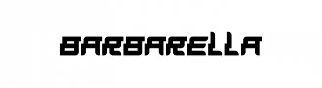
( THESE ARE SHAREWARE FONTS ! NOT FREEWARE ! PLEASE VISIT www.fuelfonts.com )
A bold, geometric font with a futuristic and digital aesthetic.
![Barbarella font caratteri gratis]() Scaricare 377 Downloads@WebFont
Scaricare 377 Downloads@WebFont -
( Fonts by Alex Tomlinson - Skyhaven Fonts - shfonts.com )
A bold, textured, hand-drawn font with a dynamic and energetic style.
![LostintheSound-Regular font caratteri gratis]() Scaricare 377 Downloads@WebFont
Scaricare 377 Downloads@WebFont -
( Fonts by David Espinosa [Type Sailor] - www.facebook.com/typesailor - Personal-use only. For commercial use please contact owner. )
An elegant serif font with a blend of classic and modern elements.
![Olimpia font caratteri gratis]() Scaricare 377 Downloads@WebFont
Scaricare 377 Downloads@WebFont -
( Fonts by Nick Curtis - www.nicksfonts.com )
A bold, angular font with a futuristic and geometric style.
![Nickley NF font caratteri gratis]() Scaricare 377 Downloads@WebFont
Scaricare 377 Downloads@WebFont -
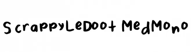
( Fonts by Alex Tomlinson - Skyhaven Fonts - shfonts.com )
A bold, playful handwritten font with rounded, uneven strokes.
![ScrappyLeDoot-MedMono font caratteri gratis]() Scaricare 377 Downloads@WebFont
Scaricare 377 Downloads@WebFont -
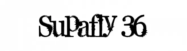
( Fonts by Gyom Seguin - last-soundtrack.daportfolio.com )
A bold, distressed font with a grunge aesthetic.
![Supafly 36 font caratteri gratis]() Scaricare 377 Downloads@WebFont
Scaricare 377 Downloads@WebFont -
![Les Fleurs font caratteri gratis]() Scaricare 377 Downloads@WebFont
Scaricare 377 Downloads@WebFont -
( Fonts by Subectype )
A bold, playful font with rounded strokes and whimsical curves.
![Rezdone font caratteri gratis]() Scaricare 377 Downloads@WebFont
Scaricare 377 Downloads@WebFont -
( Fonts by Mans Greback - www.mawns.com )
A bold, dramatic blackletter font with high contrast and intricate details.
![Walk Da Walk Three font caratteri gratis]() Scaricare 377 Downloads@WebFont
Scaricare 377 Downloads@WebFont -
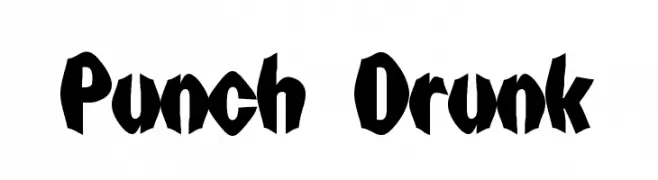
( Fonts by Digital Graphics Labs - www.digitalgraphiclabs.com )
A bold, playful font with exaggerated, uneven strokes and a hand-drawn feel.
![Punch Drunk font caratteri gratis]() Scaricare 377 Downloads@WebFont
Scaricare 377 Downloads@WebFont -
( Fonts by Bride & Groom www.brideandgroomdirect.co.uk )
A playful, whimsical handwritten font with tall, narrow letters and a casual style.
![Laura-Alternate font caratteri gratis]() Scaricare 377 Downloads@WebFont
Scaricare 377 Downloads@WebFont -
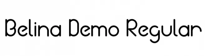
( Joz Gandoz - creativemarket.com/jozgandoz )
A modern, rounded sans-serif font with clean lines and geometric structure.
![Belina Demo Regular font caratteri gratis]() Scaricare 377 Downloads@WebFont
Scaricare 377 Downloads@WebFont -
( Fonts by Hanna Bie - Personal-use only. For commercial use please contact owner. )
A bold, modern sans-serif font with a condensed and geometric style.
![Sans Fransisco font caratteri gratis]() Scaricare 377 Downloads@WebFont
Scaricare 377 Downloads@WebFont -
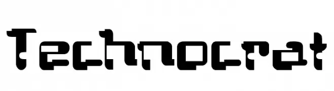
![Technocrat font caratteri gratis]() Scaricare 377 Downloads@WebFont
Scaricare 377 Downloads@WebFont -
Caratteri di defharo. For commercial use please contact the owner.
![Monserga font caratteri gratis]() Scaricare 377 Downloads@WebFont
Scaricare 377 Downloads@WebFont -
![Ko City font caratteri gratis]() Scaricare 377 Downloads@WebFont
Scaricare 377 Downloads@WebFont -
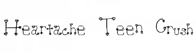
![Heartache Teen Crush font caratteri gratis]() Scaricare 377 Downloads@WebFont
Scaricare 377 Downloads@WebFont -
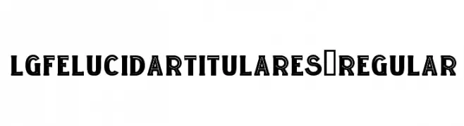
( Fonts by Manuel Lage )
A bold, decorative font with a modern, geometric style.
![LGFELUCIDARTITULARES-Regular font caratteri gratis]() Scaricare 377 Downloads@WebFont
Scaricare 377 Downloads@WebFont -
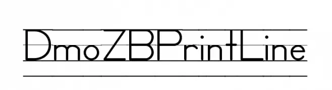
( Demo font. To purchase the full version, you can order it online at www.schoolhousefonts.com )
A modern, geometric font with clean lines and consistent stroke widths.
![DmoZBPrintLine font caratteri gratis]() Scaricare 377 Downloads@WebFont
Scaricare 377 Downloads@WebFont -
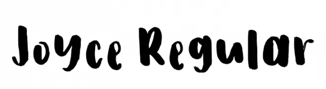
( Fonts by Ira Joyce Alvarez )
A bold, expressive handwritten font with brush-like strokes and playful forms.
![Joyce Regular font caratteri gratis]() Scaricare 377 Downloads@WebFont
Scaricare 377 Downloads@WebFont -
![homeboots font caratteri gratis]() Scaricare 377 Downloads@WebFont
Scaricare 377 Downloads@WebFont -
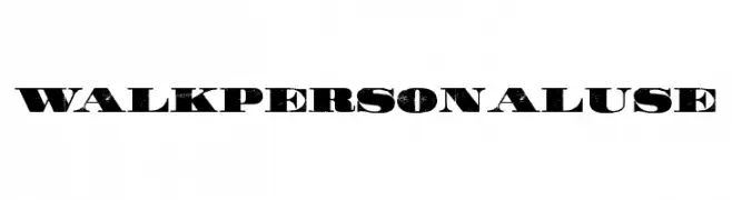
( Fonts by Billy Argel )
A bold, distressed font with a vintage, rugged appearance.
![WALK Personal Use font caratteri gratis]() Scaricare 377 Downloads@WebFont
Scaricare 377 Downloads@WebFont -
![PrintedCircuitBoard-Italic font caratteri gratis]() Scaricare 377 Downloads@WebFont
Scaricare 377 Downloads@WebFont -
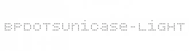
( Fonts by backpacker.gr )
A modern dotted font with a digital, tech-inspired aesthetic.
![BPdotsUnicase-Light font caratteri gratis]() Scaricare 377 Downloads@WebFont
Scaricare 377 Downloads@WebFont -
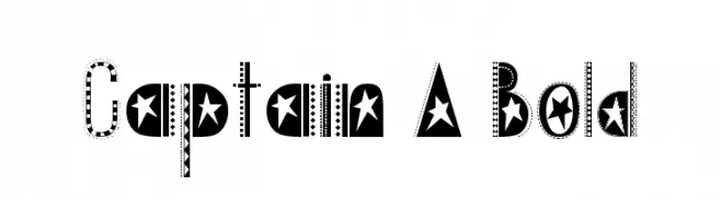
( 100% Free - oohlalaartsy.blogspot.com )
A bold, decorative font with star and stripe patterns, ideal for playful designs.
![Captain A Bold font caratteri gratis]() Scaricare 377 Downloads@WebFont
Scaricare 377 Downloads@WebFont


Quali sono i font più popolari adesso?
Poppins, Roboto, Montserrat, Open Sans e Lato sono molto usati per le forme pulite e l'ampia applicabilità — dall'identità di marca alle landing page e ai poster.
Quali font si usano spesso nei loghi?
Le sans serif geometriche (es. Poppins, famiglie in stile Gotham) sono scelte comuni per un branding pulito e scalabile. Per un tocco personale restano valide script e stili manoscritti. Abbina un display deciso per i titoli a un corpo testo neutro per riconoscibilità ed equilibrio.
Ogni quanto si aggiorna la lista?
Con regolarità, in base ai download e all'attività reale. Torna spesso per scoprire in anticipo le nuove preferite.
💡 Consiglio: aggiungi ai preferiti — le tendenze cambiano in fretta e i font top di oggi possono ispirare il rebranding di domani.