Benvenuto nelle Font Più Popolari — dove popolarità e qualità si incontrano. Qui trovi i font più scaricati e usati dell'anno. Se cerchi scelte sicure per logo, web o social, inizia da qui.
Ogni font top si distingue per equilibrio, leggibilità e versatilità. Troverai sans serif moderne, script eleganti, serif vintage e display minimalisti.
-
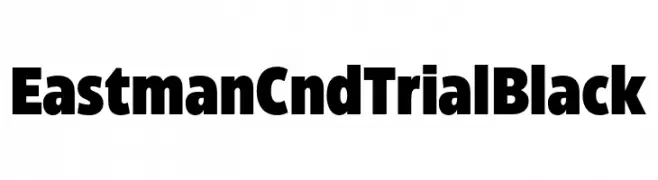
( Fonts by Zetafonts - Personal-use only. For commercial use please contact owner. )
A bold, condensed font with a strong, modern appearance.
 Scaricare 342 Downloads@WebFont
 -
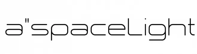
( Fonts by Studio Typo )
A modern, geometric font with thin, uniform lines and a minimalist design.
![a]() Scaricare 342 Downloads@WebFont
Scaricare 342 Downloads@WebFont -
![Masb font caratteri gratis]() Scaricare 342 Downloads@WebFont
Scaricare 342 Downloads@WebFont -
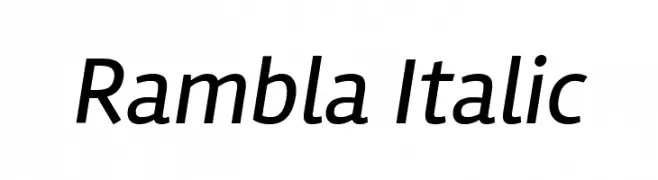
( Copyright (c) 2011-2012, Martin Sommaruga (martin@estudiotrama.com), with Reserved Font Name 'Rambla' )
A modern, italic font with clean lines and balanced proportions.
![Rambla Italic font caratteri gratis]() Scaricare 342 Downloads@WebFont
Scaricare 342 Downloads@WebFont -
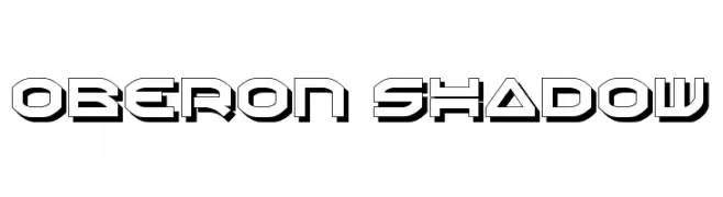
( Fonts by Daniel Zadorozny - www.iconian.com )
A bold, geometric font with a three-dimensional shadow effect.
![Oberon Shadow font caratteri gratis]() Scaricare 342 Downloads@WebFont
Scaricare 342 Downloads@WebFont -
-
( Paul Lloyd Fonts )
A modern, bold, and italicized pattern of stylized letters.
![NewStyle Embossed font caratteri gratis]() Scaricare 342 Downloads@WebFont
Scaricare 342 Downloads@WebFont -
![Tirion Sarati font caratteri gratis]() Scaricare 342 Downloads@WebFont
Scaricare 342 Downloads@WebFont -
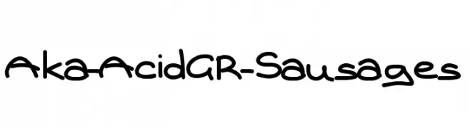
( Fonts by www.aka-acid.com )
A playful, handwritten font with rounded, whimsical characters.
![Aka-AcidGR-Sausages font caratteri gratis]() Scaricare 342 Downloads@WebFont
Scaricare 342 Downloads@WebFont -
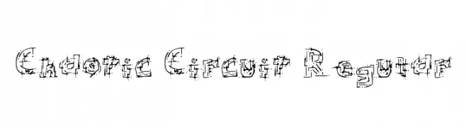
( Fonts by or from www.graffitifonts.net )
A complex, circuit-inspired font with a bold, industrial style.
![Chaotic Circuit Regular font caratteri gratis]() Scaricare 342 Downloads@WebFont
Scaricare 342 Downloads@WebFont -
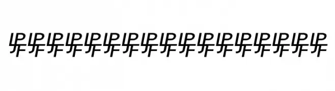
![IP font caratteri gratis]() Scaricare 342 Downloads@WebFont
Scaricare 342 Downloads@WebFont -
![Tattoo No1 font caratteri gratis]() Scaricare 342 Downloads@WebFont
Scaricare 342 Downloads@WebFont -
![usagi font caratteri gratis]() Scaricare 342 Downloads@WebFont
Scaricare 342 Downloads@WebFont -
![domo laughing font caratteri gratis]() Scaricare 342 Downloads@WebFont
Scaricare 342 Downloads@WebFont -
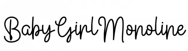
( Fonts by Fillo Graphic )
A playful and elegant monoline script font with smooth, continuous strokes.
![Baby Girl Monoline font caratteri gratis]() Scaricare 342 Downloads@WebFont
Scaricare 342 Downloads@WebFont -
( Fonts by Syaf Rizal - Khurasan - Personal-use only. For commercial use please contact owner. )
A bold, brush-style font with dynamic and expressive strokes.
![Young Robust font caratteri gratis]() Scaricare 342 Downloads@WebFont
Scaricare 342 Downloads@WebFont -
( Fonts by Biham Santoso - Personal-use only. For commercial use please contact owner. )
A classic serif font with modern elegance and high contrast strokes.
![Ghaitsa font caratteri gratis]() Scaricare 342 Downloads@WebFont
Scaricare 342 Downloads@WebFont -
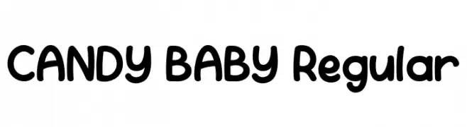
( Fonts by Achmad Yani )
A playful, rounded font with a bold and whimsical style.
![CANDY BABY Regular font caratteri gratis]() Scaricare 342 Downloads@WebFont
Scaricare 342 Downloads@WebFont -
( Fonts by StringLabs - stringlabscreative.com - Personal-use only. For commercial use please contact owner. )
A bold, distressed serif font with a grunge aesthetic.
![Black Rose font caratteri gratis]() Scaricare 342 Downloads@WebFont
Scaricare 342 Downloads@WebFont -
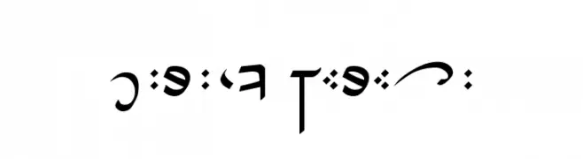
![D'ni Script Angular font caratteri gratis]() Scaricare 342 Downloads@WebFont
Scaricare 342 Downloads@WebFont -
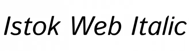
( Copyright (c) 2008-2012, 2014, Andrey V. Panov (panov@canopus.iacp.dvo.ru) )
A modern, italic font with smooth curves and balanced readability.
![Istok Web Italic font caratteri gratis]() Scaricare 342 Downloads@WebFont
Scaricare 342 Downloads@WebFont -
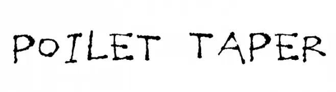
( Fonts by Jacob Fisher - www.pizzadude.dk )
A playful, hand-drawn font with a rough, textured appearance and whimsical style.
![Poilet Taper font caratteri gratis]() Scaricare 342 Downloads@WebFont
Scaricare 342 Downloads@WebFont -
( Fonts by Faris Graphic Art - Personal-use only. For commercial use please contact owner. )
A playful, cursive font with bold, flowing characters and elegant loops.
![Beach font caratteri gratis]() Scaricare 342 Downloads@WebFont
Scaricare 342 Downloads@WebFont -
![bit-01:cube 16 remix font caratteri gratis]() Scaricare 342 Downloads@WebFont
Scaricare 342 Downloads@WebFont -
![Earth Dry - LJ-Design Studios font caratteri gratis]() Scaricare 342 Downloads@WebFont
Scaricare 342 Downloads@WebFont -
( Fonts by Scratchones )
An elegant, flowing script font with modern flourishes.
![Board font caratteri gratis]() Scaricare 342 Downloads@WebFont
Scaricare 342 Downloads@WebFont -
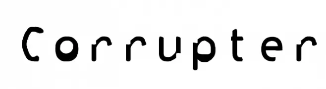
( Fonts by www.fontdiner.com )
A playful, distorted font with quirky, energetic characters.
![Corrupter font caratteri gratis]() Scaricare 342 Downloads@WebFont
Scaricare 342 Downloads@WebFont -
( Fonts by junkohanhero )
A bold, distressed stencil-style font with a vintage industrial feel.
![More news from nowhere font caratteri gratis]() Scaricare 342 Downloads@WebFont
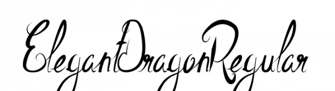
Scaricare 342 Downloads@WebFont -
![ElegantDragonRegular font caratteri gratis]() Scaricare 342 Downloads@WebFont
Scaricare 342 Downloads@WebFont -
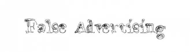
( Fonts by www.lars-manenschijn.nl )
An artistic, hand-drawn font with intricate, sketch-like details.
![False Advertising font caratteri gratis]() Scaricare 342 Downloads@WebFont
Scaricare 342 Downloads@WebFont -
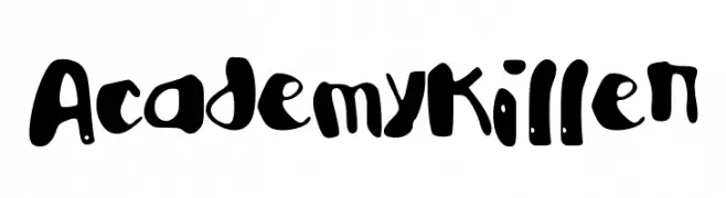
( Fonts by a The Branded Quotes - https://sellfy.com/thebrandedquotes. Personal-use only. For commercial use please contact owner. )
A playful, bold, hand-drawn font with a whimsical and artistic style.
![AcademyKiller font caratteri gratis]() Scaricare 342 Downloads@WebFont
Scaricare 342 Downloads@WebFont -
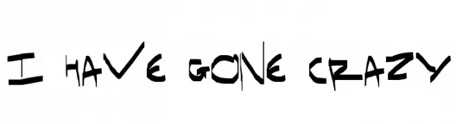
![I have gone crazy font caratteri gratis]() Scaricare 342 Downloads@WebFont
Scaricare 342 Downloads@WebFont -
( Fonts by Vladimir Nikolic - www.creativefabrica.com/designer/vladimirnikolic/ - Personal-use only. For commercial use please contact owner. )
A bold, three-dimensional font with a vintage, industrial feel and dotted interior.
![Scale Regular font caratteri gratis]() Scaricare 342 Downloads@WebFont
Scaricare 342 Downloads@WebFont -
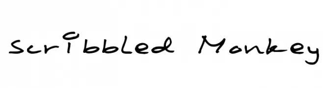
( THESE ARE SHAREWARE FONTS ! NOT FREEWARE ! PLEASE VISIT www.fuelfonts.com )
A playful, casual handwritten font with fluid strokes and a personal touch.
![Scribbled Monkey font caratteri gratis]() Scaricare 342 Downloads@WebFont
Scaricare 342 Downloads@WebFont -
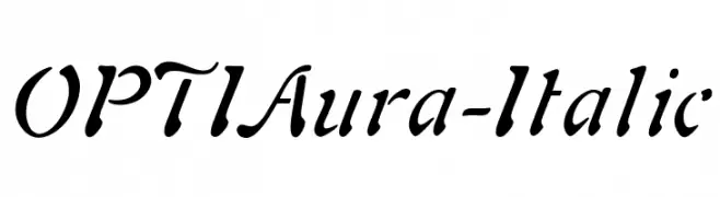
( Fonts by Castcraft Software - opti.netii.net - check the website before use )
An elegant italic font with flowing, cursive strokes and a moderate slant.
![OPTIAura-Italic font caratteri gratis]() Scaricare 342 Downloads@WebFont
Scaricare 342 Downloads@WebFont -
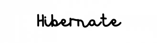
( Fonts by Graphicfresh - Personal-use only. For commercial use please contact owner. )
A playful, casual handwritten font with a smooth, flowing style.
![Hibernate font caratteri gratis]() Scaricare 342 Downloads@WebFont
Scaricare 342 Downloads@WebFont


Quali sono i font più popolari adesso?
Poppins, Roboto, Montserrat, Open Sans e Lato sono molto usati per le forme pulite e l'ampia applicabilità — dall'identità di marca alle landing page e ai poster.
Quali font si usano spesso nei loghi?
Le sans serif geometriche (es. Poppins, famiglie in stile Gotham) sono scelte comuni per un branding pulito e scalabile. Per un tocco personale restano valide script e stili manoscritti. Abbina un display deciso per i titoli a un corpo testo neutro per riconoscibilità ed equilibrio.
Ogni quanto si aggiorna la lista?
Con regolarità, in base ai download e all'attività reale. Torna spesso per scoprire in anticipo le nuove preferite.
💡 Consiglio: aggiungi ai preferiti — le tendenze cambiano in fretta e i font top di oggi possono ispirare il rebranding di domani.