Benvenuto nelle Font Più Popolari — dove popolarità e qualità si incontrano. Qui trovi i font più scaricati e usati dell'anno. Se cerchi scelte sicure per logo, web o social, inizia da qui.
Ogni font top si distingue per equilibrio, leggibilità e versatilità. Troverai sans serif moderne, script eleganti, serif vintage e display minimalisti.
-
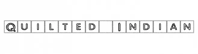
( Fonts by Graham Meade - GemFonts )
A quilted, textured font with boxed characters, offering a playful yet sophisticated look.
 Scaricare 332 Downloads@WebFont
 -
( Fonts by Peter Wiegel - www.peter-wiegel.de )
A bold, playful font with thick strokes and rounded edges, ideal for impactful designs.
![WaschkuecheGrob-Ultra font caratteri gratis]() Scaricare 332 Downloads@WebFont
Scaricare 332 Downloads@WebFont -
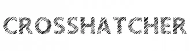
( Fonts by Sharkshock - Personal-use only. For commercial use please contact owner. )
A bold, crosshatched font with a hand-drawn, artistic style.
![Crosshatcher font caratteri gratis]() Scaricare 332 Downloads@WebFont
Scaricare 332 Downloads@WebFont -
( Fonts by Måns Grebäck )
A bold, classic serif typeface with strong vertical lines and prominent serifs.
![Vacer Serif Personal font caratteri gratis]() Scaricare 332 Downloads@WebFont
Scaricare 332 Downloads@WebFont -
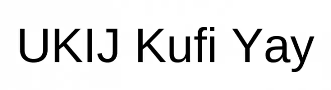
( Fonts by Tursun Sultan - Personal-use only. For commercial use please contact owner. )
A modern sans-serif font with clean lines and a slightly condensed style.
![UKIJ Kufi Yay font caratteri gratis]() Scaricare 332 Downloads@WebFont
Scaricare 332 Downloads@WebFont -
-
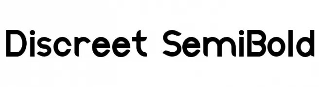
( Fonts by Thais Trizoli - www.behance.net/thaistrizoli )
A modern, rounded font with uniform stroke width and excellent readability.
![Discreet SemiBold font caratteri gratis]() Scaricare 332 Downloads@WebFont
Scaricare 332 Downloads@WebFont -
( Fonts by Xerographer Fonts )
A bold, brush-like font with high contrast and a dynamic, artistic style.
![Spiral font caratteri gratis]() Scaricare 332 Downloads@WebFont
Scaricare 332 Downloads@WebFont -
( Fonts by LyonsType - Daniel Lyons - Personal-use only. For commercial use please contact owner. )
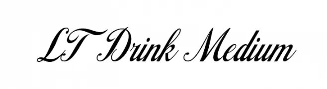
An elegant script font with flowing, cursive style and high contrast strokes.
![LT Drink Medium font caratteri gratis]() Scaricare 332 Downloads@WebFont
Scaricare 332 Downloads@WebFont -
( Fonts by Muhammad Yafinuha )
A bold, playful font with a hand-drawn, graffiti-like style.
![Zooberg font caratteri gratis]() Scaricare 332 Downloads@WebFont
Scaricare 332 Downloads@WebFont -
( Free for a personal use. For a commercial use please visit www.kevinandamanda.com )
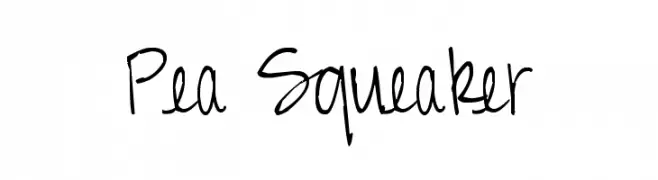
A playful and energetic handwritten font with a casual, free-flowing style.
![Pea Squeaker font caratteri gratis]() Scaricare 332 Downloads@WebFont
Scaricare 332 Downloads@WebFont -
( Fonts by Dan P. Lyons - Personal-use only. For commercial use please contact owner. )
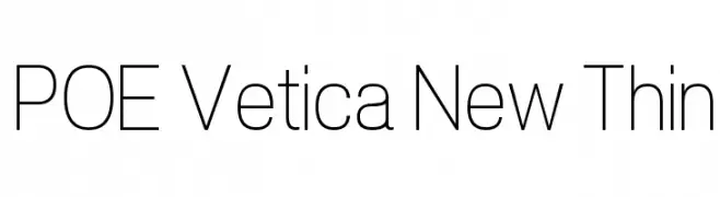
A modern, thin sans-serif font with clean lines and elegant simplicity.
![POE Vetica New Thin font caratteri gratis]() Scaricare 332 Downloads@WebFont
Scaricare 332 Downloads@WebFont -
( Cooldesignlab - Kurniadi Saputra - creativemarket.com/cooldesignlab?u=cooldesignlab )
An elegant, flowing script font with intricate loops and swashes, ideal for formal use.
![StarliveScript font caratteri gratis]() Scaricare 332 Downloads@WebFont
Scaricare 332 Downloads@WebFont -
( Fonts by Vanessa Bays - bythebutterfly.com )
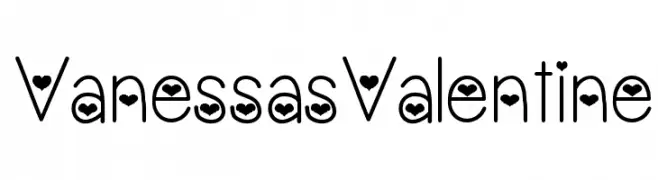
A playful font with heart motifs embedded in each character, perfect for romantic themes.
![VanessasValentine font caratteri gratis]() Scaricare 332 Downloads@WebFont
Scaricare 332 Downloads@WebFont -
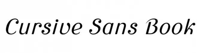
( Fonts by Wojciech Kalinowski "wmk69" (wmk69@o2.pl) - Personal-use only. For commercial use please contact owner. )
A cursive-inspired sans-serif font with elegant, slanted characters.
![Cursive Sans Book font caratteri gratis]() Scaricare 332 Downloads@WebFont
Scaricare 332 Downloads@WebFont -
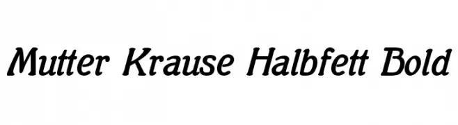
( Fonts by www.peter-wiegel.de. Personal-use only. For commercial use please contact owner. )
A bold, slightly italicized serif font with smooth curves and elegant serifs.
![Mutter Krause Halbfett Bold font caratteri gratis]() Scaricare 332 Downloads@WebFont
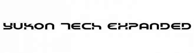
Scaricare 332 Downloads@WebFont -
![Yukon Tech Expanded font caratteri gratis]() Scaricare 332 Downloads@WebFont
Scaricare 332 Downloads@WebFont -
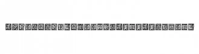
( Fonts by Dieter Steffmann )
A decorative display font with intricate woodcut designs and ornate floral motifs.
![TypographerWoodcutInitialsOne font caratteri gratis]() Scaricare 332 Downloads@WebFont
Scaricare 332 Downloads@WebFont -
( Fonts by Dieter Steffmann )
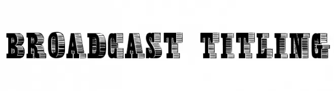
A bold, decorative font with a three-dimensional effect and strong visual impact.
![Broadcast Titling font caratteri gratis]() Scaricare 332 Downloads@WebFont
Scaricare 332 Downloads@WebFont -
( Fonts by Rokas Cicenas - www.roci.lt )
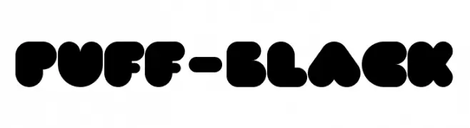
A bold, rounded font with a playful and modern style.
![PUFF-Black font caratteri gratis]() Scaricare 332 Downloads@WebFont
Scaricare 332 Downloads@WebFont -
( Fonts by Pustudio )
A playful, bold font with a hand-drawn, whimsical style.
![PlayCheerful font caratteri gratis]() Scaricare 332 Downloads@WebFont
Scaricare 332 Downloads@WebFont -
![Rosango Italic font caratteri gratis]() Scaricare 332 Downloads@WebFont
Scaricare 332 Downloads@WebFont -
( Fonts by Khurasan )
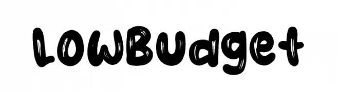
A bold, brush-style font with a playful and artistic appearance.
![Low Budget font caratteri gratis]() Scaricare 332 Downloads@WebFont
Scaricare 332 Downloads@WebFont -
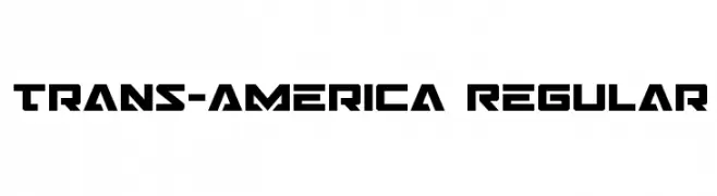
( Fonts by Daniel Zadorozny - www.iconian.com )
A bold, geometric font with a futuristic and industrial style.
![Trans-America Regular font caratteri gratis]() Scaricare 332 Downloads@WebFont
Scaricare 332 Downloads@WebFont -
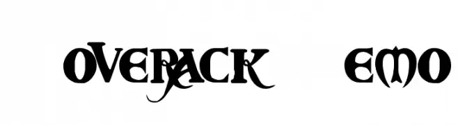
( Fonts by The Scriptorium - Dave Nalle )
A bold, gothic-style font with intricate details and ornamental flourishes.
![Coverack Demo font caratteri gratis]() Scaricare 332 Downloads@WebFont
Scaricare 332 Downloads@WebFont -
![Kinki font caratteri gratis]() Scaricare 332 Downloads@WebFont
Scaricare 332 Downloads@WebFont -
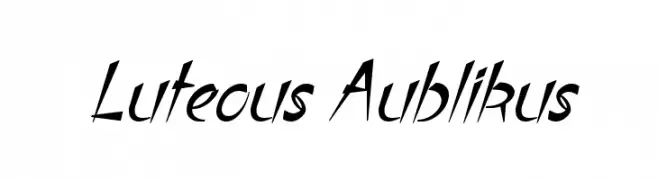
( Fonts by Apostrophic Lab )
A dynamic, angular font with a forward-leaning slant and dramatic flair.
![Luteous Aublikus font caratteri gratis]() Scaricare 332 Downloads@WebFont
Scaricare 332 Downloads@WebFont -
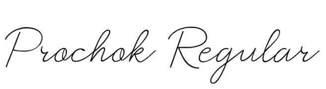
( Le Parte Studio )
A delicate and elegant script font with smooth, flowing lines and connected characters.
![Prochok Regular font caratteri gratis]() Scaricare 332 Downloads@WebFont
Scaricare 332 Downloads@WebFont -
( Fonts by Vladimir Nikolic - www.creativefabrica.com/designer/vladimirnikolic/ - Personal-use only. For commercial use please contact owner. )
A bold, italicized font with a modern, angular design.
![Archigadget Italic font caratteri gratis]() Scaricare 332 Downloads@WebFont
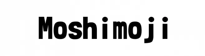
Scaricare 332 Downloads@WebFont -
![Moshimoji font caratteri gratis]() Scaricare 332 Downloads@WebFont
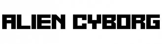
Scaricare 332 Downloads@WebFont -
![Alien Cyborg font caratteri gratis]() Scaricare 332 Downloads@WebFont
Scaricare 332 Downloads@WebFont -
( Fonts by Mans Greback - www.mawns.com )
A futuristic, geometric font with thin, continuous lines and a minimalist design.
![Radio 187.5 font caratteri gratis]() Scaricare 332 Downloads@WebFont
Scaricare 332 Downloads@WebFont -
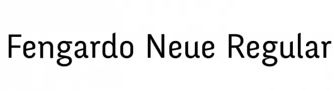
( Fonts by Velvetyne Type Foundry - Personal-use only. For commercial use please contact owner. )
A clean, modern typeface with geometric structure and uniform stroke widths.
![Fengardo Neue Regular font caratteri gratis]() Scaricare 332 Downloads@WebFont
Scaricare 332 Downloads@WebFont -
Caratteri di abhishek7. For commercial use please contact the owner.
![Kruti Dev 010 font caratteri gratis]() Scaricare 332 Downloads@WebFont
Scaricare 332 Downloads@WebFont -
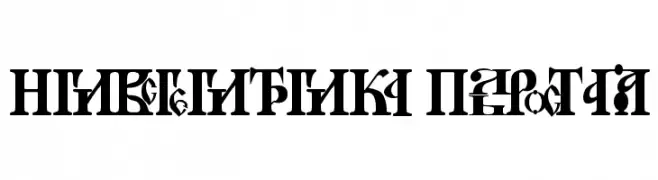
![Novgorod Plain font caratteri gratis]() Scaricare 332 Downloads@WebFont
Scaricare 332 Downloads@WebFont -
![DS Reckoning Cyr font caratteri gratis]() Scaricare 332 Downloads@WebFont
Scaricare 332 Downloads@WebFont


Quali sono i font più popolari adesso?
Poppins, Roboto, Montserrat, Open Sans e Lato sono molto usati per le forme pulite e l'ampia applicabilità — dall'identità di marca alle landing page e ai poster.
Quali font si usano spesso nei loghi?
Le sans serif geometriche (es. Poppins, famiglie in stile Gotham) sono scelte comuni per un branding pulito e scalabile. Per un tocco personale restano valide script e stili manoscritti. Abbina un display deciso per i titoli a un corpo testo neutro per riconoscibilità ed equilibrio.
Ogni quanto si aggiorna la lista?
Con regolarità, in base ai download e all'attività reale. Torna spesso per scoprire in anticipo le nuove preferite.
💡 Consiglio: aggiungi ai preferiti — le tendenze cambiano in fretta e i font top di oggi possono ispirare il rebranding di domani.