Benvenuto nelle Font Più Popolari — dove popolarità e qualità si incontrano. Qui trovi i font più scaricati e usati dell'anno. Se cerchi scelte sicure per logo, web o social, inizia da qui.
Ogni font top si distingue per equilibrio, leggibilità e versatilità. Troverai sans serif moderne, script eleganti, serif vintage e display minimalisti.
-
( Fonts by Geronimo Fonts - Personal-use only. For commercial use please contact owner. )
A modern, geometric font with bold, structured characters.
 Scaricare 332 Downloads@WebFont
 -
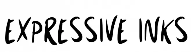
( Fonts by Darrell Flood )
A bold, hand-drawn font with a playful and expressive style.
![Expressive Inks font caratteri gratis]() Scaricare 332 Downloads@WebFont
Scaricare 332 Downloads@WebFont -
( Fonts by YOFonts - Yasuhiro Yamaoka - yoworks.com - Personal-use only. For commercial use please contact owner. )
A modern, clean sans-serif font with uniform stroke width and balanced spacing.
![Eau Sans Book font caratteri gratis]() Scaricare 332 Downloads@WebFont
Scaricare 332 Downloads@WebFont -
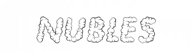
( www.stefibert.it )
A playful, cloud-like font with rounded, bubbly characters.
![NUBLES font caratteri gratis]() Scaricare 332 Downloads@WebFont
Scaricare 332 Downloads@WebFont -
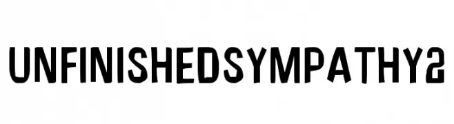
( Fonts by Jacob Fisher - www.pizzadude.dk )
A bold, modern font with blocky, geometric characters ideal for headlines.
![UnfinishedSympathy2 font caratteri gratis]() Scaricare 332 Downloads@WebFont
Scaricare 332 Downloads@WebFont -
-
![Perfect Pixel font caratteri gratis]() Scaricare 332 Downloads@WebFont
Scaricare 332 Downloads@WebFont -
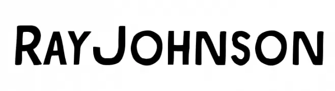
( Download for Personal Use. For Commercial: http://www.k-type.com )
A bold, modern font with a vintage touch, featuring slightly condensed uppercase letters.
![RayJohnson font caratteri gratis]() Scaricare 332 Downloads@WebFont
Scaricare 332 Downloads@WebFont -
![Diager font caratteri gratis]() Scaricare 332 Downloads@WebFont
Scaricare 332 Downloads@WebFont -
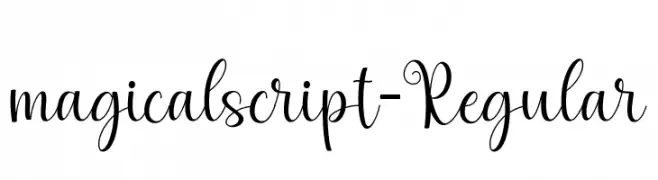
( Fonts by zulkhairilettering - Zulkhairi M Saleh - Personal-use only. For commercial use please contact owner. )
A whimsical, cursive font with elegant loops and flowing connections.
![magicalscript-Regular font caratteri gratis]() Scaricare 332 Downloads@WebFont
Scaricare 332 Downloads@WebFont -
( Fonts by Daniel Zadorozny - www.iconian.com - Free for personal use )
A bold, expanded, and italicized font with a futuristic geometric style.
![Direktor Expanded Italic font caratteri gratis]() Scaricare 332 Downloads@WebFont
Scaricare 332 Downloads@WebFont -
( Michael D. Adams - www.triskele.com/roadgeek-fonts/ )
A bold, clean sans-serif font with geometric shapes and uniform strokes.
![Roadgeek2000EM font caratteri gratis]() Scaricare 332 Downloads@WebFont
Scaricare 332 Downloads@WebFont -
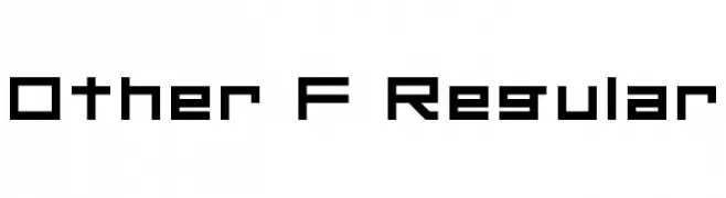
( Fonts by Nathan McArthur )
A bold, geometric font with a modern, tech-inspired design.
![Other F Regular font caratteri gratis]() Scaricare 332 Downloads@WebFont
Scaricare 332 Downloads@WebFont -
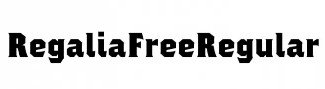
( Fonts by Philatype - Personal-use only. For commercial use please contact owner. )
A bold, angular font with a modern geometric style.
![Regalia Free Regular font caratteri gratis]() Scaricare 332 Downloads@WebFont
Scaricare 332 Downloads@WebFont -
( Fonts by Daniel Zadorozny - www.iconian.com )
A bold, gothic-inspired font with sharp, angular lines and dramatic serifs.
![Xiphos font caratteri gratis]() Scaricare 332 Downloads@WebFont
Scaricare 332 Downloads@WebFont -
( Fonts by Daniel Zadorozny - www.iconian.com )
A futuristic, narrow font with consistent stroke widths and a modern aesthetic.
![Alien League Condensed font caratteri gratis]() Scaricare 332 Downloads@WebFont
Scaricare 332 Downloads@WebFont -
![Cyberspace Raceway Back font caratteri gratis]() Scaricare 332 Downloads@WebFont
Scaricare 332 Downloads@WebFont -
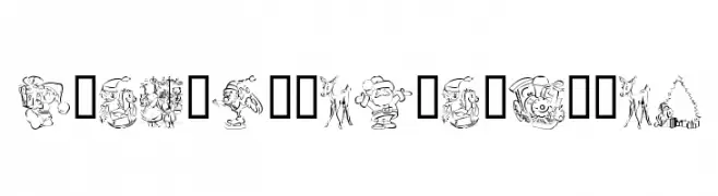
( Fonts by Kat`s Fun Fonts - Personal-use only. For commercial use please contact owner. )
A decorative font with Christmas-themed illustrations replacing standard characters.
![KR Christmas Color Me font caratteri gratis]() Scaricare 332 Downloads@WebFont
Scaricare 332 Downloads@WebFont -
( Fonts by Manfred Klein. Free for private and charity use. Free for commercial with donation to organizations )
A decorative font with intricate floral designs on each character.
![PlantsLetters font caratteri gratis]() Scaricare 332 Downloads@WebFont
Scaricare 332 Downloads@WebFont -
( Fonts by Tursun Sultan - Personal-use only. For commercial use please contact owner. )
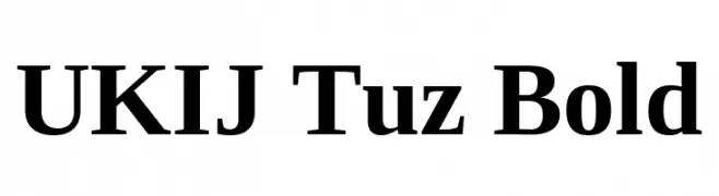
A bold serif typeface with high contrast and pronounced serifs, ideal for impactful headlines.
![UKIJ Tuz Bold font caratteri gratis]() Scaricare 332 Downloads@WebFont
Scaricare 332 Downloads@WebFont -
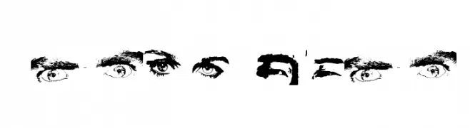
![Eye Spy font caratteri gratis]() Scaricare 332 Downloads@WebFont
Scaricare 332 Downloads@WebFont -
( Fonts by Graham Meade - GemFonts )
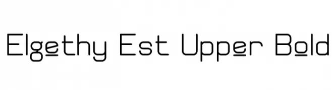
A modern, geometric font with clean lines and rounded edges.
![Elgethy Est Upper Bold font caratteri gratis]() Scaricare 332 Downloads@WebFont
Scaricare 332 Downloads@WebFont -
( Fonts by Graham Meade - GemFonts )
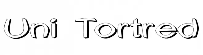
A playful, 3D-effect font with bold, rounded characters and a whimsical style.
![Uni Tortred font caratteri gratis]() Scaricare 332 Downloads@WebFont
Scaricare 332 Downloads@WebFont -
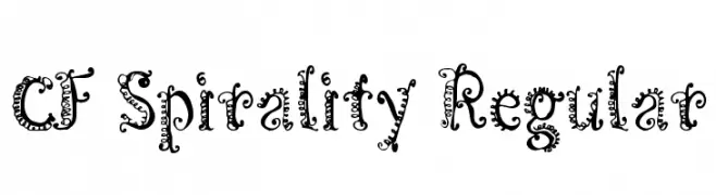
( Fonts by Steve Cloutier - www.cloutierfontes.ca )
A whimsical, decorative font with intricate spirals and curls.
![CF Spirality Regular font caratteri gratis]() Scaricare 332 Downloads@WebFont
Scaricare 332 Downloads@WebFont -
![Clip Font Caps font caratteri gratis]() Scaricare 332 Downloads
Scaricare 332 Downloads -
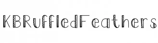
( Fonts by Khrys Bosland )
A whimsical, hand-drawn decorative font with intricate patterns.
![KBRuffledFeathers font caratteri gratis]() Scaricare 332 Downloads@WebFont
Scaricare 332 Downloads@WebFont -
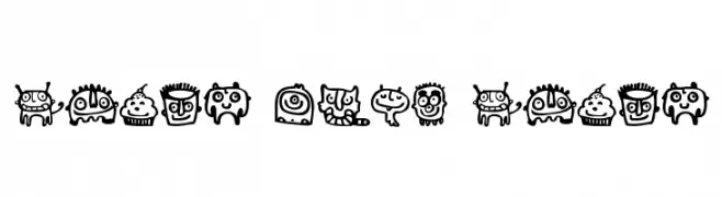
![Smile Baby Smile font caratteri gratis]() Scaricare 332 Downloads@WebFont
Scaricare 332 Downloads@WebFont -
![Aesthetika font caratteri gratis]() Scaricare 332 Downloads@WebFont
Scaricare 332 Downloads@WebFont -
![SF Orson Casual Medium Oblique font caratteri gratis]() Scaricare 332 Downloads@WebFont
Scaricare 332 Downloads@WebFont -
![G4 2004 Regular font caratteri gratis]() Scaricare 332 Downloads@WebFont
Scaricare 332 Downloads@WebFont -
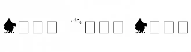
![The Butcher Factory font caratteri gratis]() Scaricare 332 Downloads@WebFont
Scaricare 332 Downloads@WebFont -
![AngloSaxon Runes 1 font caratteri gratis]() Scaricare 332 Downloads
Scaricare 332 Downloads -
( Fonts by Letterhend Studio - Hendry Juanda - Personal-use only. For commercial use please contact owner. )
An elegant cursive font with flowing, handwritten style.
![Thirdlone-Regular font caratteri gratis]() Scaricare 332 Downloads@WebFont
Scaricare 332 Downloads@WebFont -
( Copyright (c) 2015, Cadson Demak (info@cadsondemak.com) )
A modern serif font with elegant proportions and balanced stroke contrast.
![Maitree Light font caratteri gratis]() Scaricare 332 Downloads@WebFont
Scaricare 332 Downloads@WebFont -
( Free for a personal use. For a commercial use please visit www.kevinandamanda.com )
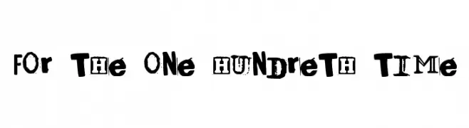
A decorative, grunge-inspired font with a vintage and eclectic style.
![For The One Hundreth Time font caratteri gratis]() Scaricare 332 Downloads@WebFont
Scaricare 332 Downloads@WebFont -
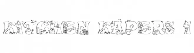
![Kitchen Kapers I font caratteri gratis]() Scaricare 332 Downloads@WebFont
Scaricare 332 Downloads@WebFont


Quali sono i font più popolari adesso?
Poppins, Roboto, Montserrat, Open Sans e Lato sono molto usati per le forme pulite e l'ampia applicabilità — dall'identità di marca alle landing page e ai poster.
Quali font si usano spesso nei loghi?
Le sans serif geometriche (es. Poppins, famiglie in stile Gotham) sono scelte comuni per un branding pulito e scalabile. Per un tocco personale restano valide script e stili manoscritti. Abbina un display deciso per i titoli a un corpo testo neutro per riconoscibilità ed equilibrio.
Ogni quanto si aggiorna la lista?
Con regolarità, in base ai download e all'attività reale. Torna spesso per scoprire in anticipo le nuove preferite.
💡 Consiglio: aggiungi ai preferiti — le tendenze cambiano in fretta e i font top di oggi possono ispirare il rebranding di domani.