Benvenuto nelle Font Più Popolari — dove popolarità e qualità si incontrano. Qui trovi i font più scaricati e usati dell'anno. Se cerchi scelte sicure per logo, web o social, inizia da qui.
Ogni font top si distingue per equilibrio, leggibilità e versatilità. Troverai sans serif moderne, script eleganti, serif vintage e display minimalisti.
-
( Free for personal use - )
A bold, 3D-effect font with clean lines and a modern aesthetic.
 Scaricare 292 Downloads@WebFont
 -
Caratteri di HammerBro101. For commercial use please contact the owner.
![CarbonThin Italic W00 Regular font caratteri gratis]() Scaricare 292 Downloads@WebFont
Scaricare 292 Downloads@WebFont -
![Jetta font caratteri gratis]() Scaricare 292 Downloads@WebFont
Scaricare 292 Downloads@WebFont -
( Fonts by twinletter )
A bold, rugged font with a hand-crafted, edgy appearance.
![Thertole Personal Use font caratteri gratis]() Scaricare 292 Downloads@WebFont
Scaricare 292 Downloads@WebFont -
![AnmolNeon font caratteri gratis]() Scaricare 292 Downloads@WebFont
Scaricare 292 Downloads@WebFont -
-
( dcoxy - Greg Medina - www.dcoxy.com/ )
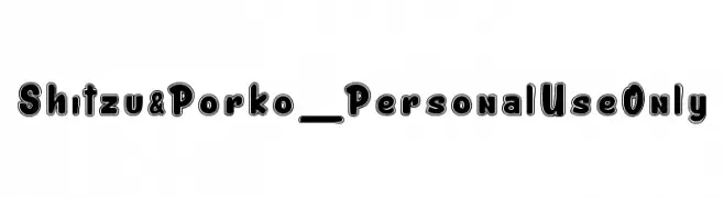
A bold, playful font with rounded, outlined characters.
![Shitzu&Porko_PersonalUseOnly font caratteri gratis]() Scaricare 292 Downloads@WebFont
Scaricare 292 Downloads@WebFont -
( Fonts by www.alphabetype.it )
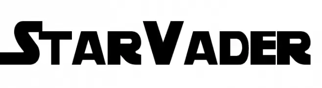
A bold, futuristic font with strong geometric shapes and sharp angles.
![StarVader font caratteri gratis]() Scaricare 292 Downloads@WebFont
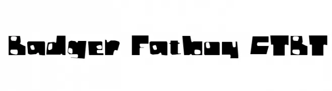
Scaricare 292 Downloads@WebFont -
![Badger Fatboy CTBT font caratteri gratis]() Scaricare 292 Downloads@WebFont
Scaricare 292 Downloads@WebFont -
( Fonts by www.omniglot.com )
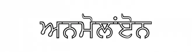
A bold, geometric font inspired by traditional scripts with sharp, angular characters.
![Enganagri font caratteri gratis]() Scaricare 292 Downloads@WebFont
Scaricare 292 Downloads@WebFont -
( Fonts by Meir Sadan - www.sadan.com Commerciali Caratteri )
A bold, brush-style font with dynamic, hand-drawn characteristics.
![Serena font caratteri gratis]() Scaricare 292 Downloads
Scaricare 292 Downloads -
![Kovacs Spot font caratteri gratis]() Scaricare 292 Downloads
Scaricare 292 Downloads -
( Fonts by Modestype Studio )
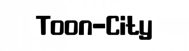
A bold, cartoonish font with rounded edges and a playful style.
![Toon-City font caratteri gratis]() Scaricare 292 Downloads@WebFont
Scaricare 292 Downloads@WebFont -
( Fonts by Abo Daniel Studio )
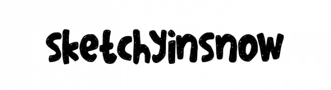
A bold, sketchy font with a snowy texture and playful, hand-drawn style.
![sketchyinsnow font caratteri gratis]() Scaricare 292 Downloads@WebFont
Scaricare 292 Downloads@WebFont -
![Tristan font caratteri gratis]() Scaricare 292 Downloads@WebFont
Scaricare 292 Downloads@WebFont -
Caratteri di JuanCasco. For commercial use please contact the owner.
( Fonts by Juan Casco - www.juancasco.net )
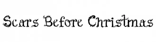
An edgy, distressed font with thorny, jagged edges.
![Scars Before Christmas font caratteri gratis]() Scaricare 292 Downloads@WebFont
Scaricare 292 Downloads@WebFont -
( Rajendra Bitling - www.rbitling.com )
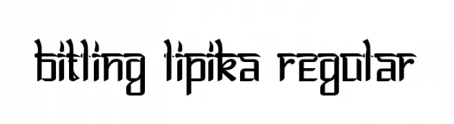
A modern, angular font with a futuristic and bold design.
![Bitling lipika Regular font caratteri gratis]() Scaricare 292 Downloads@WebFont
Scaricare 292 Downloads@WebFont -
( Fonts by Jacob Fisher - www.pizzadude.dk )
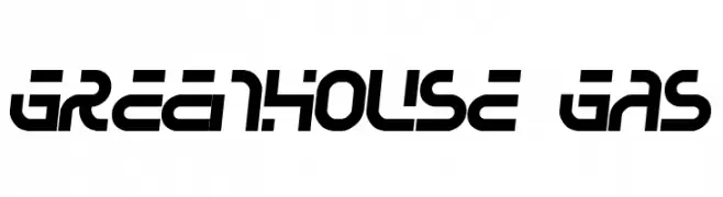
A bold, futuristic font with geometric shapes and a dynamic style.
![Greenhouse gas font caratteri gratis]() Scaricare 292 Downloads@WebFont
Scaricare 292 Downloads@WebFont -
( I Like Fonts - Alan Alan )
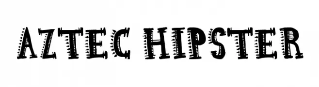
A bold, decorative font with tribal-inspired geometric patterns.
![Aztec Hipster font caratteri gratis]() Scaricare 292 Downloads@WebFont
Scaricare 292 Downloads@WebFont -
( Fonts by Andrew McCluskey - nalgames.com )
A bold, geometric font with a modern, tech-inspired design.
![The Keepsake Days Regular font caratteri gratis]() Scaricare 292 Downloads@WebFont
Scaricare 292 Downloads@WebFont -
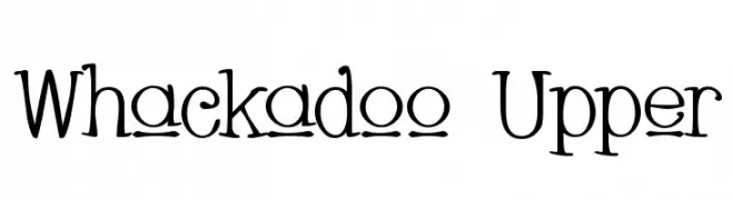
( Fonts by Apostrophic Lab )
A whimsical and playful serif font with curly, exaggerated serifs and a hand-drawn feel.
![Whackadoo Upper font caratteri gratis]() Scaricare 292 Downloads@WebFont
Scaricare 292 Downloads@WebFont -
![FuwafuwaFururuHS font caratteri gratis]() Scaricare 292 Downloads@WebFont
Scaricare 292 Downloads@WebFont -
( Fonts by Matthew Luckow - Personal-use only. For commercial use please contact owner. )
A sharp, angular font with a mythical, rune-like appearance.
![Dragon Alphabet [Thuum] font caratteri gratis]() Scaricare 292 Downloads@WebFont
Scaricare 292 Downloads@WebFont -
![Konfekt font caratteri gratis]() Scaricare 292 Downloads@WebFont
Scaricare 292 Downloads@WebFont -
![Malarky font caratteri gratis]() Scaricare 292 Downloads@WebFont
Scaricare 292 Downloads@WebFont -
( Fonts by a Max Infeld - XEROGRAPHER FONTS - xerographer.blogspot.com . Personal-use only. For commercial use please contact owner. )
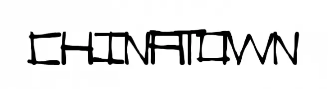
A bold, hand-drawn font inspired by traditional East Asian calligraphy.
![ChinaTown font caratteri gratis]() Scaricare 292 Downloads@WebFont
Scaricare 292 Downloads@WebFont -
![hermida_pro font caratteri gratis]() Scaricare 292 Downloads@WebFont
Scaricare 292 Downloads@WebFont -
( Fonts by Douglas Vitkauskas - www.vtksdesign.com. Personal-use only. For commercial use please contact owner. )
An ornate and decorative font with intricate swirls, perfect for artistic and vintage-themed projects.
![Vtks Wine Label Two font caratteri gratis]() Scaricare 292 Downloads@WebFont
Scaricare 292 Downloads@WebFont -
Caratteri di danny91194. For commercial use please contact the owner.
( marty bee )
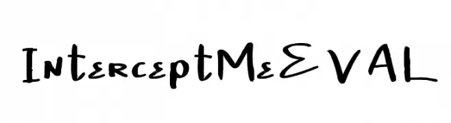
A playful, hand-drawn font with dynamic strokes and whimsical details.
![InterceptMeEVAL font caratteri gratis]() Scaricare 292 Downloads@WebFont
Scaricare 292 Downloads@WebFont -
( Fonts by Adien Gunarta - fontasticindonesia.blogspot.com )
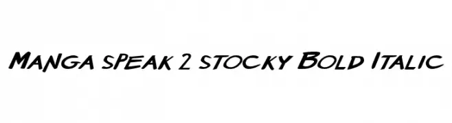
A bold, italicized font with a dynamic, comic-inspired style.
![Manga speak 2 stocky Bold Italic font caratteri gratis]() Scaricare 292 Downloads@WebFont
Scaricare 292 Downloads@WebFont -
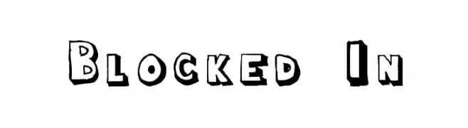
![Blocked In font caratteri gratis]() Scaricare 292 Downloads@WebFont
Scaricare 292 Downloads@WebFont -
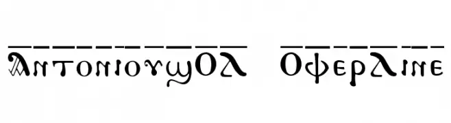
![AntoniousOL OverLine font caratteri gratis]() Scaricare 292 Downloads
Scaricare 292 Downloads -
![Your Star font caratteri gratis]() Scaricare 292 Downloads@WebFont
Scaricare 292 Downloads@WebFont -
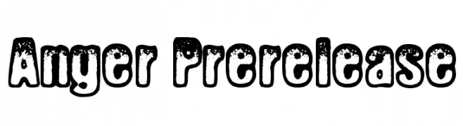
![Anger Prerelease font caratteri gratis]() Scaricare 292 Downloads@WebFont
Scaricare 292 Downloads@WebFont -
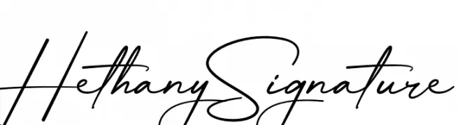
( Fonts by Halymunt Studio - Personal-use only. For commercial use please contact owner. )
A graceful and elegant handwritten script font with flowing curves.
![Hethany Signature font caratteri gratis]() Scaricare 292 Downloads@WebFont
Scaricare 292 Downloads@WebFont -
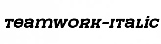
( 7NTypes - Situjuh Nazara - 7ntypes.com )
A bold, italic font with strong, dynamic strokes and a modern style.
![TeamWork-Italic font caratteri gratis]() Scaricare 292 Downloads@WebFont
Scaricare 292 Downloads@WebFont


![Dragon Alphabet [Thuum] font caratteri gratis](https://d144mzi0q5mijx.cloudfront.net/img/D/R/Dragon-Alphabet-Thuum.webp)


Quali sono i font più popolari adesso?
Poppins, Roboto, Montserrat, Open Sans e Lato sono molto usati per le forme pulite e l'ampia applicabilità — dall'identità di marca alle landing page e ai poster.
Quali font si usano spesso nei loghi?
Le sans serif geometriche (es. Poppins, famiglie in stile Gotham) sono scelte comuni per un branding pulito e scalabile. Per un tocco personale restano valide script e stili manoscritti. Abbina un display deciso per i titoli a un corpo testo neutro per riconoscibilità ed equilibrio.
Ogni quanto si aggiorna la lista?
Con regolarità, in base ai download e all'attività reale. Torna spesso per scoprire in anticipo le nuove preferite.
💡 Consiglio: aggiungi ai preferiti — le tendenze cambiano in fretta e i font top di oggi possono ispirare il rebranding di domani.