Benvenuto nelle Font Più Popolari — dove popolarità e qualità si incontrano. Qui trovi i font più scaricati e usati dell'anno. Se cerchi scelte sicure per logo, web o social, inizia da qui.
Ogni font top si distingue per equilibrio, leggibilità e versatilità. Troverai sans serif moderne, script eleganti, serif vintage e display minimalisti.
-
( Fonts by Syaf Rizal - https://creativemarket.com/khurasan - Personal-use only. For commercial use please contact owner. )
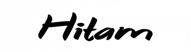
A bold, dynamic script font with a handwritten, energetic style.
 Scaricare 301 Downloads@WebFont
 -
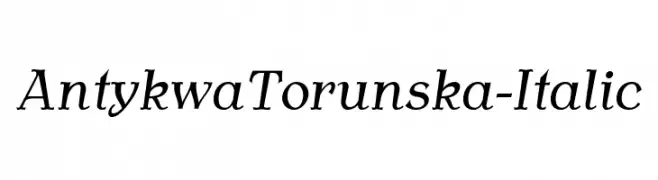
![AntykwaTorunska-Italic font caratteri gratis]() Scaricare 301 Downloads@WebFont
Scaricare 301 Downloads@WebFont -
( Fonts by Hendra Maulia )
An elegant and flowing script font with intricate loops and swirls.
![CeciliaScript font caratteri gratis]() Scaricare 301 Downloads@WebFont
Scaricare 301 Downloads@WebFont -
![Zamolxis VI font caratteri gratis]() Scaricare 301 Downloads@WebFont
Scaricare 301 Downloads@WebFont -
( Fonts by www.DigitalDreamDesign.net )
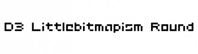
A pixelated, blocky font inspired by retro digital displays.
![D3 Littlebitmapism Round font caratteri gratis]() Scaricare 301 Downloads@WebFont
Scaricare 301 Downloads@WebFont -
( Fonts by Thomas Ledin - tomledin.com )
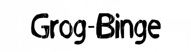
A bold, distressed font with a rugged, textured appearance.
![Grog-Binge font caratteri gratis]() Scaricare 301 Downloads@WebFont
Scaricare 301 Downloads@WebFont -
( Fonts by Qwerks )
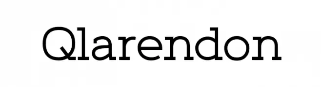
A modern slab serif font with bold serifs and clean lines.
![Qlarendon font caratteri gratis]() Scaricare 301 Downloads@WebFont
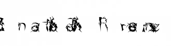
Scaricare 301 Downloads@WebFont -
![Beneath The Remains font caratteri gratis]() Scaricare 301 Downloads@WebFont
Scaricare 301 Downloads@WebFont -
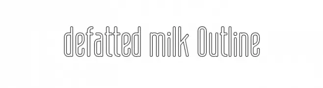
![defatted milk Outline font caratteri gratis]() Scaricare 301 Downloads@WebFont
Scaricare 301 Downloads@WebFont -
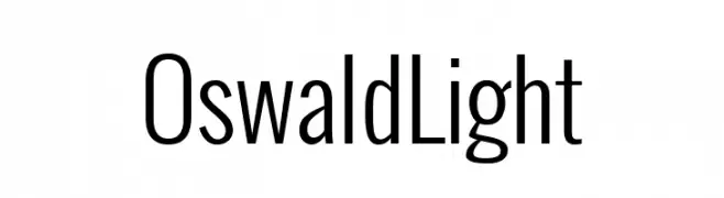
( Fonts by Vernon Adams )
A modern, tall, and narrow sans-serif font with clean lines and balanced spacing.
![Oswald Light font caratteri gratis]() Scaricare 301 Downloads@WebFont
Scaricare 301 Downloads@WebFont -
( Fonts by Daniel Zadorozny - www.iconian.com )
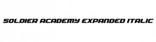
A bold, expanded, and italicized font with a modern, dynamic style.
![Soldier Academy Expanded Italic font caratteri gratis]() Scaricare 301 Downloads@WebFont
Scaricare 301 Downloads@WebFont -
( Fonts by www.smeltery.net )
A bold, modern monospaced font with consistent stroke thickness and geometric design.
![TElerysmMono2-Regular font caratteri gratis]() Scaricare 301 Downloads@WebFont
Scaricare 301 Downloads@WebFont -
( Fonts by Marty Bee - www.martybee.com )
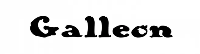
A bold, vintage-style font with thick strokes and decorative serifs.
![Galleon font caratteri gratis]() Scaricare 301 Downloads@WebFont
Scaricare 301 Downloads@WebFont -
( Fonts by Bonjour Monde )
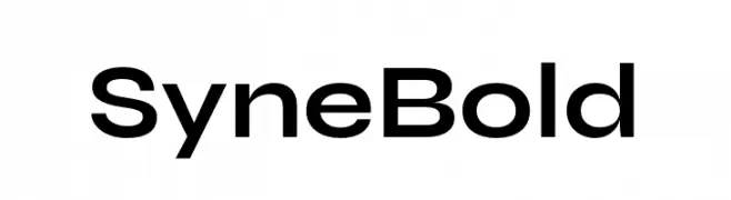
A bold, geometric sans-serif font with a modern and clean design.
![Syne Bold font caratteri gratis]() Scaricare 301 Downloads@WebFont
Scaricare 301 Downloads@WebFont -
( Fonts by deFharo )
A bold, tribal-inspired font with strong lines and decorative elements.
![The Tribal Box font caratteri gratis]() Scaricare 301 Downloads@WebFont
Scaricare 301 Downloads@WebFont -
( imagex - www.imagex-fonts.com )
A bold, angular font with a futuristic and geometric design.
![Fuji Quake Zone font caratteri gratis]() Scaricare 301 Downloads@WebFont
Scaricare 301 Downloads@WebFont -
( Fonts by madeDeduk - Personal-use only. For commercial use please contact owner. )
A bold, dynamic script font with thick, connected strokes.
![Phamelo font caratteri gratis]() Scaricare 301 Downloads@WebFont
Scaricare 301 Downloads@WebFont -
( Free for a personal use. For a commercial use please visit www.kevinandamanda.com )
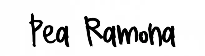
A playful, handwritten font with a casual and friendly vibe.
![Pea Ramona font caratteri gratis]() Scaricare 301 Downloads@WebFont
Scaricare 301 Downloads@WebFont -
![Hall of Fame font caratteri gratis]() Scaricare 301 Downloads@WebFont
Scaricare 301 Downloads@WebFont -
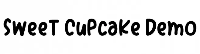
( mlkwsn - Malik Wisnu )
A playful, hand-drawn font with rounded, bold characters and a whimsical style.
![Sweet Cupcake Demo font caratteri gratis]() Scaricare 301 Downloads@WebFont
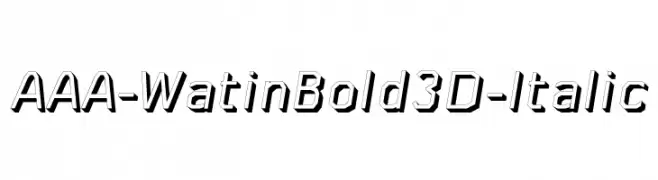
Scaricare 301 Downloads@WebFont -
![AAA-WatinBold3D-Italic font caratteri gratis]() Scaricare 301 Downloads@WebFont
Scaricare 301 Downloads@WebFont -
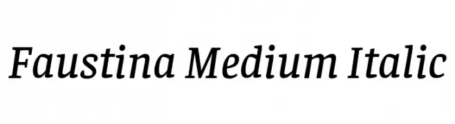
( Copyright 2016 The Faustina Project Authors (omnibus.type@gmail.com) )
A medium-weight, italic serif font with a classic and elegant style.
![Faustina Medium Italic font caratteri gratis]() Scaricare 301 Downloads@WebFont
Scaricare 301 Downloads@WebFont -
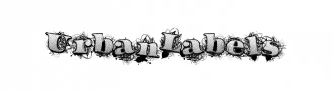
( Fonts by a Max Infeld - XEROGRAPHER FONTS - xerographer.blogspot.com . Personal-use only. For commercial use please contact owner. )
A bold, graffiti-inspired font with a textured, urban aesthetic.
![UrbanLabels font caratteri gratis]() Scaricare 301 Downloads@WebFont
Scaricare 301 Downloads@WebFont -
![SF Eccentric Opus Shaded font caratteri gratis]() Scaricare 301 Downloads@WebFont
Scaricare 301 Downloads@WebFont -
![V5 Cuadra2 Thick font caratteri gratis]() Scaricare 301 Downloads@WebFont
Scaricare 301 Downloads@WebFont -
( Dan Smith's Fantasy Fonts - www.acondia.com/fonts/index.html )
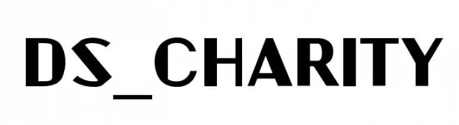
A bold, geometric font with a modern and assertive style.
![DS_Charity font caratteri gratis]() Scaricare 301 Downloads
Scaricare 301 Downloads -
( Fonts by Xerographer Fonts )
A bold, decorative font with a cross-hatched texture and structured design.
![PrizedStudy font caratteri gratis]() Scaricare 301 Downloads@WebFont
Scaricare 301 Downloads@WebFont -
( Fonts by Nestype - Yesaya Amnestian - Personal-use only. For commercial use please contact owner. )
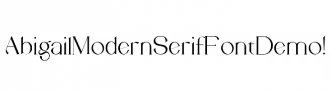
A modern serif font with high contrast and elegant, thin strokes.
![Abigail Modern Serif Font Demo ! font caratteri gratis]() Scaricare 301 Downloads@WebFont
Scaricare 301 Downloads@WebFont -
( Fonts by New Typography - Vernon Adams. Personal-use only. For commercial use please contact owner. )
A casual, elegant handwritten font with smooth curves and a slight slant.
![Damion font caratteri gratis]() Scaricare 301 Downloads@WebFont
Scaricare 301 Downloads@WebFont -
( Fonts by Kustomtype - Personal-use only. For commercial use please contact owner. )
A bold, modern sans-serif font with strong, uniform strokes.
![Fontwax font caratteri gratis]() Scaricare 301 Downloads@WebFont
Scaricare 301 Downloads@WebFont -
![Dennor font caratteri gratis]() Scaricare 301 Downloads@WebFont
Scaricare 301 Downloads@WebFont -
( Fonts by www.peter-wiegel.de. Personal-use only. For commercial use please contact owner. )
A bold, rounded font with a playful and dynamic style.
![Beta54 font caratteri gratis]() Scaricare 300 Downloads@WebFont
Scaricare 300 Downloads@WebFont -
( Fonts by Jacob Fisher - www.pizzadude.dk )
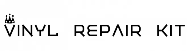
A modern, geometric font with crown motifs, ideal for decorative use.
![Vinyl repair kit font caratteri gratis]() Scaricare 300 Downloads@WebFont
Scaricare 300 Downloads@WebFont -
( Fonts by softerviews.org )
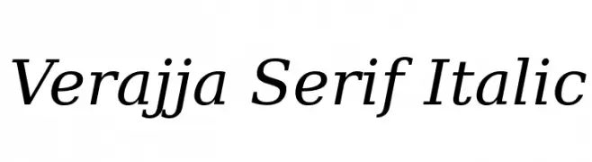
An elegant serif font with a classic italic style and refined serifs.
![Verajja Serif Italic font caratteri gratis]() Scaricare 300 Downloads@WebFont
Scaricare 300 Downloads@WebFont -
Caratteri di TGIFStudio. For commercial use please contact the owner.
( Thank you for downloading this font This font is free for PERSONAL USE ONLY! Commercial license for this font can be purchased at: http://bit.ly/2xZKj1Q )
A dynamic and flowing script font with elegant cursive letterforms.
![Elliot font caratteri gratis]() Scaricare 300 Downloads@WebFont
Scaricare 300 Downloads@WebFont


Quali sono i font più popolari adesso?
Poppins, Roboto, Montserrat, Open Sans e Lato sono molto usati per le forme pulite e l'ampia applicabilità — dall'identità di marca alle landing page e ai poster.
Quali font si usano spesso nei loghi?
Le sans serif geometriche (es. Poppins, famiglie in stile Gotham) sono scelte comuni per un branding pulito e scalabile. Per un tocco personale restano valide script e stili manoscritti. Abbina un display deciso per i titoli a un corpo testo neutro per riconoscibilità ed equilibrio.
Ogni quanto si aggiorna la lista?
Con regolarità, in base ai download e all'attività reale. Torna spesso per scoprire in anticipo le nuove preferite.
💡 Consiglio: aggiungi ai preferiti — le tendenze cambiano in fretta e i font top di oggi possono ispirare il rebranding di domani.