Benvenuto nelle Font Più Popolari — dove popolarità e qualità si incontrano. Qui trovi i font più scaricati e usati dell'anno. Se cerchi scelte sicure per logo, web o social, inizia da qui.
Ogni font top si distingue per equilibrio, leggibilità e versatilità. Troverai sans serif moderne, script eleganti, serif vintage e display minimalisti.
-
( Fonts by www.kimberlygeswein.com - Kimberly Geswein )
A bold, circular font with decorative stars and high contrast.
 Scaricare 289 Downloads@WebFont
 -
![Halo Condensed font caratteri gratis]() Scaricare 289 Downloads@WebFont
Scaricare 289 Downloads@WebFont -
( Fonts by www.DigitalDreamDesign.net )
A bold, angular font with a futuristic and dynamic style.
![D3 Factorism Italic font caratteri gratis]() Scaricare 289 Downloads@WebFont
Scaricare 289 Downloads@WebFont -
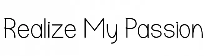
( Fonts by skomii - Personal-use only. For commercial use please contact owner. )
A modern, geometric sans-serif font with consistent stroke width and rounded lowercase letters.
![Realize My Passion font caratteri gratis]() Scaricare 289 Downloads@WebFont
Scaricare 289 Downloads@WebFont -
( Fonts by William Jeovah de Medeiros )
A playful, bold handwritten font with rounded strokes and an informal style.
![Decalk font caratteri gratis]() Scaricare 289 Downloads@WebFont
Scaricare 289 Downloads@WebFont -
-
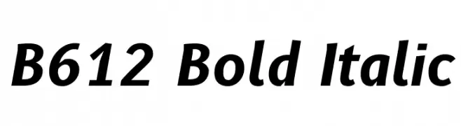
( Copyright 2012 The B612 Project Authors (https://github.com/polarsys/b612) )
A bold, italicized font with a modern and dynamic style.
![B612 Bold Italic font caratteri gratis]() Scaricare 289 Downloads@WebFont
Scaricare 289 Downloads@WebFont -
![Mused Regular font caratteri gratis]() Scaricare 289 Downloads@WebFont
Scaricare 289 Downloads@WebFont -
( Fonts by Docallisme HAS )
A playful, stitched outline font with bold, rounded characters.
![Hooman Stitch font caratteri gratis]() Scaricare 289 Downloads@WebFont
Scaricare 289 Downloads@WebFont -
( Bagus Belo Prayogo - biangwarna.tumblr.com )
A decorative, angular font with a fragmented, geometric design.
![Ark font caratteri gratis]() Scaricare 289 Downloads@WebFont
Scaricare 289 Downloads@WebFont -
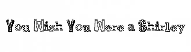
( Free for a personal use. For a commercial use please visit www.kevinandamanda.com )
A playful, textured display font with unique patterns in each letter.
![You Wish You Were a Shirley font caratteri gratis]() Scaricare 289 Downloads@WebFont
Scaricare 289 Downloads@WebFont -
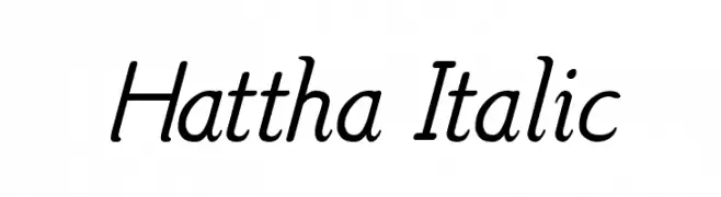
( Fonts by www.aimwell.org/Fonts/fonts.html )
An elegant italic font with smooth curves and a sophisticated style.
![Hattha Italic font caratteri gratis]() Scaricare 289 Downloads@WebFont
Scaricare 289 Downloads@WebFont -
( Fonts by Kevin Richey - Personal-use only. For commercial use please contact owner. )
A playful and casual script font with flowing, connected letters.
![Peterbuilt font caratteri gratis]() Scaricare 289 Downloads@WebFont
Scaricare 289 Downloads@WebFont -
( Fonts by Letterflow Studio - Personal-use only. For commercial use please contact owner. )
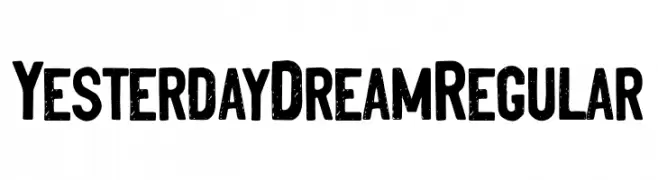
A bold, textured font with a vintage, distressed style.
![YesterdayDreamRegular font caratteri gratis]() Scaricare 289 Downloads@WebFont
Scaricare 289 Downloads@WebFont -
( Fonts by gabreyes.com - Personal-use only. For commercial use please contact owner. )
A bold, dynamic serif font with a modern twist and high contrast.
![Tropikal Bold font caratteri gratis]() Scaricare 289 Downloads@WebFont
Scaricare 289 Downloads@WebFont -
![Seasalt font caratteri gratis]() Scaricare 289 Downloads@WebFont
Scaricare 289 Downloads@WebFont -
( Fonts by Daniel Zadorozny - www.iconian.com - Free for personal use )
A bold, italicized font with a futuristic and dynamic style.
![Gemina Academy Italic font caratteri gratis]() Scaricare 289 Downloads@WebFont
Scaricare 289 Downloads@WebFont -
( Fonts by Apostrophic Lab )
A bold, distressed decorative font with a rugged, geometric style.
![Karnivore Pump font caratteri gratis]() Scaricare 289 Downloads@WebFont
Scaricare 289 Downloads@WebFont -
( Fonts by Daniel Zadorozny - www.iconian.com - Free for personal use )
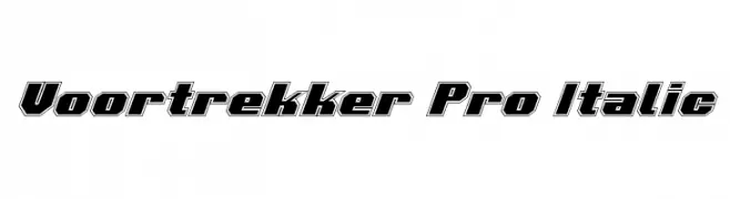
A bold, italicized font with outlined characters and a dynamic, impactful style.
![Voortrekker Pro Italic font caratteri gratis]() Scaricare 289 Downloads@WebFont
Scaricare 289 Downloads@WebFont -
( Fonts by backpacker.gr )
A typewriter-style font with italicized characters and a strikethrough effect.
![BPtypewriteDamagedStrikethrough Italic font caratteri gratis]() Scaricare 289 Downloads@WebFont
Scaricare 289 Downloads@WebFont -
( Fonts by Khurasan )
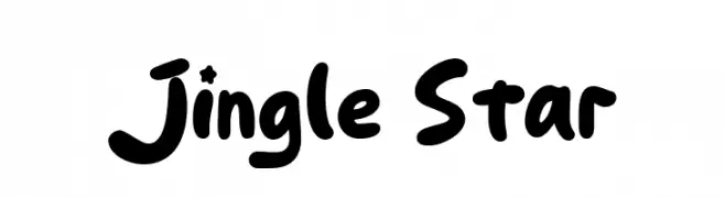
A playful, bold, and rounded font with a hand-drawn, whimsical style.
![Jingle Star font caratteri gratis]() Scaricare 289 Downloads@WebFont
Scaricare 289 Downloads@WebFont -
( Free for a personal use. For a commercial use please visit www.kevinandamanda.com )
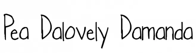
A playful, casual handwritten font with irregular strokes and a whimsical appearance.
![Pea Dalovely Damanda font caratteri gratis]() Scaricare 289 Downloads@WebFont
Scaricare 289 Downloads@WebFont -
![Groove Machine Bold font caratteri gratis]() Scaricare 289 Downloads@WebFont
Scaricare 289 Downloads@WebFont -
( fontdroe - graphicsupplement.com/product/natural-script/ )
A flowing, hand-drawn cursive font with a natural, artistic style.
![Natural font caratteri gratis]() Scaricare 289 Downloads@WebFont
Scaricare 289 Downloads@WebFont -
( Fonts by Kustomtype - Personal-use only. For commercial use please contact owner. )
A bold, modern sans-serif font with strong, uniform strokes.
![Fontwax font caratteri gratis]() Scaricare 289 Downloads@WebFont
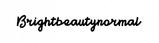
Scaricare 289 Downloads@WebFont -
![Brightbeautynormal font caratteri gratis]() Scaricare 289 Downloads@WebFont
Scaricare 289 Downloads@WebFont -
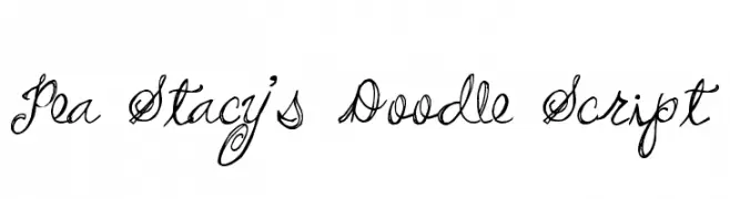
( Free for a personal use. For a commercial use please visit www.kevinandamanda.com )
A playful, whimsical cursive script with intricate swirls and loops.
![Pea Stacy's Doodle Script font caratteri gratis]() Scaricare 288 Downloads@WebFont
Scaricare 288 Downloads@WebFont -
![Franck Bold font caratteri gratis]() Scaricare 288 Downloads@WebFont
Scaricare 288 Downloads@WebFont -
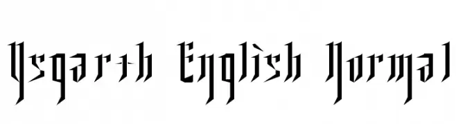
![Ysgarth English Normal font caratteri gratis]() Scaricare 288 Downloads
Scaricare 288 Downloads -
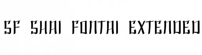
( Fonts by ShyFonts )
A bold, gothic-inspired font with sharp, angular edges.
![SF Shai Fontai Extended font caratteri gratis]() Scaricare 288 Downloads@WebFont
Scaricare 288 Downloads@WebFont -
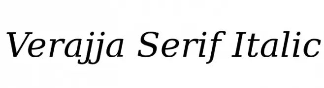
( Fonts by softerviews.org )
An elegant serif font with a classic italic style and refined serifs.
![Verajja Serif Italic font caratteri gratis]() Scaricare 288 Downloads@WebFont
Scaricare 288 Downloads@WebFont -
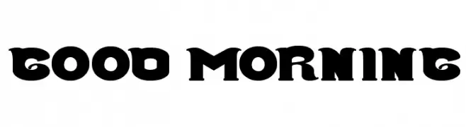
( Fonts by weknow - Wino S Kadir )
A bold, decorative font with thick strokes and unique curves.
![Good Morning font caratteri gratis]() Scaricare 288 Downloads@WebFont
Scaricare 288 Downloads@WebFont -
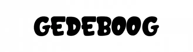
( Fonts by Fachran Heit )
A bold, playful font with rounded edges and a whimsical style.
![GEDEBOOG font caratteri gratis]() Scaricare 288 Downloads@WebFont
Scaricare 288 Downloads@WebFont -
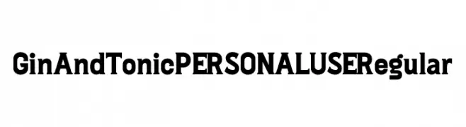
( Fonts by Mans Greback - Personal-use only. For commercial use please contact owner. )
A bold, modern font with a vintage touch, featuring strong, consistent characters.
![Gin And Tonic PERSONAL USE Regular font caratteri gratis]() Scaricare 288 Downloads@WebFont
Scaricare 288 Downloads@WebFont -
( Fonts by Woodcutter )
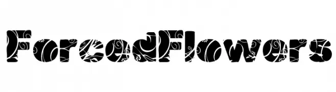
A bold decorative font with intricate floral patterns in each character.
![Forced Flowers font caratteri gratis]() Scaricare 288 Downloads@WebFont
Scaricare 288 Downloads@WebFont -
( Fonts by MartinPlus )
A bold, angular font with a modern, edgy style.
![Daela-Book font caratteri gratis]() Scaricare 288 Downloads@WebFont
Scaricare 288 Downloads@WebFont


Quali sono i font più popolari adesso?
Poppins, Roboto, Montserrat, Open Sans e Lato sono molto usati per le forme pulite e l'ampia applicabilità — dall'identità di marca alle landing page e ai poster.
Quali font si usano spesso nei loghi?
Le sans serif geometriche (es. Poppins, famiglie in stile Gotham) sono scelte comuni per un branding pulito e scalabile. Per un tocco personale restano valide script e stili manoscritti. Abbina un display deciso per i titoli a un corpo testo neutro per riconoscibilità ed equilibrio.
Ogni quanto si aggiorna la lista?
Con regolarità, in base ai download e all'attività reale. Torna spesso per scoprire in anticipo le nuove preferite.
💡 Consiglio: aggiungi ai preferiti — le tendenze cambiano in fretta e i font top di oggi possono ispirare il rebranding di domani.