Benvenuto nelle Font Più Popolari — dove popolarità e qualità si incontrano. Qui trovi i font più scaricati e usati dell'anno. Se cerchi scelte sicure per logo, web o social, inizia da qui.
Ogni font top si distingue per equilibrio, leggibilità e versatilità. Troverai sans serif moderne, script eleganti, serif vintage e display minimalisti.
-
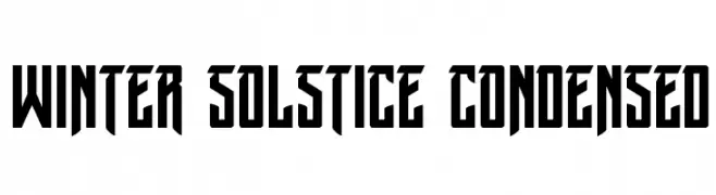
( Fonts by Iconian Fonts )
A bold, condensed font with sharp, angular edges and a modern, geometric style.
 Scaricare 288 Downloads@WebFont
 -
( Fonts by www.houseoflime.com )
Not a font; illustrated cat artwork.
![Cats font caratteri gratis]() Scaricare 288 Downloads@WebFont
Scaricare 288 Downloads@WebFont -
![Markera font caratteri gratis]() Scaricare 288 Downloads@WebFont
Scaricare 288 Downloads@WebFont -
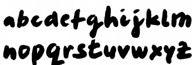
( Fonts by MJType )
A playful, casual handwritten font with smooth, rounded strokes.
![Shell Crabs font caratteri gratis]() Scaricare 288 Downloads@WebFont
Scaricare 288 Downloads@WebFont -
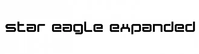
( Fonts by Daniel Zadorozny - www.iconian.com )
A futuristic, geometric font with bold, angular lines and a modern aesthetic.
![Star Eagle Expanded font caratteri gratis]() Scaricare 288 Downloads@WebFont
Scaricare 288 Downloads@WebFont -
-
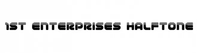
( Fonts by Iconian Fonts )
A bold, futuristic font with a halftone effect and rounded edges.
![1st Enterprises Halftone font caratteri gratis]() Scaricare 288 Downloads@WebFont
Scaricare 288 Downloads@WebFont -
( Fonts by Apostrophic Lab )
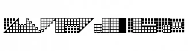
A decorative, geometric font with a pixelated, grid-like design.
![Pica Hole - SIM font caratteri gratis]() Scaricare 288 Downloads@WebFont
Scaricare 288 Downloads@WebFont -
( Fonts by Graham Meade - GemFonts )
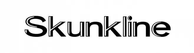
A bold, modern font with a unique dual-line style for dynamic visual impact.
![Skunkline font caratteri gratis]() Scaricare 288 Downloads@WebFont
Scaricare 288 Downloads@WebFont -
( Fonts by The Docallisme )
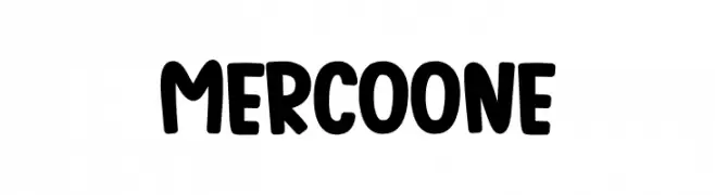
A playful, bold font with rounded edges and a hand-drawn feel.
![Mercoone font caratteri gratis]() Scaricare 288 Downloads@WebFont
Scaricare 288 Downloads@WebFont -
( Fonts by George Williams - Personal-use only. For commercial use please contact owner. )
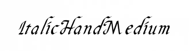
An elegant, italic font with medium weight and classic calligraphic style.
![Italic Hand Medium font caratteri gratis]() Scaricare 288 Downloads@WebFont
Scaricare 288 Downloads@WebFont -
( Fonts by a Neale Davidson - www.pixelsagas.com. Personal-use only. For commercial use please contact owner. )
A bold, geometric font with an industrial, modern aesthetic.
![Wreckers font caratteri gratis]() Scaricare 288 Downloads@WebFont
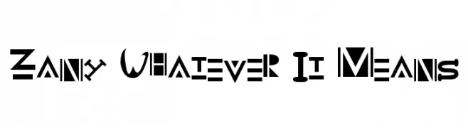
Scaricare 288 Downloads@WebFont -
![Zany Whatever It Means font caratteri gratis]() Scaricare 288 Downloads@WebFont
Scaricare 288 Downloads@WebFont -
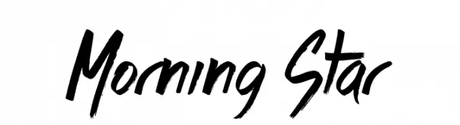
( Fonts by Jonathan S. Harris - www.tattoowoo.com. Personal-use only. For commercial use please contact owner. )
A bold, expressive handwritten font with dynamic brush strokes.
![Morning Star font caratteri gratis]() Scaricare 288 Downloads@WebFont
Scaricare 288 Downloads@WebFont -
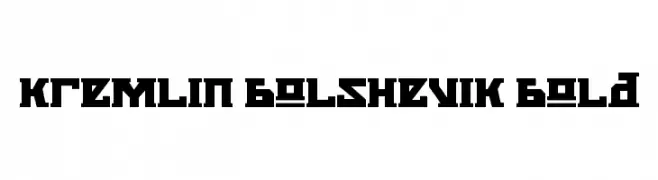
![Kremlin Bolshevik Bold font caratteri gratis]() Scaricare 288 Downloads@WebFont
Scaricare 288 Downloads@WebFont -
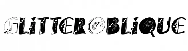
![GlitterOblique font caratteri gratis]() Scaricare 288 Downloads@WebFont
Scaricare 288 Downloads@WebFont -
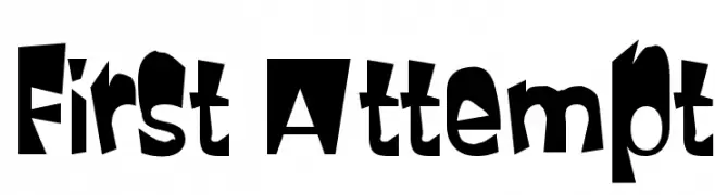
![First Attempt font caratteri gratis]() Scaricare 288 Downloads@WebFont
Scaricare 288 Downloads@WebFont -
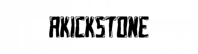
( Fonts by bringtypestudio.co )
A bold, rugged font with a distressed, hand-drawn style.
![AKICK STONE font caratteri gratis]() Scaricare 288 Downloads@WebFont
Scaricare 288 Downloads@WebFont -
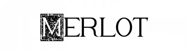
( Fonts by David Espinosa [Type Sailor] - www.facebook.com/typesailor - Personal-use only. For commercial use please contact owner. )
A decorative serif font with ornate uppercase and classic lowercase characters.
![Merlot font caratteri gratis]() Scaricare 288 Downloads@WebFont
Scaricare 288 Downloads@WebFont -
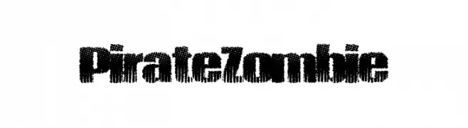
( Fonts by a Max Infeld - XEROGRAPHER FONTS - xerographer.blogspot.com . Personal-use only. For commercial use please contact owner. )
A bold, distressed font with a rugged, weathered texture.
![PirateZombie font caratteri gratis]() Scaricare 288 Downloads@WebFont
Scaricare 288 Downloads@WebFont -
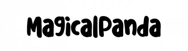
( Fonts by Erik Studio )
A bold, playful hand-drawn font with rounded edges and a whimsical style.
![Magical Panda font caratteri gratis]() Scaricare 288 Downloads@WebFont
Scaricare 288 Downloads@WebFont -
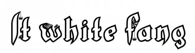
( Fonts by Lauren Thompson - www.nymfont.com )
A bold, gothic font with decorative elements like spider webs and bats, perfect for spooky themes.
![LT White Fang font caratteri gratis]() Scaricare 288 Downloads@WebFont
Scaricare 288 Downloads@WebFont -
( Fonts by Wahyu Eka Prasetya - wepfont.com - Personal-use only. For commercial use please contact owner. )
A bold, sans-serif font with a strong, modern appearance.
![Finish font caratteri gratis]() Scaricare 288 Downloads@WebFont
Scaricare 288 Downloads@WebFont -
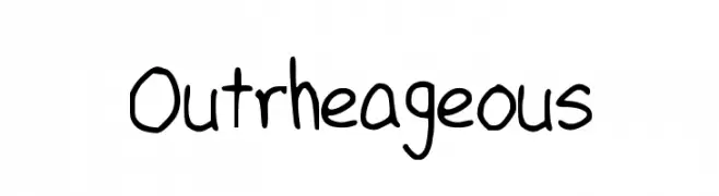
![Outrheageous font caratteri gratis]() Scaricare 288 Downloads@WebFont
Scaricare 288 Downloads@WebFont -
( Fonts by FreshtypeINK )
Decorative script font with flowing cursive style.
![Blackids font caratteri gratis]() Scaricare 288 Downloads@WebFont
Scaricare 288 Downloads@WebFont -
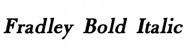
( Roger White - web.archive.org/web/20120416090521/www.rogersfonts.org.uk/ )
A bold, italic serif font with strong presence and elegant serifs.
![Fradley Bold Italic font caratteri gratis]() Scaricare 288 Downloads@WebFont
Scaricare 288 Downloads@WebFont -
( K-Type Freebies (Free for Personal Use Only) FROM http://www.k-type.com )
A modern, geometric font with sleek lines and playful character variations.
![Wanda font caratteri gratis]() Scaricare 288 Downloads@WebFont
Scaricare 288 Downloads@WebFont -
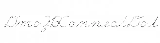
( Demo font. To purchase the full version, you can order it online at www.schoolhousefonts.com )
A dotted script font with a playful and creative style.
![DmoZBConnectDot font caratteri gratis]() Scaricare 288 Downloads@WebFont
Scaricare 288 Downloads@WebFont -
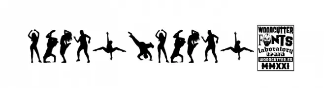
( Fonts by Woodcutter )
![Dance,Dance! font caratteri gratis]() Scaricare 288 Downloads@WebFont
Scaricare 288 Downloads@WebFont -
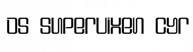
![DS Supervixen Cyr font caratteri gratis]() Scaricare 288 Downloads@WebFont
Scaricare 288 Downloads@WebFont -
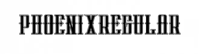
( Fonts by Peter Olexa )
A bold, decorative font with a vintage Western flair and intricate detailing.
![phoenixregular font caratteri gratis]() Scaricare 288 Downloads@WebFont
Scaricare 288 Downloads@WebFont -
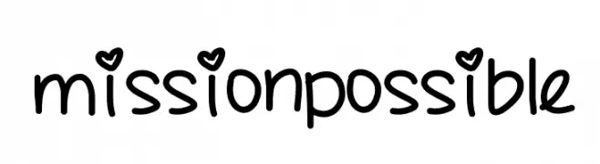
( Fonts by a Des Gomez. Personal-use only. For commercial use please contact owner. )
A playful, handwritten font with a casual and friendly style.
![missionpossible font caratteri gratis]() Scaricare 288 Downloads@WebFont
Scaricare 288 Downloads@WebFont -
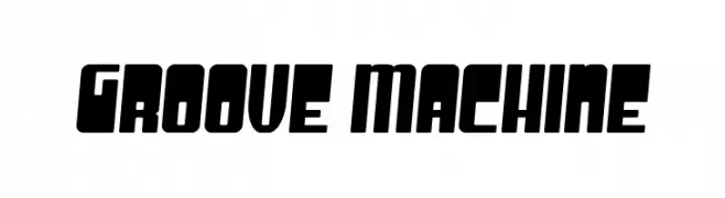
![Groove Machine font caratteri gratis]() Scaricare 288 Downloads@WebFont
Scaricare 288 Downloads@WebFont -
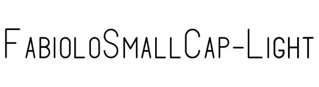
( Fonts by Fabien Despinoy - Personal-use only. For commercial use please contact owner. )
A modern, light sans-serif font with a sleek, condensed style.
![FabioloSmallCap-Light font caratteri gratis]() Scaricare 288 Downloads@WebFont
Scaricare 288 Downloads@WebFont -
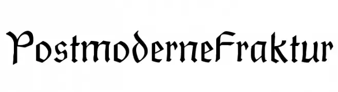
![PostmoderneFraktur font caratteri gratis]() Scaricare 288 Downloads@WebFont
Scaricare 288 Downloads@WebFont -
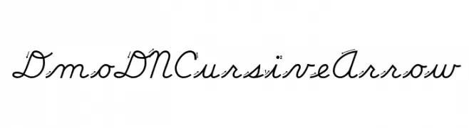
( Demo font. To purchase the full version, you can order it online at www.schoolhousefonts.com )
A cursive font with elegant, flowing lines and connected characters.
![DmoDNCursiveArrow font caratteri gratis]() Scaricare 288 Downloads@WebFont
Scaricare 288 Downloads@WebFont


Quali sono i font più popolari adesso?
Poppins, Roboto, Montserrat, Open Sans e Lato sono molto usati per le forme pulite e l'ampia applicabilità — dall'identità di marca alle landing page e ai poster.
Quali font si usano spesso nei loghi?
Le sans serif geometriche (es. Poppins, famiglie in stile Gotham) sono scelte comuni per un branding pulito e scalabile. Per un tocco personale restano valide script e stili manoscritti. Abbina un display deciso per i titoli a un corpo testo neutro per riconoscibilità ed equilibrio.
Ogni quanto si aggiorna la lista?
Con regolarità, in base ai download e all'attività reale. Torna spesso per scoprire in anticipo le nuove preferite.
💡 Consiglio: aggiungi ai preferiti — le tendenze cambiano in fretta e i font top di oggi possono ispirare il rebranding di domani.