Benvenuto nelle Font Più Popolari — dove popolarità e qualità si incontrano. Qui trovi i font più scaricati e usati dell'anno. Se cerchi scelte sicure per logo, web o social, inizia da qui.
Ogni font top si distingue per equilibrio, leggibilità e versatilità. Troverai sans serif moderne, script eleganti, serif vintage e display minimalisti.
-
 Scaricare 3689 Downloads@WebFont
 -
( Fonts by Florian Bambhout - www.bambootypes.net )
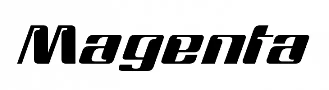
A bold, slanted font with a geometric and dynamic style.
![Magenta font caratteri gratis]() Scaricare 3687 Downloads@WebFont
Scaricare 3687 Downloads@WebFont -
![Gastada font caratteri gratis]() Scaricare 3685 Downloads@WebFont
Scaricare 3685 Downloads@WebFont -
( www.hanodedfonts.com )
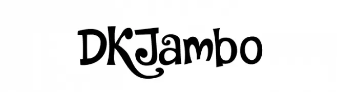
A playful, whimsical font with exaggerated curves and a hand-drawn style.
![DKJambo font caratteri gratis]() Scaricare 3684 Downloads@WebFont
Scaricare 3684 Downloads@WebFont -
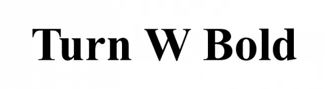
![Turn W Bold font caratteri gratis]() Scaricare 3684 Downloads@WebFont
Scaricare 3684 Downloads@WebFont -
-
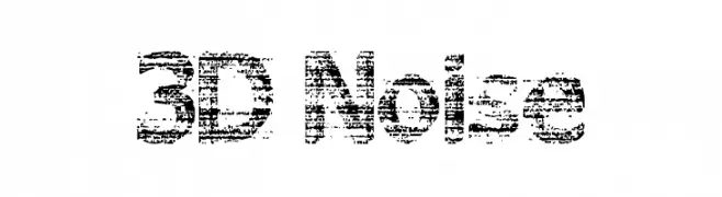
![3D Noise font caratteri gratis]() Scaricare 3684 Downloads@WebFont
Scaricare 3684 Downloads@WebFont -
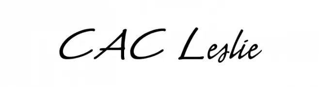
![CAC Leslie font caratteri gratis]() Scaricare 3684 Downloads@WebFont
Scaricare 3684 Downloads@WebFont -
![Mytupi font caratteri gratis]() Scaricare 3682 Downloads@WebFont
Scaricare 3682 Downloads@WebFont -
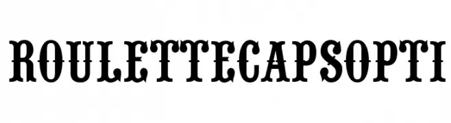
( Fonts by Castcraft Software - OPTI Fonts Archive - opti.netii.net - Personal-use only. For commercial use please contact owner. )
A bold, slab serif font with a vintage style and strong presence.
![RouletteCapsOpti font caratteri gratis]() Scaricare 3681 Downloads@WebFont
Scaricare 3681 Downloads@WebFont -
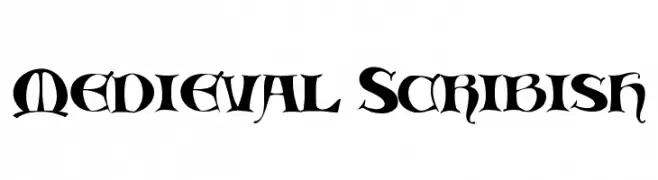
![Medieval Scribish font caratteri gratis]() Scaricare 3681 Downloads@WebFont
Scaricare 3681 Downloads@WebFont -
( NFL Fonts )
A bold, modern font with a strong geometric structure and clean lines.
![NFL Detroit Lions font caratteri gratis]() Scaricare 3680 Downloads@WebFont
Scaricare 3680 Downloads@WebFont -
( Fortress Tech - www.youtube.com/channel/UCLyHUw5NcyVCILijN5vebwg )
A modern, clean sans-serif font with a minimalistic design.
![Modern Sans Light font caratteri gratis]() Scaricare 3680 Downloads@WebFont
Scaricare 3680 Downloads@WebFont -
( Fonts by martin zarth - Personal-use only. For commercial use please contact owner. )
A modern, geometric sans-serif font with a clean and minimalist design.
![Arcon font caratteri gratis]() Scaricare 3680 Downloads@WebFont
Scaricare 3680 Downloads@WebFont -
( Fonts by Dieter Steffmann )
An elegant and artistic font with tall, slender letterforms and intricate detailing.
![Ambrosia font caratteri gratis]() Scaricare 3680 Downloads@WebFont
Scaricare 3680 Downloads@WebFont -
![Fillmore Regular font caratteri gratis]() Scaricare 3680 Downloads@WebFont
Scaricare 3680 Downloads@WebFont -
( Fonts by Alit Suarnegara - Alit Design - www.alitdesign.net - Personal-use only. For commercial use please contact owner. )
A bold, high-contrast font with elegant curves and distinctive flourishes.
![Boiling Black Demo font caratteri gratis]() Scaricare 3678 Downloads@WebFont
Scaricare 3678 Downloads@WebFont -
![AGA Rasheeq V.2 14JB font caratteri gratis]() Scaricare 3677 Downloads@WebFont
Scaricare 3677 Downloads@WebFont -
( Fonts by Zetafonts - Personal-use only. For commercial use please contact owner. )
A modern, rounded font with a clean and friendly design.
![Arista Pro Trial Regular font caratteri gratis]() Scaricare 3675 Downloads@WebFont
Scaricare 3675 Downloads@WebFont -
( Fonts by Manfred Klein. Free for private and charity use. Free for commercial with donation to organizations )
A classic serif font with high contrast and elegant, sophisticated design.
![GiambattistaVsPetit font caratteri gratis]() Scaricare 3673 Downloads@WebFont
Scaricare 3673 Downloads@WebFont -
![Madonna font caratteri gratis]() Scaricare 3673 Downloads@WebFont
Scaricare 3673 Downloads@WebFont -
![MJGranada-Granada font caratteri gratis]() Scaricare 3672 Downloads@WebFont
Scaricare 3672 Downloads@WebFont -
( Fonts by Bright Ideas )
A bold, italicized font with flame-like extensions, exuding energy and motion.
![Blazed font caratteri gratis]() Scaricare 3672 Downloads@WebFont
Scaricare 3672 Downloads@WebFont -
( Copyright (c) 2011 by Mariela Monsalve (marmonsalve@gmail.com) )
A modern serif font with balanced proportions and versatile applications.
![Asul font caratteri gratis]() Scaricare 3670 Downloads@WebFont
Scaricare 3670 Downloads@WebFont -
( Fonts by SDFonts - Ritzy )
A bold graffiti-style font with expressive, dynamic strokes.
![Tagster font caratteri gratis]() Scaricare 3670 Downloads@WebFont
Scaricare 3670 Downloads@WebFont -
![Caribbean Regular font caratteri gratis]() Scaricare 3669 Downloads@WebFont
Scaricare 3669 Downloads@WebFont -
![Runic font caratteri gratis]() Scaricare 3667 Downloads@WebFont
Scaricare 3667 Downloads@WebFont -
![ROBO font caratteri gratis]() Scaricare 3666 Downloads@WebFont
Scaricare 3666 Downloads@WebFont -
( Fonts by Tup Wanders - www.tupwanders.nl )
A bold, geometric typeface with a vintage poster feel, ideal for impactful headlines.
![FORQUE font caratteri gratis]() Scaricare 3666 Downloads@WebFont
Scaricare 3666 Downloads@WebFont -
( Fonts by Google - Personal-use only. For commercial use please contact owner. )
A bold, modern font with strong strokes and a cohesive design.
![Franco Bold font caratteri gratis]() Scaricare 3664 Downloads@WebFont
Scaricare 3664 Downloads@WebFont -
![WesternSlant Regular font caratteri gratis]() Scaricare 3664 Downloads@WebFont
Scaricare 3664 Downloads@WebFont -
( Copyright 2011 The Old Standard Project Authors (amkryukov@gmail.com) )
A classic serif font with sharp serifs and balanced proportions.
![Old Standard TT Regular font caratteri gratis]() Scaricare 3664 Downloads@WebFont
Scaricare 3664 Downloads@WebFont -
( Fonts by Rob Dobi - Toxic Type - www.dobi.nu )
A dynamic, calligraphic font with sharp, angular strokes and high contrast.
![Killigraphy font caratteri gratis]() Scaricare 3664 Downloads@WebFont
Scaricare 3664 Downloads@WebFont -
( Fonts by Peter Wiegel - www.peter-wiegel.de - Personal-use only. For commercial use please contact owner. )
A modern, clean sans-serif font with uniform strokes and excellent readability.
![EuropaMittelschrift font caratteri gratis]() Scaricare 3663 Downloads@WebFont
Scaricare 3663 Downloads@WebFont -
![SF Florencesans SC Exp Bold font caratteri gratis]() Scaricare 3663 Downloads@WebFont
Scaricare 3663 Downloads@WebFont -
( Fonts by Ahmad Syarif Afandi - https://delapan.studio - Personal-use only. For commercial use please contact owner. )
A classic script font with elegant, flowing cursive letters and moderate stroke contrast.
![HeyMonday font caratteri gratis]() Scaricare 3662 Downloads@WebFont
Scaricare 3662 Downloads@WebFont


Quali sono i font più popolari adesso?
Poppins, Roboto, Montserrat, Open Sans e Lato sono molto usati per le forme pulite e l'ampia applicabilità — dall'identità di marca alle landing page e ai poster.
Quali font si usano spesso nei loghi?
Le sans serif geometriche (es. Poppins, famiglie in stile Gotham) sono scelte comuni per un branding pulito e scalabile. Per un tocco personale restano valide script e stili manoscritti. Abbina un display deciso per i titoli a un corpo testo neutro per riconoscibilità ed equilibrio.
Ogni quanto si aggiorna la lista?
Con regolarità, in base ai download e all'attività reale. Torna spesso per scoprire in anticipo le nuove preferite.
💡 Consiglio: aggiungi ai preferiti — le tendenze cambiano in fretta e i font top di oggi possono ispirare il rebranding di domani.