Benvenuto nelle Font Più Popolari — dove popolarità e qualità si incontrano. Qui trovi i font più scaricati e usati dell'anno. Se cerchi scelte sicure per logo, web o social, inizia da qui.
Ogni font top si distingue per equilibrio, leggibilità e versatilità. Troverai sans serif moderne, script eleganti, serif vintage e display minimalisti.
-
( Fonts by www.26plus-zeichen.de )
A modern, geometric sans-serif font with clean lines and balanced proportions.
 Scaricare 3656 Downloads@WebFont
 -
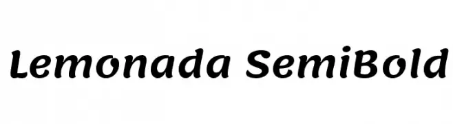
( Copyright 2015 The Lemonada Project Authors (gaber@gaberism.net) )
A playful, semi-bold font with rounded, slightly condensed characters and moderate contrast.
![Lemonada SemiBold font caratteri gratis]() Scaricare 3655 Downloads@WebFont
Scaricare 3655 Downloads@WebFont -
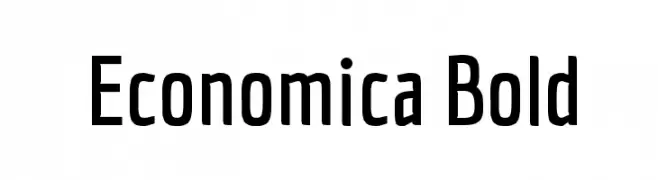
( Copyright (c) 2012, Vicente Lamonaca (produccion.taller@gmail.com www.tipografia-montevideo.info www.tipotype.com) )
A modern, clean, and slightly condensed font with medium contrast.
![Economica Bold font caratteri gratis]() Scaricare 3655 Downloads@WebFont
Scaricare 3655 Downloads@WebFont -
![BenFranklin font caratteri gratis]() Scaricare 3653 Downloads
Scaricare 3653 Downloads -
![Compstyle Regular font caratteri gratis]() Scaricare 3653 Downloads@WebFont
Scaricare 3653 Downloads@WebFont -
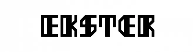
( Fonts by Sander de Voogt - Personal-use only. For commercial use please contact owner. )
A bold, geometric font with sharp angles and a futuristic style.
![Ekster font caratteri gratis]() Scaricare 3652 Downloads@WebFont
Scaricare 3652 Downloads@WebFont -
![10.12 4 font caratteri gratis]() Scaricare 3652 Downloads@WebFont
Scaricare 3652 Downloads@WebFont -
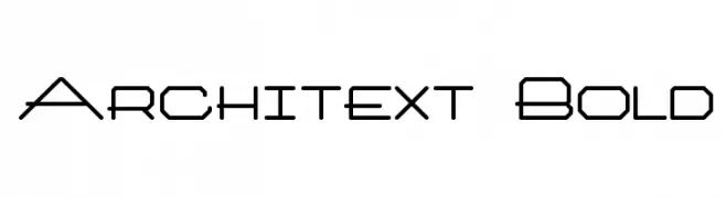
![Architext Bold font caratteri gratis]() Scaricare 3650 Downloads@WebFont
Scaricare 3650 Downloads@WebFont -
( Copyright 2019 The Bevietnam Project Authors (https://github.com/bettergui/beVietnam) )
A modern, thin, and elegant sans-serif font with excellent readability.
![Be Vietnam Thin font caratteri gratis]() Scaricare 3648 Downloads@WebFont
Scaricare 3648 Downloads@WebFont -
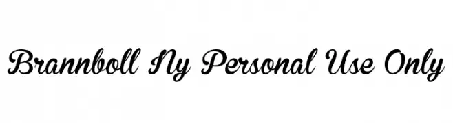
![Brannboll Ny Personal Use Only font caratteri gratis]() Scaricare 3646 Downloads@WebFont
Scaricare 3646 Downloads@WebFont -
![Paquita font caratteri gratis]() Scaricare 3646 Downloads@WebFont
Scaricare 3646 Downloads@WebFont -
![Cookie font caratteri gratis]() Scaricare 3645 Downloads@WebFont
Scaricare 3645 Downloads@WebFont -
![Steel Tongs Esp font caratteri gratis]() Scaricare 3645 Downloads@WebFont
Scaricare 3645 Downloads@WebFont -
( Fonts by Daniel Zadorozny - www.iconian.com )
A futuristic, geometric font with bold, angular lines and a 3D effect.
![4114 Blaster 3D font caratteri gratis]() Scaricare 3645 Downloads@WebFont
Scaricare 3645 Downloads@WebFont -
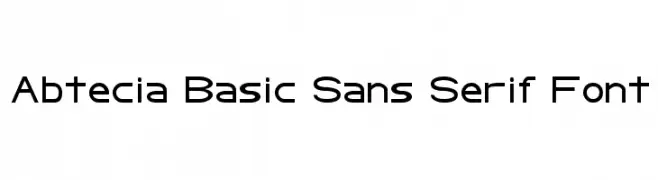
![Abtecia Basic Sans Serif Font font caratteri gratis]() Scaricare 3645 Downloads@WebFont
Scaricare 3645 Downloads@WebFont -
( Fonts by wepfont - Wahyu Eka Prasetya - Personal-use only. For commercial use please contact owner. )
A bold, expressive script font with fluid, cursive strokes.
![Apotik font caratteri gratis]() Scaricare 3644 Downloads@WebFont
Scaricare 3644 Downloads@WebFont -
( Fonts by wepfont - Wahyu Eka Prasetya - Personal-use only. For commercial use please contact owner. )
A bold, angular serif font with a modern twist, ideal for impactful designs.
![a Absolute Empire font caratteri gratis]() Scaricare 3644 Downloads@WebFont
Scaricare 3644 Downloads@WebFont -
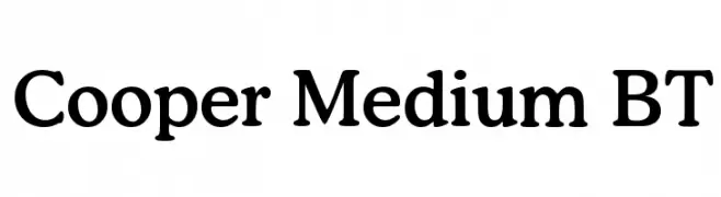
![Cooper Medium BT font caratteri gratis]() Scaricare 3644 Downloads
Scaricare 3644 Downloads -
![NHL Boston font caratteri gratis]() Scaricare 3643 Downloads@WebFont
Scaricare 3643 Downloads@WebFont -
![GL-Nummernschild-Mtl font caratteri gratis]() Scaricare 3641 Downloads@WebFont
Scaricare 3641 Downloads@WebFont -
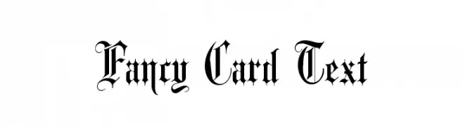
( Fonts by Dieter Steffmann )
An ornate, calligraphic font with intricate flourishes and sharp serifs.
![Fancy Card Text font caratteri gratis]() Scaricare 3641 Downloads@WebFont
Scaricare 3641 Downloads@WebFont -
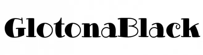
Caratteri di defharo. For commercial use please contact the owner.
![GlotonaBlack font caratteri gratis]() Scaricare 3640 Downloads@WebFont
Scaricare 3640 Downloads@WebFont -
( Fonts by www.gliphmaker.com. Personal-use only. For commercial use please contact owner. )
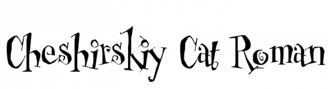
A whimsical, hand-drawn style font with playful and dynamic characters.
![Cheshirskiy Cat Roman font caratteri gratis]() Scaricare 3639 Downloads@WebFont
Scaricare 3639 Downloads@WebFont -
![Symbola font caratteri gratis]() Scaricare 3639 Downloads@WebFont
Scaricare 3639 Downloads@WebFont -
![POWERLESS font caratteri gratis]() Scaricare 3637 Downloads@WebFont
Scaricare 3637 Downloads@WebFont -
( Fonts by a Neale Davidson - www.pixelsagas.com. Personal-use only. For commercial use please contact owner. )
A futuristic, geometric font with rounded edges and uniform strokes.
![Classic Robot font caratteri gratis]() Scaricare 3637 Downloads@WebFont
Scaricare 3637 Downloads@WebFont -
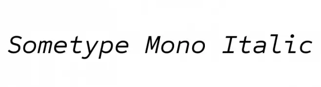
( Copyright 2018 The Sometype Mono Project Authors (https://github.com/googlefonts/sometype-mono) )
A monospaced, italic font with a modern and clean design.
![Sometype Mono Italic font caratteri gratis]() Scaricare 3636 Downloads@WebFont
Scaricare 3636 Downloads@WebFont -
( Fonts by www.fontalicious.com )
A playful and bold font with dynamic curves and angles.
![Pornhut font caratteri gratis]() Scaricare 3635 Downloads@WebFont
Scaricare 3635 Downloads@WebFont -
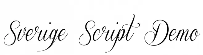
( Fonts by Mans Greback - www.mawns.com )
An elegant and flowing script font with high contrast and classic style.
![Sverige Script Demo font caratteri gratis]() Scaricare 3634 Downloads@WebFont
Scaricare 3634 Downloads@WebFont -
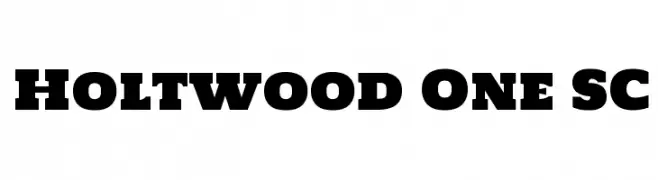
( Copyright (c) 2011 by vernon adams (vern@newtypography.co.uk) )
A bold slab serif font with strong, block-like serifs and a vintage yet modern appeal.
![Holtwood One SC font caratteri gratis]() Scaricare 3633 Downloads@WebFont
Scaricare 3633 Downloads@WebFont -
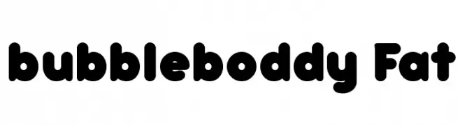
( Fonts by a kmzero font foundry - www.zetafonts.com. Personal-use only. For commercial use please contact owner. )
A playful, bold font with rounded, bubbly characters.
![bubbleboddy Fat font caratteri gratis]() Scaricare 3633 Downloads@WebFont
Scaricare 3633 Downloads@WebFont -
![IllegalEdding font caratteri gratis]() Scaricare 3633 Downloads@WebFont
Scaricare 3633 Downloads@WebFont -
![Ample font caratteri gratis]() Scaricare 3632 Downloads@WebFont
Scaricare 3632 Downloads@WebFont -
![Trekker Regular font caratteri gratis]() Scaricare 3632 Downloads@WebFont
Scaricare 3632 Downloads@WebFont -
( Fonts by Castcraft Software - OPTI Fonts Archive - opti.netii.net - Personal-use only. For commercial use please contact owner. )
A bold, classic serif font with strong strokes and a traditional aesthetic.
![OPTIRomanaRoman-Bold font caratteri gratis]() Scaricare 3631 Downloads@WebFont
Scaricare 3631 Downloads@WebFont


Quali sono i font più popolari adesso?
Poppins, Roboto, Montserrat, Open Sans e Lato sono molto usati per le forme pulite e l'ampia applicabilità — dall'identità di marca alle landing page e ai poster.
Quali font si usano spesso nei loghi?
Le sans serif geometriche (es. Poppins, famiglie in stile Gotham) sono scelte comuni per un branding pulito e scalabile. Per un tocco personale restano valide script e stili manoscritti. Abbina un display deciso per i titoli a un corpo testo neutro per riconoscibilità ed equilibrio.
Ogni quanto si aggiorna la lista?
Con regolarità, in base ai download e all'attività reale. Torna spesso per scoprire in anticipo le nuove preferite.
💡 Consiglio: aggiungi ai preferiti — le tendenze cambiano in fretta e i font top di oggi possono ispirare il rebranding di domani.