Benvenuto nelle Font Più Popolari — dove popolarità e qualità si incontrano. Qui trovi i font più scaricati e usati dell'anno. Se cerchi scelte sicure per logo, web o social, inizia da qui.
Ogni font top si distingue per equilibrio, leggibilità e versatilità. Troverai sans serif moderne, script eleganti, serif vintage e display minimalisti.
-
( Fonts by SnailFonts )
A bold, decorative font with abstract, organic shapes and a playful aesthetic.
 Scaricare 255 Downloads@WebFont
 -
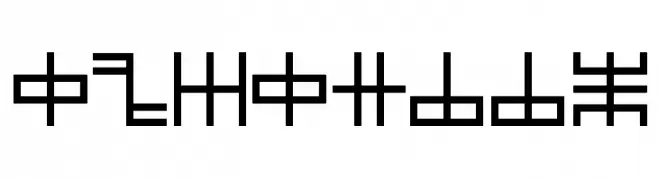
( IYBI - Radi Safi - ifyoubuildit.com.au/ )
A bold, geometric font with sharp angles and solid shapes.
![Happy font caratteri gratis]() Scaricare 255 Downloads@WebFont
Scaricare 255 Downloads@WebFont -
( Fonts by a cenz qobbal - www.facebook.com/cenzqobbalfonts. Personal-use only. For commercial use please contact owner. )
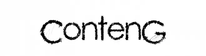
A rugged, textured font with a hand-drawn, edgy style.
![ContenG font caratteri gratis]() Scaricare 255 Downloads@WebFont
Scaricare 255 Downloads@WebFont -
( Fonts by Origin Type )
Playful handwritten font with rounded edges.
![Zodicat font caratteri gratis]() Scaricare 255 Downloads@WebFont
Scaricare 255 Downloads@WebFont -
![Starstruck Regular font caratteri gratis]() Scaricare 255 Downloads@WebFont
Scaricare 255 Downloads@WebFont -
-
( Fonts by www.omniglot.com )
An ornate and decorative font with flowing, cursive elements and varied stroke thickness.
![Cr-Paitoon font caratteri gratis]() Scaricare 255 Downloads@WebFont
Scaricare 255 Downloads@WebFont -
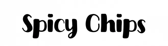
( Fonts by Khurasan )
A bold, playful handwritten font with thick strokes and rounded edges.
![Spicy Chips font caratteri gratis]() Scaricare 255 Downloads@WebFont
Scaricare 255 Downloads@WebFont -
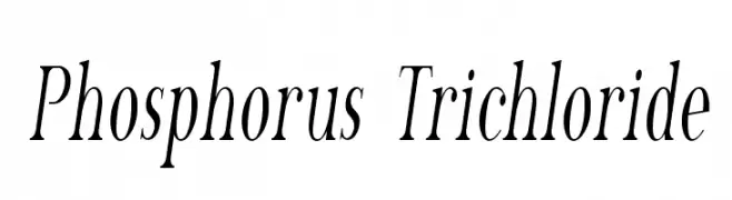
( Fonts by Apostrophic Lab )
A classic, high-contrast serif font with elegant italics.
![Phosphorus Trichloride font caratteri gratis]() Scaricare 255 Downloads@WebFont
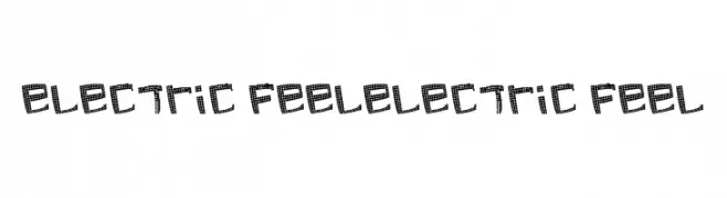
Scaricare 255 Downloads@WebFont -
![electric feelelectric feel font caratteri gratis]() Scaricare 255 Downloads@WebFont
Scaricare 255 Downloads@WebFont -
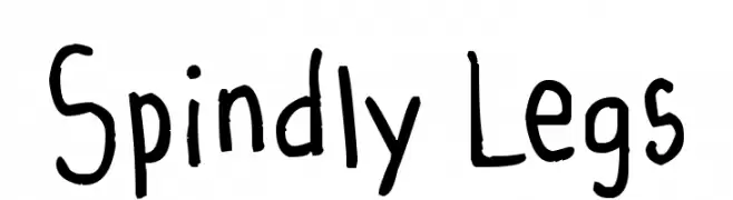
( Stork - Vextorart Stork - www.vextorart.blogspot.com )
A playful, hand-drawn font with irregular strokes and a whimsical style.
![Spindly Legs font caratteri gratis]() Scaricare 255 Downloads@WebFont
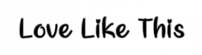
Scaricare 255 Downloads@WebFont -
![Love Like This font caratteri gratis]() Scaricare 255 Downloads@WebFont
Scaricare 255 Downloads@WebFont -
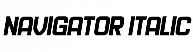
( Fonts by Vladimir Nikolic - www.creativefabrica.com/designer/vladimirnikolic/ - Personal-use only. For commercial use please contact owner. )
A bold, italic font with a modern and dynamic style.
![Navigator Italic font caratteri gratis]() Scaricare 255 Downloads@WebFont
Scaricare 255 Downloads@WebFont -
Caratteri di danny91194. For commercial use please contact the owner.
( Themothergooseclub )
A modern, clean font with a balanced and elegant structure.
![Gardenzi - Demi font caratteri gratis]() Scaricare 255 Downloads
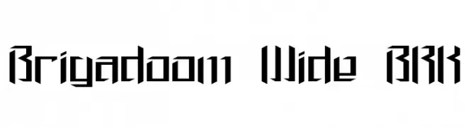
Scaricare 255 Downloads -
![Brigadoom Wide BRK font caratteri gratis]() Scaricare 255 Downloads@WebFont
Scaricare 255 Downloads@WebFont -
( Fonts by www.omniglot.com )
A flowing, connected script font with elegant loops and smooth curves.
![Newcursive font caratteri gratis]() Scaricare 255 Downloads@WebFont
Scaricare 255 Downloads@WebFont -
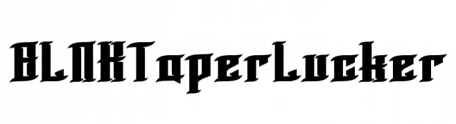
![BLNKTaperLucker font caratteri gratis]() Scaricare 255 Downloads@WebFont
Scaricare 255 Downloads@WebFont -
( Fonts by Balpirick Studio - https://www.creativefabrica.com/designer/balpirick/ref/308299/ - Personal-use only. For commercial use please contact owner. )
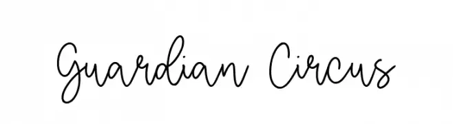
A playful handwritten font with fluid, elegant letterforms.
![Guardian Circus font caratteri gratis]() Scaricare 255 Downloads@WebFont
Scaricare 255 Downloads@WebFont -
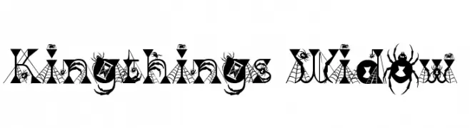
( Font by kingthingsfonts.co.uk )
A decorative font with spider and web motifs, perfect for Halloween themes.
![Kingthings Widow font caratteri gratis]() Scaricare 255 Downloads@WebFont
Scaricare 255 Downloads@WebFont -
![Sixgun font caratteri gratis]() Scaricare 255 Downloads@WebFont
Scaricare 255 Downloads@WebFont -
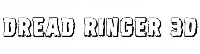
( Fonts by Iconian Fonts )
A bold, 3D cartoonish font with rugged edges and a playful style.
![Dread Ringer 3D font caratteri gratis]() Scaricare 255 Downloads@WebFont
Scaricare 255 Downloads@WebFont -
( Fonts by www.omniglot.com )
A modern, geometric font with clean lines and a minimalist aesthetic.
![SunsheeW font caratteri gratis]() Scaricare 255 Downloads@WebFont
Scaricare 255 Downloads@WebFont -
( Fonts by David Rakowski )
An ornate and decorative font with intricate patterns and a vintage flair.
![VarahCaps font caratteri gratis]() Scaricare 255 Downloads@WebFont
Scaricare 255 Downloads@WebFont -
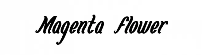
![Magenta Flower font caratteri gratis]() Scaricare 255 Downloads@WebFont
Scaricare 255 Downloads@WebFont -
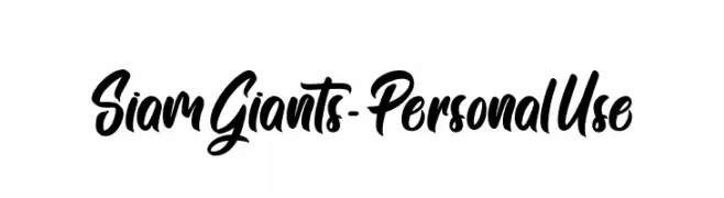
( Fonts by Typhoon Type - Suthi Srisopha - www.typhoontype.net - Personal-use only. For commercial use please contact owner. )
A bold, dynamic script font with fluid, connected characters and elegant curves.
![Siam Giants - Personal Use font caratteri gratis]() Scaricare 255 Downloads@WebFont
Scaricare 255 Downloads@WebFont -
![WarnerLogoFontNine font caratteri gratis]() Scaricare 255 Downloads@WebFont
Scaricare 255 Downloads@WebFont -
![Shitfont font caratteri gratis]() Scaricare 255 Downloads@WebFont
Scaricare 255 Downloads@WebFont -
( Free for a personal use. For a commercial use please visit www.kevinandamanda.com )
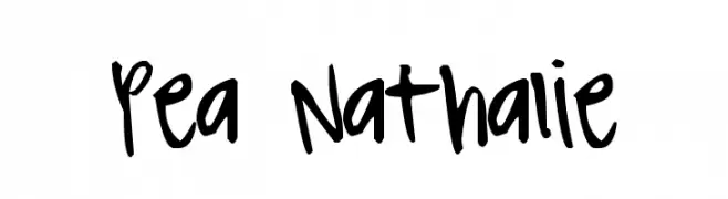
A playful, handwritten font with a casual and whimsical style.
![Pea Nathalie font caratteri gratis]() Scaricare 255 Downloads@WebFont
Scaricare 255 Downloads@WebFont -
( Fonts by Miss Tiina at www.misstiina.com (please check the website before use) )
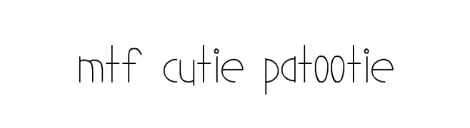
A playful, hand-drawn font with thin, elongated characters and a whimsical style.
![MTF Cutie Patootie font caratteri gratis]() Scaricare 255 Downloads@WebFont
Scaricare 255 Downloads@WebFont -
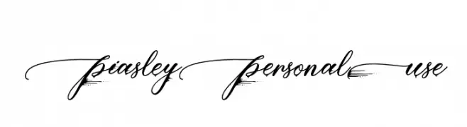
( Fonts by Typhoon Type - Suthi Srisopha - www.typhoontype.net - Personal-use only. For commercial use please contact owner. )
An elegant, cursive script font with intricate loops and swirls.
![PiasleyPersonalUse font caratteri gratis]() Scaricare 255 Downloads@WebFont
Scaricare 255 Downloads@WebFont -
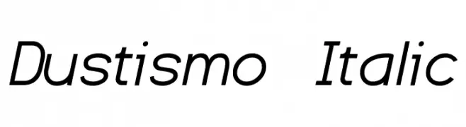
( Fonts by Dustin Norlander - www.cheapskatefonts.com )
A modern, italic font with clean lines and a dynamic appearance.
![Dustismo Italic font caratteri gratis]() Scaricare 255 Downloads@WebFont
Scaricare 255 Downloads@WebFont -
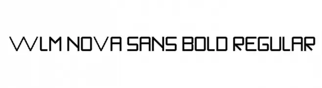
![WLM Nova Sans Bold Regular font caratteri gratis]() Scaricare 255 Downloads@WebFont
Scaricare 255 Downloads@WebFont -
( Fonts by Misti`s Fonts - mistifonts.com - Personal-use only. For commercial use please contact owner. )
A textured, hand-drawn font with a rough, artistic style.
![Killing Loneliness font caratteri gratis]() Scaricare 255 Downloads@WebFont
Scaricare 255 Downloads@WebFont -
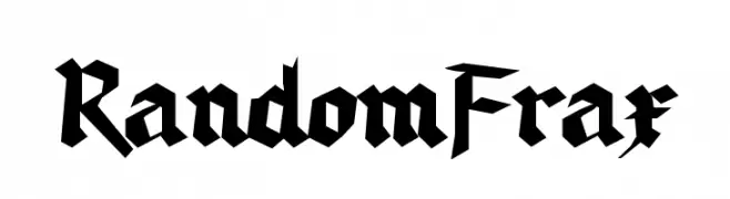
( Fonts by Manfred Klein. Free for private and charity use. Free for commercial with donation to organizations )
A bold, angular Blackletter font with high contrast and ornate detailing.
![RandomFrax font caratteri gratis]() Scaricare 255 Downloads@WebFont
Scaricare 255 Downloads@WebFont -
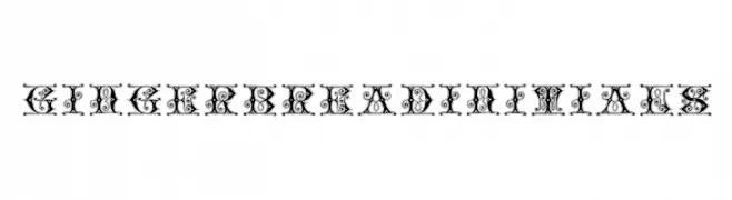
( Fonts by Dieter Steffmann )
An ornate, decorative font with intricate swirls and embellishments.
![GingerbreadInitials font caratteri gratis]() Scaricare 255 Downloads@WebFont
Scaricare 255 Downloads@WebFont -
( Iordanis Passas - http:/ip-art.info )
A bold, textured slab serif font with a vintage, distressed style.
![Sanek font caratteri gratis]() Scaricare 255 Downloads@WebFont
Scaricare 255 Downloads@WebFont


Quali sono i font più popolari adesso?
Poppins, Roboto, Montserrat, Open Sans e Lato sono molto usati per le forme pulite e l'ampia applicabilità — dall'identità di marca alle landing page e ai poster.
Quali font si usano spesso nei loghi?
Le sans serif geometriche (es. Poppins, famiglie in stile Gotham) sono scelte comuni per un branding pulito e scalabile. Per un tocco personale restano valide script e stili manoscritti. Abbina un display deciso per i titoli a un corpo testo neutro per riconoscibilità ed equilibrio.
Ogni quanto si aggiorna la lista?
Con regolarità, in base ai download e all'attività reale. Torna spesso per scoprire in anticipo le nuove preferite.
💡 Consiglio: aggiungi ai preferiti — le tendenze cambiano in fretta e i font top di oggi possono ispirare il rebranding di domani.