Benvenuto nelle Font Più Popolari — dove popolarità e qualità si incontrano. Qui trovi i font più scaricati e usati dell'anno. Se cerchi scelte sicure per logo, web o social, inizia da qui.
Ogni font top si distingue per equilibrio, leggibilità e versatilità. Troverai sans serif moderne, script eleganti, serif vintage e display minimalisti.
-
 Scaricare 255 Downloads@WebFont
 -
![Invasion 2028 Italic font caratteri gratis]() Scaricare 255 Downloads@WebFont
Scaricare 255 Downloads@WebFont -
( Fonts by Peter Wiegel - www.peter-wiegel.de )
A geometric, outline font with a modern and futuristic style.
![Luxembourg 1910 Contur font caratteri gratis]() Scaricare 255 Downloads@WebFont
Scaricare 255 Downloads@WebFont -
( Fonts by www.selawetype.com - Personal-use only. FOR DONATION https://www.paypal.me/selawe . For commercial use please contact owner. )
A bold, playful handwritten font with smooth, rounded edges.
![FREETAPE font caratteri gratis]() Scaricare 255 Downloads@WebFont
Scaricare 255 Downloads@WebFont -
( Fonts by Erik Studio - Personal-use only. For commercial use please contact owner. )
A cursive, handwritten font with elegant, flowing strokes.
![Tamara font caratteri gratis]() Scaricare 254 Downloads@WebFont
Scaricare 254 Downloads@WebFont -
-
( Fonts by www.DigitalDreamDesign.net )
A bold, geometric font with cubic shapes and rounded edges.
![D3 Cubicism Extra font caratteri gratis]() Scaricare 254 Downloads@WebFont
Scaricare 254 Downloads@WebFont -
( Fonts by Mr Fisk - Mike Larsson - fontorama.net )
A chaotic, splattered font with irregular shapes and varying stroke thicknesses.
![Evil-Mail font caratteri gratis]() Scaricare 254 Downloads@WebFont
Scaricare 254 Downloads@WebFont -
( Fonts by Manfred Klein. Free for private and charity use. Free for commercial with donation to organizations )
A bold, playful slab serif font with a hand-drawn, whimsical style.
![SlabSerifWrittenBold font caratteri gratis]() Scaricare 254 Downloads@WebFont
Scaricare 254 Downloads@WebFont -
( Din Studio - Donis Miftahudin - creativemarket.com/donism )
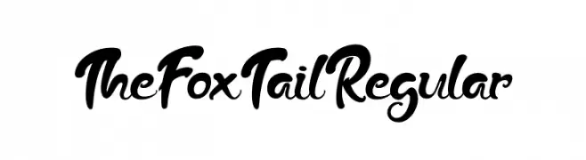
A playful and whimsical script font with flowing curves and elegant loops.
![The Fox Tail Regular font caratteri gratis]() Scaricare 254 Downloads@WebFont
Scaricare 254 Downloads@WebFont -
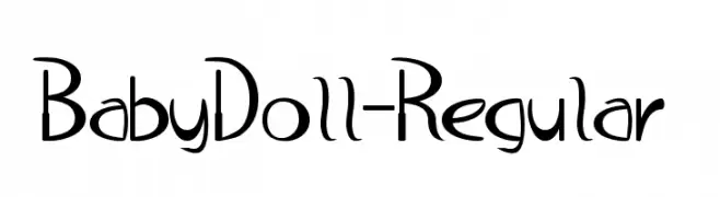
![BabyDoll-Regular font caratteri gratis]() Scaricare 254 Downloads@WebFont
Scaricare 254 Downloads@WebFont -
![FreeRibbons font caratteri gratis]() Scaricare 254 Downloads@WebFont
Scaricare 254 Downloads@WebFont -
( Fonts by Daniel Zadorozny - www.iconian.com - Free for personal use )
A bold, modern font with a unique horizontal striped pattern and geometric shapes.
![21 Gun Salute Gradient font caratteri gratis]() Scaricare 254 Downloads@WebFont
Scaricare 254 Downloads@WebFont -
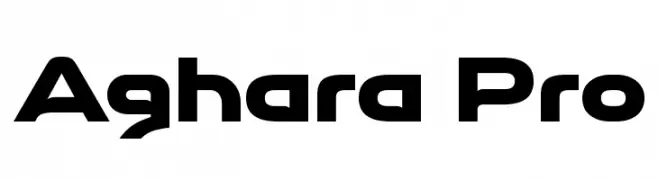
( Typopey - Reand Aghara - facebook.com/typopey )
A bold, futuristic font with sharp angles and geometric shapes.
![Aghara Pro font caratteri gratis]() Scaricare 254 Downloads@WebFont
Scaricare 254 Downloads@WebFont -
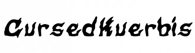
![CursedKuerbis font caratteri gratis]() Scaricare 254 Downloads@WebFont
Scaricare 254 Downloads@WebFont -
( Fonts by Darcy Baldwin - darcybaldwin.com. Free for personal use only )
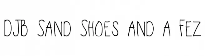
A playful, handwritten font with tall, narrow letters and a casual appearance.
![DJB Sand Shoes and a Fez font caratteri gratis]() Scaricare 254 Downloads@WebFont
Scaricare 254 Downloads@WebFont -
( JK Typeface - hiltonbrasfoot.wixsite.com/jktypeface )
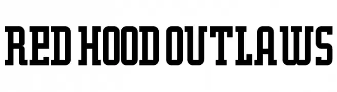
A bold, structured font with block-like serifs and a vintage industrial feel.
![Red Hood Outlaws font caratteri gratis]() Scaricare 254 Downloads@WebFont
Scaricare 254 Downloads@WebFont -
( Fonts by Muhammad Yafinuha )
A bold, playful font with thick, rounded strokes and a cartoonish style.
![Zooberg font caratteri gratis]() Scaricare 254 Downloads@WebFont
Scaricare 254 Downloads@WebFont -
( Fonts by a Max Infeld - XEROGRAPHER FONTS - xerographer.blogspot.com . Personal-use only. For commercial use please contact owner. )
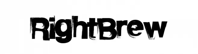
A bold, distressed font with a grunge aesthetic and textured edges.
![RightBrew font caratteri gratis]() Scaricare 254 Downloads@WebFont
Scaricare 254 Downloads@WebFont -
( Fonts by Heather T. - oohlalaartsy.blogspot.com )
A playful, bold outline font with a hand-drawn aesthetic.
![Home&Hearth-OutlineBold font caratteri gratis]() Scaricare 254 Downloads@WebFont
Scaricare 254 Downloads@WebFont -
( Fonts by Peter Wiegel - www.peter-wiegel.de - Personal-use only. For commercial use please contact owner. )
A bold, ornate blackletter font with intricate detailing, reminiscent of medieval scripts.
![FetteNationalFraktur font caratteri gratis]() Scaricare 254 Downloads@WebFont
Scaricare 254 Downloads@WebFont -
( Geronimo Font Studios - Geronimo )
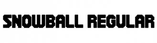
A playful, bubbly font with a snowball-like texture and rounded edges.
![Snowball Regular font caratteri gratis]() Scaricare 254 Downloads@WebFont
Scaricare 254 Downloads@WebFont -
![Dubya2 font caratteri gratis]() Scaricare 254 Downloads@WebFont
Scaricare 254 Downloads@WebFont -
( Fonts by Kong Font - https://fontkong.com/ - Personal-use only. For commercial use please contact owner. )
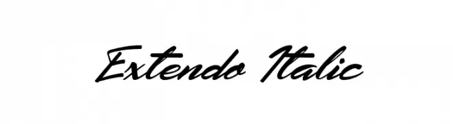
A dynamic, italic script font with flowing, connected characters.
![Extendo Italic font caratteri gratis]() Scaricare 254 Downloads@WebFont
Scaricare 254 Downloads@WebFont -
( Fonts by Kong Font - https://fontkong.com/ - Personal-use only. For commercial use please contact owner. )
A bold, modern font with geometric shapes and a futuristic style.
![Chambers font caratteri gratis]() Scaricare 254 Downloads@WebFont
Scaricare 254 Downloads@WebFont -
( Fonts by Burntilldead Typefoundry )
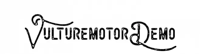
A decorative and bold font with ornate uppercase letters and textured characters.
![VulturemotorDemo font caratteri gratis]() Scaricare 254 Downloads@WebFont
Scaricare 254 Downloads@WebFont -
( Fonts by benoitsjoholm.blogspot.com - Benoit Sjoholm - Personal-use only. For commercial use please contact owner. )
A modern, geometric font with bold, rounded shapes and a futuristic aesthetic.
![Alice font caratteri gratis]() Scaricare 254 Downloads@WebFont
Scaricare 254 Downloads@WebFont -
( Free for a personal use. For a commercial use please visit www.kevinandamanda.com )
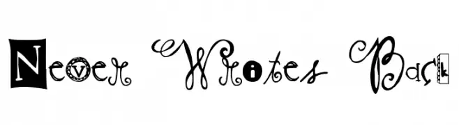
A playful and eclectic font with unique, decorative characters.
![Never Writes Back font caratteri gratis]() Scaricare 254 Downloads@WebFont
Scaricare 254 Downloads@WebFont -
![VI Kiên Trúc font caratteri gratis]() Scaricare 254 Downloads
Scaricare 254 Downloads -
( Fonts by Darrell Flood )
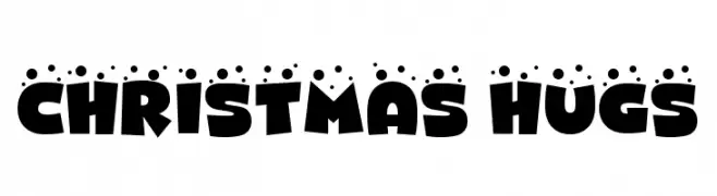
A playful, bold font with rounded letters and festive accents, perfect for cheerful designs.
![CHRISTMAS HUGS font caratteri gratis]() Scaricare 254 Downloads@WebFont
Scaricare 254 Downloads@WebFont -
( Fonts by Manfred Klein. Free for private and charity use. Free for commercial with donation to organizations )
Eclectic pictogram font with detailed black-and-white illustrations.
![Symbolica font caratteri gratis]() Scaricare 254 Downloads@WebFont
Scaricare 254 Downloads@WebFont -
( Fonts by Kong Font - https://fontkong.com/ - Personal-use only. For commercial use please contact owner. )
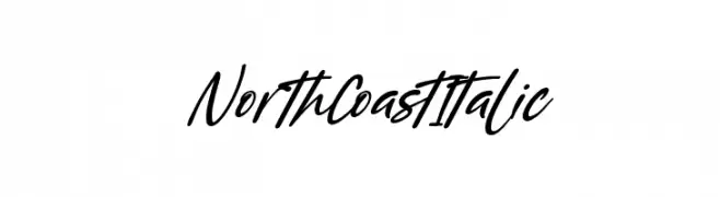
A dynamic and elegant cursive script font with a flowing style.
![North Coast Italic font caratteri gratis]() Scaricare 254 Downloads@WebFont
Scaricare 254 Downloads@WebFont -
( Fonts by Daniel Zadorozny - www.iconian.com - Free for personal use )
Bold, angular, and italic with a condensed form and high contrast.
![Skirmisher Condensed Italic font caratteri gratis]() Scaricare 254 Downloads@WebFont
Scaricare 254 Downloads@WebFont -
( Fonts by Daniel Zadorozny - www.iconian.com )
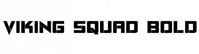
A bold, angular font with a geometric, rune-like design.
![Viking Squad Bold font caratteri gratis]() Scaricare 254 Downloads@WebFont
Scaricare 254 Downloads@WebFont -
( ingoFonts - Ingo Zimmermann - www.ingofonts.com )
A bold, oblique font with thick strokes and a dynamic appearance.
![Analogue Reduced 76 Bold Oblique font caratteri gratis]() Scaricare 254 Downloads@WebFont
Scaricare 254 Downloads@WebFont -
( Fonts by Docallisme HAS - Ryal - docallisme.blogspot.com - Personal-use only. For commercial use please contact owner. )
A bold, 3D-effect font with a modern and playful style.
![BATAVIA-KOTA font caratteri gratis]() Scaricare 254 Downloads@WebFont
Scaricare 254 Downloads@WebFont


Quali sono i font più popolari adesso?
Poppins, Roboto, Montserrat, Open Sans e Lato sono molto usati per le forme pulite e l'ampia applicabilità — dall'identità di marca alle landing page e ai poster.
Quali font si usano spesso nei loghi?
Le sans serif geometriche (es. Poppins, famiglie in stile Gotham) sono scelte comuni per un branding pulito e scalabile. Per un tocco personale restano valide script e stili manoscritti. Abbina un display deciso per i titoli a un corpo testo neutro per riconoscibilità ed equilibrio.
Ogni quanto si aggiorna la lista?
Con regolarità, in base ai download e all'attività reale. Torna spesso per scoprire in anticipo le nuove preferite.
💡 Consiglio: aggiungi ai preferiti — le tendenze cambiano in fretta e i font top di oggi possono ispirare il rebranding di domani.