Benvenuto nelle Font Più Popolari — dove popolarità e qualità si incontrano. Qui trovi i font più scaricati e usati dell'anno. Se cerchi scelte sicure per logo, web o social, inizia da qui.
Ogni font top si distingue per equilibrio, leggibilità e versatilità. Troverai sans serif moderne, script eleganti, serif vintage e display minimalisti.
-
 Scaricare 250 Downloads@WebFont
 -
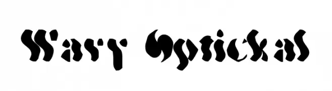
![Wavy Optickal font caratteri gratis]() Scaricare 250 Downloads@WebFont
Scaricare 250 Downloads@WebFont -
![Pixel II Regular font caratteri gratis]() Scaricare 250 Downloads@WebFont
Scaricare 250 Downloads@WebFont -
( Fonts by falahfont248 )
A bold, playful, and hand-drawn style font with dynamic curves.
![Gaming font caratteri gratis]() Scaricare 250 Downloads@WebFont
Scaricare 250 Downloads@WebFont -
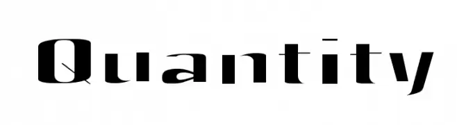
![Quantity font caratteri gratis]() Scaricare 250 Downloads@WebFont
Scaricare 250 Downloads@WebFont -
-
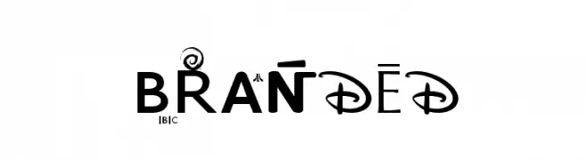
![BRANDED font caratteri gratis]() Scaricare 250 Downloads@WebFont
Scaricare 250 Downloads@WebFont -
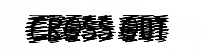
( Font by Jonathan Harris - www.tattoowoo.com )
A bold, scribbled font with a hand-drawn, cross-hatched style.
![Cross Out font caratteri gratis]() Scaricare 250 Downloads@WebFont
Scaricare 250 Downloads@WebFont -
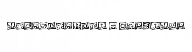
![indezonefont - creative font caratteri gratis]() Scaricare 250 Downloads@WebFont
Scaricare 250 Downloads@WebFont -
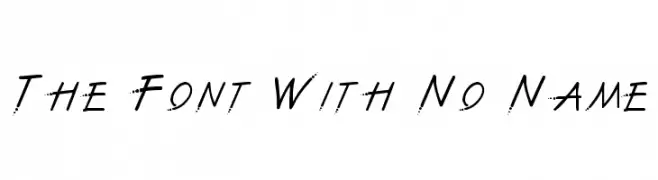
![The Font With No Name font caratteri gratis]() Scaricare 250 Downloads@WebFont
Scaricare 250 Downloads@WebFont -
( weknow - Wino S Kadir - www.creativefabrica.com/designer/weknow/ )
A bold, geometric font with a pixelated, digital aesthetic.
![GAMER-Light font caratteri gratis]() Scaricare 250 Downloads@WebFont
Scaricare 250 Downloads@WebFont -
( Fonts by Galdino Otten Fonts - www.galdinootten.com - Personal-use only. For commercial use please contact owner. )
A pixelated outline font with a retro digital aesthetic.
![Pixel Book Out font caratteri gratis]() Scaricare 250 Downloads@WebFont
Scaricare 250 Downloads@WebFont -
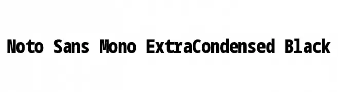
( Noto is a trademark of Google Inc. Noto fonts are open source. All Noto fonts are published under the SIL Open Font License, Version 1.1 )
A bold, monospaced, extra-condensed font with uniform stroke thickness.
![Noto Sans Mono ExtraCondensed Black font caratteri gratis]() Scaricare 250 Downloads@WebFont
Scaricare 250 Downloads@WebFont -
( Fonts by www.gliphmaker.com. Personal-use only. For commercial use please contact owner. )
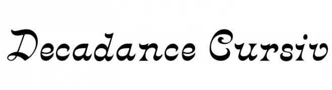
A decorative cursive font with elegant swirls and flourishes.
![Decadance Cursiv font caratteri gratis]() Scaricare 250 Downloads@WebFont
Scaricare 250 Downloads@WebFont -
( Fonts by Nicki Throndsen - www.throndsendesigns.com )
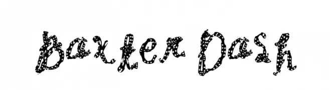
A playful, dotted font with a hand-drawn, whimsical style.
![Baxter Dash font caratteri gratis]() Scaricare 250 Downloads@WebFont
Scaricare 250 Downloads@WebFont -
![DJB Speak Up font caratteri gratis]() Scaricare 250 Downloads@WebFont
Scaricare 250 Downloads@WebFont -
![Gogebashvili-ITV font caratteri gratis]() Scaricare 250 Downloads
Scaricare 250 Downloads -
![AntPoltExpd-Italic font caratteri gratis]() Scaricare 250 Downloads@WebFont
Scaricare 250 Downloads@WebFont -
( Fonts by Weape Design - Personal-use only. For commercial use please contact owner. )
A cursive, handwritten-style font with elegant curves and moderate contrast.
![Kitabisa font caratteri gratis]() Scaricare 250 Downloads@WebFont
Scaricare 250 Downloads@WebFont -
( Fonts by www.aka-acid.com )
A pixelated, grid-like font with a retro digital aesthetic.
![Aka-AcidGR-Starmap font caratteri gratis]() Scaricare 250 Downloads@WebFont
Scaricare 250 Downloads@WebFont -
( Fonts by a Claude Pelletier . Personal-use only. For commercial use please contact owner. )
A bold, geometric font with a modern and artistic style.
![AngelicaCP font caratteri gratis]() Scaricare 250 Downloads@WebFont
Scaricare 250 Downloads@WebFont -
![Activate Oddtype font caratteri gratis]() Scaricare 250 Downloads@WebFont
Scaricare 250 Downloads@WebFont -
( Fonts by www.dcoxy.com )
A playful, hand-drawn font with tall, narrow characters and a whimsical style.
![Right Balance font caratteri gratis]() Scaricare 250 Downloads@WebFont
Scaricare 250 Downloads@WebFont -
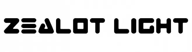
( Fonts by Daniel Zadorozny - www.iconian.com )
A bold, futuristic font with geometric shapes and sharp angles.
![Zealot Light font caratteri gratis]() Scaricare 250 Downloads@WebFont
Scaricare 250 Downloads@WebFont -
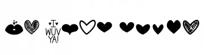
![MF Love Dings font caratteri gratis]() Scaricare 250 Downloads@WebFont
Scaricare 250 Downloads@WebFont -
( Fonts by www.fontpanda.com. Personal-use only. For commercial use please contact owner. )
A playful, handwritten font with smooth, consistent strokes.
![CRAE font caratteri gratis]() Scaricare 250 Downloads@WebFont
Scaricare 250 Downloads@WebFont -
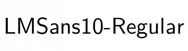
( Fonts by GUST e-foundry )
A clean, modern sans-serif font with balanced spacing and consistent stroke width.
![LMSans10-Regular font caratteri gratis]() Scaricare 250 Downloads@WebFont
Scaricare 250 Downloads@WebFont -
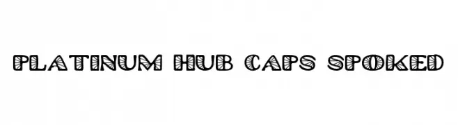
( Fonts by GreyWolf Webworks - www.greywolfwebworks.com - Personal-use only. For commercial use please contact owner. )
A bold, decorative font with geometric patterns inside each character.
![Platinum Hub Caps Spoked font caratteri gratis]() Scaricare 249 Downloads@WebFont
Scaricare 249 Downloads@WebFont -
( Fonts by Galdino Otten - galdinootten.com )
A playful, hand-drawn font with a whimsical and informal style.
![True 2D font caratteri gratis]() Scaricare 249 Downloads@WebFont
Scaricare 249 Downloads@WebFont -
( Fonts by Fajar Abdul Fattah - https://fontbundles.net/sibelumpagi-studio - Personal-use only. For commercial use please contact owner. )
A fluid and elegant script font with dynamic, flowing letterforms.
![Anthoine font caratteri gratis]() Scaricare 249 Downloads@WebFont
Scaricare 249 Downloads@WebFont -
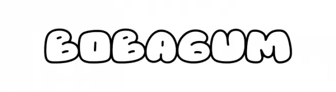
( Fonts by Forberas Club )
A playful, bubble-like font with thick, rounded edges and a cartoonish style.
![Bobagum font caratteri gratis]() Scaricare 249 Downloads@WebFont
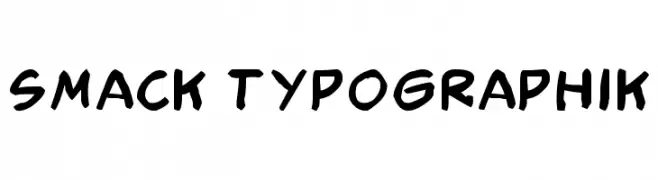
Scaricare 249 Downloads@WebFont -
![Smack Typographik font caratteri gratis]() Scaricare 249 Downloads@WebFont
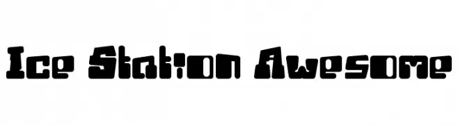
Scaricare 249 Downloads@WebFont -
![Ice Station Awesome font caratteri gratis]() Scaricare 249 Downloads@WebFont
Scaricare 249 Downloads@WebFont -
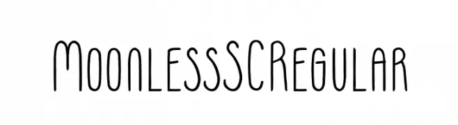
( Fonts by Franzi Draws )
A modern, rounded, and narrow font with a clean and friendly appearance.
![Moonless SC Regular font caratteri gratis]() Scaricare 249 Downloads@WebFont
Scaricare 249 Downloads@WebFont -
( Fonts by www.sweeep.fr - Damien Gosset )
A collection of pixelated arrows with a retro digital aesthetic.
![PixArrows font caratteri gratis]() Scaricare 249 Downloads@WebFont
Scaricare 249 Downloads@WebFont -
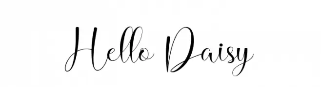
( Fonts by Naharstd - Nanda Hardiansyah - Personal-use only. For commercial use please contact owner. )
An elegant script font with flowing curves and decorative swashes.
![Hello Daisy font caratteri gratis]() Scaricare 249 Downloads@WebFont
Scaricare 249 Downloads@WebFont


Quali sono i font più popolari adesso?
Poppins, Roboto, Montserrat, Open Sans e Lato sono molto usati per le forme pulite e l'ampia applicabilità — dall'identità di marca alle landing page e ai poster.
Quali font si usano spesso nei loghi?
Le sans serif geometriche (es. Poppins, famiglie in stile Gotham) sono scelte comuni per un branding pulito e scalabile. Per un tocco personale restano valide script e stili manoscritti. Abbina un display deciso per i titoli a un corpo testo neutro per riconoscibilità ed equilibrio.
Ogni quanto si aggiorna la lista?
Con regolarità, in base ai download e all'attività reale. Torna spesso per scoprire in anticipo le nuove preferite.
💡 Consiglio: aggiungi ai preferiti — le tendenze cambiano in fretta e i font top di oggi possono ispirare il rebranding di domani.