Benvenuto nelle Font Più Popolari — dove popolarità e qualità si incontrano. Qui trovi i font più scaricati e usati dell'anno. Se cerchi scelte sicure per logo, web o social, inizia da qui.
Ogni font top si distingue per equilibrio, leggibilità e versatilità. Troverai sans serif moderne, script eleganti, serif vintage e display minimalisti.
-
( Fanastudio )
A casual, handwritten font with fluid strokes and a personal touch.
 Scaricare 249 Downloads@WebFont
 -
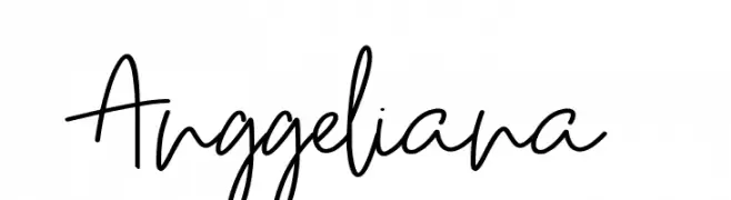
( Fonts by Naharstd - Nanda Hardiansyah - Personal-use only. For commercial use please contact owner. )
An elegant and flowing script font with graceful curves and cursive strokes.
![Confidently font caratteri gratis]() Scaricare 249 Downloads@WebFont
Scaricare 249 Downloads@WebFont -
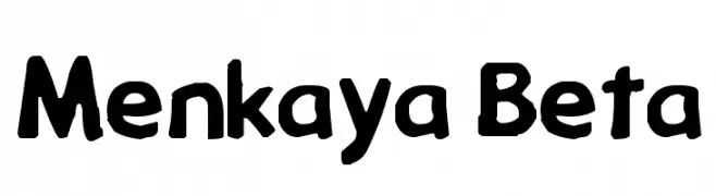
![Menkaya Beta font caratteri gratis]() Scaricare 249 Downloads@WebFont
Scaricare 249 Downloads@WebFont -
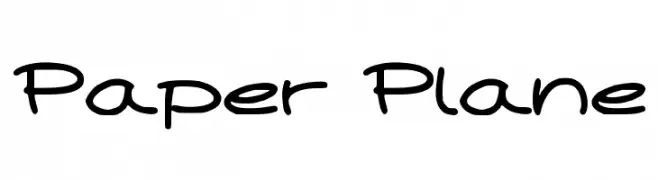
( Fonts by maja.mint - creativemarket.com/maja.mint - Personal-use only. For commercial use please contact owner. )
A playful, handwritten font with smooth curves and a casual style.
![Paper Plane font caratteri gratis]() Scaricare 249 Downloads@WebFont
Scaricare 249 Downloads@WebFont -
![Kruti Dev 080 Italic font caratteri gratis]() Scaricare 249 Downloads@WebFont
Scaricare 249 Downloads@WebFont -
-
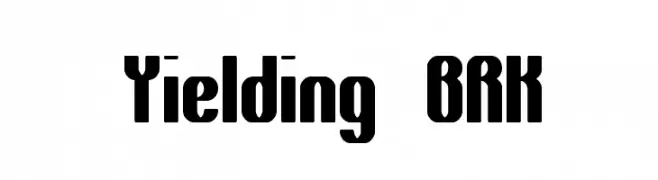
![Yielding BRK font caratteri gratis]() Scaricare 249 Downloads@WebFont
Scaricare 249 Downloads@WebFont -
( Darrell Flood )
A bold, geometric font with a futuristic, digital aesthetic.
![Digital Dare font caratteri gratis]() Scaricare 249 Downloads@WebFont
Scaricare 249 Downloads@WebFont -
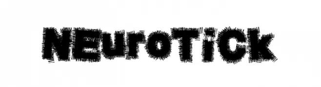
( Fonts by a Max Infeld - XEROGRAPHER FONTS - xerographer.blogspot.com . Personal-use only. For commercial use please contact owner. )
A bold, textured font with a dynamic, vibrating appearance.
![NeuroTick font caratteri gratis]() Scaricare 249 Downloads@WebFont
Scaricare 249 Downloads@WebFont -
![GriffDinReg font caratteri gratis]() Scaricare 249 Downloads@WebFont
Scaricare 249 Downloads@WebFont -
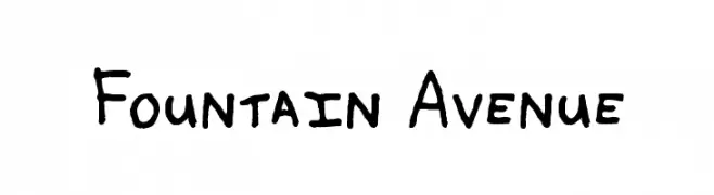
( www222.pair.com/sjohn/fonts.htm )
A playful, handwritten font with irregular strokes and a casual style.
![Fountain Avenue font caratteri gratis]() Scaricare 249 Downloads@WebFont
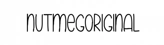
Scaricare 249 Downloads@WebFont -
![NutmegOriginal font caratteri gratis]() Scaricare 249 Downloads@WebFont
Scaricare 249 Downloads@WebFont -
( Fonts by Darrell Flood - Personal-use only. For commercial use please contact owner. )
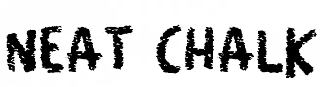
A bold, textured font with a playful, chalk-like appearance.
![Neat Chalk font caratteri gratis]() Scaricare 249 Downloads@WebFont
Scaricare 249 Downloads@WebFont -
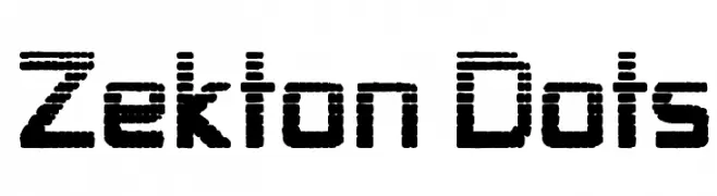
![Zekton Dots font caratteri gratis]() Scaricare 249 Downloads@WebFont
Scaricare 249 Downloads@WebFont -
( imagex - www.imagex-fonts.com )
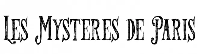
A vintage, decorative font with a distressed, hand-drawn appearance.
![Les Mysteres de Paris font caratteri gratis]() Scaricare 249 Downloads@WebFont
Scaricare 249 Downloads@WebFont -
( Fonts by Daniel Zadorozny - www.iconian.com - Free for personal use )
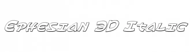
A bold, 3D italic font with a playful and dynamic style.
![Ephesian 3D Italic font caratteri gratis]() Scaricare 249 Downloads@WebFont
Scaricare 249 Downloads@WebFont -
( Fonts by Sharkshock - Dennis Ludlow - Personal-use only. For commercial use please contact owner. )
A bold, rounded, hand-drawn font with a warm and inviting style.
![Cafe Francoise font caratteri gratis]() Scaricare 249 Downloads@WebFont
Scaricare 249 Downloads@WebFont -
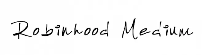
( Fonts by Robin Phelps )
A casual, handwritten font with a playful and informal style.
![Robinhood Medium font caratteri gratis]() Scaricare 249 Downloads@WebFont
Scaricare 249 Downloads@WebFont -
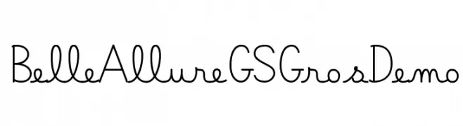
( Fonts by JBFoundry )
A playful, handwritten-style font with elegant, slender characters.
![Belle Allure GS GrosDemo font caratteri gratis]() Scaricare 249 Downloads@WebFont
Scaricare 249 Downloads@WebFont -
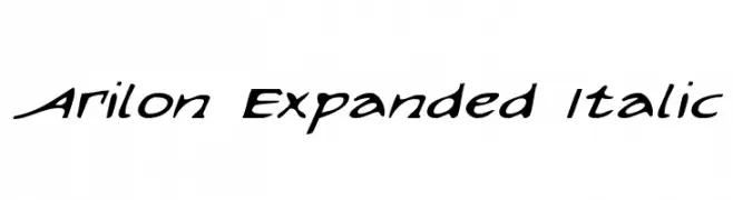
( Fonts by Daniel Zadorozny - www.iconian.com - Free for personal use )
A dynamic, italicized font with expanded letterforms and a modern flair.
![Arilon Expanded Italic font caratteri gratis]() Scaricare 249 Downloads@WebFont
Scaricare 249 Downloads@WebFont -
Caratteri di antipixel. For commercial use please contact the owner.
![ItaloLightItalic font caratteri gratis]() Scaricare 249 Downloads@WebFont
Scaricare 249 Downloads@WebFont -
( Zetafonts - www.zetafonts.com )
A thin, modern font with geometric influences and clean lines.
![Codec Warm Trial Thin font caratteri gratis]() Scaricare 249 Downloads@WebFont
Scaricare 249 Downloads@WebFont -
( Fonts by Jonathan Harris - www.tattoowoo.com )
A bold, sketch-like font with a hand-drawn, textured appearance.
![Herons Nest font caratteri gratis]() Scaricare 249 Downloads@WebFont
Scaricare 249 Downloads@WebFont -
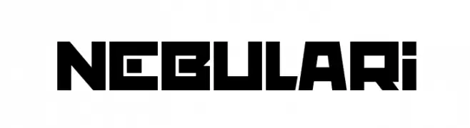
( Darrell Flood )
A bold, geometric font with a futuristic and angular design.
![nebulari font caratteri gratis]() Scaricare 249 Downloads@WebFont
Scaricare 249 Downloads@WebFont -
( Fonts by www.blambot.com )
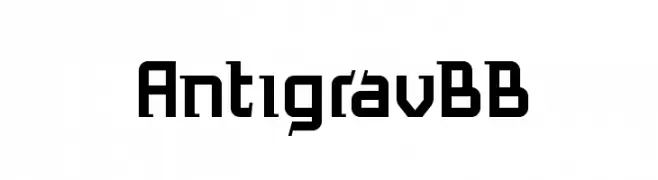
A bold, futuristic font with angular, geometric characters.
![AntigravBB font caratteri gratis]() Scaricare 249 Downloads@WebFont
Scaricare 249 Downloads@WebFont -
( Fonts by www.lifewithouttaffy.com )
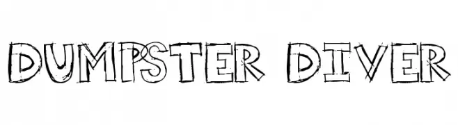
A playful, hand-drawn font with a sketch-like, chaotic appearance.
![Dumpster Diver font caratteri gratis]() Scaricare 249 Downloads@WebFont
Scaricare 249 Downloads@WebFont -
![Vertaboy Amore font caratteri gratis]() Scaricare 249 Downloads@WebFont
Scaricare 249 Downloads@WebFont -
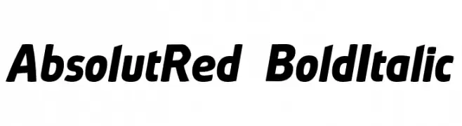
( Fonts by ingoFonts - Ingo Zimmermann - Personal-use only. For commercial use please contact owner. )
A bold, italic font with smooth curves and a dynamic style.
![AbsolutRed-BoldItalic font caratteri gratis]() Scaricare 249 Downloads@WebFont
Scaricare 249 Downloads@WebFont -
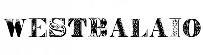
![WestBalaio font caratteri gratis]() Scaricare 249 Downloads@WebFont
Scaricare 249 Downloads@WebFont -
( Fonts by Arkandis Digital Foundry )
A bold, oblique font with a modern and dynamic style.
![UniversalisADFPro-BoldOblique font caratteri gratis]() Scaricare 249 Downloads@WebFont
Scaricare 249 Downloads@WebFont -
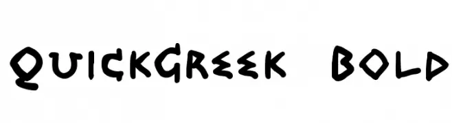
![QuickGreek Bold font caratteri gratis]() Scaricare 249 Downloads@WebFont
Scaricare 249 Downloads@WebFont -
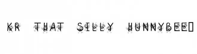
![KR That Silly Hunnybee! font caratteri gratis]() Scaricare 249 Downloads@WebFont
Scaricare 249 Downloads@WebFont -
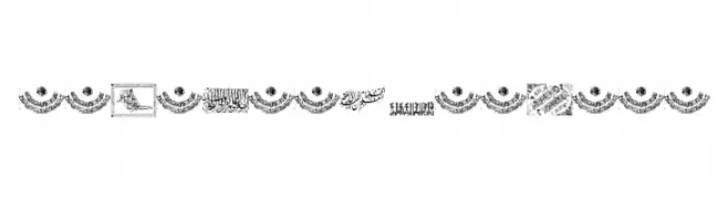
![Aayat Quraan 17 font caratteri gratis]() Scaricare 249 Downloads@WebFont
Scaricare 249 Downloads@WebFont -
( Fonts by www.pia-frauss.de )
An elegant, flowing cursive font with intricate flourishes and decorative appeal.
![Tycho'sElegy font caratteri gratis]() Scaricare 249 Downloads@WebFont
Scaricare 249 Downloads@WebFont -
![Heydings Controls font caratteri gratis]() Scaricare 249 Downloads@WebFont
Scaricare 249 Downloads@WebFont -
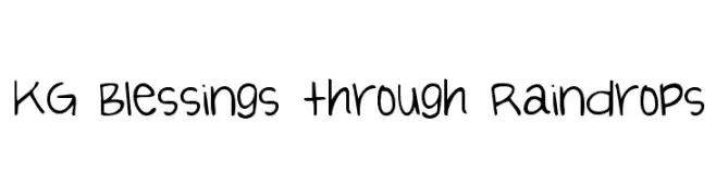
( Fonts by www.kimberlygeswein.com - Kimberly Geswein )
A playful handwritten font with a casual and friendly appearance.
![KG Blessings through Raindrops font caratteri gratis]() Scaricare 249 Downloads@WebFont
Scaricare 249 Downloads@WebFont


Quali sono i font più popolari adesso?
Poppins, Roboto, Montserrat, Open Sans e Lato sono molto usati per le forme pulite e l'ampia applicabilità — dall'identità di marca alle landing page e ai poster.
Quali font si usano spesso nei loghi?
Le sans serif geometriche (es. Poppins, famiglie in stile Gotham) sono scelte comuni per un branding pulito e scalabile. Per un tocco personale restano valide script e stili manoscritti. Abbina un display deciso per i titoli a un corpo testo neutro per riconoscibilità ed equilibrio.
Ogni quanto si aggiorna la lista?
Con regolarità, in base ai download e all'attività reale. Torna spesso per scoprire in anticipo le nuove preferite.
💡 Consiglio: aggiungi ai preferiti — le tendenze cambiano in fretta e i font top di oggi possono ispirare il rebranding di domani.