Benvenuto nelle Font Più Popolari — dove popolarità e qualità si incontrano. Qui trovi i font più scaricati e usati dell'anno. Se cerchi scelte sicure per logo, web o social, inizia da qui.
Ogni font top si distingue per equilibrio, leggibilità e versatilità. Troverai sans serif moderne, script eleganti, serif vintage e display minimalisti.
-
( Google Web Fonts )
A clean, modern monospaced font with rounded edges and consistent spacing.
 Scaricare 21334 Downloads@WebFont
 -
![Kabel Regular font caratteri gratis]() Scaricare 21311 Downloads@WebFont
Scaricare 21311 Downloads@WebFont -
![WeezerFont font caratteri gratis]() Scaricare 21284 Downloads@WebFont
Scaricare 21284 Downloads@WebFont -
![The Voice Font font caratteri gratis]() Scaricare 21270 Downloads@WebFont
Scaricare 21270 Downloads@WebFont -
![RSSlabface font caratteri gratis]() Scaricare 21233 Downloads
Scaricare 21233 Downloads -
-
![01 Digitall font caratteri gratis]() Scaricare 21130 Downloads@WebFont
Scaricare 21130 Downloads@WebFont -
Caratteri di spideraysfonts. For commercial use please contact the owner.
( OVERWATCH )
A bold, futuristic font with sharp angles and geometric shapes.
![OVERWATCH font caratteri gratis]() Scaricare 21120 Downloads@WebFont
Scaricare 21120 Downloads@WebFont -
( Copyright 2017 The Playfair Display Project Authors (https://github.com/clauseggers/Playfair-Display), with Reserved Font Name "Playfair Display". )
A high-contrast serif font with a classic yet modern elegance.
![Playfair Display Black font caratteri gratis]() Scaricare 21087 Downloads@WebFont
Scaricare 21087 Downloads@WebFont -
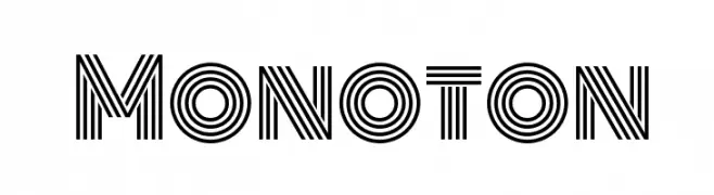
( Copyright (c) 2011 by vernon adams (vern@newtypography.co.uk) )
A modern, geometric font with parallel line detailing for a bold, futuristic look.
![Monoton font caratteri gratis]() Scaricare 21085 Downloads@WebFont
Scaricare 21085 Downloads@WebFont -
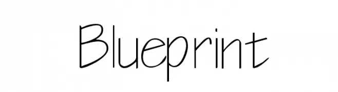
![Blueprint font caratteri gratis]() Scaricare 21029 Downloads@WebFont
Scaricare 21029 Downloads@WebFont -
( Fonts by Plamen Motev - www.fontfabric.com - Personal-use only. For commercial use please contact owner. )
A bold, modern sans-serif font with clean lines and excellent legibility.
![Akrobat Bold font caratteri gratis]() Scaricare 20996 Downloads@WebFont
Scaricare 20996 Downloads@WebFont -
( Fonts by Matthew Welch - www.squaregear.net/fonts/ )
A bold, geometric font with a collegiate, sports-inspired style.
![College font caratteri gratis]() Scaricare 20958 Downloads@WebFont
Scaricare 20958 Downloads@WebFont -
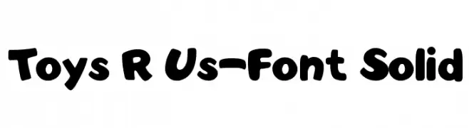
![Toys R Us-Font Solid font caratteri gratis]() Scaricare 20846 Downloads@WebFont
Scaricare 20846 Downloads@WebFont -
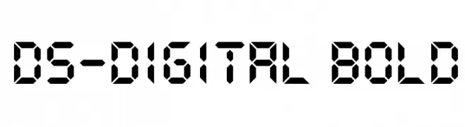
![DS-Digital Bold font caratteri gratis]() Scaricare 20834 Downloads@WebFont
Scaricare 20834 Downloads@WebFont -
( Fonts by Castcraft Software - opti.netii.net - check the website before use )
A modern, geometric font with clean lines and extended width.
![OPTIEdgar-Extended font caratteri gratis]() Scaricare 20704 Downloads@WebFont
Scaricare 20704 Downloads@WebFont -
![Matrix font caratteri gratis]() Scaricare 20695 Downloads@WebFont
Scaricare 20695 Downloads@WebFont -
( Fonts by a Neale Davidson - www.pixelsagas.com. Personal-use only. For commercial use please contact owner. )
A bold, geometric font with a futuristic and angular design.
![Horizon font caratteri gratis]() Scaricare 20641 Downloads@WebFont
Scaricare 20641 Downloads@WebFont -
![Agenda Regular font caratteri gratis]() Scaricare 20620 Downloads@WebFont
Scaricare 20620 Downloads@WebFont -
Caratteri di glyphstyle. For commercial use please contact the owner.
( NOTE: This font is FREE 100% FOR PERSONAL USE ONLY! But any donation are very appreciated. visit our website for FULL VERSION font: https://www.glyphstyle.net/shop/ Paypal account for donation : https://www.paypal.me/dimasardhi Please follow our instag )
A classic serif font with elegant strokes and moderate contrast, perfect for sophisticated designs.
![Brighamdemo font caratteri gratis]() Scaricare 20602 Downloads
Scaricare 20602 Downloads -
![Times Sans Serif font caratteri gratis]() Scaricare 20576 Downloads@WebFont
Scaricare 20576 Downloads@WebFont -
( Fonts by www.exclamachine.com )
A playful, informal handwritten font with dynamic strokes.
![!PaulMaul font caratteri gratis]() Scaricare 20556 Downloads@WebFont
Scaricare 20556 Downloads@WebFont -
![Wild Monkeys AOE font caratteri gratis]() Scaricare 20482 Downloads@WebFont
Scaricare 20482 Downloads@WebFont -
![Coco font caratteri gratis]() Scaricare 20467 Downloads@WebFont
Scaricare 20467 Downloads@WebFont -
( Fonts by ShyFonts )
A bold, modern sans-serif font with clean, geometric lines.
![SF Old Republic Bold font caratteri gratis]() Scaricare 20450 Downloads@WebFont
Scaricare 20450 Downloads@WebFont -
![Primavera font caratteri gratis]() Scaricare 20438 Downloads@WebFont
Scaricare 20438 Downloads@WebFont -
( Fonts are free for a personal use only - www.cuttyfruty.com )
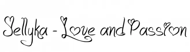
A whimsical, romantic cursive font with heart embellishments.
![Jellyka - Love and Passion font caratteri gratis]() Scaricare 20414 Downloads@WebFont
Scaricare 20414 Downloads@WebFont -
![Bard font caratteri gratis]() Scaricare 20395 Downloads@WebFont
Scaricare 20395 Downloads@WebFont -
( Fonts by backpacker.gr )
A bold, rounded font with smooth curves and even spacing.
![BPreplay-Bold font caratteri gratis]() Scaricare 20382 Downloads@WebFont
Scaricare 20382 Downloads@WebFont -
![Patrika font caratteri gratis]() Scaricare 20370 Downloads@WebFont
Scaricare 20370 Downloads@WebFont -
( Fonts by Art Designs by Sue - Personal-use only. For commercial use please contact owner. )
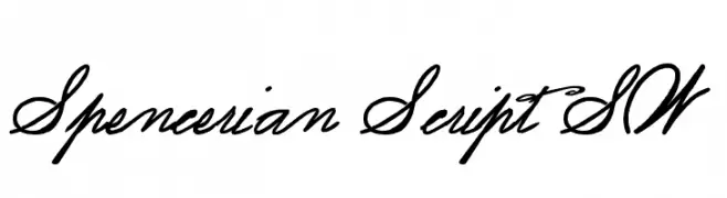
An elegant script font with flowing, interconnected letters and dynamic stroke contrast.
![Spencerian Script SW font caratteri gratis]() Scaricare 20358 Downloads@WebFont
Scaricare 20358 Downloads@WebFont -
( IRO Specialty Chemicals USA, LLC - www.irowater.com )
A versatile collection of brand icons with a clean and modern aesthetic.
![Font Awesome 5 Brands Regular font caratteri gratis]() Scaricare 20348 Downloads@WebFont
Scaricare 20348 Downloads@WebFont -
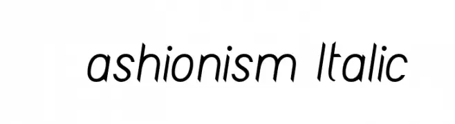
![Fashionism Italic font caratteri gratis]() Scaricare 20348 Downloads@WebFont
Scaricare 20348 Downloads@WebFont -
( A font by Jos Buivenga (exljbris) -> www.exljbris.com )
A bold, modern font with clean lines and a slightly condensed style.
![Diavlo Bold Regular font caratteri gratis]() Scaricare 20340 Downloads@WebFont
Scaricare 20340 Downloads@WebFont -
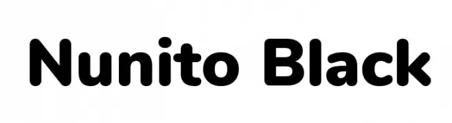
( Copyright 2014 The Nunito Project Authors (contact@sansoxygen.com) )
A modern, rounded, and bold font with smooth edges and high legibility.
![Nunito Black font caratteri gratis]() Scaricare 20302 Downloads@WebFont
Scaricare 20302 Downloads@WebFont -
![NFL Texans font caratteri gratis]() Scaricare 20299 Downloads@WebFont
Scaricare 20299 Downloads@WebFont


Quali sono i font più popolari adesso?
Poppins, Roboto, Montserrat, Open Sans e Lato sono molto usati per le forme pulite e l'ampia applicabilità — dall'identità di marca alle landing page e ai poster.
Quali font si usano spesso nei loghi?
Le sans serif geometriche (es. Poppins, famiglie in stile Gotham) sono scelte comuni per un branding pulito e scalabile. Per un tocco personale restano valide script e stili manoscritti. Abbina un display deciso per i titoli a un corpo testo neutro per riconoscibilità ed equilibrio.
Ogni quanto si aggiorna la lista?
Con regolarità, in base ai download e all'attività reale. Torna spesso per scoprire in anticipo le nuove preferite.
💡 Consiglio: aggiungi ai preferiti — le tendenze cambiano in fretta e i font top di oggi possono ispirare il rebranding di domani.